

Procedure to enter using the “Line Scouter” on a 15-minute chart
This time, in response to the buyer's request, “Please teach me the concrete steps to enter on a 15-minute chart.”
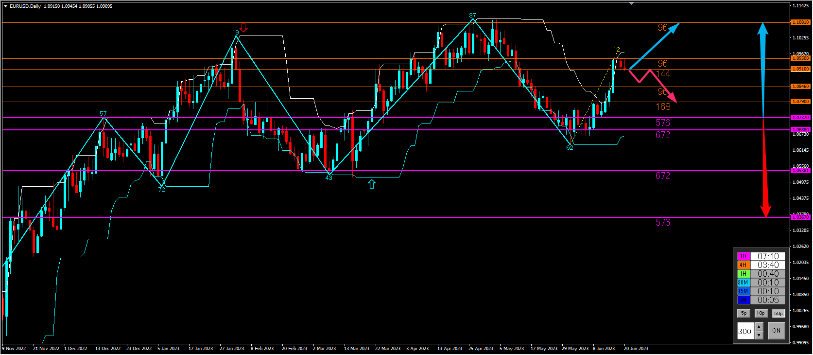
Even with a 15-minute chart, first check the overall market trend on the daily chart.
On the EUR/USD daily chart, price has recently risen sharply and is now cooling off a bit.
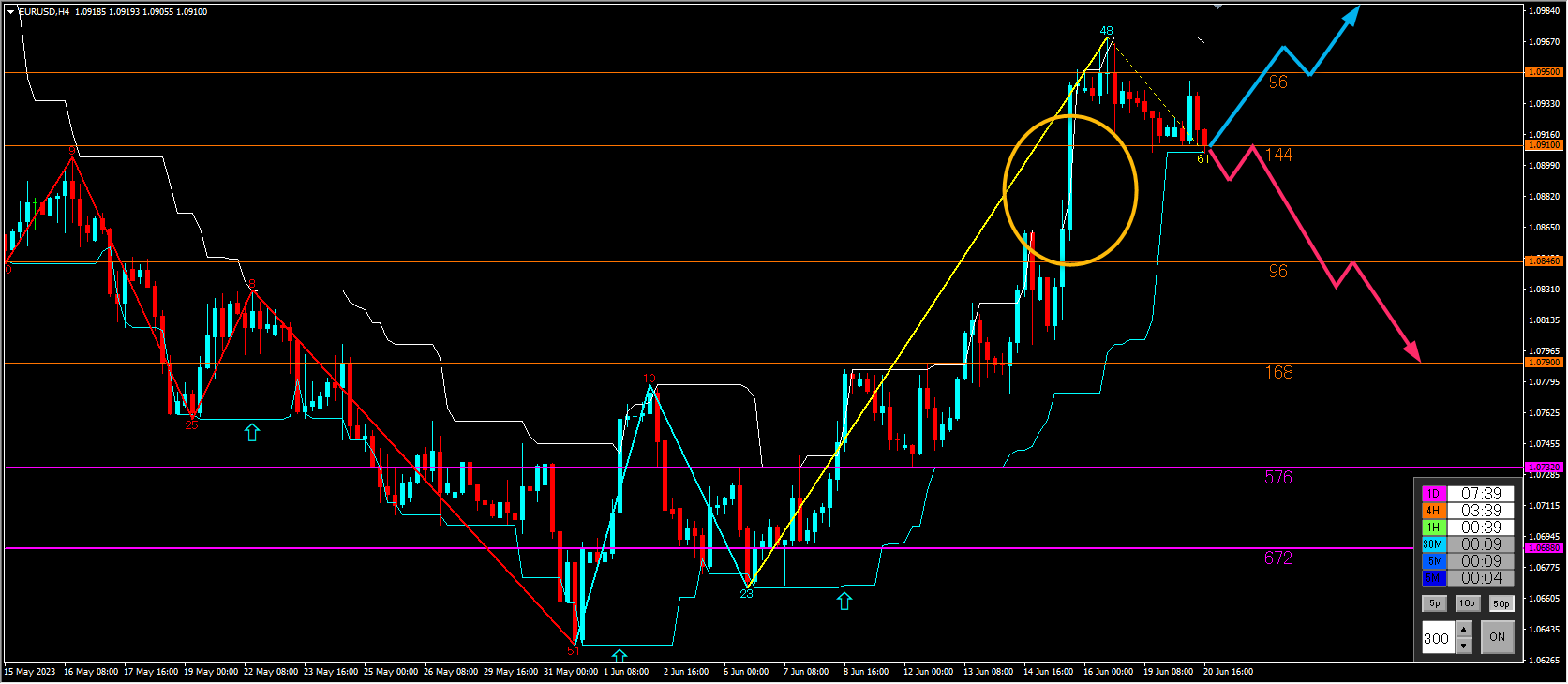
If the body closes above the orange (96) line that sits above the current price on the 4-hour chart, will the upward momentum continue?
Alternatively, if the body closes below the orange line (144) below, the rapid rise could turn into a sharp decline.
Reduce the time frame to the 4-hour chart.
Price has risen vigorously (yellow circle) and is gradually descending.
The area where it rose vigorously has little resistance, so if the body closes below the orange line (144) on the 4-hour chart just under the current price, a large drop can be imagined.
If it rises, the body needs to close above the orange line (96) above the current price to move upward, but since there is no momentum yet, it may take several days to form a new trend.
To consider an entry on the 15-minute chart, the target is when the body breaks the orange line (144).
It would be efficient to aim for a sharp drop within the yellow circle range.
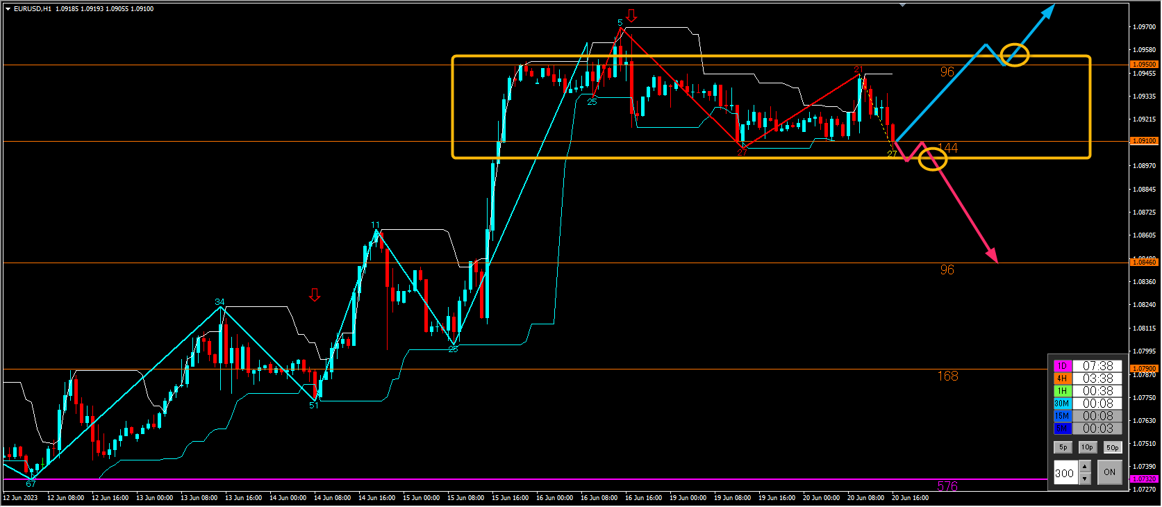
1-hour chart
To make it easier to understand, it has risen vigorously, then momentum faded and it has entered a range, but it continues to make higher highs and higher lows and drifts downward.
If it breaks below the orange line (144), it looks like it could drop rapidly.
As a trading scenario, the idea is to capture the downside.
Specifically, take profit near the orange line (96) below by about 60 pips, with a stop loss slightly above the orange line (144) near the current price by about 15 pips.
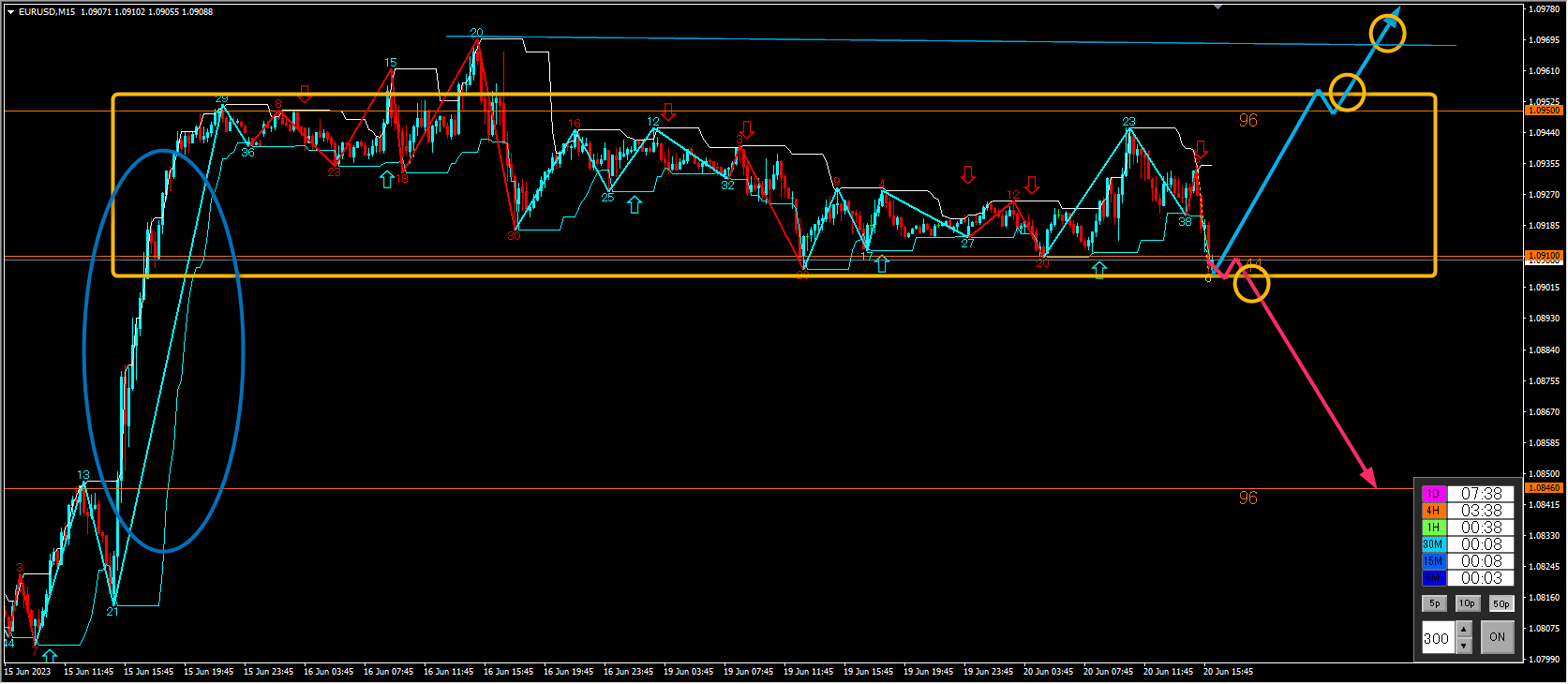
15-minute chart
Lowering the time frame further confirms that the orange line is having a strong effect.
Entry timing is around the yellow circle.
Entry occurs when the candlestick body clearly breaks out, or when a pullback-selling or pullback-buying pattern is confirmed on a lower time frame.
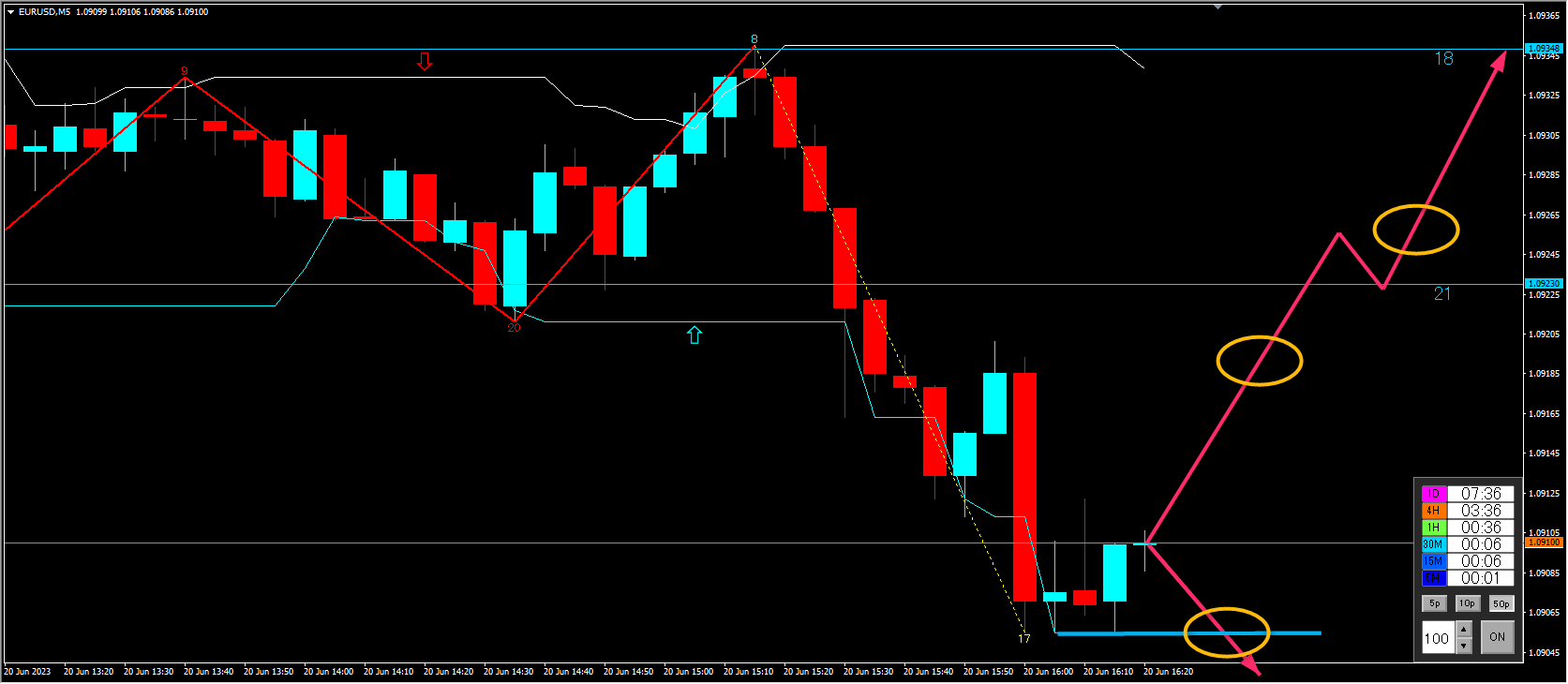
5-minute chart
To gauge pullback buying or pullback selling, the yellow area is considered.
In summary, after checking charts from the daily down to the 5-minute, the conclusions are:
① Daily chart (direction over weeks to months)
The uptrend settles temporarily; the bias is bullish, but there may be no clear direction for several days.
② 4-hour chart (direction over days to about a week)
If the sharp rise turns into a drop, there is a possibility of a rapid fall in a short period.
If it remains in a range or uptrend, it may take several days.
③ 1-hour chart (direction over 4 hours to 2–3 days)
A clear range can be confirmed. For an uptrend to develop, it may take about half a day to two days.
For a downtrend, there could be an entry timing within minutes to hours.
④ 15-minute chart (up to about 1 day) and 5-minute chart (up to a few hours)
Points for timing entries.
That’s how it goes. This is a common form of market setup, but we analyze the market flow using higher timeframes.
In environmental analysis, we check the market flow, but while we tend to focus on profit-taking or loss, it’s important to imagine how long you will hold the position when you enter.
When you take profit or stop loss, imagine how much profit or loss you will have and how long you will hold the position.
Once an entry scenario is formed, as a trigger, you enter when the body breaks out at the confirmation of the candlestick or when you confirm a pullback-selling or pullback-buying pattern on a lower time frame using the line scanner.
The resistance- support lines displayed by the line scanner are quite excellent. However, these lines are calculated from past data and do not guarantee the future.
Entering the moment the line is touched is dangerous. You need an entry that is supported by evidence such as a pullback-selling or pullback-buying pattern confirmed on a lower time frame and a new high/low update.