
AUDUSD 1-hour Chart: Situation After Buy-the-Dip Signal Lights Up [RCI 3-Lines + BODSOR]
Yesterday, I wrote an article about the bullish push signal lighting up, but
the subsequent situation is as follows.
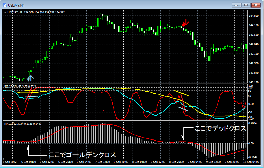
AUD/USD 1-Hour Chart

Upper row:BODSOR
Lower row: 3-line RCI (Red: RCI9, Light blue: RCI26, Yellow: RCI52)
As shown in the chart above, the price has risen substantially without breaking the low of the candle where the signal lit.
You can see that.

Twitter
https://twitter.com/RCIX3Line
Blog
http://bodsor.blog.fc2.com/
Investment Navi+
https://fx-on.com/navi/serial/?id=359
YouTube
https://www.youtube.com/channel/UCL-g5uAlesiWVJEDtWlFvGw
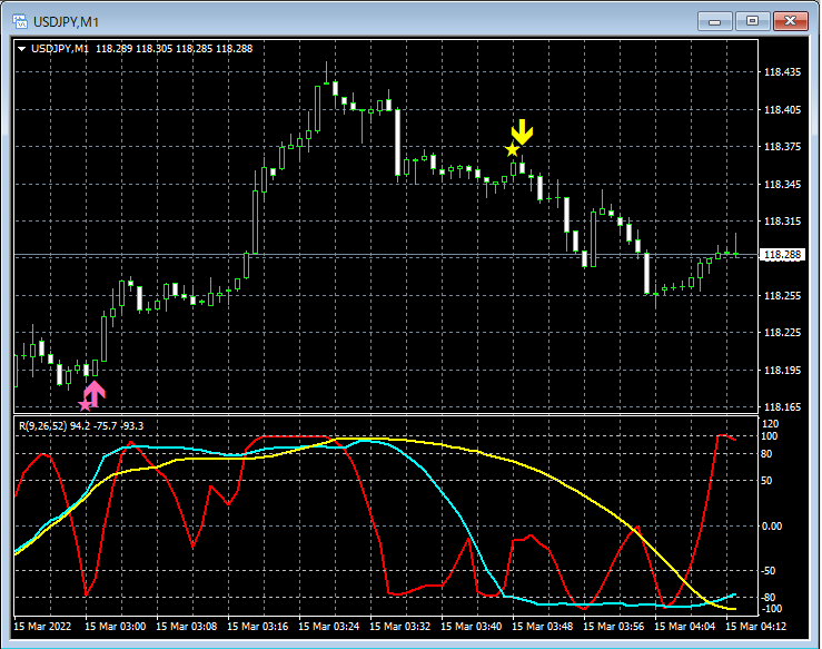
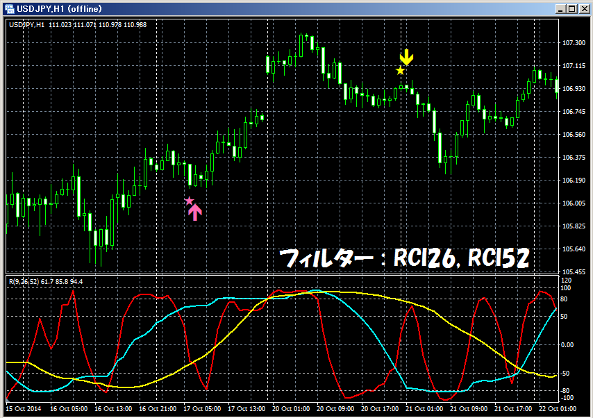
USD/JPY 1-Hour Chart: Example of Pullback Buy / Rebound Sell signals
*In the charts within this article, for convenience of explanation, you may see added elements such as currency symbols, straight lines, or squares. Please understand.
.