
MACD divergence indicates a turning point in the market
Please look at the following chart. This is the GBP/USD 1-hour chart.
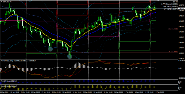
Pay attention to the two lows marked with circles.
The lows are making lower lows.
And when you look at the MACD at that time (orange line in the subwindow), you can see that the MACD lows are rising.
This is MACD divergence, which often marks a market turning point.
In actual trading terms, the entry point would be the close of the bullish candle that formed the lowest low, and the exit point is not easy, but if you exit early, it would be around when the MACD line has risen and become horizontal.
Since the market continues to trend upward afterward, you might enter on the 26EMA (blue line) and exit when it surpasses the +2σ of the Bollinger band to take profit.
Note that the above chart displays the following technicals.
Chart Window: 12EMA, 26EMA, 26EMA Bollinger Bands, Daily Pivot
Sub-window 1: MACD line, Signal line, OsMA
Sub-window 2: Trend Analyzer (26EMA)
Sub-window 3: Trend Analyzer (12EMA)
The indicator used in Sub-window 1 isMACD (4 types of alerts and email possible)which can alert when the MACD line changes direction, so you can check divergence at the moment an alert occurs.
↓ This is a set of templates that display these technicals all at once. We also sell individual technical indicators.
MACD (4 types of alerts and email possible) Trade System
This article is an excerpt from the blog “When you watch and freely apply, the market becomes a lucky charm.”