
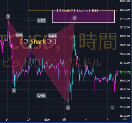
September 8th (Fri): 【Harmonic】 Nikkei 225 VS Bitcoin (Course: Standard chart and logarithmic scale (semi-log chart))
Good morning ☔
Kantō is facing a typhoon, isn't it?
Please take care if you are commuting?
Suddenly, I apologize for the abruptness?
In the harmonic analysis of Bitcoin, there is a possibility that I may have caused considerable trouble?♂️?
That is the content of this lecture
「Normal chart and logarithmic scale (semi-log chart)」.
First, let's look at the charts?
Bitcoin 〖1-hour〗: Normal chart
Bitcoin 〖1-hour〗: Log scale
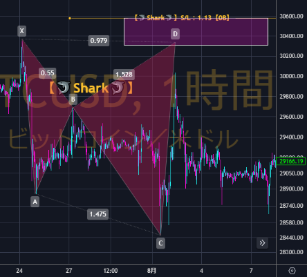
Honestly, which is which...
From a quick glance, you can't tell, can you?
Next...
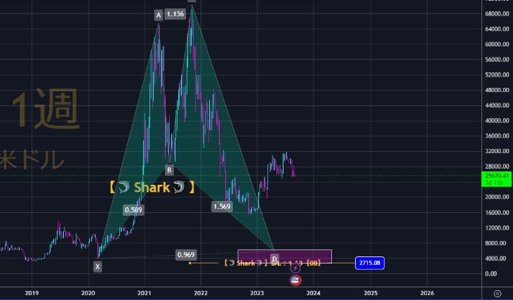
Bitcoin 〖weekly〗: Normal chart
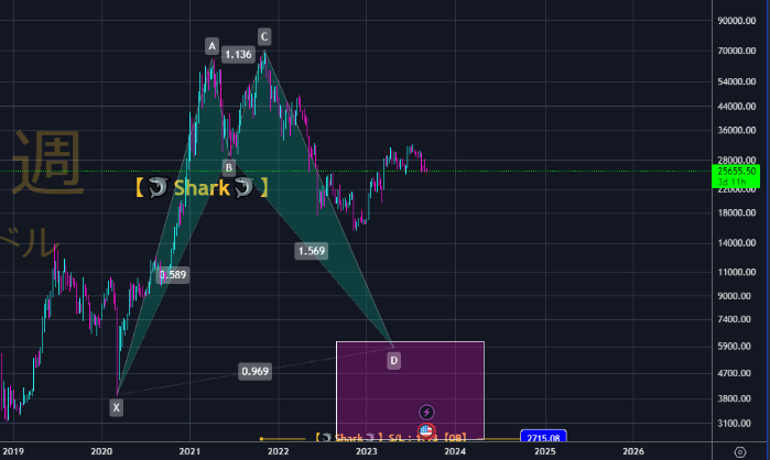
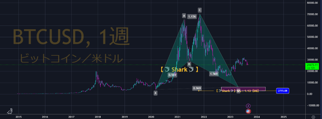
Bitcoin 〖weekly〗: Log scale
For volatile cryptocurrencies, the waveform changes a lot?
Thus in the above case, on the normal chart the harmonic appears extremely distorted.
In fact, it might not even be possible to draw it?
Then「Normal chart and logarithmic scale (semi-log chart)」, how do they differ?
The normal chart has the vertical axis scaled evenly with price.
Since Bitcoin may be difficult to explain,
please consider it in USD/JPY terms.
In a normal chart, when 1 dollar moves by 1 yen,
the increments are the same distance for every 1-yen move, right?
In a log scale, we look at the rate of change.
So the same price range does not correspond to the same dollar movement.
If 1 dollar moves from 100 yen to 101 yen, that is a 1% move.
If 1 dollar moves from 90 yen to 91 yen, that is a 1.1% move.
Therefore on a normal scale,
whether it moves 1 yen from 100 to 99 or from 90 to 89, the candlestick size is the same, but
on a log scale,
whether it moves 1 yen from 100 to 99 or from 90 to 89, the candlestick size differs (the candlestick size is 1:1.1).
If candlesticks of the same size are used,
a move of 1 yen from 100 to 99 and a move of 0.9 yen from 90 to 89 would have the same 1% price move, thus the same size.
In other words, high-volatility cryptos.
Even with large timeframes, the normal chart and the log scale can differ greatly?
If you look at Bitcoin 〖weekly〗 on the normal chart,
to the left of the chart, from 2015–2017 there is hardly any waveform, is there?
But if you view it on a log scale,
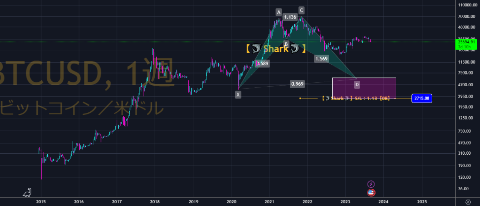
it becomes a proper chart.
If you analyze volatile coins on harmonic analysis, it might be better to set only the large timeframes to the log scale!
One thing to be careful about is,
when analyzing on the log scale,
please apply Fibonacci on the log scale as well.
The bottom of the Fibonacci (both retracement and expansion) settings?
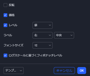
Check the box for “Based on logarithmic scale Fibonacci levels”.
By the way, if you check this box and accidentally apply Fibonacci on the normal chart,
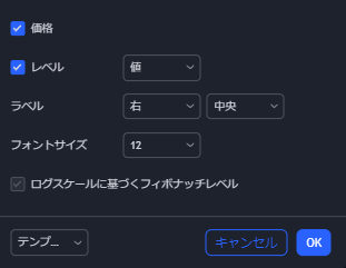
it will automatically darken as shown, so calculations are done normally.
No mistakes, so安心です!(the reverse is not guaranteed, so beware?)
Scott M Carney uses the normal chart,
but I usually view charts on a log scale,
so all my posts are in log scale.
We apologize for any confusion regarding cryptocurrencies, but please understand?♂️?
(※The following is limited to members.)