Simple and straightforward! How to analyze multiple candlesticks
Hello.
This is Guava LLC.
This time as well, I would like to delve into candlestick analysis.
In previous articles, I wrote about how to interpret a single candlestick.
However, in actual markets, the situation changes rapidly, so
if you analyze each candlestick individually, you may fall behind.
Therefore, in this article,
“How to interpret consecutive candlesticks”
is what I would like to discuss.
Please stay with me until the end!
Concept of Consecutive Candlesticks
I will start with the conclusion.
Consecutive candlesticks should be
considered as a single candlestick.
In fact, this is a similar idea to MTF analysis.
Rather than analyzing the market with only a 1-minute chart,
analyze with higher timeframes such as 5 minutes and 1 hour
to grasp the big picture of the market.
This concept is also effective in candlestick analysis.
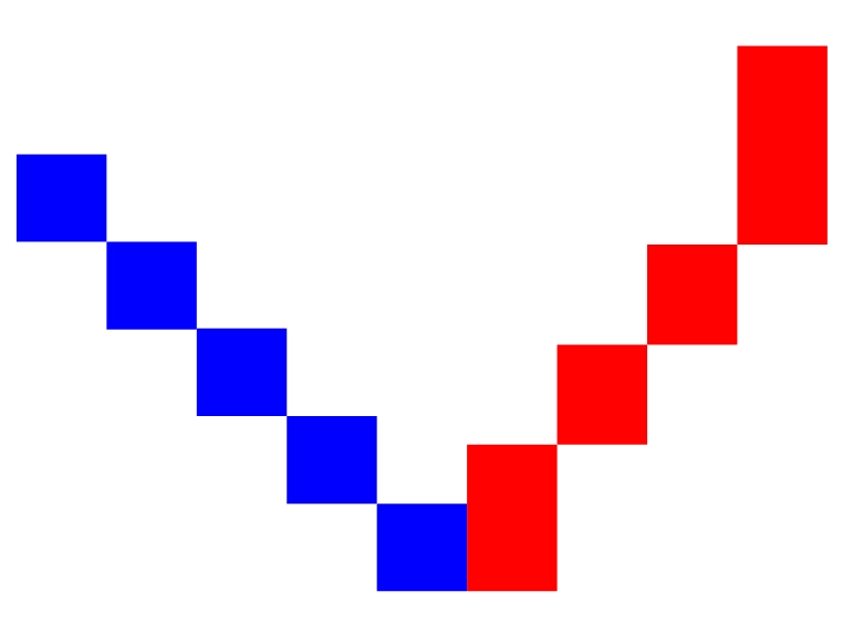
For example, when you look at this chart, how would you think about it?
It feels like it’s being pushed down and then rebounding upward,
but try incorporating the idea of a single candlestick here.
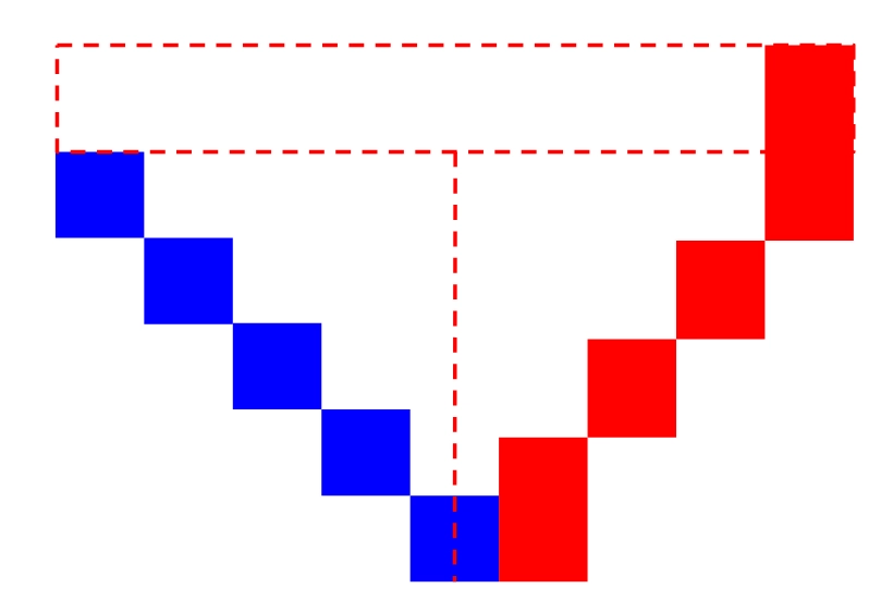
When you think of it as a “single candlestick,”
candlesticks like the ones shown in this chart will emerge.
This shape is called the “yang umbrella” (bullish candle body),
and is generally viewed as a “trend reversal signal.”
Of course, by looking at the chartthe fact that the downtrend reversed to an uptrendcan be read,
so it is natural to view this candlestick as a reversal signal.
In this way, if you think of multiple candlesticks as a group,
you can capture the essence even amid volatile price movements in a simple way.
Common “tuzumi candle” or “harami candle” etc. can be explained with the exact same thinking.
What are the key points in the summary?
To summarize in one word,
the problem is where to define the start and end of the consolidation.
For example, when thinking in terms of MTF analysis, you can get into an infinite loop.
Seen on a 1-minute chart as a downtrend,
on a 5-minute chart you may be in a range,
on a 15-minute chart you may be in a pullback of an uptrend,
on a 30-minute chart...
If you repeat this thinking,
ultimately you may end up summarizing everything from the past to the present
into a single candlestick.
This would not be meaningful analysis.
So what should you do?
I will state the conclusion.
Candlesticks should be grouped according to the time frame relevant to your trading.
For example, in binary options with 15-minute trades,
there is little you can gain by looking at the 1-hour chart.
Because,you are trying to forecast price movements while the 1-hour chart is still forming.)
From a chart at 25 minutes on the 1-hour timeframe to a chart at 40 minutes, predicting is
intuitively difficult, or in other words, a no-go game.
Therefore,
in 15-minute trading you should think that “the 1-hour chart doesn’t matter.”
To give a concrete example, if you are trading on a 15-minute chart,
a rough analysis on the 1-minute chart, and if needed, using the 5-minute chart, would be a balanced approach.
This does not mean “give up because there is no end to thinking.”
It means you trim away meaningless higher-timeframes to perform meaningful analysis.
Although higher-timeframe filters are often used,
if you think, “because the 1-hour is in an uptrend, I will stop low-entry,”
you should ask,
“why is it the 1-hour, and why is that necessary?”
It is important to think carefully.
In closing
That is all for now.
If even one reader found this article helpful, I would be glad.
Finally, a quick promotion,
we are currently offering our developed indicator for free.
↓↓
https://www.gogojungle.co.jp/tools/indicators/19469
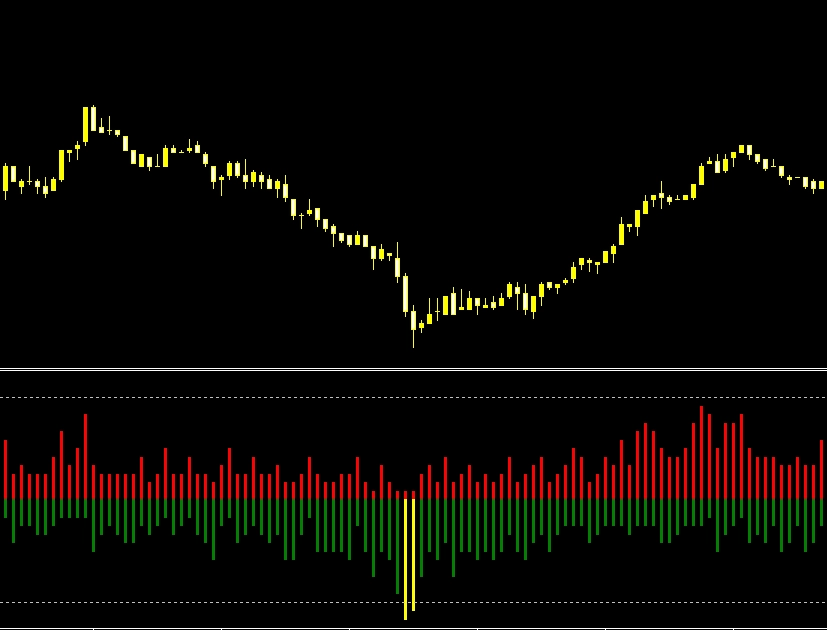
It is a simple oscillator-type indicator that is easy for beginners to use.
We also publish usage guides and backtests,
so if you are interested, please check it out!
Thank you for reading to the end.
× ![]()