
[MFT Analysis] Clear explanation of multi-timeframe analysis with images
This article is for these kinds of people
- “What should I do about MFT analysis?”
- “It moves against me after entry”
- “I can’t ride the trend effectively”
MFT analysis is often described with the metaphor of a “Matryoshka doll.” However, even when you research MFT analysis, most explanations only cover the concept, and there is little guidance on how to use it in practice.
【I understand the meaning of riding the smaller trend along the larger trend, but...】
【I don’t know how to apply it to trading…】
This article is for those people and will explain with images how toactually use MFT analysis on the chartin practice.
There is a purpose for the price moving against you after entry.
■ What is MFT Analysis
MFT Analysis (Multi-Time Frame Analysis) is a method of judging the market environment from multiple timeframes for a single currency pair.This is commonly referred to as
Environmental Recognition.
Generally, you analyze from larger to smaller timeframes like “monthly → weekly → daily → 4-hour → 1-hour, …”
However, you don’t need to analyze everything exhaustively; on large timeframes such as monthly or weekly, understanding that the market is “trending upward” to some extent is usually enough.
Now, I will explain the concrete method of analysis.
■ How to Perform MFT Analysis
This time, I will assume trading on a 5-minute chart for day trading.
The explanation will be fairly brief, but I hope you can grasp the overall flow at least.
Start by looking at the chart from the monthly timeframe down to the 5-minute timeframe to perform environment recognition.
To make it easy to understand, I will draw horizontal lines.
Monthly = Red
Weekly = Yellow
Daily = Orange
4-hour = Pink
1-hour = Light blue
Note: The chart used for this explanation is XAU/USD as of 19:07 on October 19, 2023.
Monthly
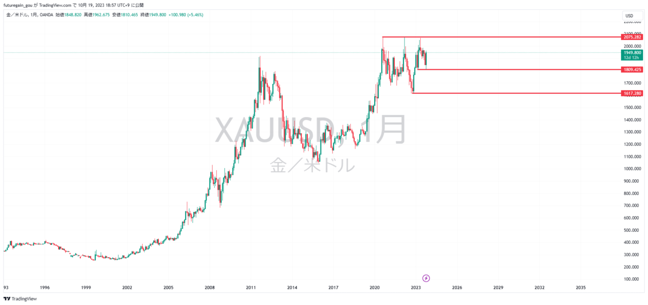
From the monthly chart, draw lines at the high, the low that formed the third high, and the recent pullback points.
Currently, the price is attempting to reach new highs again, so the monthly trend is upward.
The monthly can be understood roughly. It’s enough to check the monthly once a week.
Weekly
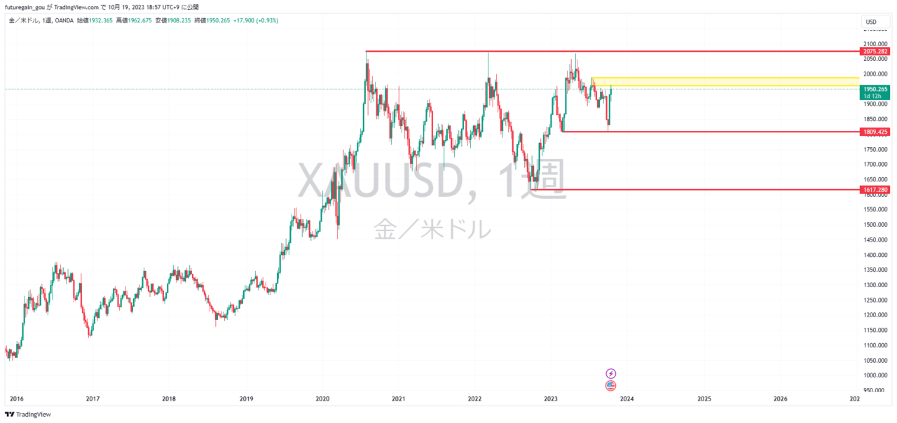
On the weekly chart, prices are rising, but the yellow box (the high that became the starting point of the drop) is acting as resistance.
However, because the starting low that formed the third high has not been broken, the Dow theory indicates an upward trend.
Daily
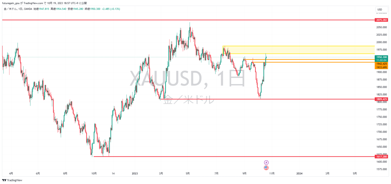
On the daily chart, the price has broken the orange line by the body of the candlestick, which indicates a bullish reversal in Dow theory.