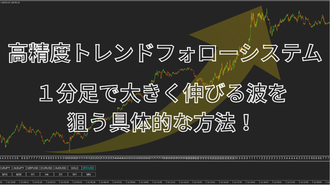

[ There is a 5,000 yen coupon! ] [鉄板パターン] used to target a large upward move on the 1-minute chart—specific method to catch a big wave!

It can be taken significantly here.
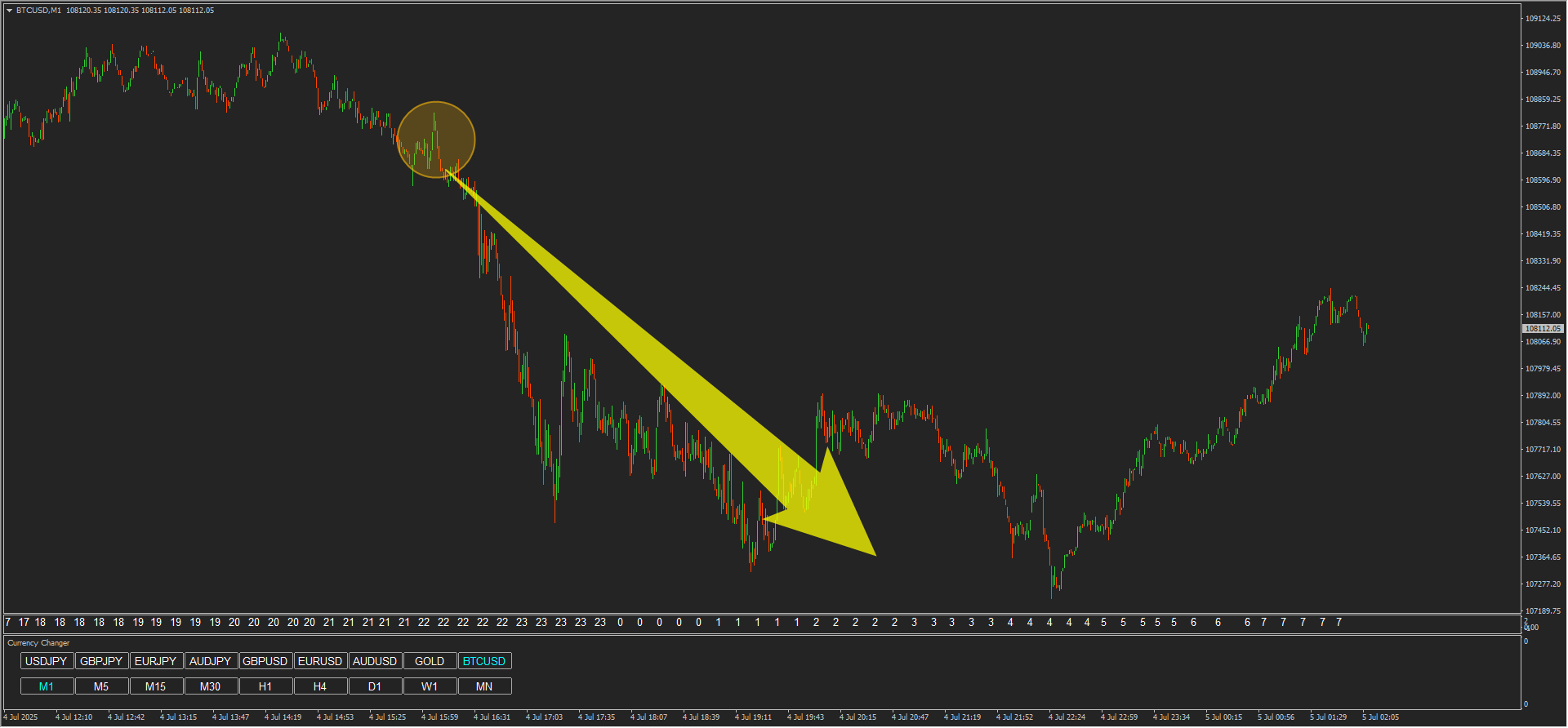
In this chart, one of the common ironclad patterns appears as a chart shape.
Therefore, based on how to profit from that shape, we will utilize the “Ferocious Attack and Iron Defense.”
The exact shape of the ironclad pattern cannot be shared, but
it is a pattern where the risk-reward ratio can target -1 : +3, so
based on that, we will select profit-taking points.
↓15-minute chart↓
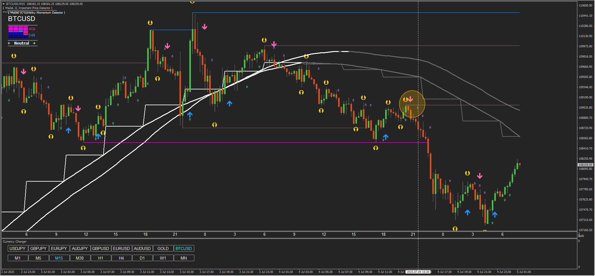
※If the profit target on a higher timeframe is reached, it is likely to be farther away.
Therefore, before reaching there,
based on the capital management concept in the product manual,
it is best to firmly capture profits using the risk-reward ratio as a base.
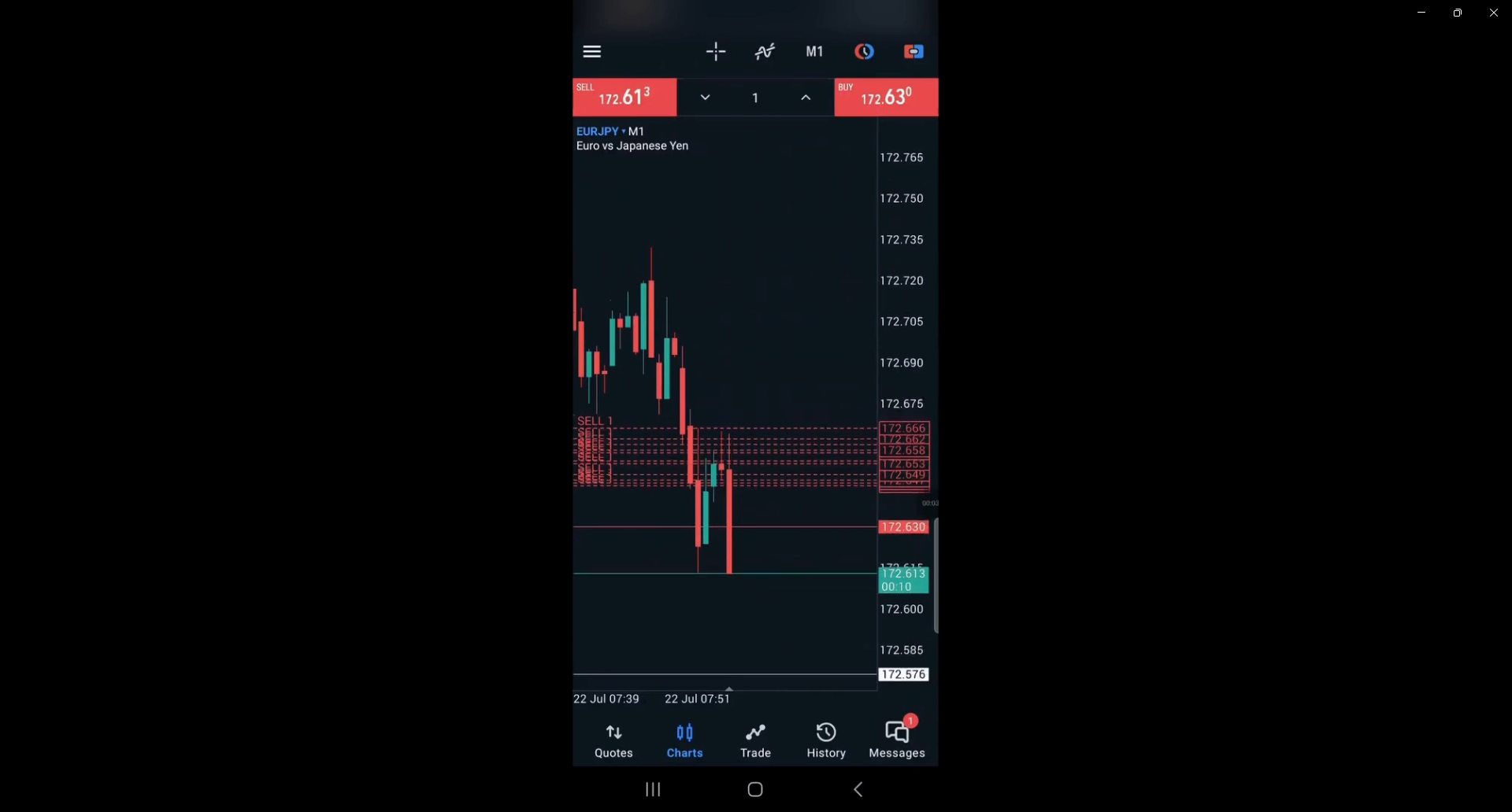
↓ 1-minute chart ↓
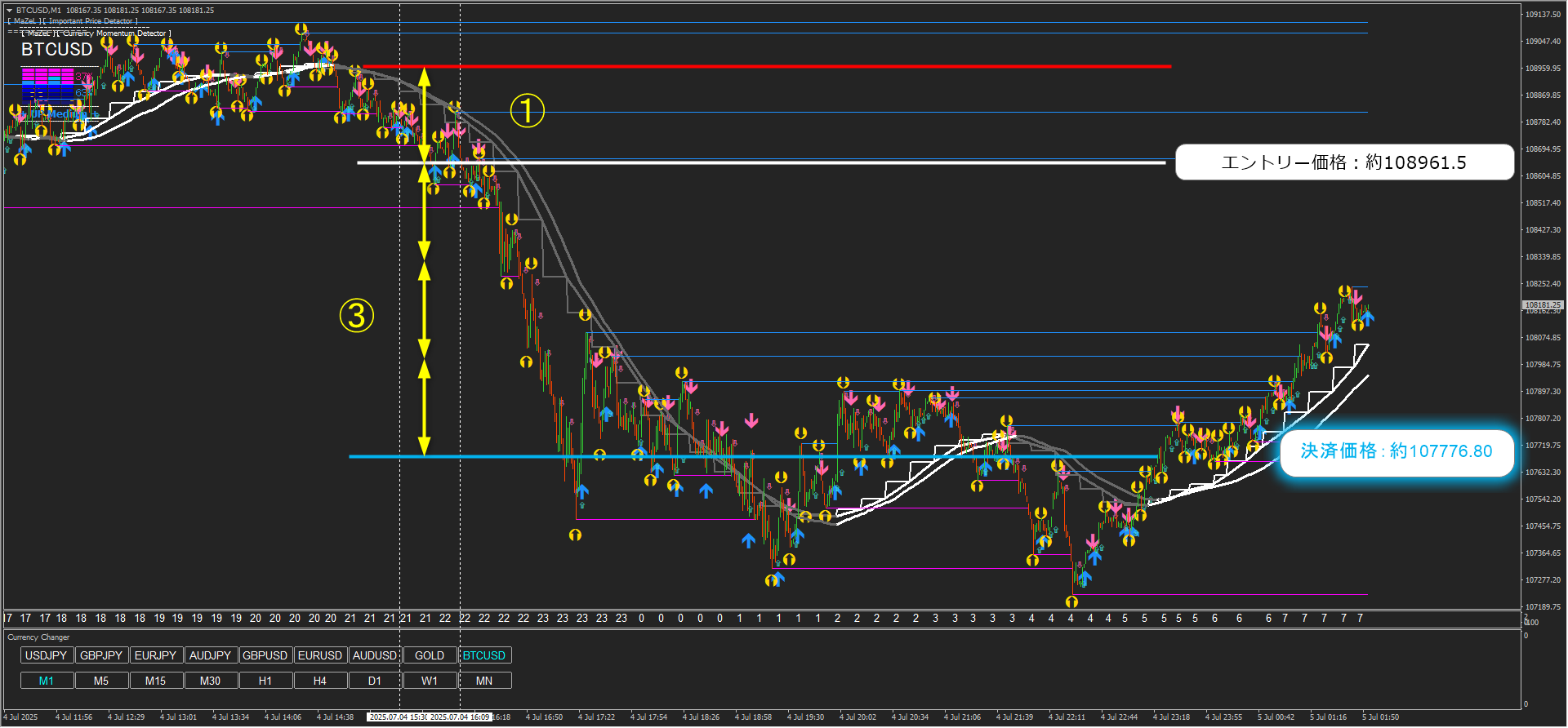
If you assume a loss of 10,000 yen, then+30,000 yen.
If you assume −100,000 yen,+300,000 yen.
If you assume −1,000,000 yen,then+3,000,000 yen.
If you want to trade like this,
please take a look until the end.
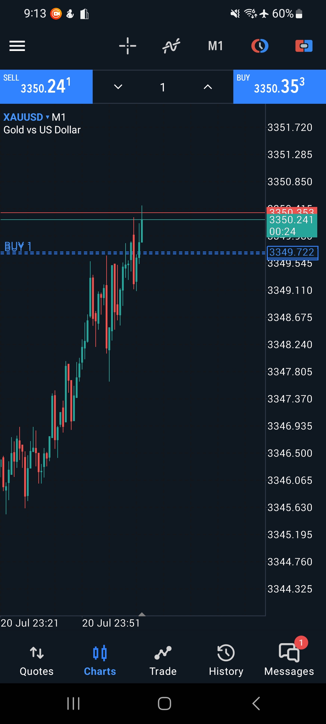
Please see the image below.
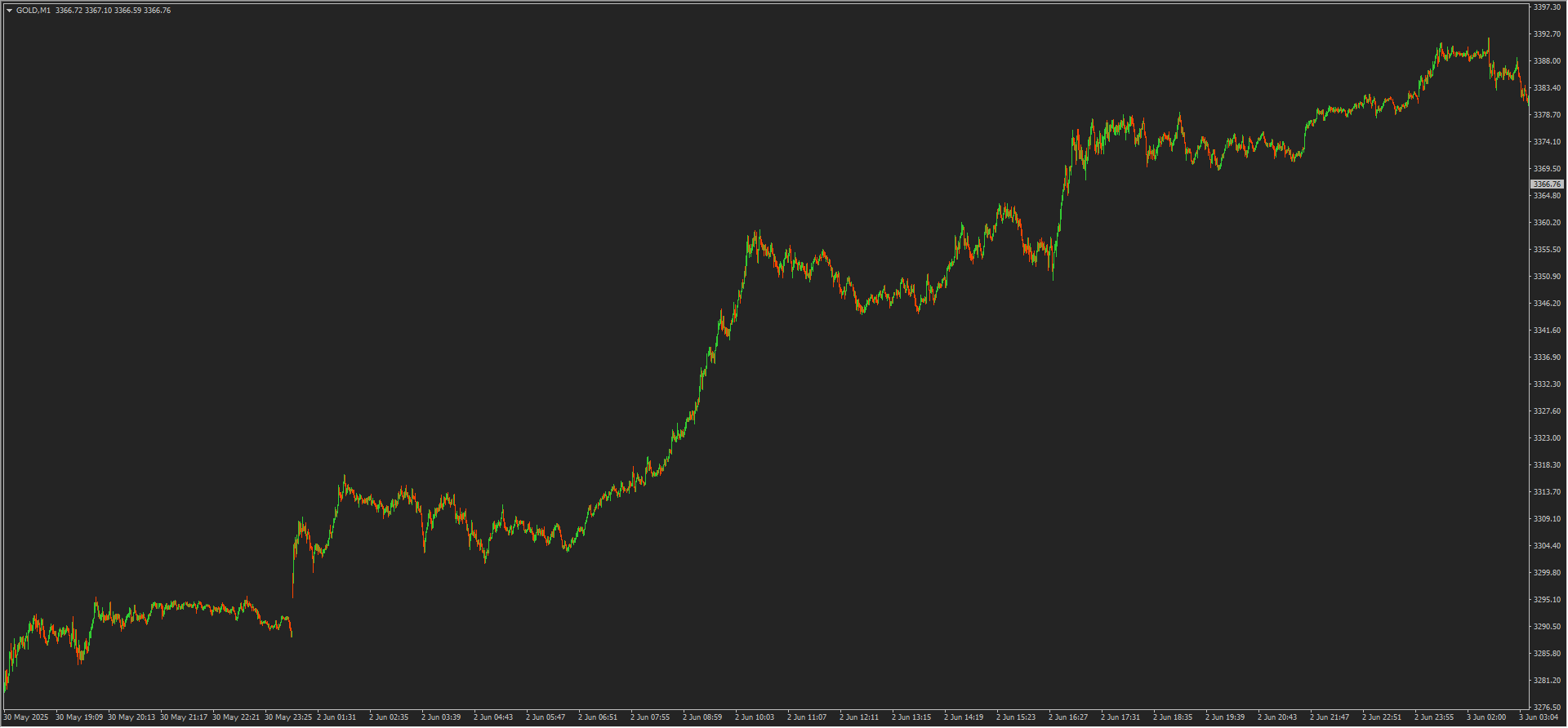
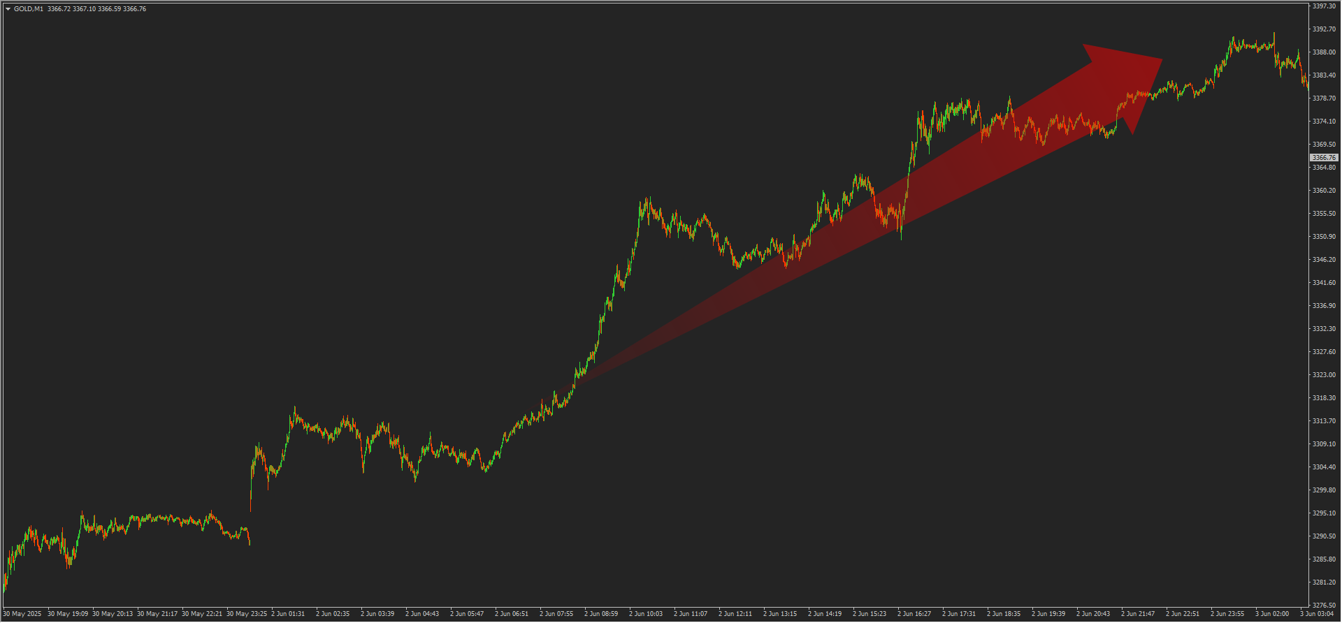
This is the 1-minute chart of GOLD from this Monday (2025-06-02).
It rose sharply in just one day.
Seeing this kind of wave,
“I want to ride the big wave.”
“If I could ride a wave like this, the risk-reward would be superb.”
“I want to make a lot of money.”
Thinking so, but just watching with fingers crossed...
Even with a plan, it’s hard to realize...
If you are reading this article now
and you are struggling with not being able to ride such waves,
please read the article below!
A method to solve itwill be shared!
So, how do we target it?
A method that even beginners can easily imagine is
“Target the big waves using lower timeframes.”
I think this is the strategy.
Please look at the image below.

The earlier rise is shown on the 15-minute chart,and the white box area has been applied.
Let's observe the wave movement.
※From here on, wave drawing varies by individual, so please use this as a reference.

As drawn in yellow, the wave is breaking on the 15-minute chart.
Since the 15-minute chart is 15 times the size of the 1-minute chart,
even one wave can yield a high risk-reward ratio.
Let’s confirm this on the 1-minute chart.


On the 1-minute chart, waves are breaking as shown by the red line.
“I understand the wave movement, but how exactly should I enter?”
This question may come to mind for some.
Let’s test some widely known methods.
For example, using Dow Theory or line trading,

in a simple form, it seems possible to analyze like this.
Since both analysis methods and wave interpretation depend on the individual,
the above is only a sample,
and beginners may find it difficult.
Also, using widely used moving averages could cause more confusion.
※ Short-term: 20 SMA & EMA
※ Medium-term: 50 SMA & EMA
※ Long-term: 200 SMA & EMA
※ Refers to numbers often seen in books, online articles, videos, etc.

However, those who have achieved results might think this:
- It is important to narrow down and practice the method you use
- Use indicators to help identify wave movements and set standards
- Master winning and losing patterns
- Study many entry points repeatedly
etc...
Indeed, there are many ways to profit in financial markets,
and focusing on one method and mastering it is
not something to deny, but rather a shortcut.
But how long does it take,
whether that method is really best for you,
even with study, the average risk-reward ratio might be -1 : +1.5
and the win rate around 55%.
Some may say, “If there’s profit, that’s enough.”
However, if you can change the situation where hard effort does not lead to unsatisfactory results,
that would be best.
In the market, macroscopically, similar shapes appear often, but
microscopically, the same shape does not always recur,
so there will be times you need to think things through again.
Of course, it is wonderful to search for methods that suit you.
However, being able to earn profits while further finding a method that suits you
is a very meaningful environment to create.
If I apply the “Ferocious Attack and Iron Defense” I’m developing,
in the previous market, entry is possible with a “simple 4-step”
as shown in the image below.
↓ 15-minute chart ↓

↓ 1-minute chart ↓

↓ Full view of the 1-minute chart ↓

If you are curious about the system details,
I would be grateful if you could view it from the URL below.
There are monitor cases that grew 6x in one month ,
“Attack and Defense” to grow assetsWith explosive power × high-speed trading system!The details page of “Basics of the Basics” is here!★ For beginners, those who are struggling to make a profit should especially get it!★Solidify the foundation! Take a leap forward!The Crystallization of Knowledge is here!Fully compatible with scalping and binary options.High win raterecordedA reliable opportunity isdetected and reacted to with high precision by the trading system!If you haven’t seen it yet, please use the links below!
With explosive power × high-speed trading system!

★ For beginners, those who are struggling to make a profit should especially get it!★
Solidify the foundation! Take a leap forward!

Fully compatible with scalping and binary options.
High win raterecorded
A reliable opportunity is detected and reacted to with high precision by the trading system!
If you haven’t seen it yet, please use the links below!