
"Still don’t know how to catch waves that grow easily?" ★ Don’t worry! I’ll teach you! ★ 【 2025年06月24日 】
【 2025.06.24 】 Let's look at the GBP/USD chart.
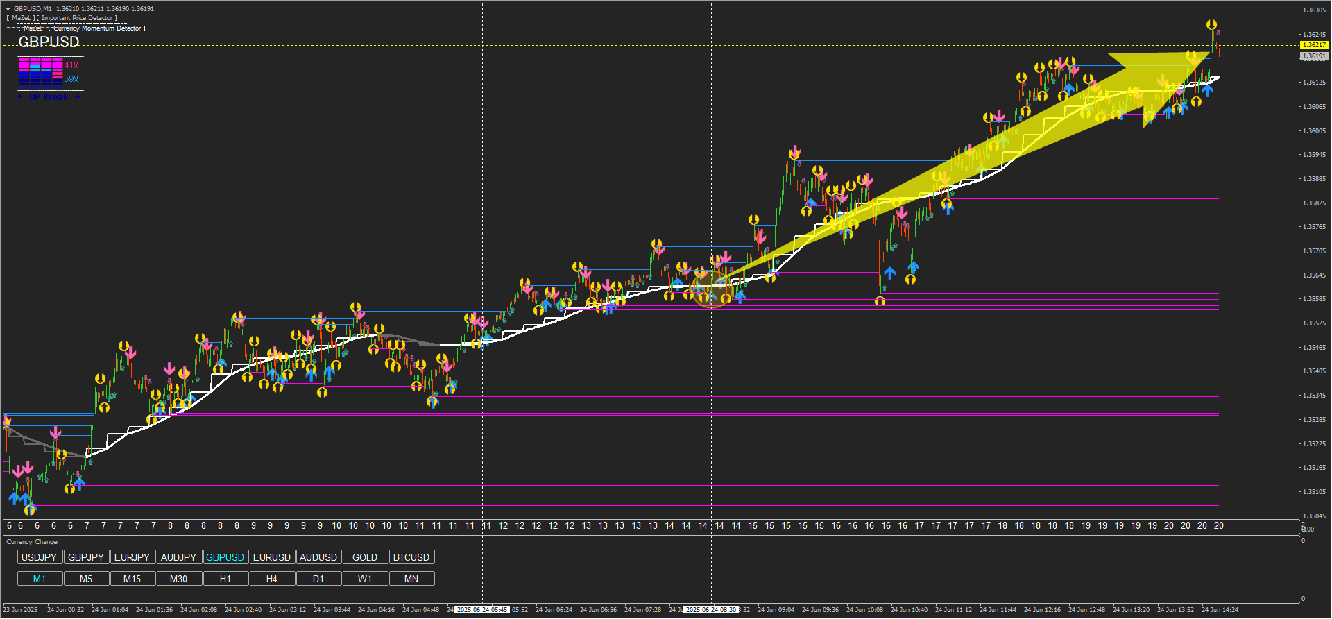
Today it’s easy to capture a substantial move here.
Focus on the 15-minute chart first, then enter on the 1-minute chart.
It’s an image like the one below.
Confirm profit target by IPD on the 15-minute chart.
↓15-minute chart ↓
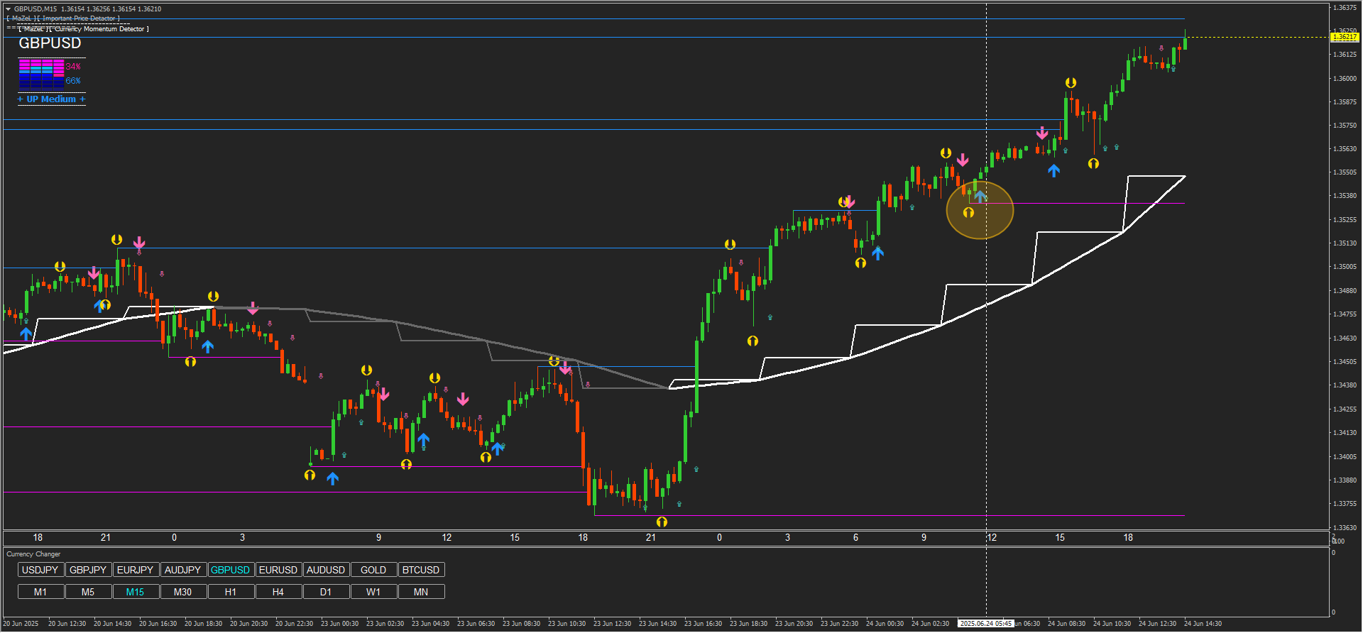
This time, since the profit target is visible on the 15-minute chart,
I will base my thinking on that value.
↓ 15-minute chart ↓
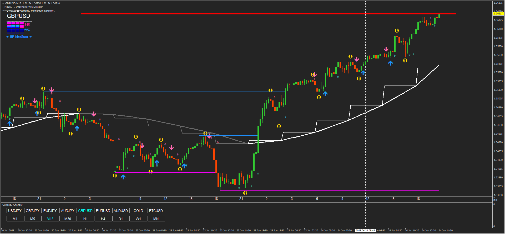
※ If the profit target on a higher timeframe becomes the target price, it is likely to be farther away.
Therefore, before reaching that point,
based on the funds management concept in the product manual,
the best approach is to firmly capture profits using a risk-reward ratio as the base.
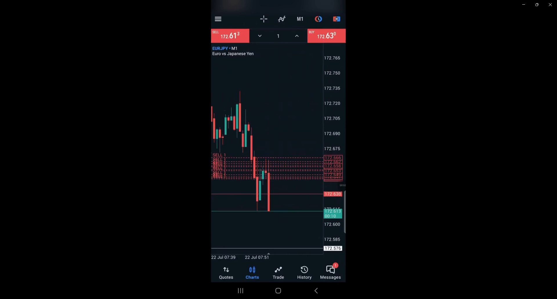
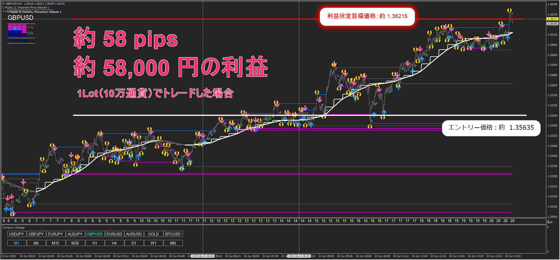
↓ 1-minute chart ↓
If you want to trade like this,
Please be sure to read to the end.
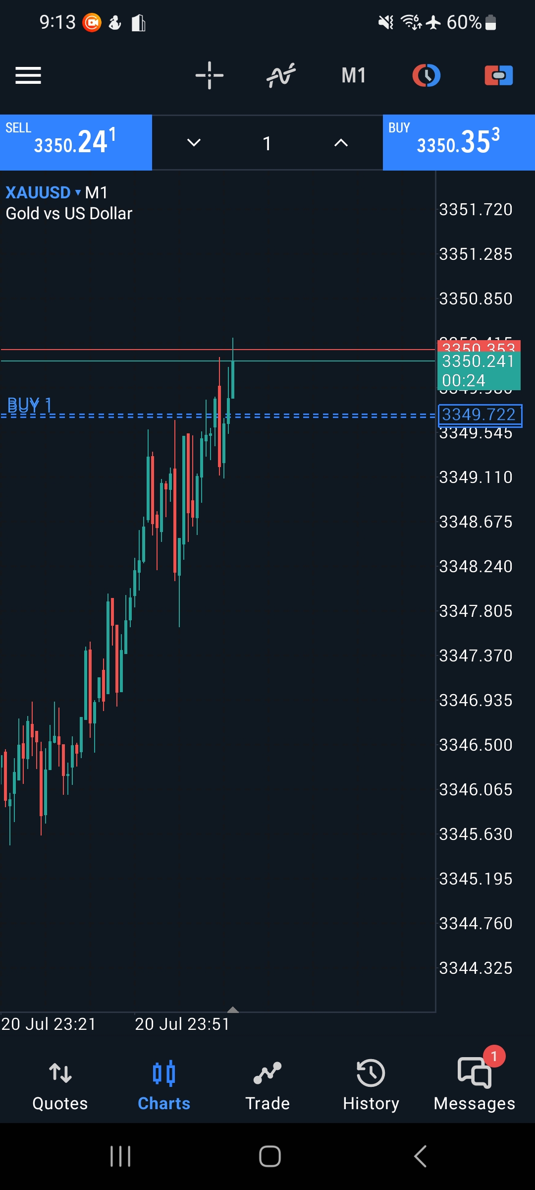
Please refer to the following image.
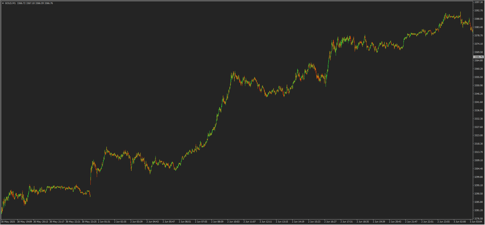
This is the 1-minute chart of GOLD for this Monday (June 2, 2025).
It rose sharply in just one day.
Looking at this kind of wave,
I think, “I want to ride a big wave.”
“If I could ride such a wave, the risk-reward would be excellent.”
“I want to make a lot of money.”
And yet I’m just watching with my fingers crossed, not taking action…
Even after planning a strategy, it’s hard to realize it…
If you are reading this article and
worry about not being able to ride such waves,
please read the following article!
A method to solvewill be shared!
So, how should we target?
A method that even beginners can easily imagine is
“Target the big waves using lower timeframes”
I think this is the strategy.
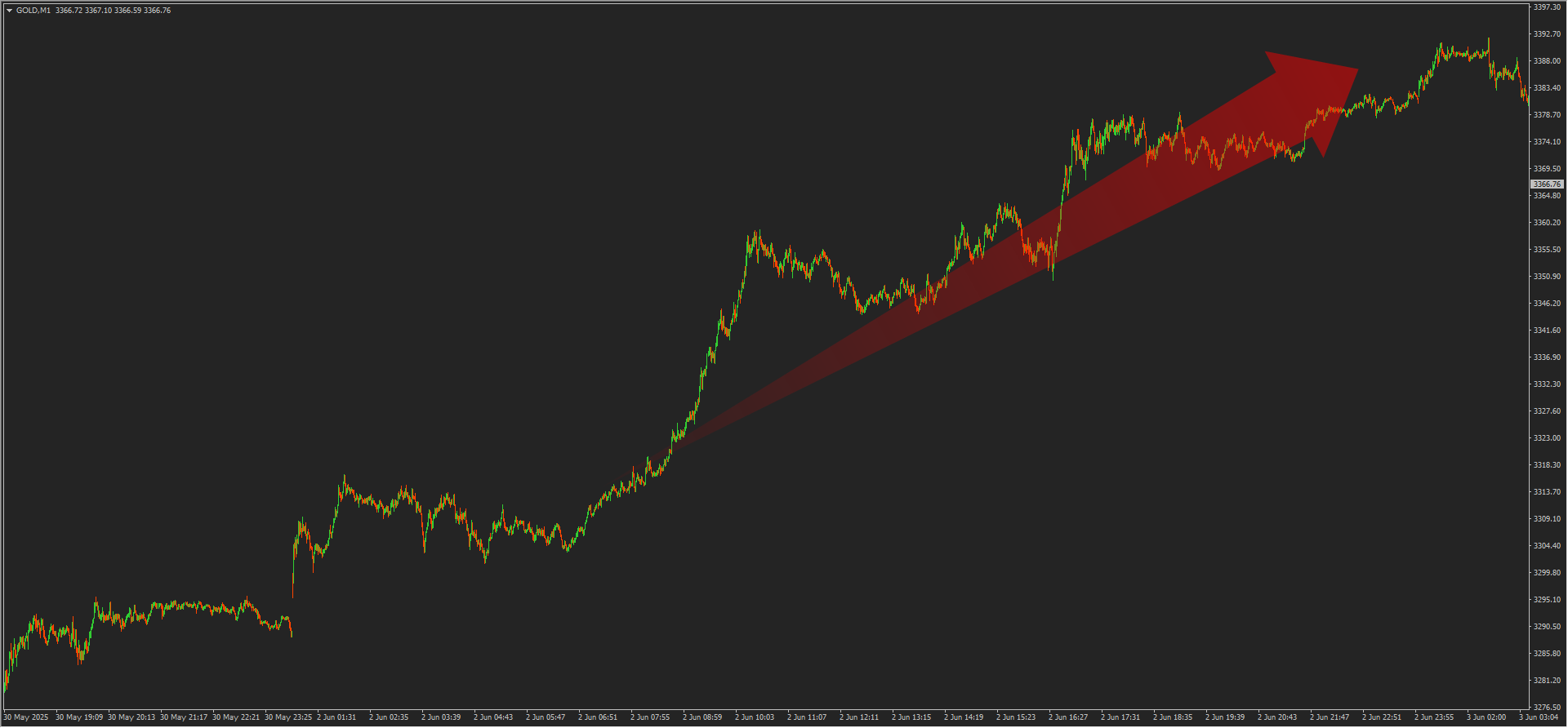
Please refer to the image below.

We displayed the previous rise on the 15-minute chart and applied a white frame to the area. .
Let’s observe the wave movements.
※ From here, wave drawing varies by individual, so please use this as a reference.

As drawn in yellow lines, the 15-minute chart shows waves.
Since the 15-minute chart is 15 times the size of the 1-minute chart,
even one wave can yield a high risk-reward ratio.
Let’s verify this on the 1-minute chart.


On the 1-minute chart, the waves are as shown by the red line.
“I understand the wave movement, but how should I actually enter?”
I think many of you may have this question.
Let’s examine some widely known methods.
For example, using Dow Theory or line trading,

the forms are simple, but such analysis seems possible.
Since the analysis method and wave interpretation depend on the individual,
the above example is only a sample,
especially beginners may find it difficult.
Also, when using widely used moving averages,
you may feel even more confused.
※ Short-term: 20 SMA & EMA
※ Medium-term: 50 SMA & EMA
※ Long-term: 200 SMA & EMA
※ Refer to numbers often seen in books, online articles, videos, etc.

Nevertheless, those who have achieved results may think like this.
• It is important to narrow down the methods you use and train
• Use indicators to define wave interpretation and set standards
• Master winning patterns and losing patterns
• Study by looking at various entry points many times
etc...
Indeed, there are many ways to profit in financial markets,
and starting with one and mastering that method is not a disfavored approach; it’s often a shortcut.
However, how long will it take,
whether that method is truly optimal for you,
even with extensive study, the average risk-reward might be “-1: +1.5”
and the win rate may be about “55%.”
“If profits come, that’s fine.”
But if you can change the situation where you’re not satisfied after putting in effort,
that would be ideal.
In the market, on a macro view, similar shapes appear frequently, but
on a micro view, you do not see the same shapes repeatedly,
and there will be times when you need to rethink each time.
Of course, it’s wonderful to search for a method that suits you.
However, being able to earn profits and further explore a method that suits you
is a very meaningful environment to create.
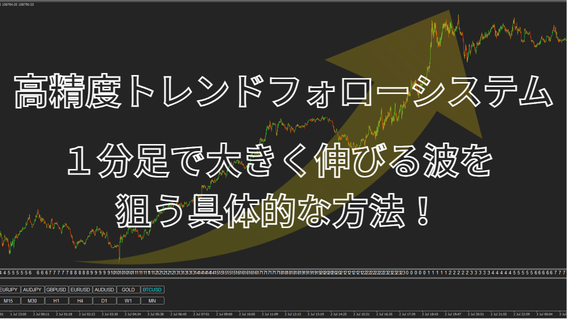
If I use the system I’m developing, “Goukou Tetsushi,”
in the prior market, it is possible to enter with a “simple 4-step”
as shown in the image below.
↓ 15-minute chart ↓

↓ 1-minute chart ↓

↓ Overall view of the 1-minute chart ↓

If you’re curious about the system details,
I’d be glad if you could view it from the URL below.
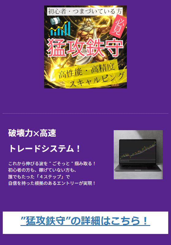
A monitor appeared who grew sixfold in one month .
Grow your assets with “Attack and Defense”.
Destructive power × High-speed trade system!