

「天下無双」Syncro System Usage Guide / Roles of Each Configuration Indicator Part II · Syncro Band / Multi-Signal MTF Syncro Board
■ Sync Band Multi-Signal
■ Features
The auxiliary tool that signals only when the Ultimate Sync Band aligns across multiple timeframes is achieved.
※ Here is the link to the previous article ⇒ https://www.gogojungle.co.jp/finance/navi/articles/92619
■ Details
We have explained it in detail in the previous article, so please refer to that.
※ Details article link ⇒ https://www.gogojungle.co.jp/finance/navi/articles/89718
■ MTF Sync Board
■ Features
The price movement information signaled by the color cues of the Ultimate Sync Band introduced in the previous article is displayed together for each instrument, for each timeframe.
For each instrument and each timeframe, displayed collectively.
■ Single-Instrument Display
Display sync-band information for a single instrument by each timeframe separately.
※ The color meanings are the same as those for the Sync Band.
■Light blue – strong rise■Green – mild rise
■Red – strong fall■Yellow – mild fall
□ White – neutral (consolidation or correction)
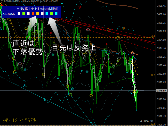
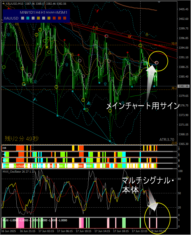
■ Function 1: Understand price action state by timeframe
※ Single-instrument display and multi-instrument display can be toggled
※ We will look at real-time specifics.
Nikkei 225 ①
30-min and 1-hour up, 15-min and below neutral (watchful)
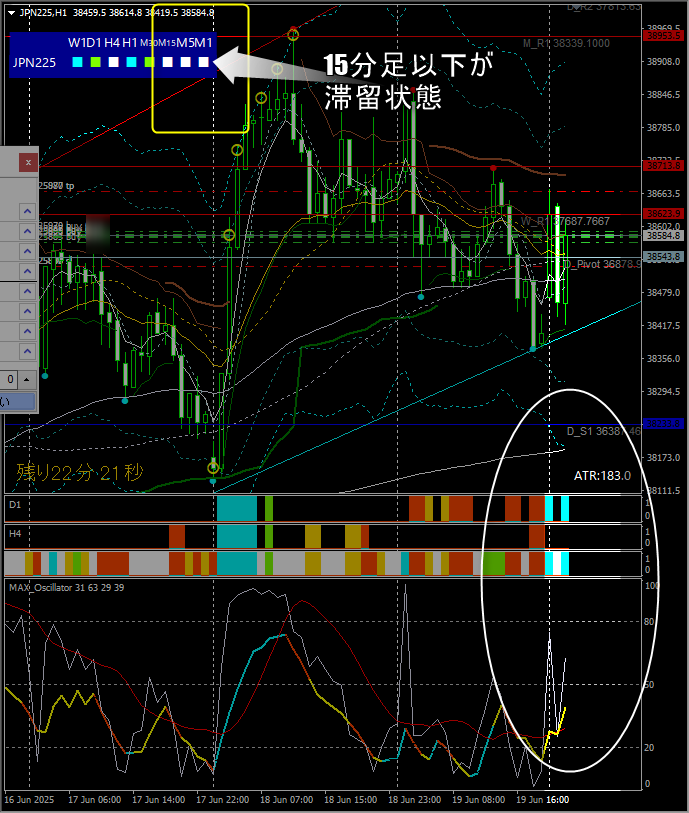
In this case,will the 15-minute and shorter candles point up or down in the future?
This determines whether to close the position or hold..
Nikkei 225 ②
Momentarily shows gains across all timeframes
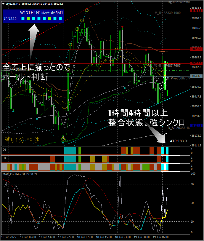
If this state continues, hold
If it does not continue and reverses, exit.
※ The future cannot be guaranteed, so continuation is not guaranteed
■ Important! When adjacent timeframes have opposite colors, wait and observe
BTCUSD
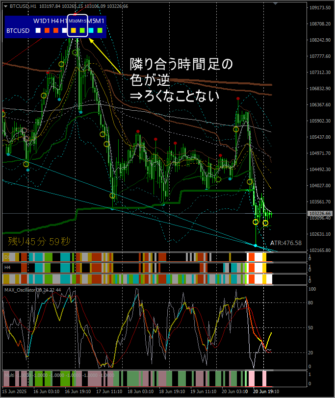
30-minute is bearish, 15-minute is bullish,adjacent timeframes show opposite color indications
⇒ In this case there is a lot of range-bound activity; recommended to observe.
※ Afterwards, the 30-minute turns white (neutral) and breaks out of the range

※ However, at this time, the 4-hour and 1-hour remain white (neutral), so it may not extend much and reverse.
⇒ If it does not extend much and reverses, exit
⇒ 1-hour and 4-hour indicate upside potential; hold
⇒ Daily indicates strong decline; since this is contrary to the near term, exit early
In this way, it is possible to reasonably read the multi-timeframe status of a single instrument.
Afterwards, it shifts to upside across up to 1-hour timeframe, indicating a rise to some extent
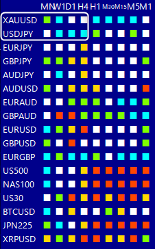
■ Function 2: Display multiple instruments' statuses across multiple timeframes
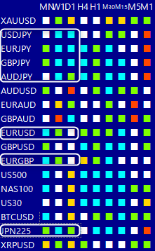
As you see, it displays multiple instruments across multiple timeframes all at once.
■Role 1: Makes it easier to select favorable instruments for day trading
※ In particular, instruments whose daily chart shows strong sync, or where weekly and daily directions are clearly aligned
are easier to trade in the same direction after a pullback.
※ Caution Of course rapid changes can occur, so it is not absolute.
Example: June 20
On that day, favorable instruments include Cross currency pairs (especially EURJPY) and Nikkei 225
(The board above is a morning screenshot)
※ On that day, EURJPY rose all day; buying and holding is OK
Thus, this tool is widely useful for deciding trading strategy and selecting trade instruments, a secretly superb tool.
A subtle, excellent tool.