Utilization of the "Visualization Indicator" (Part 203)
Utilization of the "Visualization Indicator" (its203)
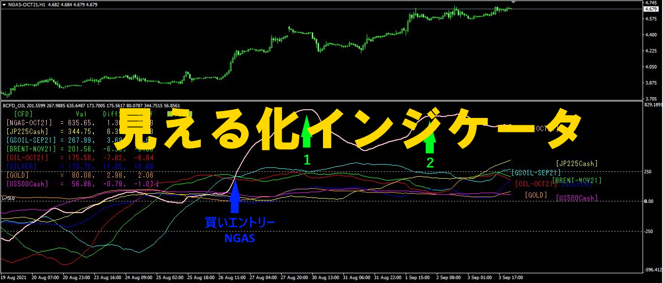
1. Further develop and advance the "28 Currency Pairs List Indicator" into an indicator
“8CP Visualization Indicator”to draw AUDCHFAUDCHF.
There are versions of the "8 CP Visualization Indicator" for Oceania, London, New York, and AnyCP. This time, we used the Oceania version.
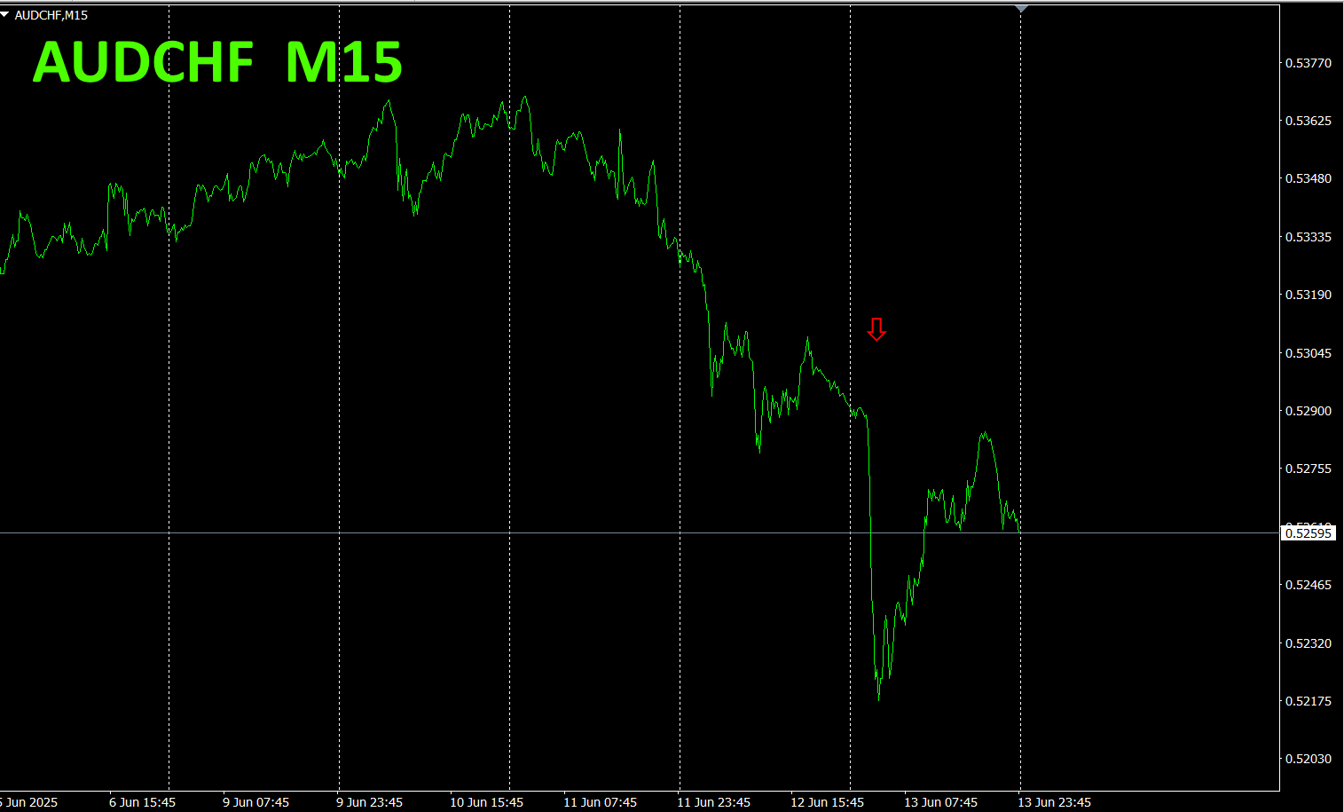
The top half is the 15-minute chart of AUDCHF. The bottom half is the visualization by the “8 CP Visualization Indicator,” where the red-purple line corresponds to AUDCHF.
On Wednesday, the AUDCHF graph fell below the other graphs, so I opened a short position. On Friday, AUDCHF hit a bottom, so I closed the position. It resulted in about 130 pips of profit.
Last week, the AUD weakened, soAUD ◯◯◯ declined, and ◯◯◯ AUD rose. The red graph in the chart above is EURAUD, and buying EURAUD would likely have yielded a favorable result.
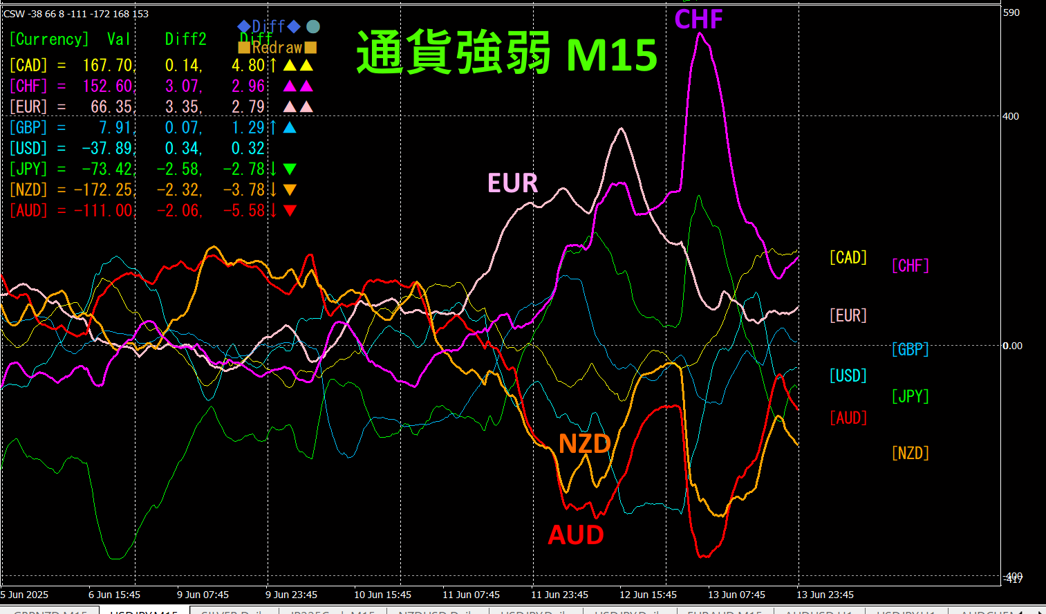
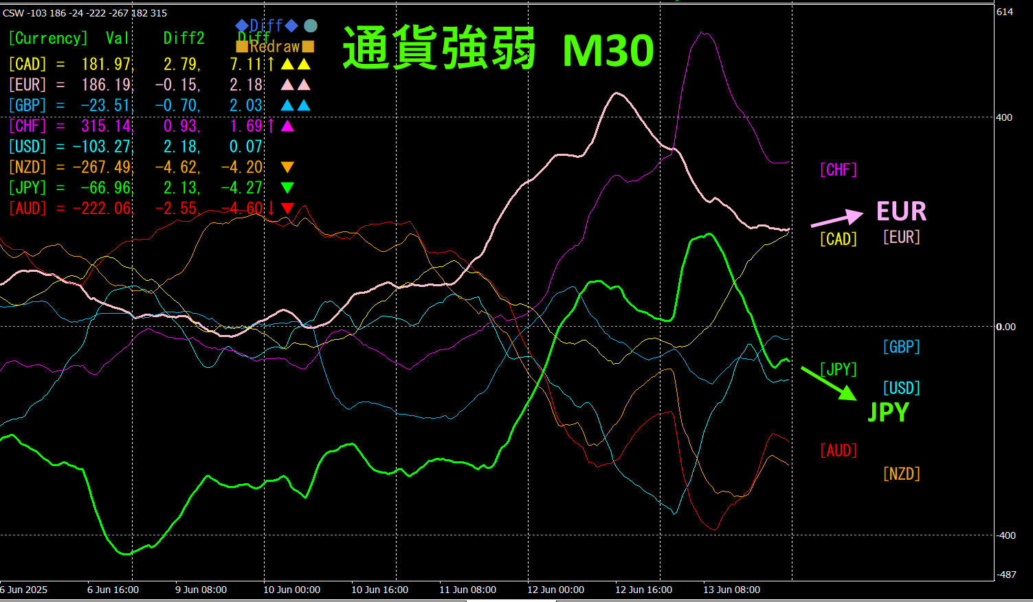
Currency Strength Graph
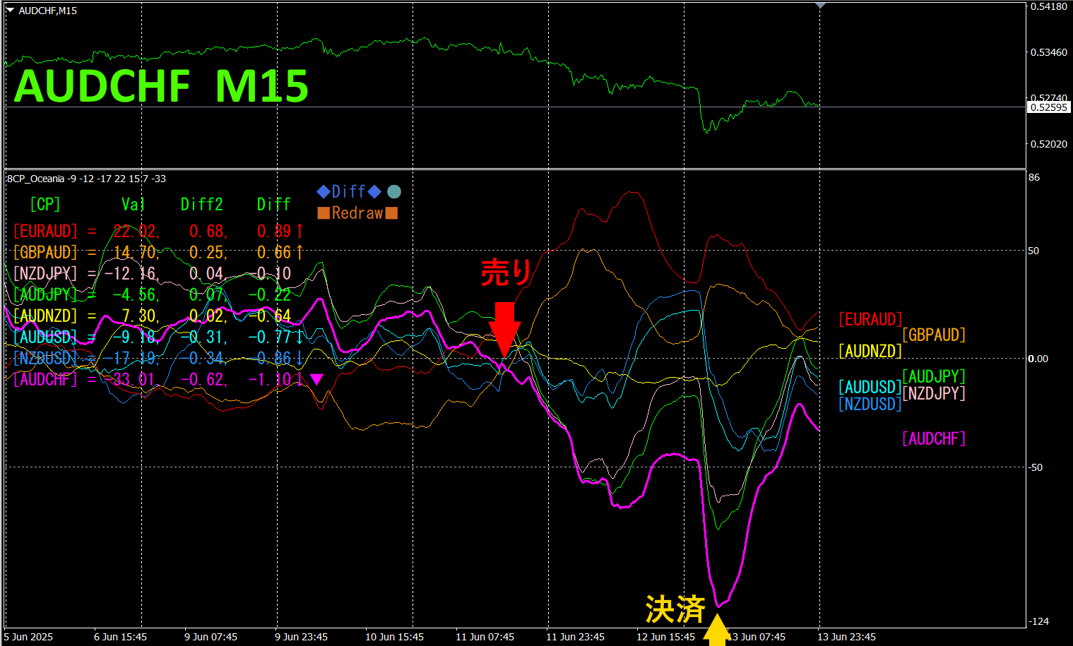
Looking at the 15-minute currency strength graph, you can quickly tell which currency pairs to trade.
From Wednesday to weekend, EUR and CHF have strengthened, while AUD and NZD have weakened. EURAUD and EURNZD are buys, AUDCHF and NZDCHF are sells. The currency pairs with inverse correlation of strength should be traded by focusing only on the parts that have shown large fluctuations.Do not trade in other places and you can avoid unnecessary losing trades.
If you use “TrendLine-EX,” you can automate entries and exits when diagonal trendlines are broken. You can just leave it as is, making trading easy. “TrendLine-EX” is a semi-automatic EA that sells automatically when the trendline is broken downward and closes automatically when the trendline is broken upward.
2. Best SelectTry the Indicator
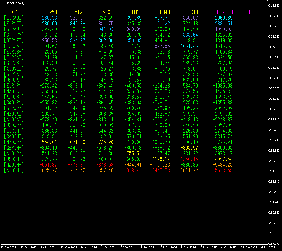
The figure below is a screenshot taken onJune13,2025, 9:19 (JST)
The total values are arranged in descending order. At the bottom, AUDCHF is shown in red color across all timeframes. The total value is: -5648.58, a large negative number. This clearly indicates a downtrend in AUDCHF across all timeframes. NZDCHF also shows a Total value of-5484.29, indicating a similar downtrend in NZDCHF.
Now, let's look at the AUDCHF chart.
The red arrows indicate the point where the screenshot was taken. It captures a fall during the middle of a downtrend.
The “28 Currency Pairs Best Select Indicator” can easily identify which currency is most strongly trending among the 28 currency pairs. It also tells you with numbers and colors whether you should trade now. You can judge the overall trends for all currency pairs at a glance.
“28 Currency Pairs Best Select Indicator”

https://www.gogojungle.co.jp/tools/indicators/35128
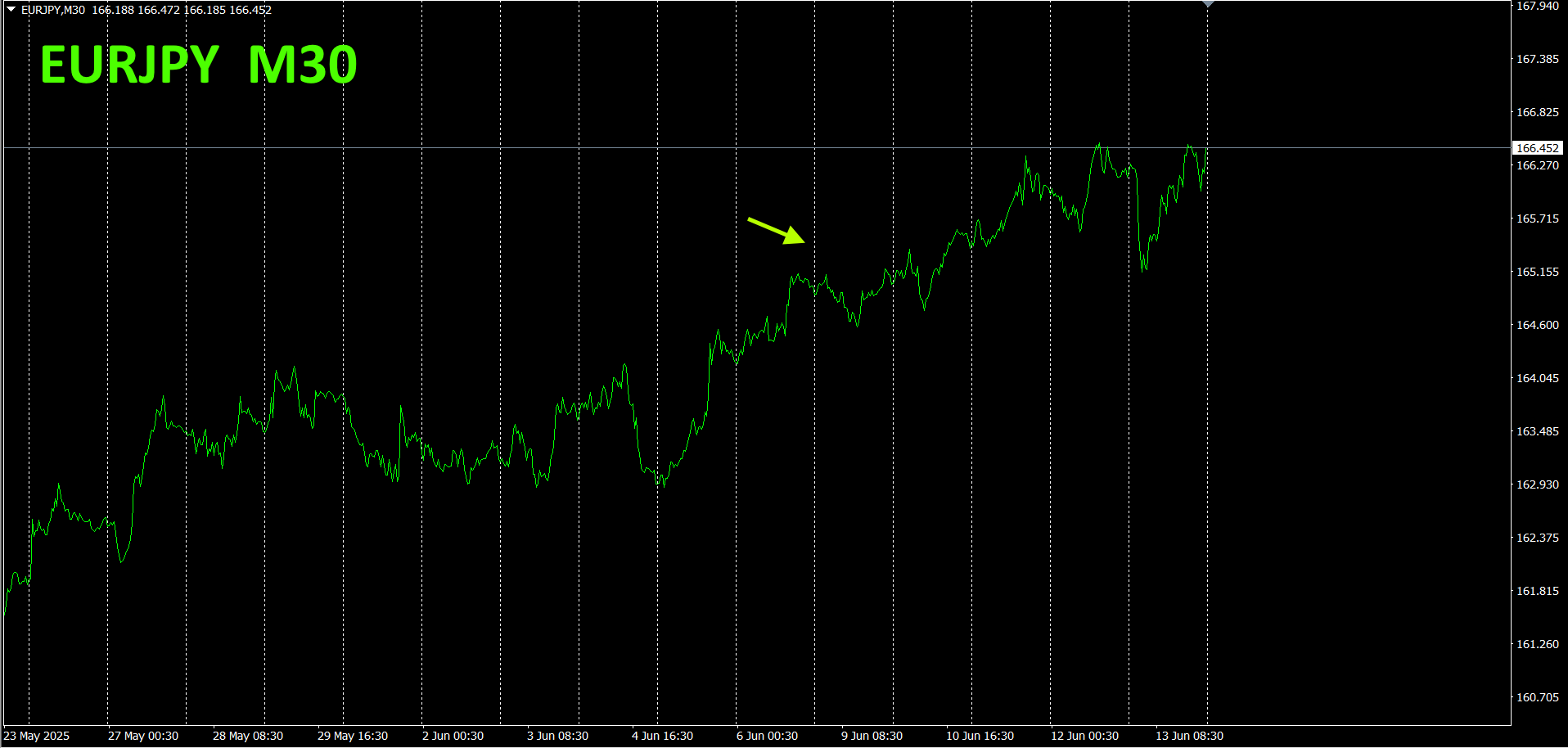
3. Since May 2021, what happened to EURJPY?
Since May 2021, EURJPY has been tracked.
To see the overall trend, a recent roughly 3 weeks are drawn on a 30-minute chart.
Last time, I wrote the following.
Pink is EUR, green is JPY. In the currency strength chart, EUR is downward, and JPY is showing a bottoming out and turning upward, so EURJPY is expected to move slightly downward in the future.
In Monday's first half, it fell a bit, but then it rose consistently.
30- minute currency strength chart.
Pink is EUR, green is JPY. The currency strength chart shows EUR turning upward and JPY turning downward, so EURJPY is expected to continue rising.
4.
New IndicatorDual_MACD_Trend_Indicatorto tryout
New Indicator “Dual_MACD_Trend_Indicator” is shown below.
MT4 version:https://www.gogojungle.co.jp/tools/indicators/62199
https://www.gogojungle.co.jp/tools/indicators/62202
This indicator clearly shows the direction of the trend with color. If the color bar is Lime, it is a Buy; if Red, it is a Sell. It is easy and beginner-friendly. If the bar is green, it indicates an uptrend; if red, a downtrend. If there is no color, there is no trend. Because it uses color display, you can grasp the trend state at a glance.
I installed this indicator on the AUDCHF 15-minute chart.
A purple downward trend line is drawn. With a descending right shoulder, it is obvious to anyone that a downtrend exists. If you install this indicator, the retracement portion during the downtrend will be shown as a green zone. If the green zone continues and the rate breaks above the downtrend line, it indicates a trend reversal; however, if the green zone becomes colorless and then red, the appearance of red becomes an ideal entry point for selling on the retrace.
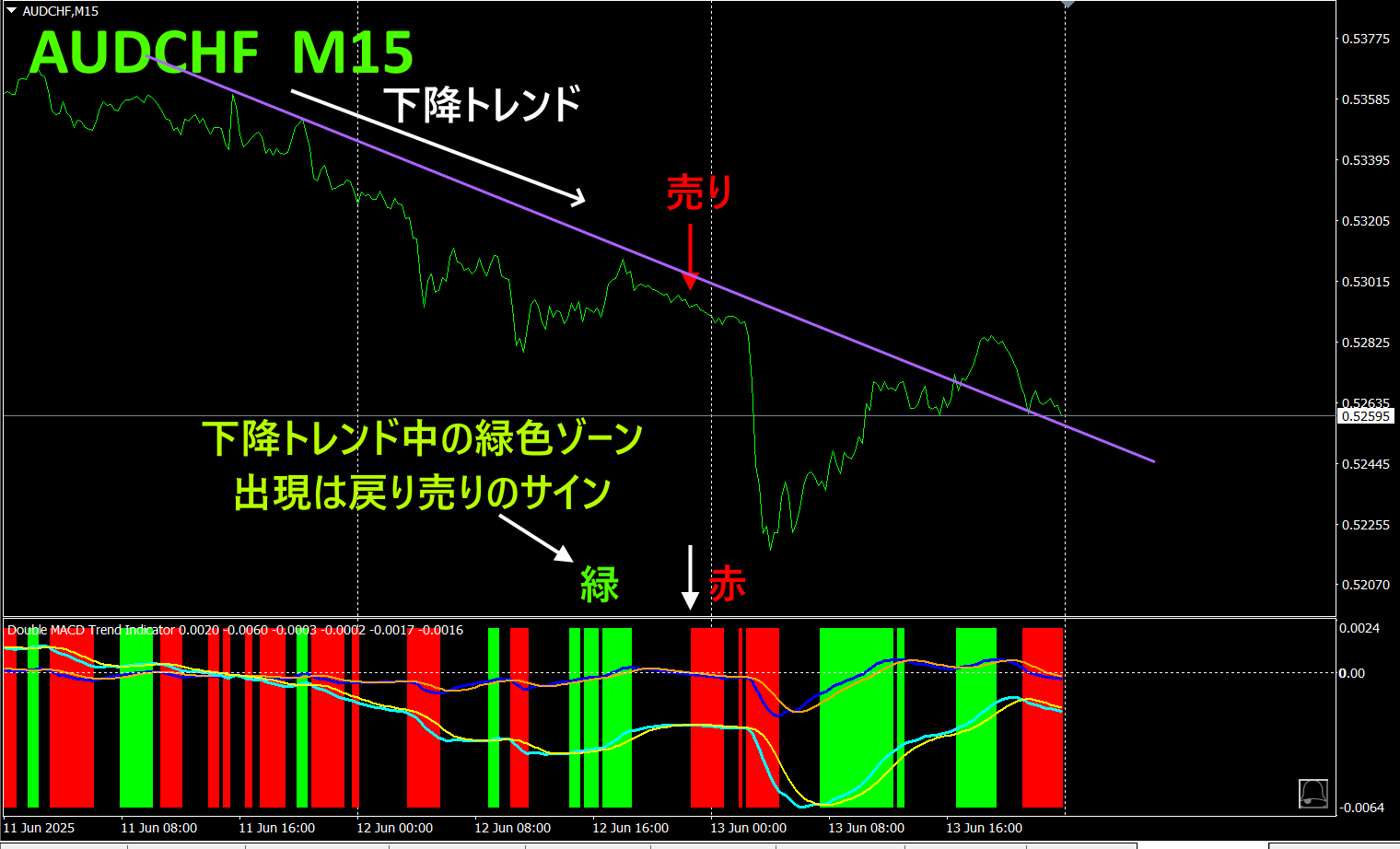
In the above chart, the rate did not break above the downtrend line, and the colors changed from green to colorless to red, so you can determine to Sell. The long-term MACD and short-term MACD lines are also below the zero line, indicating a sell signal.
By using the “Dual_MACD_Trend_Indicator,” you will no longer worry about the direction of trades.
Recommended indicators
“Toretore Indicator”
https://www.gogojungle.co.jp/tools/indicators/50115
“TrendLine-EX”


https://www.gogojungle.co.jp/tools/indicators/42257
The “8C Currency Strength Visualization Indicator” is on the following page.

MT4 version https://www.gogojungle.co.jp/tools/indicators/39150
MT5 version https://www.gogojungle.co.jp/tools/indicators/39159
【Products I have listed】