
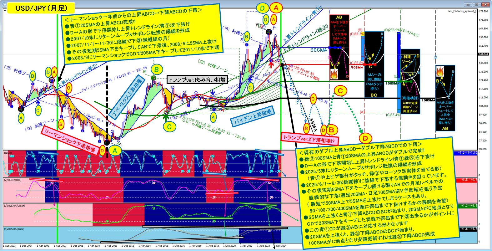
Dollar/Yen (monthly) The decline patterns of 'one year before the Lehman Shock' and 'the present'
The drop shape from one year before the Lehman Shock is similar to the current shape, and I will explain how they are similar using the USD/JPY (monthly) chart.
The chart below is the USD/JPY (monthly) chart as of the weekend of 6/7.
(Left of the black vertical line isLehman Shock decline market, and on the right isAbenomics rise market→Trump ver.1 consolidation market→Biden rise market→Trump ver.2 decline market!?This is the rough image; please view without looking into details to grasp a general sense.
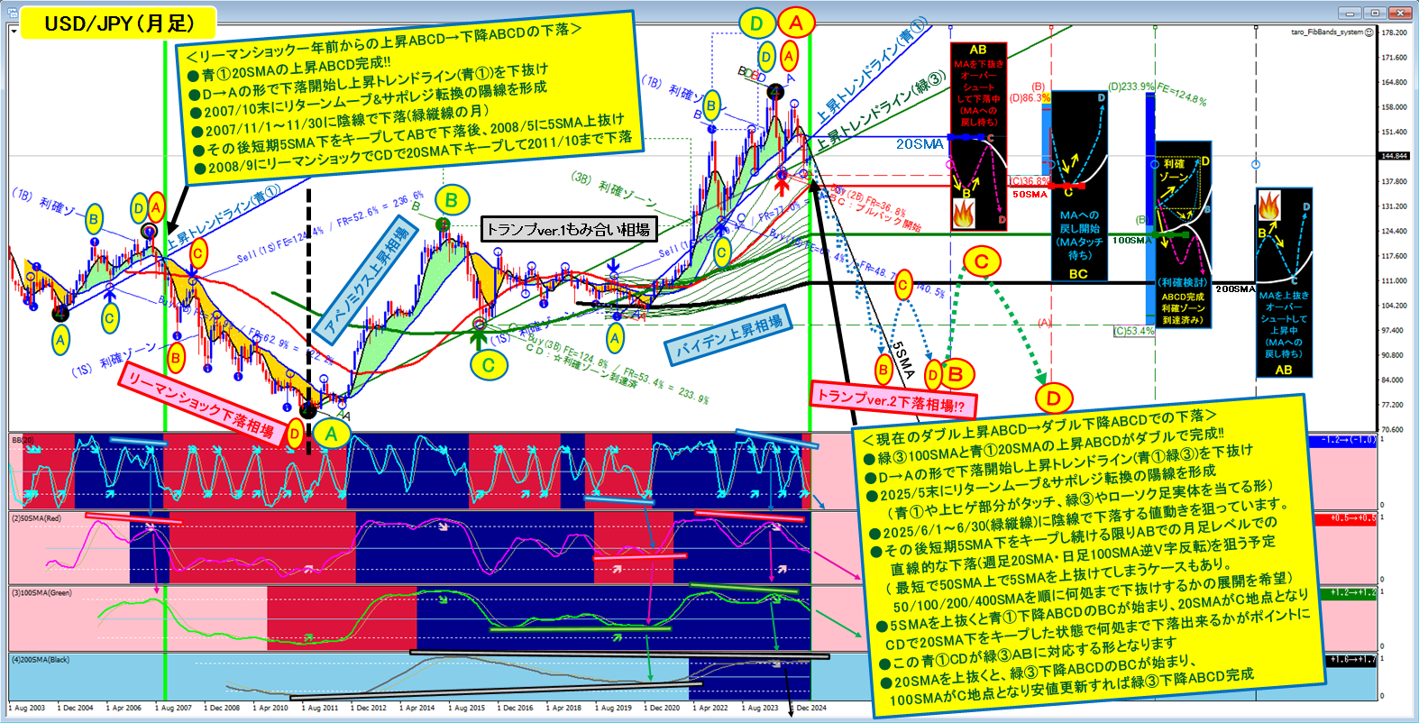
I will decompose and explain the upper chart in order.
The lower chart is the part of the USD/JPY (monthly) during the Lehman Shock decline, and I consider the month of the green vertical line about a year before Lehman as the same scene as this June. Below the chart, I will explain the price movement of this decline in order.
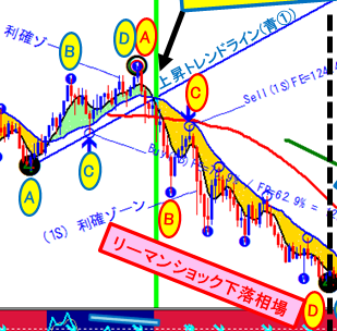
<From one year before Lehman Shock,rising ABCD→falling ABCDdecline>
●Blue ① 20SMAcompletesrising ABCD!!
(The point where the price, pressed down by the head of the candlestick under the downward 20SMA, bottoms at point A; after breaking above the 20SMA (B point), it is supported by the 20SMA turning upward (C point), and makes a new high (D point))
●The D point of rising ABCD becomes the A point of falling ABCD, thus the decline starts, and breaks below the 20SMA and the upward trend line (blue①),leading to a drop.
●> 2007/11/1~11/30, candlesticks fall with bearish candles(month of green vertical line)
●> Afterwards, it stays under the short-term 5SMA, forming downward ABCD AB, then breaks above the short-term 5SMA in May 2008
●> In 2008/9 the Lehman Shock point becomesC point of descending ABCD, andCD continues to stay below the 20SMA, falling until 2011/10(FE=CD/AB=124.4%, FR=BC/AB=52.6%)
Next, I will look at the chart from the Abe-nomics era to the present
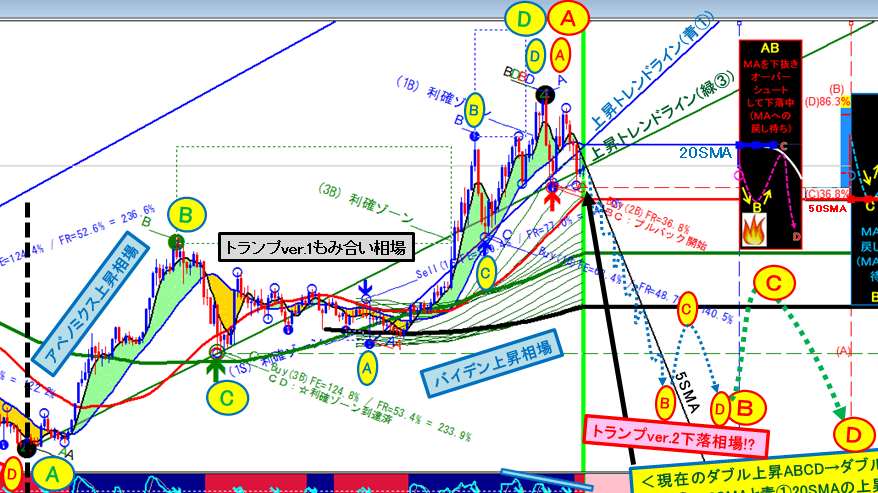
<CurrentDouble rising ABCD→Double falling ABCD decline!?>
●The scale is different from the Lehman Shock; the scale is two levels larger、green③ 100SMAisrising ABCDandblue① 20SMAis rising ABCDbeingcompleted in duplicate!!Thus,green③ rising ABCD rises to FE=124.8%.
(In the downward green③ 100SMA, the point where the candlestick head is pushed down the farthest is green③A, after breaking above the 100SMA (B point), supported by the 100SMA turning upward (C point), and new highs (D point). The blue① 20SMA behaves similarly.)
●The D point of rising ABCD becomes the A point of falling ABCD, starting the decline, and breaking below the 20SMA and the uptrend line (blue①).
(The uptrend line (blue①) is touched by the upper wick,the uptrend line (green③) is touched by the body of the candlestick)
●From 2025/6/1~6/30 (green vertical line period)the price is expected to fall with bearish candles.
(Last week's weekly bar could have been bearish, but it did not become bearish and the weekly bar is bullish,I plan to time trades by analyzing the ABCD on lower timeframes to select the week in which the weekly bar will become bearish by 6/9–14, 6/16–21, 6/23–28, or 6/30–7/5.)
●> In any case,if the monthly chart stays below the short-term 5SMA,blue①, rising ABCD AB,how far it can fall is the key.
(There is also a pattern where it could fall to the 50SMA without breaking below the 5SMA for the shortest time,but.Regarding the magnitude of waves,weekly 20SMAanddaily 100SMAcorrespond to inverse V-shaped reversals, sothe key is how far declines of waves smaller than those can go.If possible, a break below the monthly 200SMA or 400SMAwould imply ongoing declines in larger waves from 270 JPY per USD, raising the value of held yen and making many Japanese happy, I think.)