Utilization of the "Visualization Indicator" (Part 196)
“Visualization Indicator” utilization (Part196)
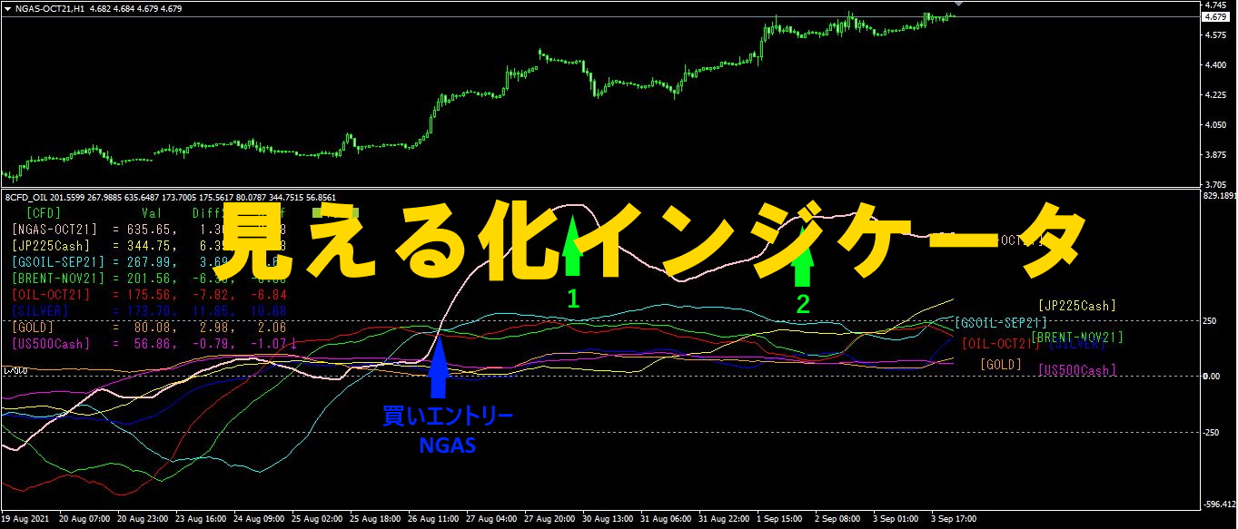
1. Advance the “28 Currency Pair List Indicator” further and visualize indicators
“8CPVisualization Indicator”to drawAUDCHF
“8CPVisualization Indicator” includesOceaniaversion,Londonversion,NewYorkversion,AnyCPversion. This time, we used theOceaniaversion.
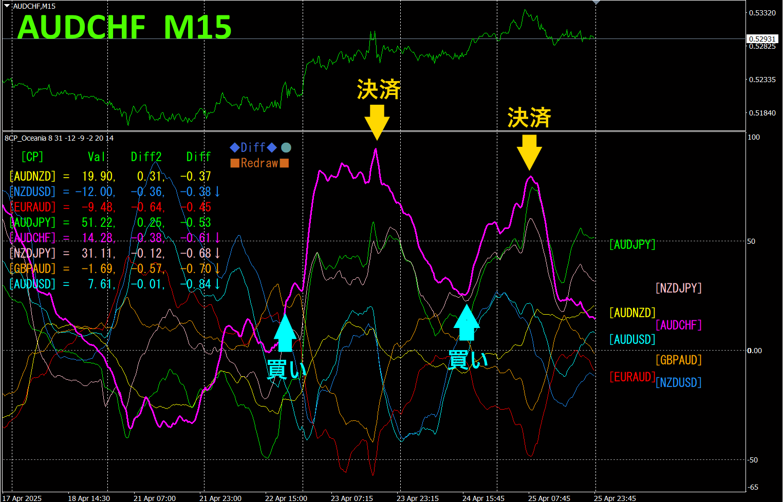
The upper half is theAUDCHF 15-minute chart. The lower half is from the “8CPVisualization Indicator,” and the red-purple thick line chart corresponds toAUDCHF.
There were buy opportunities on Tuesday and Thursday, so buying and closing the next day yielded about70pips and60pips, totaling approximately130pips of profit. This is a strategy that targets only standout parts from other chart groups, which is OK.
If you use the“, you can automate entries and exits by breaking slanted trendlines. You can leave it as is for easy trading. “TrendLine-EX is a semi-automatic EA that sells automatically when the trend line is broken downward and closes automatically when broken upward.
2. Best Select Indicator to try
The figure below is a screenshot taken on2025 year4 month23 day07:04 (JST)
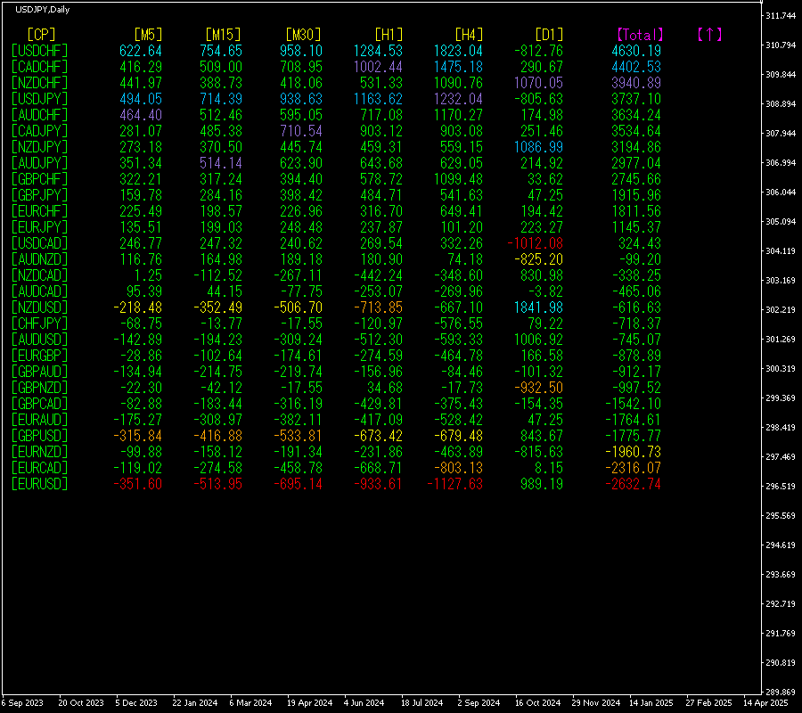
[Total]Numbers are arranged in descending order. The top one,USDCHF, is blue on all timeframes except [D1].Total value is4630.19, indicating a large positive figure. This suggests a pronounced uptrend in USDCHF.
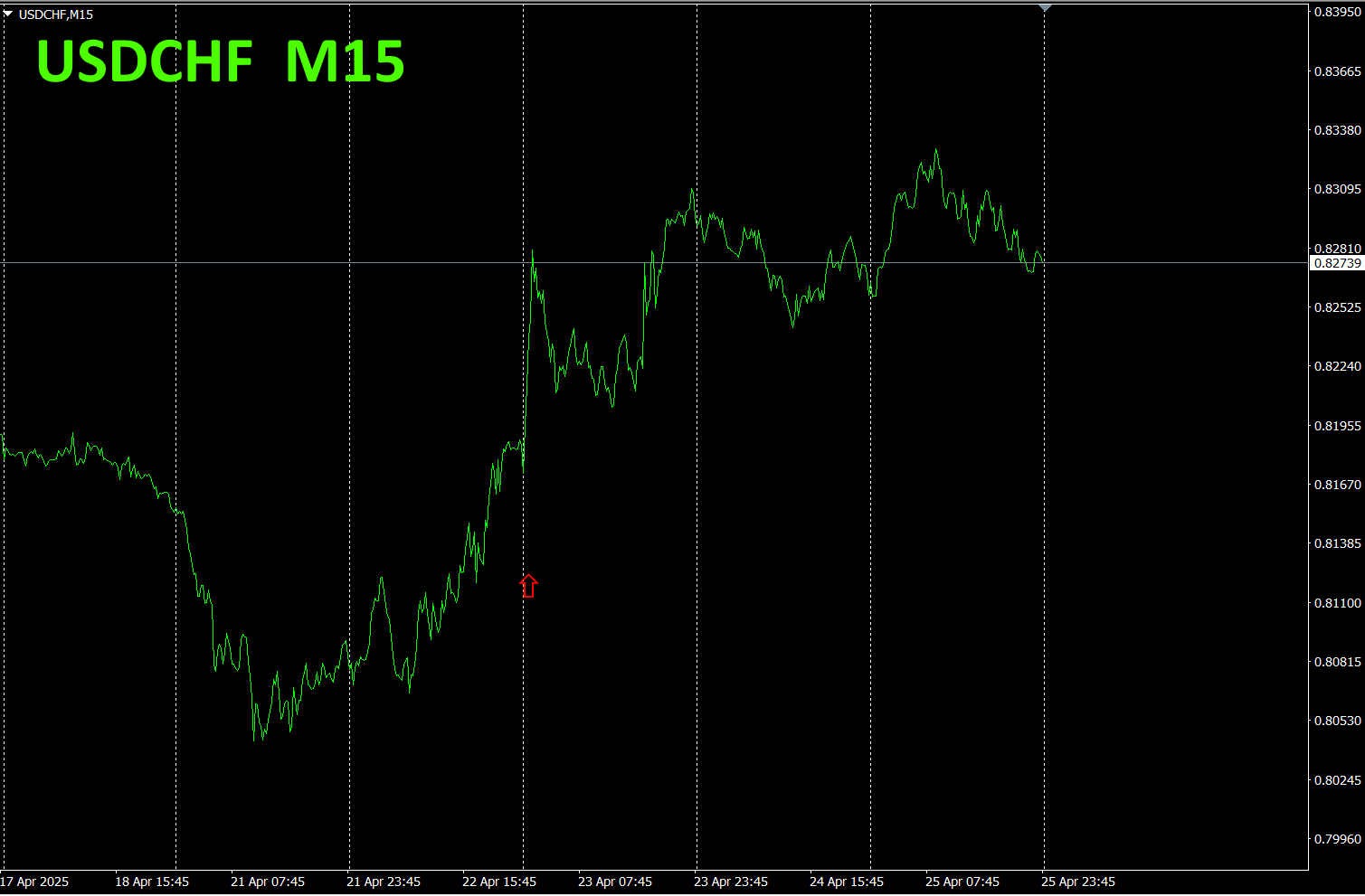
Now, let's look at the USDCHF chart.
The red arrows indicate the point where the screenshot was taken. It captures a sharp rise within an ongoing uptrend.
“28 Currency PairsBest Select Indicator can easily identify which currency among the 28 pairs is showing the most pronounced trend. It also tells you whether you should trade now via numbers and colors. It’s an excellent indicator for assessing all currency pairs at a glance.
“28 Currency PairsBest Select

https://www.gogojungle.co.jp/tools/indicators/35128
3. 2021 Year5 Month5
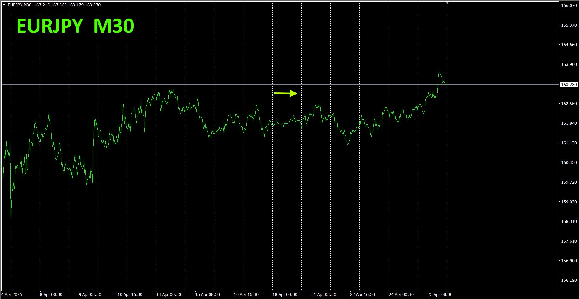
2021 Year5 Month toEURJPY track the movement of.
To view the overall trend, a 30-minute chart shows the latest about30 minutes of the last weeks.
Last time, I wrote the following.
Pink isEUR, green isJPYJPY andEUR are both almost horizontal, butJPY is slightly upward,EUR slightly downward, soEURJPY is likely to have a weak but upward-moving range.
It seems to be slightly upward but flat, lacking strong upward momentum.
30 minutes of currency strength chart.
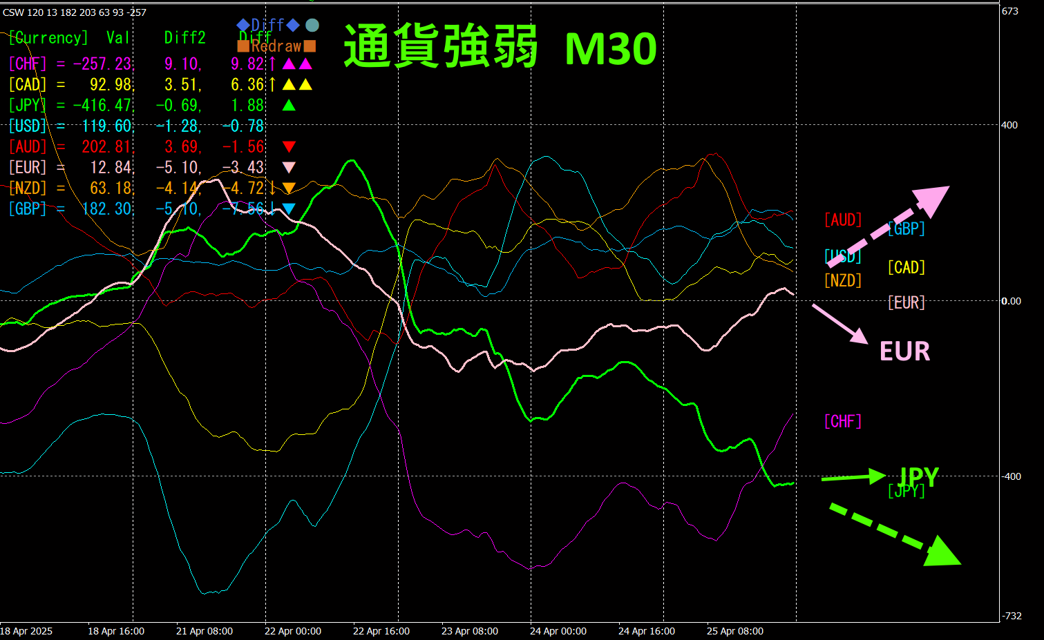
Pink isEUR, green isJPY. In the near-term direction on the currency strength chart,JPY is horizontal,EUR is downward, but on a longer-term view,JPY looks to head downward andEUR upward (indicated by a larger dashed arrow).
EURJPY
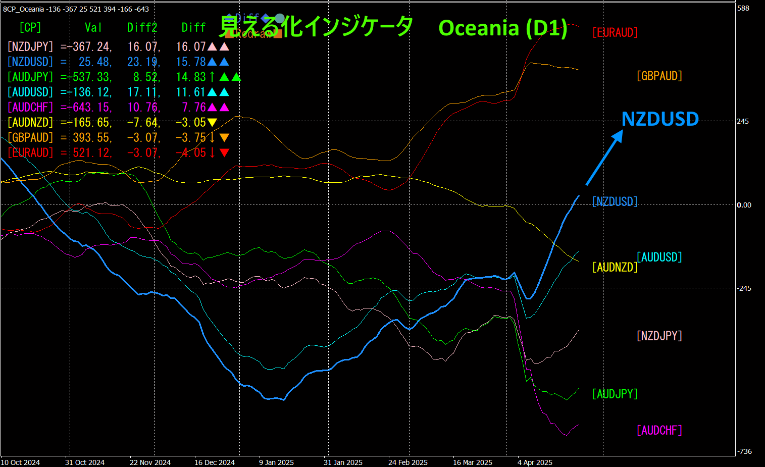
4. Using the Visualization Indicator on a Daily Chart
The figure below shows the “8CP Visualization Indicator Oceania version on daily chart.
NZDUSD was rising at a steep angle, but the rise appears to be slowing a bit. It has broken above the zero line and is rising. Until this speed slows and the vector becomes horizontal, it’s fine to hold a long position.
Recommended indicators
“Toretore Indicator”
https://www.gogojungle.co.jp/tools/indicators/50115
“TrendLine-EX”
https://www.gogojungle.co.jp/tools/indicators/42257

“8C Currency Strength Visualization Indicator” The following page is recommended.

MT4 version https://www.gogojungle.co.jp/tools/indicators/39150
MT5 version https://www.gogojungle.co.jp/tools/indicators/39159
【My items for sale】