Utilization of the "Visualization Indicator" (Part 190)
"Visualization Indicator" utilization (part190)
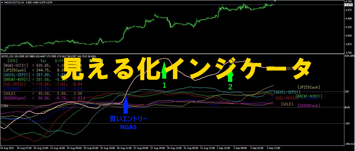
1. Further evolve the "28 Currency Pairs List Indicator" into an indicator
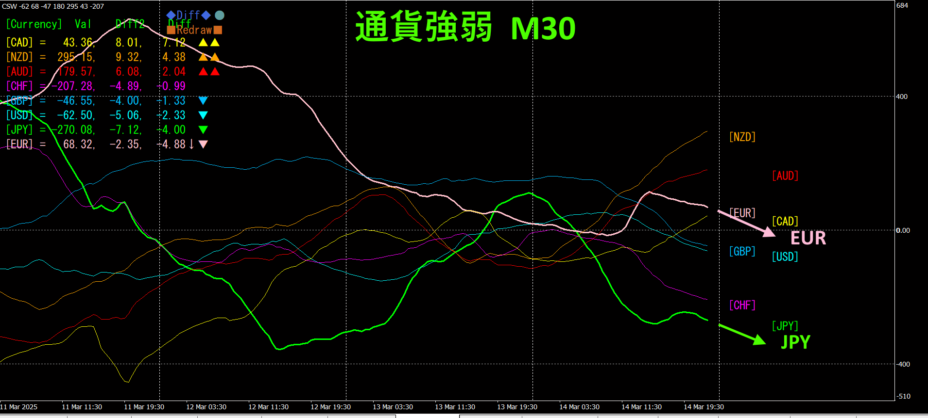
"8 CP Visualization Indicator" for AUDJPYThere are Oceania, chart
London版版,New York版,AnyCP版. This time, we used the Oceania version.
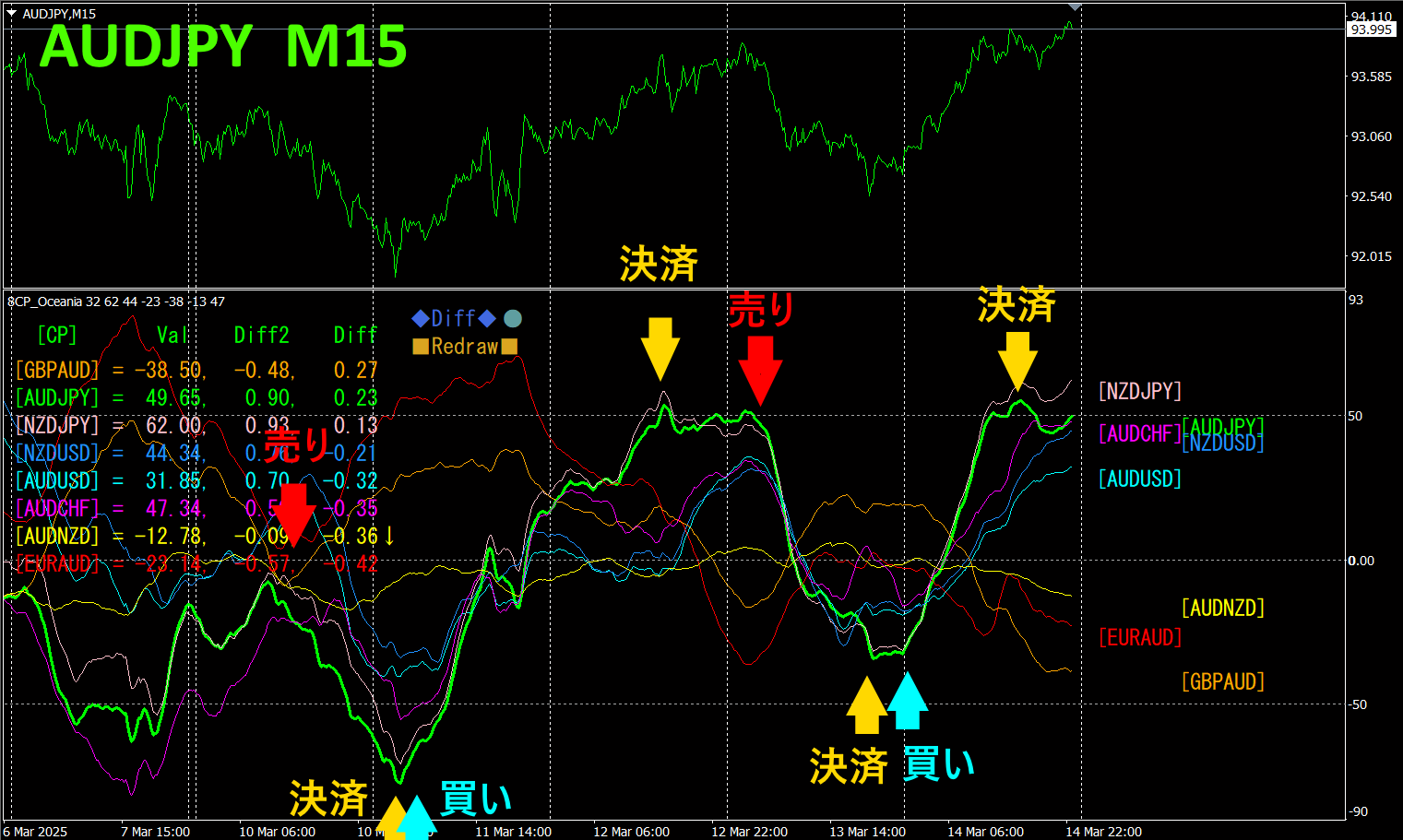
The top half is the 15-minute chart of. The bottom half is from the "8 CP Visualization Indicator"; the graph in green bold lines corresponds toAUDJPY.
Last week,AUDJPY moved with clear fluctuations. There were 2 sell opportunities and 2 buy opportunities; it was simply flashing the ceiling with the indicator graph and buying at the bottom. Drawing a trend line and trading when surpassed would also yield good results.
Roughly,130 + 180 + 100 + 120 = 530 pips of profit range, but you don't have to force to take all tops and bottoms—it's okay to aim for take profits only when a trend emerges and momentum is strong.
Using the "TrendLine-EX," you can automate entries and exits on diagonal trendline breaks. You can leave it as is for easy trading. "TrendLine-EX" is a semi-automatic EA that sells automatically on a trendline break below and closes automatically on a trendline break above.
2. Best SelectTry the indicator
The figure below shows a screenshot on2025 year3 month12 day02:14 (JST)
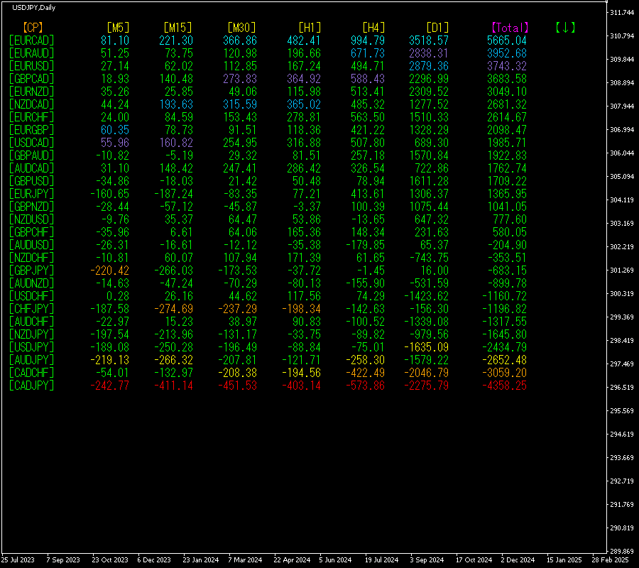
[Total]The values are arranged in descending order. At the very top,EURCAD shows blue tones across all time frames.Total value is5665.04, indicating a strong positive trend forEURCAD.
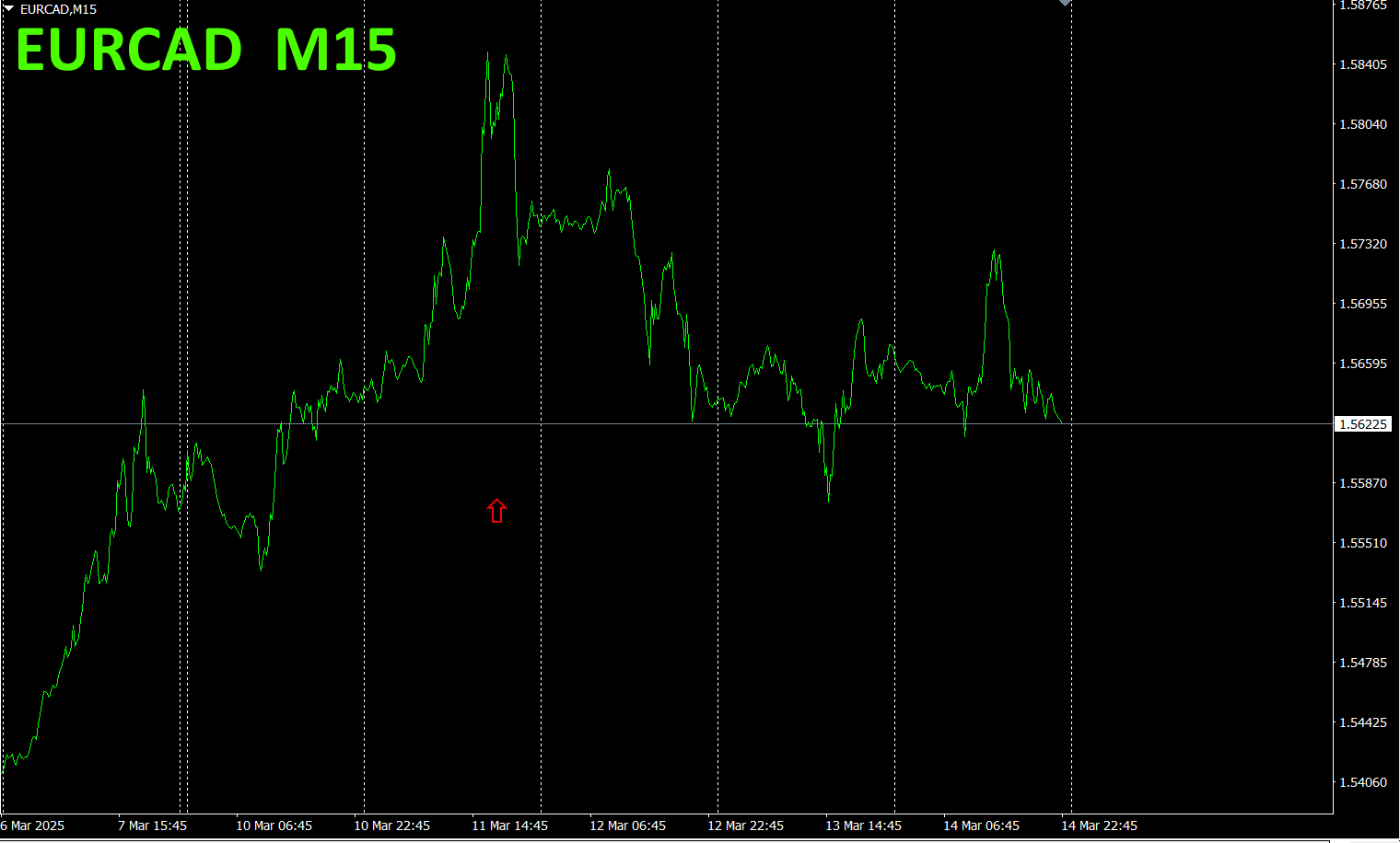
Now, let's look at the chart forEURCAD.
The red arrow marks the screenshot capture. It captures a surge within the uptrend.
"28 currency pairsBest Select indicator" can easily identify which currency among 28 pairs has the strongest trend. It also tells you whether to trade now with numeric and color cues. This is an excellent indicator to judge the overall movement of all currency pairs at a glance.
"28 currency pairsBest Select indicator"

https://www.gogojungle.co.jp/tools/indicators/35128
3. 2021年5月から追っているEURJPYの動きはどうなった?
From2021 year5月からの動きを追っています。
To see the overall trend, a30 minute chart showing about the last3 weeks is drawn.
Previously, I wrote the following.
Pink indicatesEUR, green indicatesJPY. In the currency strength chart, andEUR are both downward, with almost the same angle. In currency strength, > . In the future, it depends on which way each vector points, but currently there is no clear directional bias.
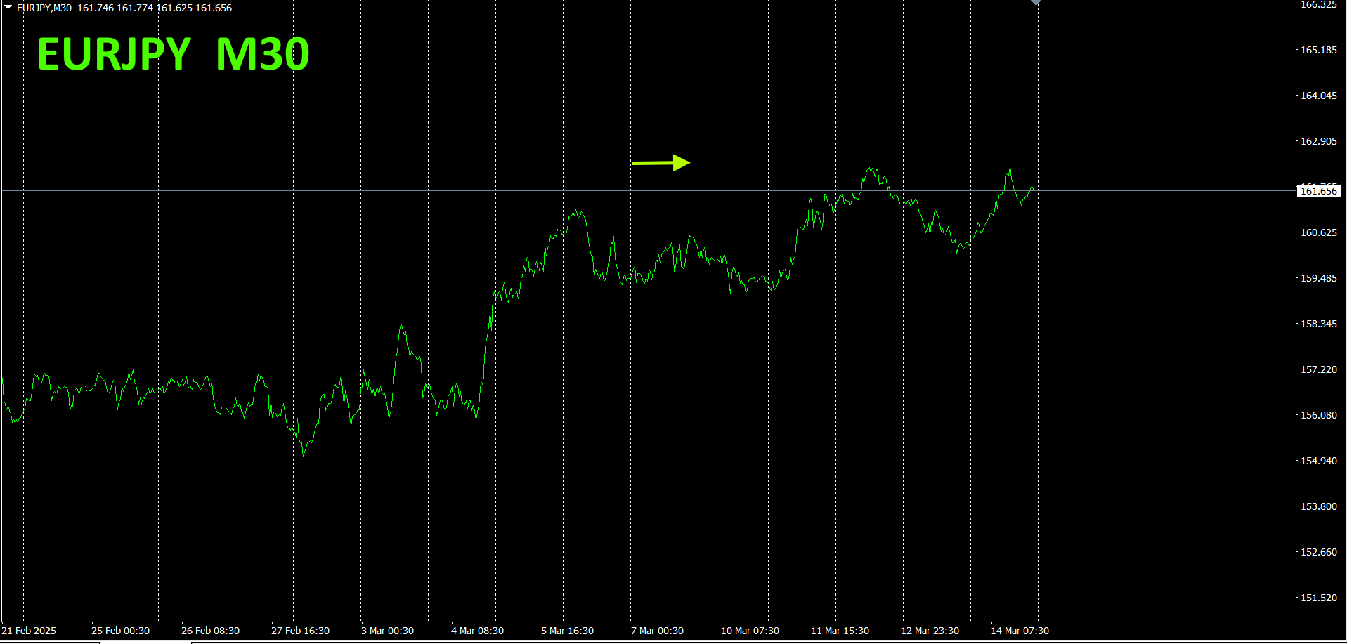
It seems to be in a choppy range with waves.
30 minute currency strength chart.
Pink indicatesEUR, green indicatesJPY. In the currency strength chart,JPY and both move downward, with nearly the same angle. In currency strength, > . For now, there is no solid directional bias.
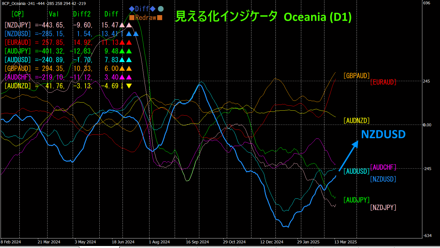
4. Using the Visualization Indicator on the daily chart
The below figure shows the "8CP Visualization Indicator" Oceania version displayed on a daily chart.
NZDUSD has bottomed and turned up, showing a V-shaped recovery. It is expected to rise further, so if you hold a long position, keep it. It may also be good to add more lots or enter new long positions.
5. Recommended indicators
"Swap Target Indicator"https://www.gogojungle.co.jp/tools/indicators/48183

"Toretore Indicator"
https://www.gogojungle.co.jp/tools/indicators/50115
"TrendLine-EX"
https://www.gogojungle.co.jp/tools/indicators/42257

"8C Currency Strength Visualization Indicator"

MT4 version https://www.gogojungle.co.jp/tools/indicators/39150
MT5 version https://www.gogojungle.co.jp/tools/indicators/39159
【My listed products】