
Cycle Theory - Environmental Perception | GBPAUD 2024.9.5 pm7:10)
Hello. Good evening.
Today is soccer. The World Cup final qualifiers against China, right?
Now it’s the very popular Mitoma appearing, isn’t he?
Now, tonight’s market sentiment will be delivered for GBP/AUD.
GBP/AUD may be highly volatile.
Market Sentiment
Summary
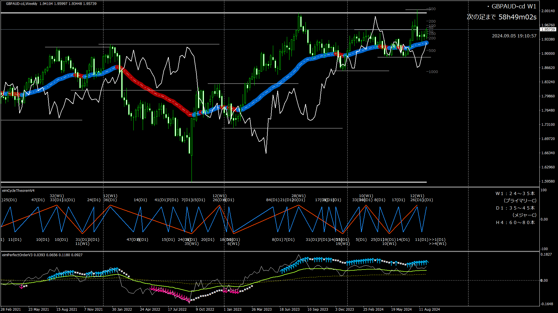
Medium to long term (weekly chart level) has begun to trend downward.
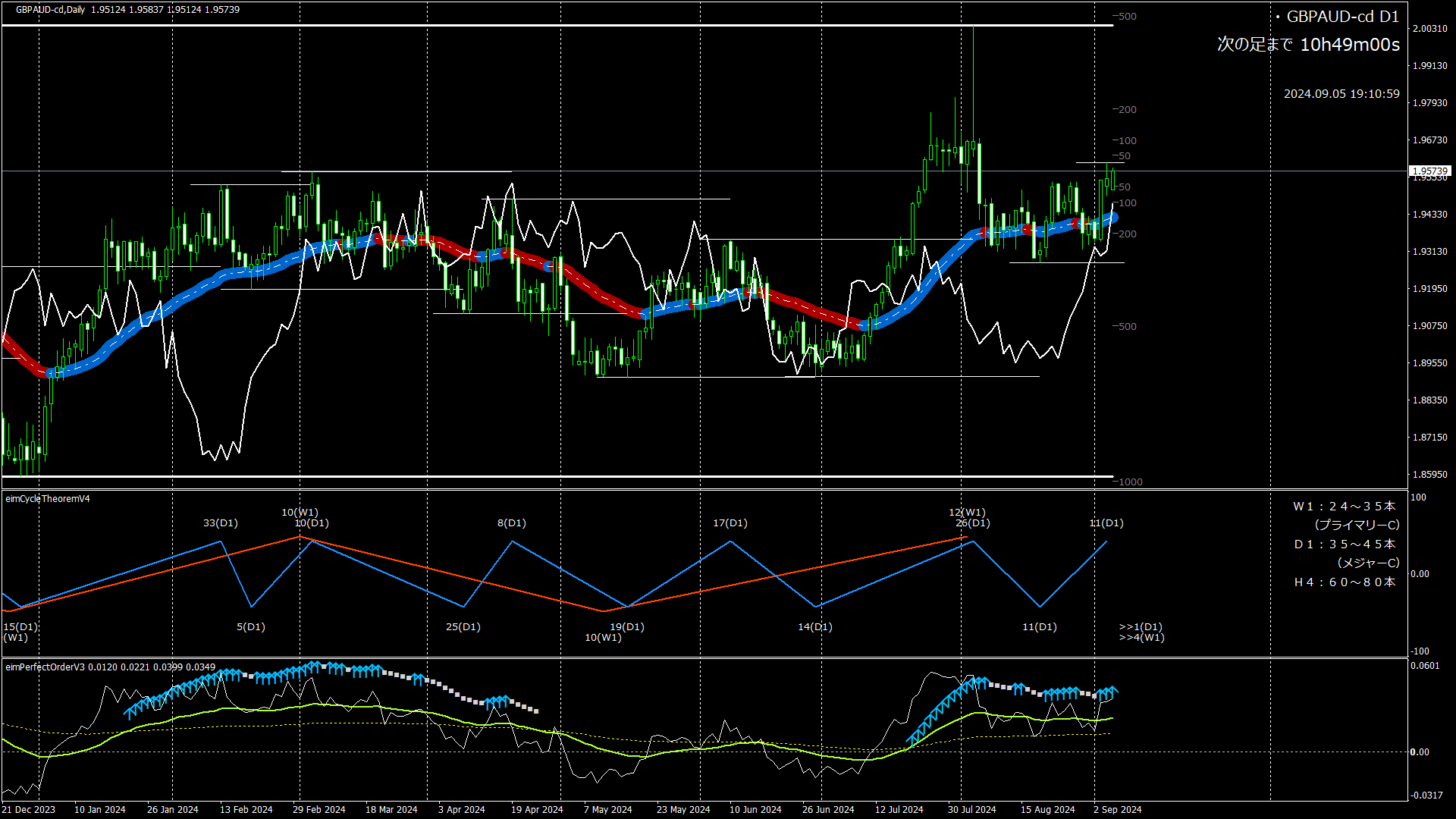
On the daily chart, after reaching a high, it is now about to head downward.
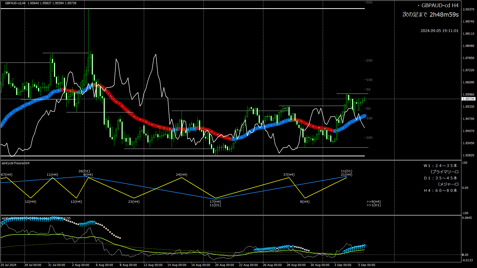
On the 4-hour chart, it is in a downward phase but not yet clearly downward.
Weekly Cycle
Cycle theory: W1 cycle is currently the 17th bar; the high was reached at the 13th bar. It is currently moving toward the low.
(Typically 24–35 bars constitute one cycle)
Moving average lines: gently rising.
Perfect order: bullish signal is lit. The signal will stay lit for a while.
Daily Cycle
Cycle theory: D1 cycle is currently the 13th bar, with the high at the 12th bar. It is about to head toward the low. Since the current candlestick is bullish, the movement after this will be important.
(Usually 35–45 bars per cycle)
Moving average lines: as with the weekly chart, a gentle upward trend.
Perfect order: bullish signal lit. As with the weekly chart, the signal will stay lit for a while.
4-Hour Cycle
Cycle theory: H4 cycle is currently the 31st bar; the high is at the 22nd bar. It is moving toward the low, but shows signs of rising.
(Typically 24–35 bars per cycle)
Moving averages: rising.
Perfect order: bullish signal lit. Following weekly and daily, the signal is further strengthening.
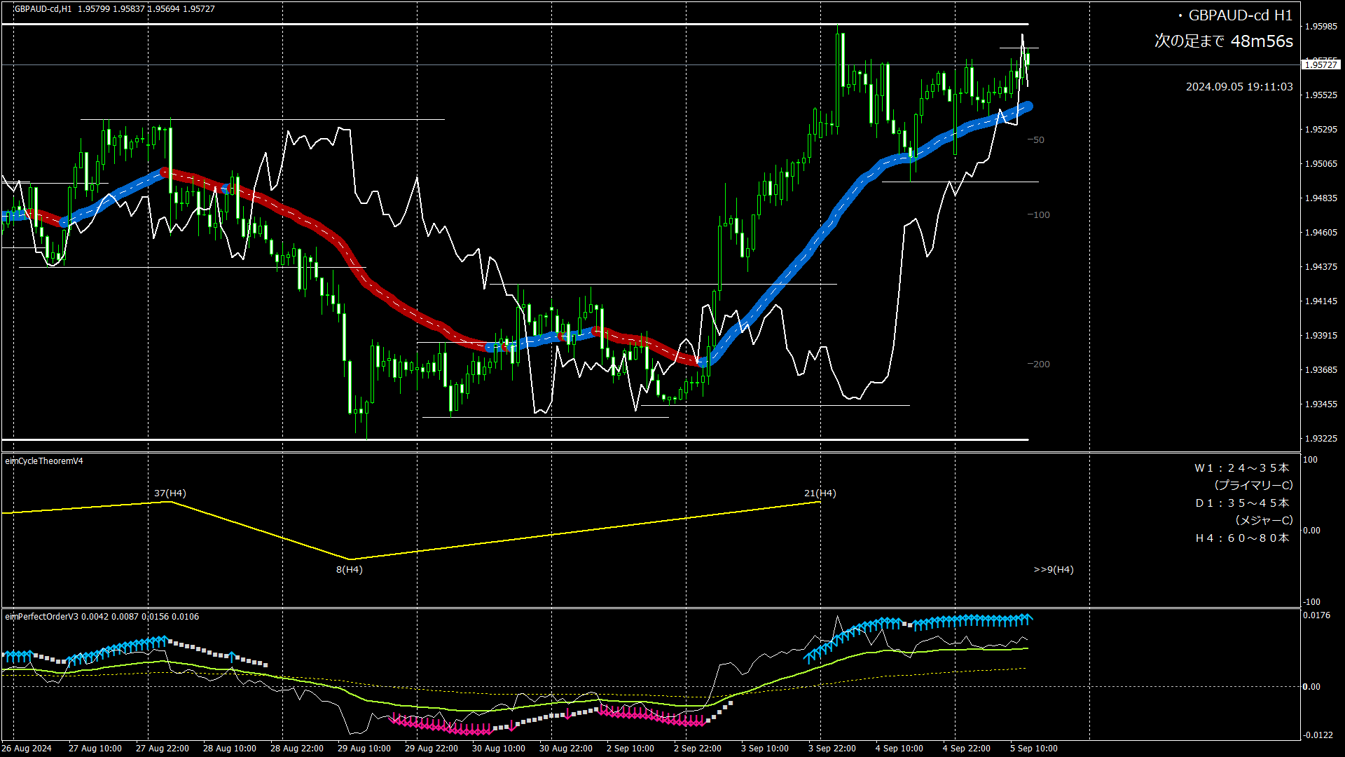
Note: 1-hour chart for reference (no commentary)

Entry Judgment
Bearish outlook. Looking to short as the downward move begins.
Stop loss if the recent high of 1.9599 is surpassed.
(That is all, according to cycle theory market sentiment)
*1) This is a research article on market sentiment based on cycle theory.
*2) Trading stance:
Determine the perspective on the daily and 4-hour charts, and adjust entry timing on the 1-hour chart.
*3) The article title and the times in the top-right of each chart are in Japan Standard Time.
That will be all for today. Thank you very much.
(Reference) Image descriptions
<Upper> Candlestick chart. The thick line is the moving average (MA). When MA is rising, it is blue; when it is falling, it is red.
<Middle> Cycle theory. Yellow is the 4-hour cycle. blue is the daily cycle (= major cycle). Red is the weekly cycle (= primary cycle). The numbers at the peaks (mountains) and troughs indicate the number of candlesticks from the previous peak. Note that the first bar is not counted. The ">> number" on the right edge shows the number of bars from the last peak to the current point.
<Lower> Perfect Order (= PO).
- Arrows (up/down) indicate a complete PO, and squares (■) indicate a closing price that crosses MA (an indication that PO is about to break).
- The line graph shows positions relative to the long-term MA.
Yellow dotted line is the mid-term MA. Light green solid line is the short-term MA. White solid line is the closing price position.