Use of the "Visualization Indicator" (Part 137)
“Visualization Indicator” usage (Part137)
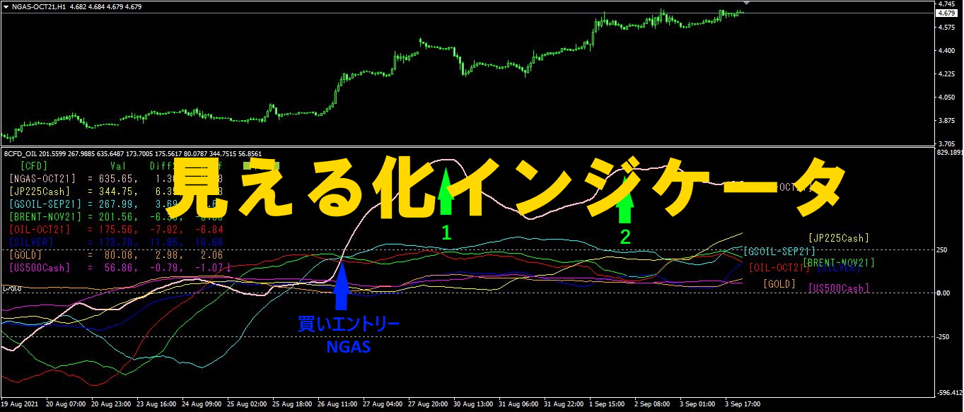
1. Evolving and developing the “28 Currency Pairs List Indicator” into an Indicator Indicator”
“8CP Visualization Indicator” to drawAUDUSD.
The “8CP Visualization Indicator” includesOceania version,London version,NewYork version,AnyCP version. This time, the Oceania version was used.
The upper half is the 15-minute chart ofAUDUSD. The lower half is from the “8CP Visualization Indicator”; the light blue bold line chart corresponds toAUDUSD.
On Wednesday,AUDUSD topped the other charts and diverged, so a buy entry was taken. By Friday’s close,approximately120 pips of profit was obtained.
With the “8CP Visualization Indicator,” by focusing only on the most active currency pair, you can trade efficiently.
2. Best Select Indicator trial
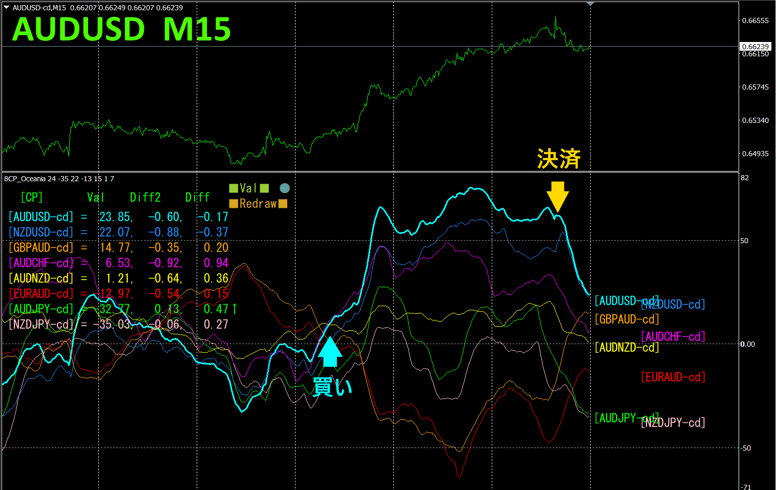
Normally, the caption would read, “The lower chart is a screen capture from2024 year3 monthdd dayhh:mm (JST) …”, but this week the home serverPC was down. Although the screen displayed numbers, I mistakenly believed it was functioning.
The automatic shooting every hour was functioning, but when I checked the data later, it turned out the same screen was being saved.
For that reason, this week's column will be on hiatus.
As a note, the saved screen copy data above is the illustration.
In this state, it’s better not to trade.
“28 Currency Pairs Best Select Indicator can easily identify which currency among the 28 pairs has the strongest trend. It also tells you, with numbers and colors, whether you should trade now. You can judge the overall movement of all currency pairs at a glance—an excellent indicator.
“28 Currency Pairs Best Select
https://www.gogojungle.co.jp/tools/indicators/35128

3. 2021 year5 month to present EURJPY movement, what happened?
2021 year5 month from EURJPY
To view the overall trend, a30 minute chart showing roughly the last3 weeks is drawn.
Last time, I wrote the following.
JPY and were almost horizontal. With no clear direction, it was hard to determine the trend. EUR
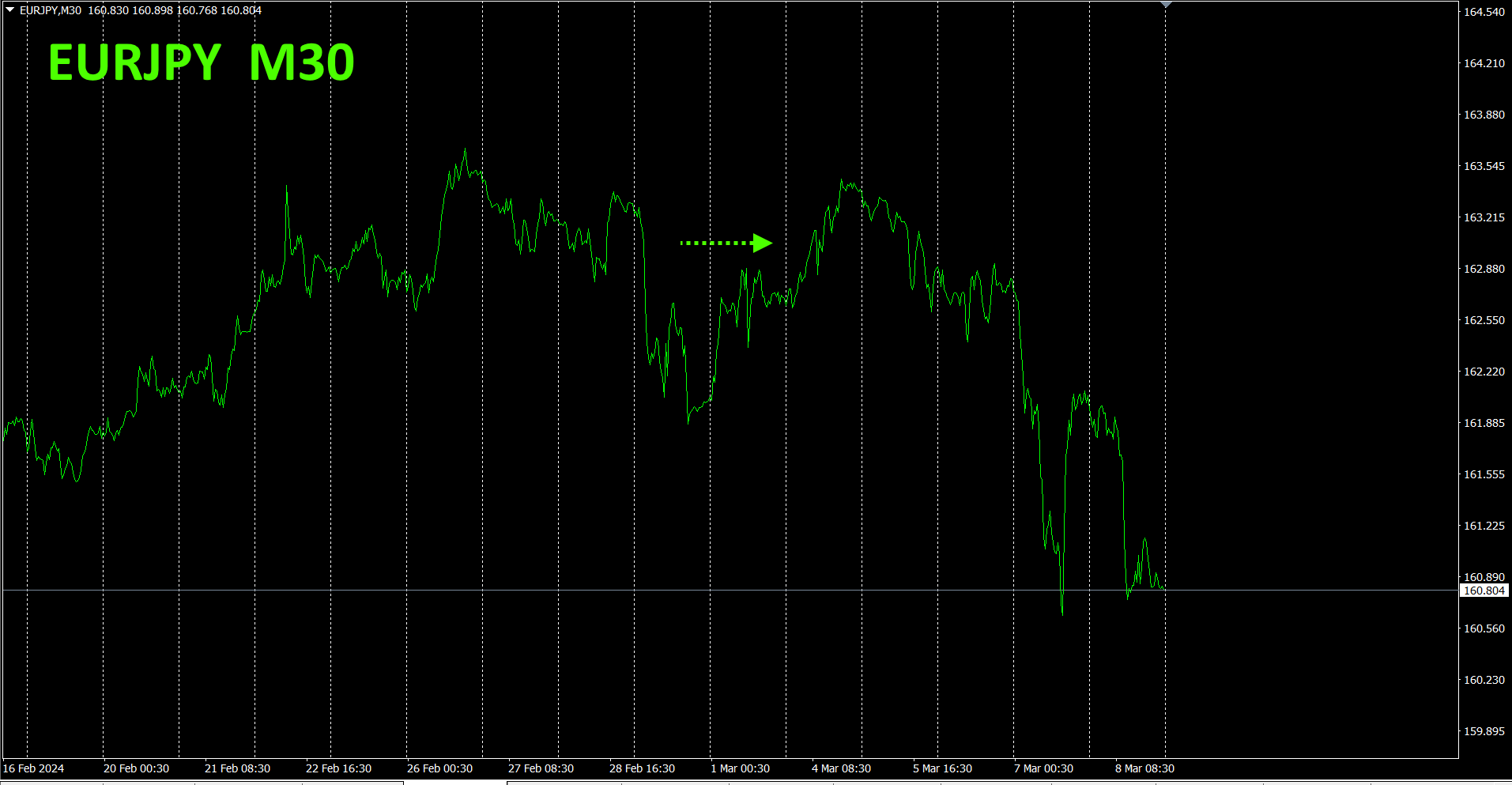
Although the chart lacked direction, the currencyJPY became slightly stronger than the currencyEUR, soEURJPY declined.
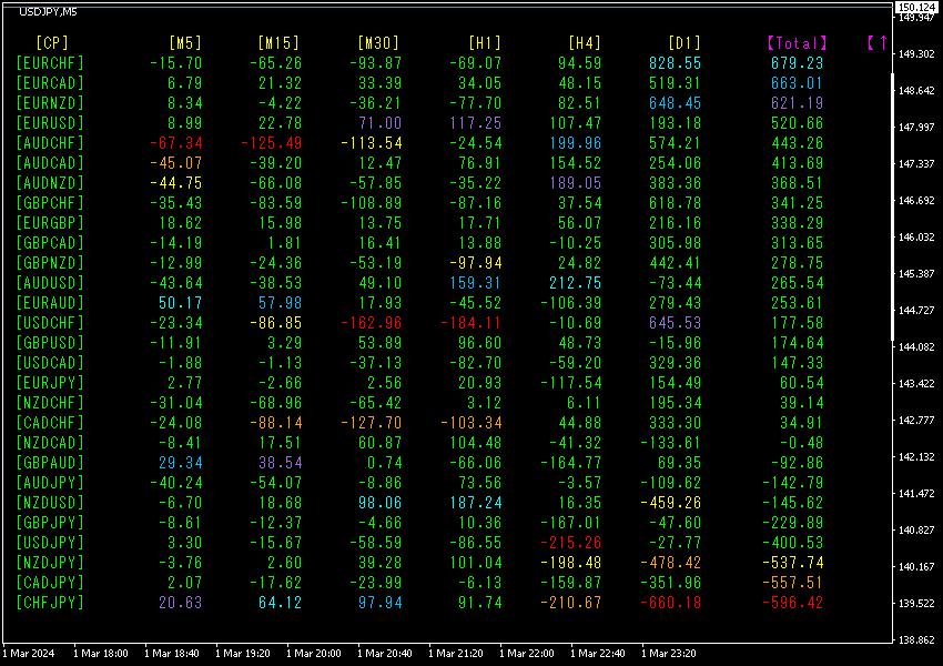
30 minute currency- strength chart.
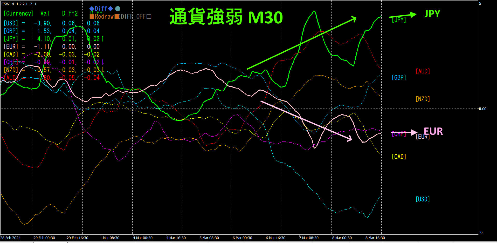
Pink isEUR, green isJPY.JPY lies aboveEUR, meaningJPY has become a stronger currency thanEUR. Therefore,EURJPY will decline.
4. Find tops and bottoms across all currency pairs to formulate a trend strategy (target isNZDCHF).
Using the 2505“Top/Bottom Search,” NZDCHF was selected as a bottom-position currency pair. We are aiming for a rise from the bottom.
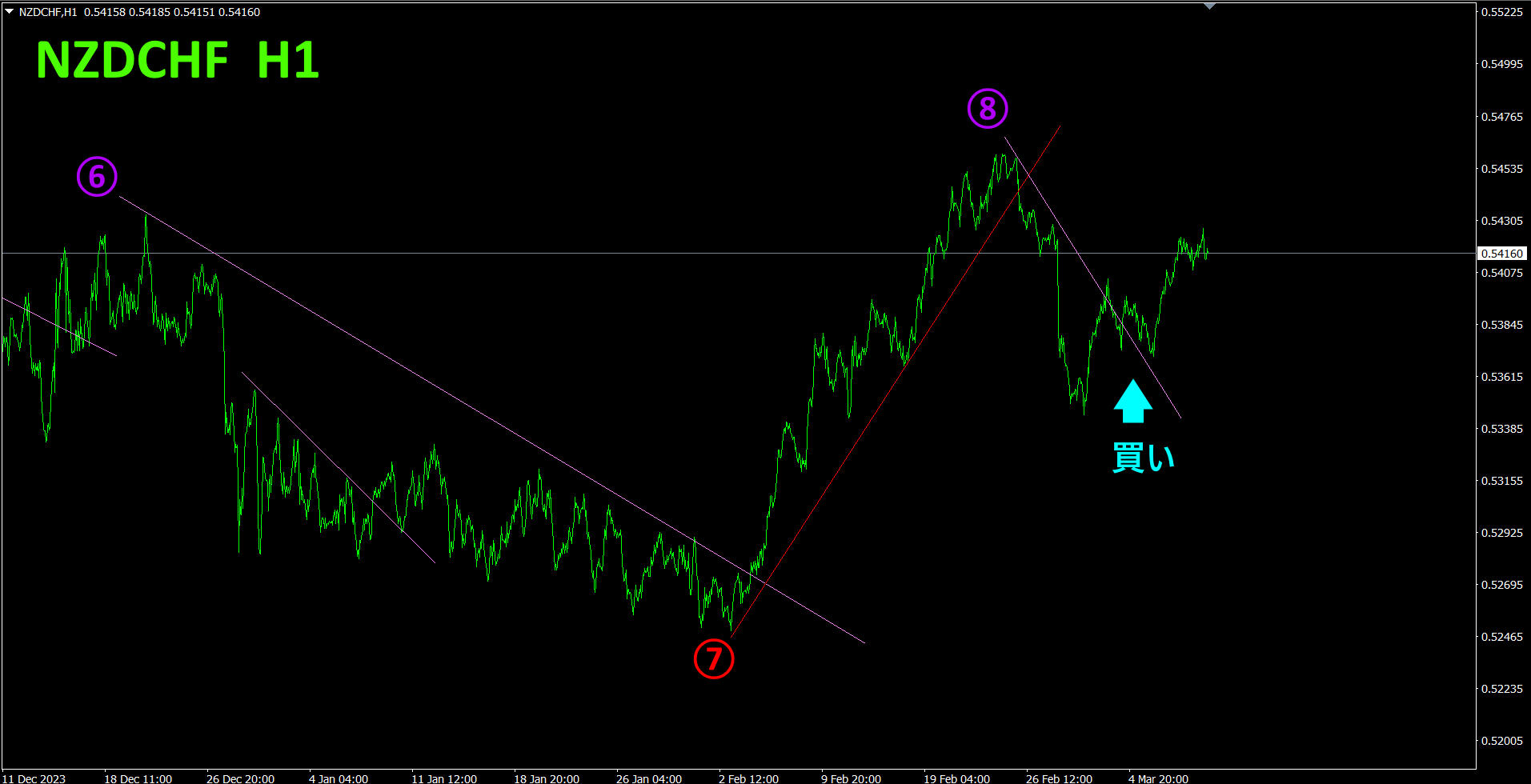
Since the eighth lower line was broken above, I opened a buy position. I will hold the position until the trend line is broken again by the market.
Using the“Trend Line EX,” hold until the rising trend line is broken, then it is fine to exit automatically.
Refer to the four-hour currency- strength chart.
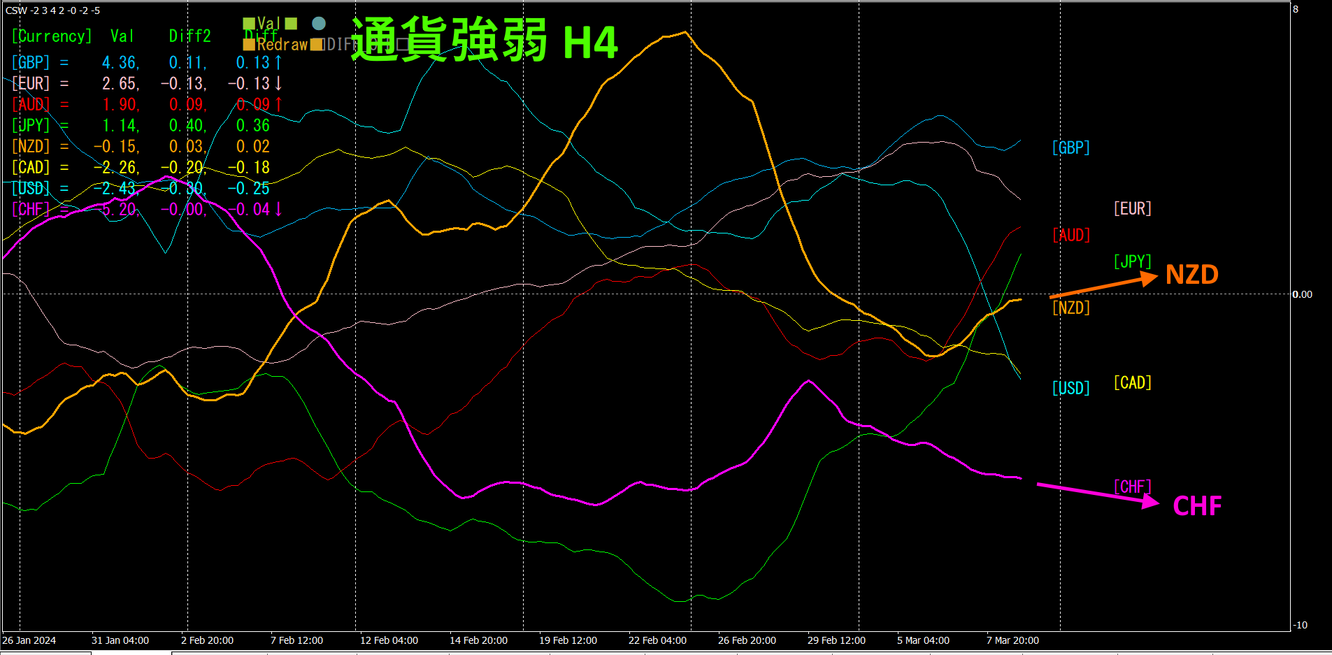
Red-purple isCHF, orange isNZD.NZD is rising,CHF is falling.NZDCHF is expanding in the divergence direction. This suggests that
By comparing normal FX charts with currency-strength charts, the trend direction becomes clearly visible through visualization.
With a semi-automaticEA, the “Trend Line EX” can place a diagonal downward line, and when it is broken to the upside, buy automatically; when the rising line is broken, automatic exit occurs, enabling hands-off trading.
※“Trend Line EX”

https://www.gogojungle.co.jp/tools/indicators/42257
“8C Currency Strength Visualization Indicator”
MT4 version https://www.gogojungle.co.jp/tools/indicators/39150
version https://www.gogojungle.co.jp/tools/indicators/39159
【My listed products】