
FX/Nikkei 225/Cryptocurrency: Pinpointing the Tops and Bottoms Precisely!
<Simulation example of movement from top to bottom and bottom to top in a 天底 chart>
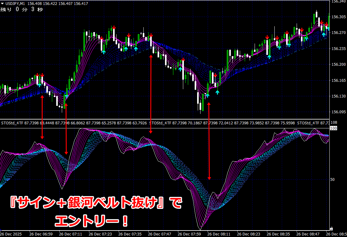
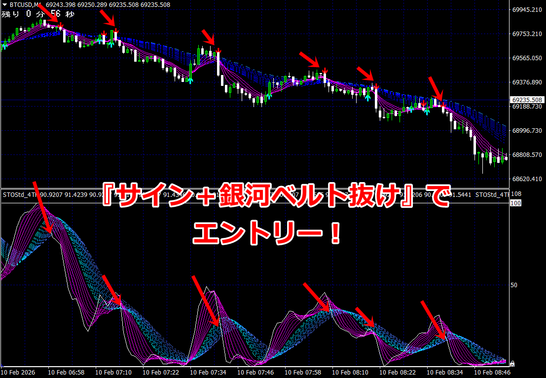
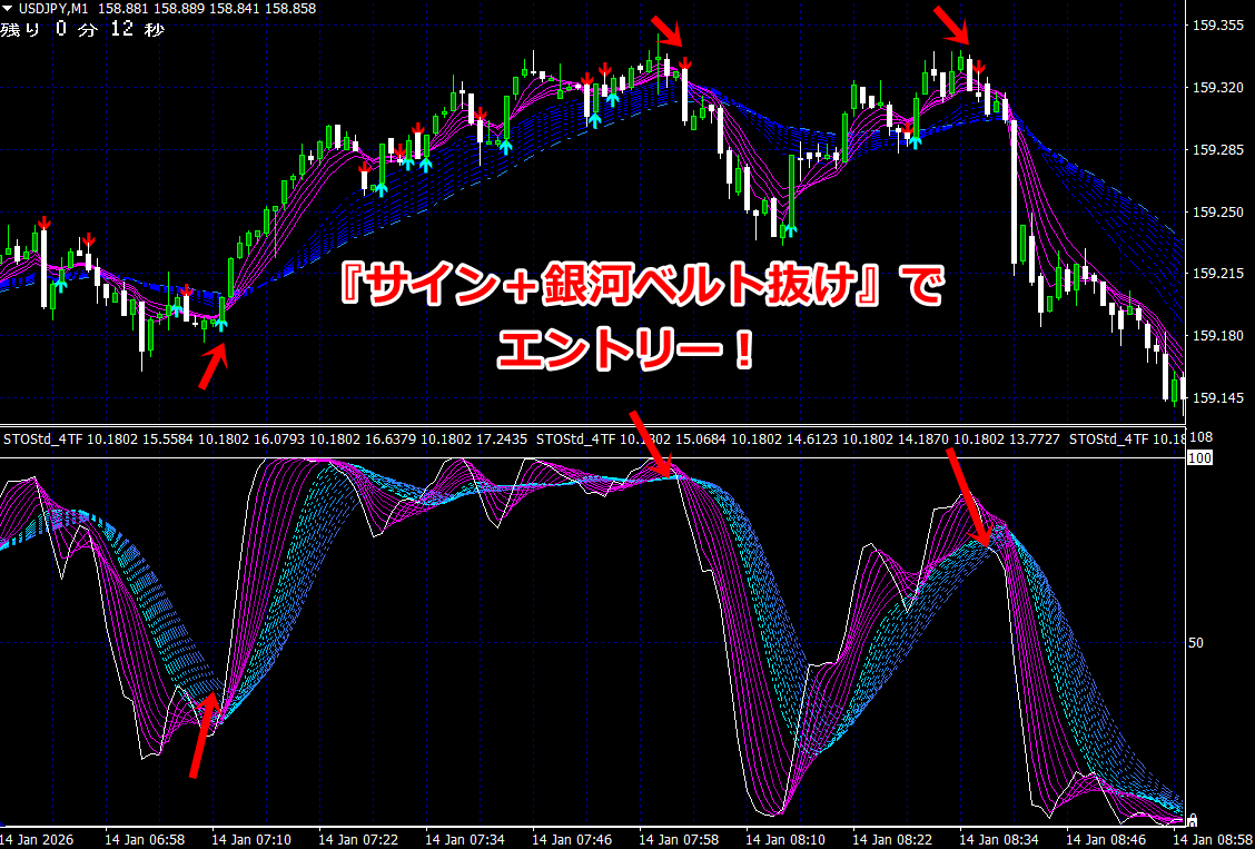
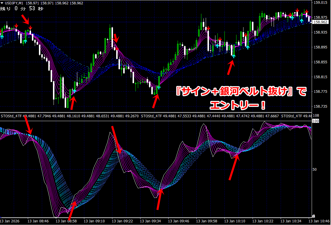
From the top to the bottom, and from the bottom to the top, the actual flow is
shown in the following image.

① Break above the blue line to switch to a rising market, and the first pullback occurs.
② At the pullback when the candlesticks all rise above all moving averages,
the green signal (buy signal) lights up.
③ White and pink nearly touch the upper limit, forming a ceiling (white signal lit = take profit).
④ At the same time, most lines of the RCI are crowded at the upper limit.
⑤ Break below the blue line to switch to a falling market.
⑥ At the same time, the first pullback occurs, and the red signal (sell signal) lights up.
⑦ White touches the lower limit and forms a bottom (white signal lit = take profit)
⑧ Break above the blue line to switch to an rising market, and the first pullback occurs,
and the green signal (buy signal) also lights up.
⑨ White touches the upper limit, and the white signal lights up (take profit).
This does not necessarily always happen, but as a basic flow,
the upper limits (ceiling) of the middle and lower chart indicators are touched and reversed, and the lower limit (bottom) is touched and reversed
and so on in repetition.