Usage of "Visualize Indicator" (Part 84)
“Visualization Indicator” usage (part84)
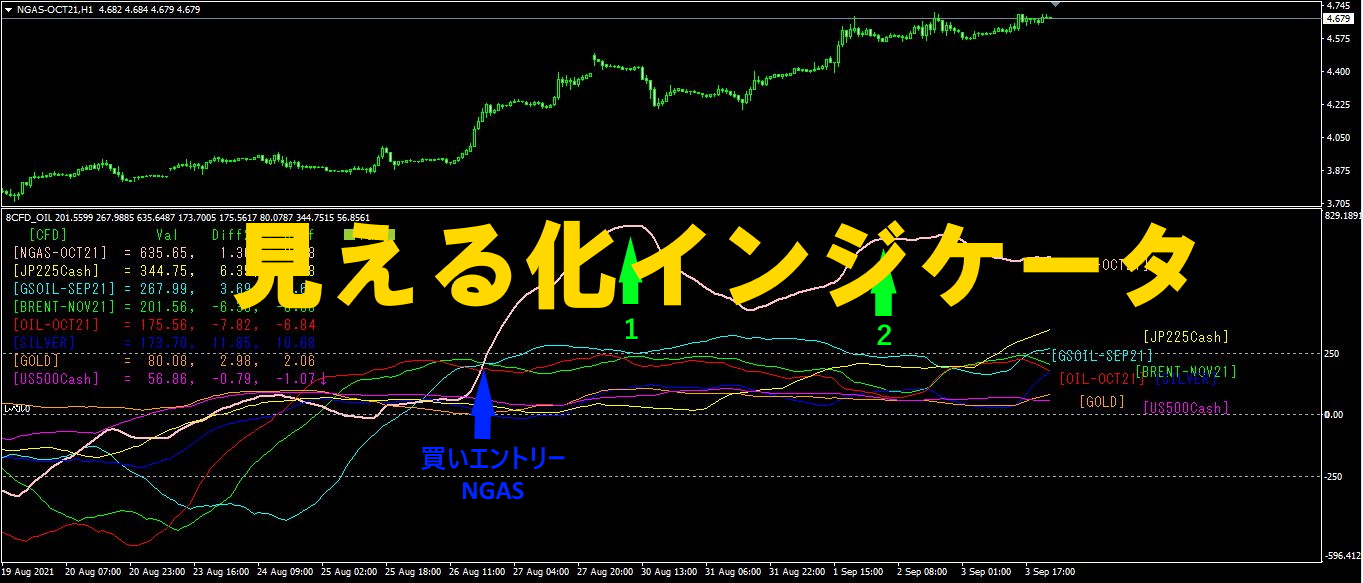
1. Further develop and advance the “28 Currency Pairs List Indicator” into an indicator
“8 CP Visualization Indicator” for GBPUSD to draw
There are several versions of the “8 CP Visualization Indicator”: Oceania, London, New York, and AnyCP. This time, we used the London version.
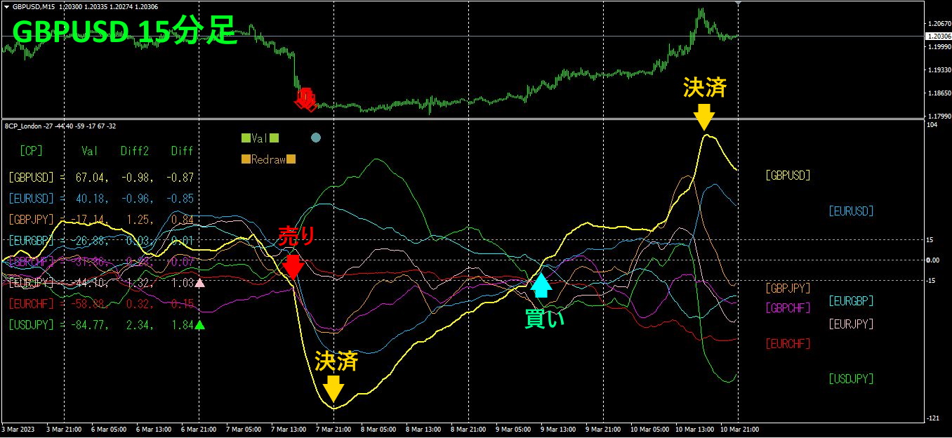
The top half is the 15-minute chart of GBPUSD. The arrows in the top half indicate the alert positions of the “28 Currency Pairs List Indicator.” The bottom half is from the “8 CP Visualization Indicator.” The yellow thick-line graph corresponds to GBPUSD. GBPUSD の15 chart. The arrows in the top half indicate the alert positions of the “28 Currency Pairs List Indicator.” The bottom half is from the “8 CP Visualization Indicator.” The yellow thick-line graph corresponds to GBPUSD.
I entered a short on Tuesday and settled the same day, then entered a long on Thursday and settled on Friday—making a profitable trade in one week twice.2 times, about150 pips,2 times, about180 pips, for a total ofabout330 pips of profit had been earned.
2. Best Select Try the indicator
The figure below is a screenshot taken at 00:06 on2023 year3 month8 day00:06 (JST))
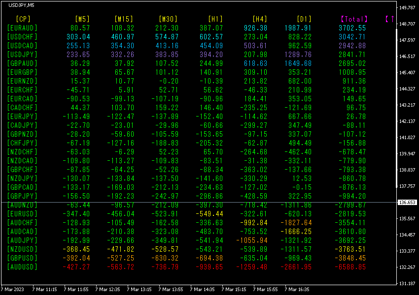
[Total] The numbers are sorted in descending order. The bottom line,AUDUSD shows all digits in the red range, and the value ofTotal is -6588.85, a large negative value. This indicates a downtrend in AUDUSD. AUDUSD
Now, let's look at the AUDUSD chart.
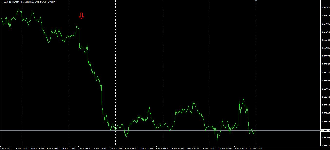
The red arrows indicate where the screenshot was taken. They capture the initial drop of the downtrend. Since the rate kept falling, selling here would have secured profit. The profit range is about140 pips.
The essence of trading is to aim only for the points that generate profit and to strictly refrain from trading at other times.
3. What happened to EURJPY, which has been tracked since May of the year before last?
From May 2021, is being tracked.
To see the overall trend, we have drawn roughly the last three weeks on a 30-minute chart.
Last time, it was written as follows.
EUR appears to be moving down, is moving up significantly. As a result,
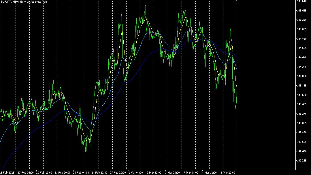
Indeed, it has moved downward.
4 Time-frame currency strength chart.
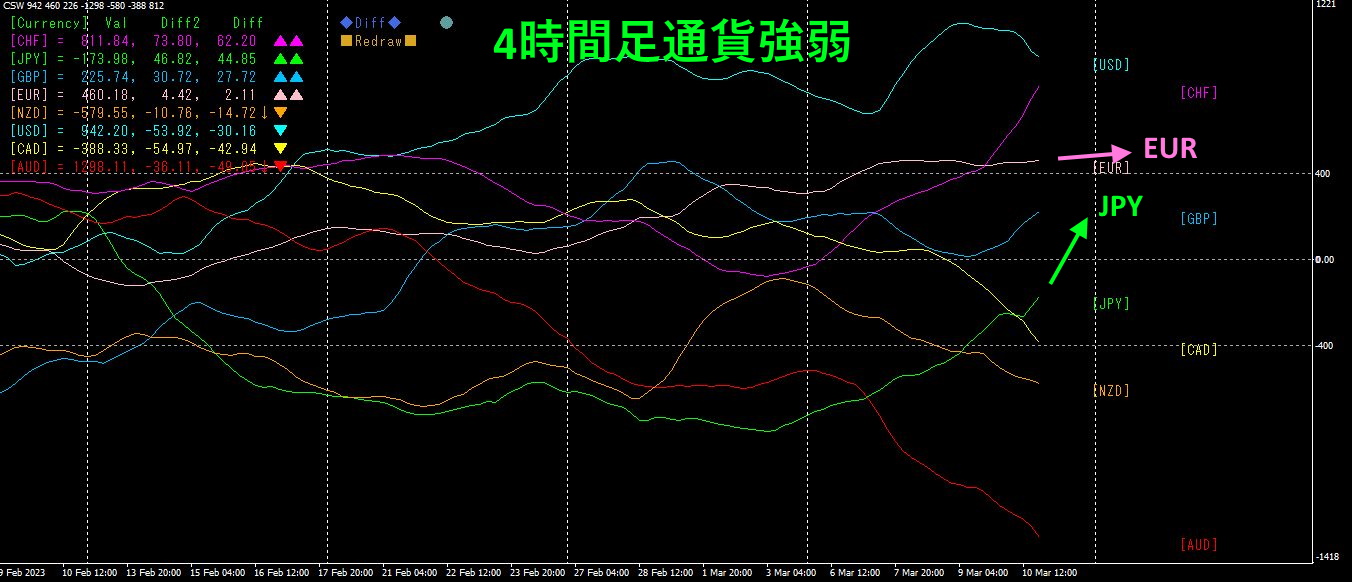
Pink showsEUR, green showsJPY. is somewhat upward, is rising sharply. As a result,
4. AI
ChatGPT, and recently are common topics.
With AI, photos can be composed, AI
Below is theWeb version service (free to use).
(1) Stable Diffusion (AI photo synthesis)
D-ID (AI video creation)

The above photo is AI-generated.
https://youtube.com/shorts/pyzAJS9Vz1I
If you are interested in the “8C” currency strength visualization indicator, please refer to the following page.
MT4 version https://www.gogojungle.co.jp/tools/indicators/39150
MT5 version https://www.gogojungle.co.jp/tools/indicators/39159
【Products I have for sale】
https://www.gogojungle.co.jp/users/140198/products