Use of the "Visualization Indicator" (Part 49)
“Visualization Indicators” usage (part49)
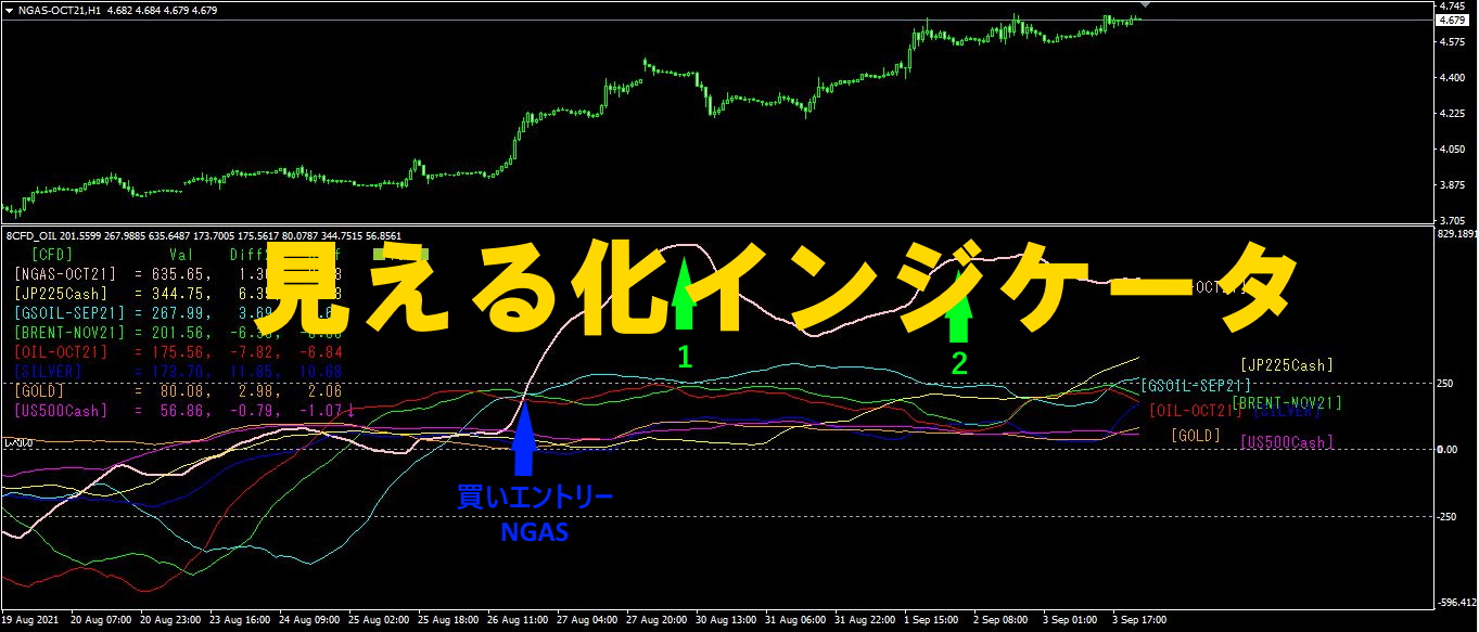
1. Further evolve the “28 Currency Pair List Indicator” into an indicator
“8 CP Visualization Indicator” for drawing EURAUD on EURAUD
The “8 CP Visualization Indicator” includes Oceania version, London version, NewYork version, AnyCP version. This time, I used the Oceania version.
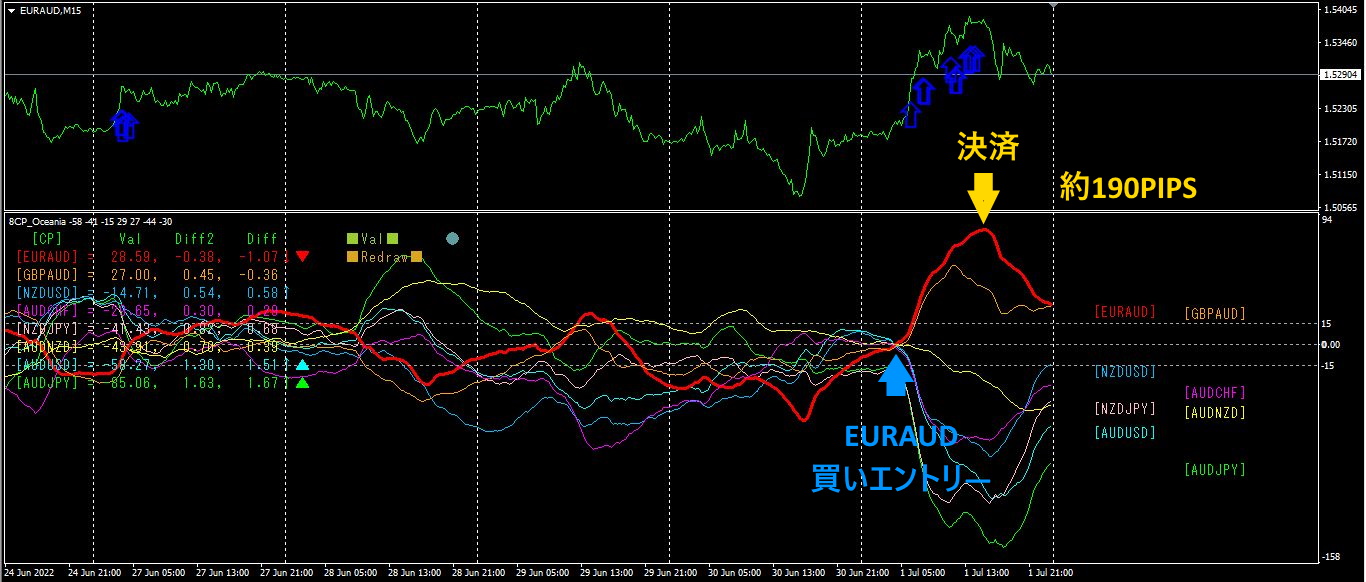
The upper half is EURAUD’s 15-minute chart. The blue arrows on the upper half indicate the alert positions from the “28 Currency Pair List Indicator.” The lower half is the “8 CP Visualization Indicator.” The red bold line graph corresponds to EURAUD.
On Friday, EURAUD rose above other graph groups to the top, so I entered a buy. By the afternoon the graph became horizontal, so I closed the position.Approximately 190 PIPS profit was made.
At the same time, AUDJPY and NZDJPY were both spreading downward, so you could have entered a sell here as well. AUDJPY yielded about 200PIPS in profit.
2. Best Select Try the Indicator
The figure below is a screenshot taken at June, 2022 on 29 at 20:13.
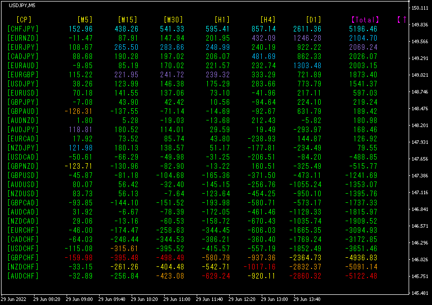
Total numbers are sorted in descending order.
The top line shows CHFJPY, [M5], [M15], [M30], [H1], [H4], [D1], [Total] are all blue. Moreover, the Total value is 5196.46!
indicates the strongest upward trend.
Now, let’s look at the CHFJPY chart.
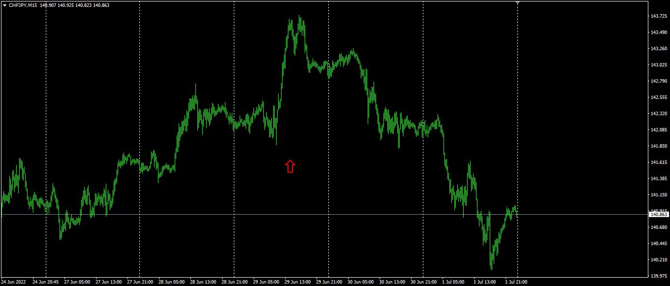
The figure shows the CHFJPY on the 15-minute chart. The red arrows mark the screen-captured point. After forming a double top, it then moved downward. Unfortunately, it yielded only a small profit of about 15PIPS or a stop-out. To understand why this happened, you need to analyze the higher-timeframe context as well.
Next, let’s look at the 4-hour chart.
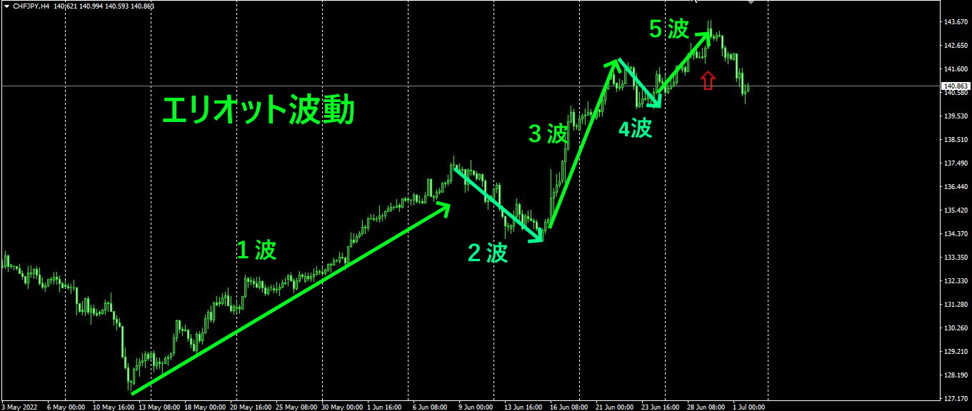
The upper figure shows the CHFJPY on the 4-hour chart. From the chart, you can see that the fifth wave of the Elliott wave sequence has just finished. It’s unlikely to move higher much after this.
Don’t just take the indicator’s numbers at face value; even if it’s cumbersome, perform the higher-timeframe contextual analysis before trading.
3. Since May last year, tracking EURJPY movements—what happened?
Since May, 2021, EURJPY movements have been tracked.
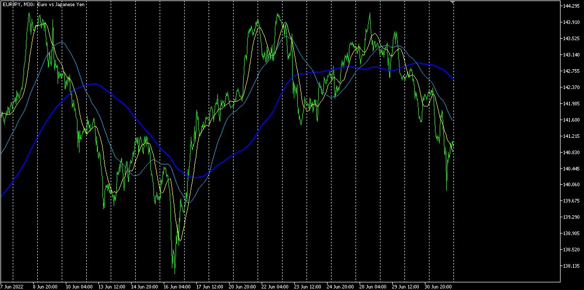
To see the overall trend, I’ve drawn about 30 minutes of the most recent roughly 3 weeks on a chart.
Last time I wrote the following.
A large N appeared completed.
Regarding future movement, as the yen remains weak, it is likely to rise further..
Although the yen remains weak and could rise, upward momentum is being capped. Depending on perspective, this forms a large inverse head-and-shoulders pattern. Chart-wise, this implies a bearish bias.
Therefore, I decided to reference the newly developed “Currency Strength Indicator.”
The lower diagram shows on the daily chart the “8CP Currency Strength Visualization Indicator.”
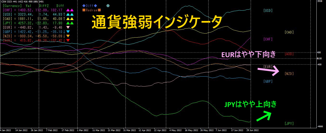
EUR's graph is slightly downward,'s graph is slightly upward, soJPY EURJPY is forecast to move downward overall.
“8C Currency Strength Visualization Indicator” is available for sale on Gogojungle, so if you’re interested, please visit the sales page.
MT4 version https://www.gogojungle.co.jp/tools/indicators/39150
MT5 version https://www.gogojungle.co.jp/tools/indicators/39159
【My items for sale】