Utilization of "Visualization Indicators" (Part 47)
Usage of "Visualizing Indicators" (Part47)
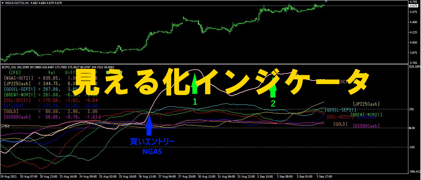
1. Further evolve the "28 Currency Pair List Indicator" into a visualized indicator
"8CP Visualizing Indicator" to drawCADCHF.
There are versions of the "8CP Visualizing Indicator" in Oceania,London version,NewYork version,AnyCP version. This time, I used theNewYork version.
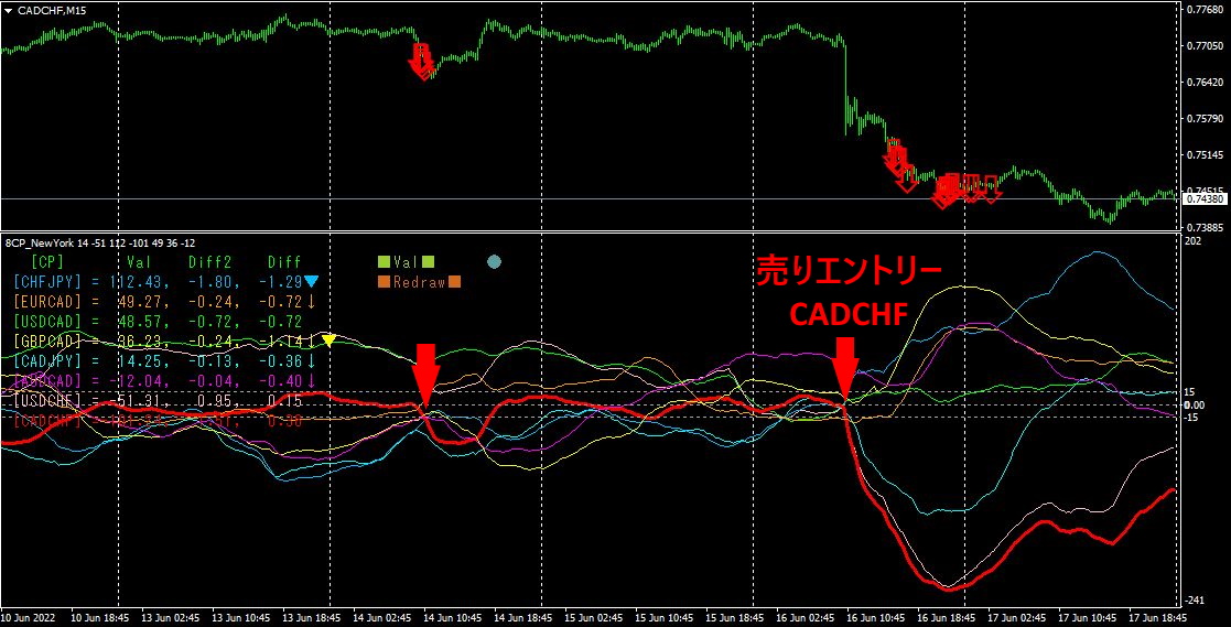
The upper half is theCADCHF 15-minute chart. The red arrows in the upper half indicate the alert positions from the “28 Currency Pair List Indicator.” The lower half is the “CP Visualizing Indicator.” The red thick line graph corresponds toCADCHF.
It dropped sharply on Thursday. Even after the drop, it continued to fall gradually, so if I had shorted after the plunge, I could have gained about130PIPS in profit.
What exactly caused this plunge? I looked into it later and found thatJune 16 (Thu) 16:30 there was the “SNB policy rate & statement release,” which caused CHF to move significantly.
2. Best Select Try using the Indicator
Last week, for some reason there were no alerts from the “28CP Best Select indicator.” VPS was stopped.MT4 was down. I considered causes like misconfigurations, butVPS was running, andMT4 was also up. I didn’t change settings, so I don’t know the cause. Perhaps the alert conditions were simply not met.
Since there is no mid-week screen copy data, I will display the weekend screen copy.
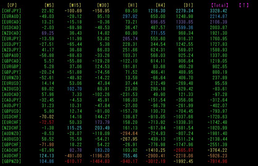
Total is sorted in descending order by value.
Notable is the bottom rowGBPNZD, where[M15] to[H4] are all shown in red.
Now, let's look at theGBPNZD for1 week chart.
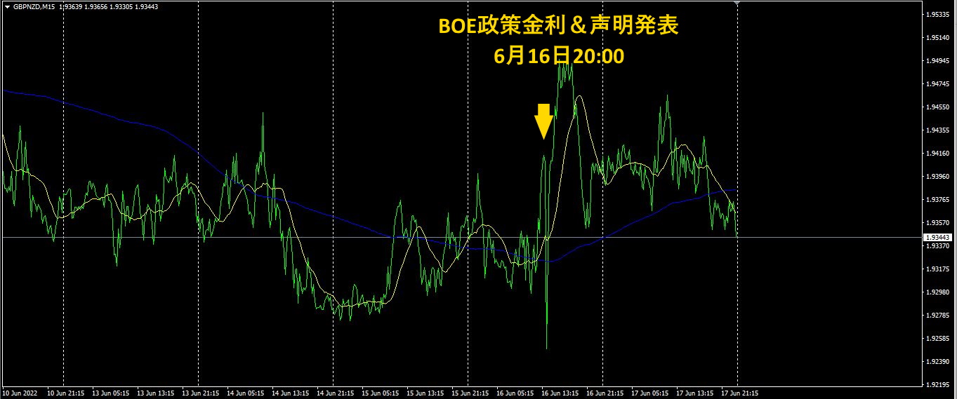
Thursday at 20:00, following the Bank of England policy rate announcement, there was significant volatility.
The policy rate was raised to1.25%, reaching a high level not seen since 2009.
In general, raising rates tends to strengthenGBP, soGBPNZD should rise, but by the weekend the effect of the rate hike faded, and it seemed to be on a downtrend.
The “28CP Best Select indicator reacts to such movements as well.GBPNZD is in a downtrend on higher timeframes. Even looking at the daily chart, it has been falling since February. The rate hike announcement caused only the short-term chart” to turn blue, but I don’t think this will propagate to the longer timeframes.
3. What happened to EURJPY, which I have been tracking sinceMay 2021?
year May EURJPY has been tracked.
To see the overall trend, I have drawn roughly the last weeks on a 30-minute chart.
Last time I wrote the following.
It rose almost in a straight line, but after exceeding the previous high by more than, it peaked.
During this period, the yen depreciated sharply as a currency, which contributed to theEURJPY rise. I think future movements will continue to be influenced by yen depreciation, but at present the yen weakness seems to be easing, keeping the upside restrained.
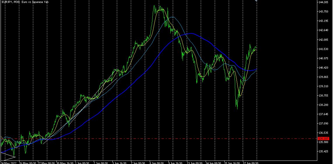
It is forming a largeN on the chart. Regarding future movement, yen is likely to stay weak, so if the yen remains weak, it should move higher.
【My listed items】