Usage of the "Visualization Indicator" (Part 27)
Utilization of the "Visualization Indicator" (part two27)
1. Further evolve the "28 Currency Pairs List Indicator" into an indicator that visualizes
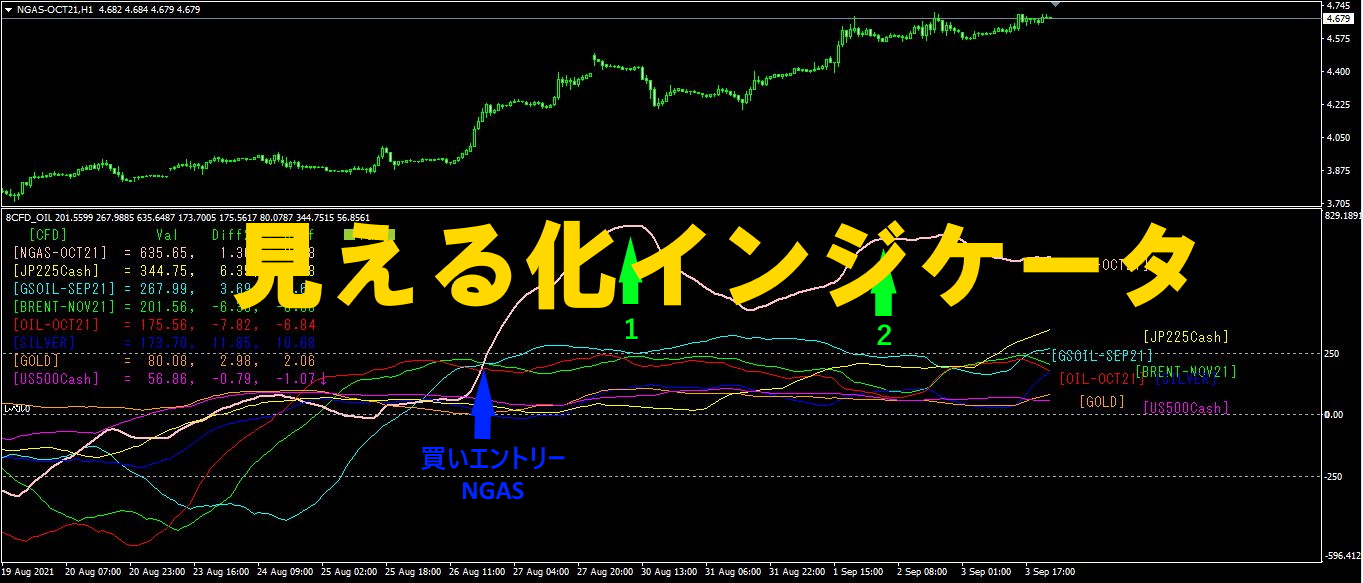
“8CPVisualization Indicatorto drawAUDUSD.
There are versions for Oceania,Oceania版, London版, New York版, AnyCP版. This time, I used the Oceania version as well.
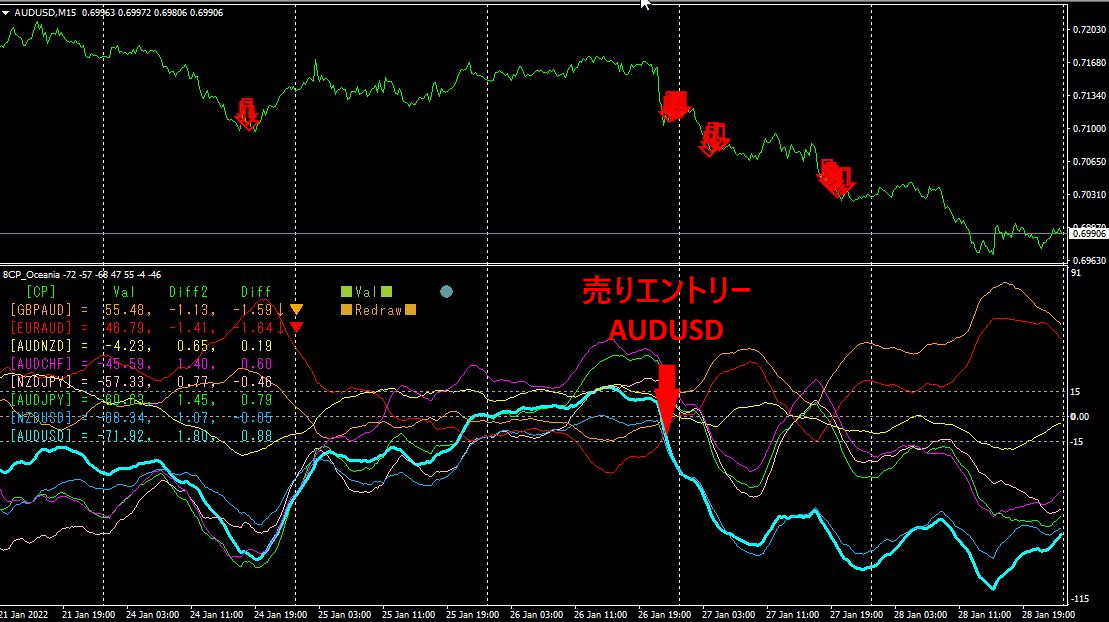
The upper half is the 15-minute chart ofAUDUSD.
The downward red arrows indicate the alert positions of the “28 Currency Pairs List Indicator”.
The lower half is the “8 CP Visualization Indicator.” The light blue thick line graph corresponds toAUDUSD.
The “28 Currency Pairs List Indicator” and the selling entry points of the “8 CP Visualization Indicator” appear at nearly the same positions. About130PIPSof profit was gained.
2. Best SelectTry the indicator
1Month28 day“
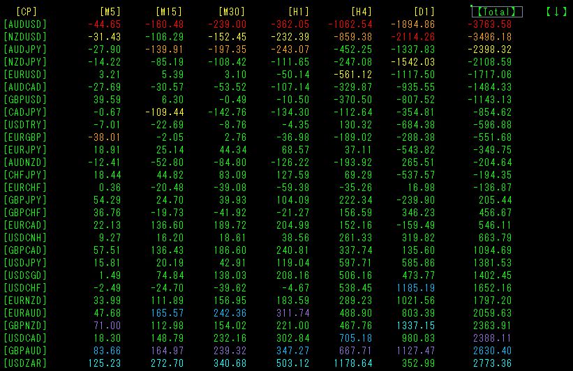
TotalSorted by numerical values. The largest negative value isAUDUSD. If trading, the best choice is to selectAUDUSD and enter a sell position. In particular,AUDUSD shows red across timeframes from[M5] to[H4].28 currency pairs, across any of the timeframes[M5],[M15],[M30],[H1],[H4], indicate that the downtrend ofAUDUSD is the steepest. Therefore, you should only sellAUDUSD. 5 minutes,15 minutes,30 minutes,1 hour,4 hours. The multi-time-frame analysis is completed in an instant, and all that remains is to enter a sell trade.
3. Best SelectIndicator (CFD edition)
Using the “Any Symbol Best Select indicator allows trading of CFDs (stock indices, commodities, etc.). This time,ASX AUD (Australian stock index) was traded.
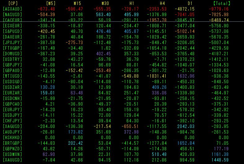
TotalSorted by numerical values.ASX A U D stands out.[M5] to[H4] show everything in red, so I will trade selling.
Now, let’s look at the chart. The chart is15 minutes.
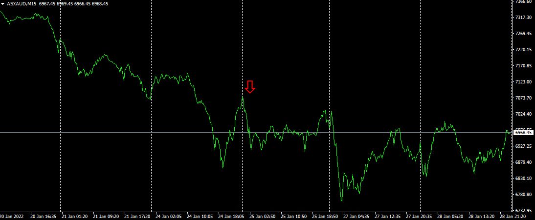
The red downward arrows indicate the position where the “Any Symbol Best Select indicator was displayed.
I think it accurately captures the sharp decline during the downtrend.
4. Since last year5month, what happened withEURJPY
Since May 2021,year5month,EURJPY? moves have been tracked.
To view the overall trend, I have drawn the most recent roughly30 minutes over about the last3 weeks on a 30-minute chart.
Last time I wrote the following.
On Tuesday, SMA200 was broken to the upside, but subsequently did not rise further,SMA200, then fell by two steps.Breaking SMA200 and going short would have yielded about210PIPS of profit.
There is still more downward potential.
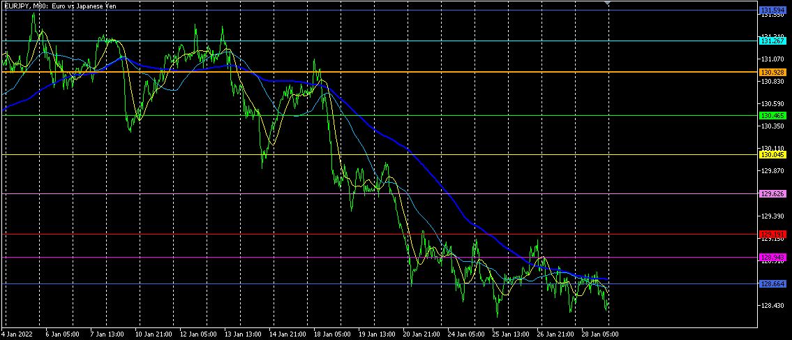
Prices are facing resistance. There is room to fall further toward the daily chart support line, so the decline may continue a little longer.
【My items for sale】