Utilization of the “Visualization Indicator” (Part 25)
Usage of "Visualization Indicator" (its25)
1. Advance and develop the "28 Currency Pair List Indicator" into a more advanced indicator
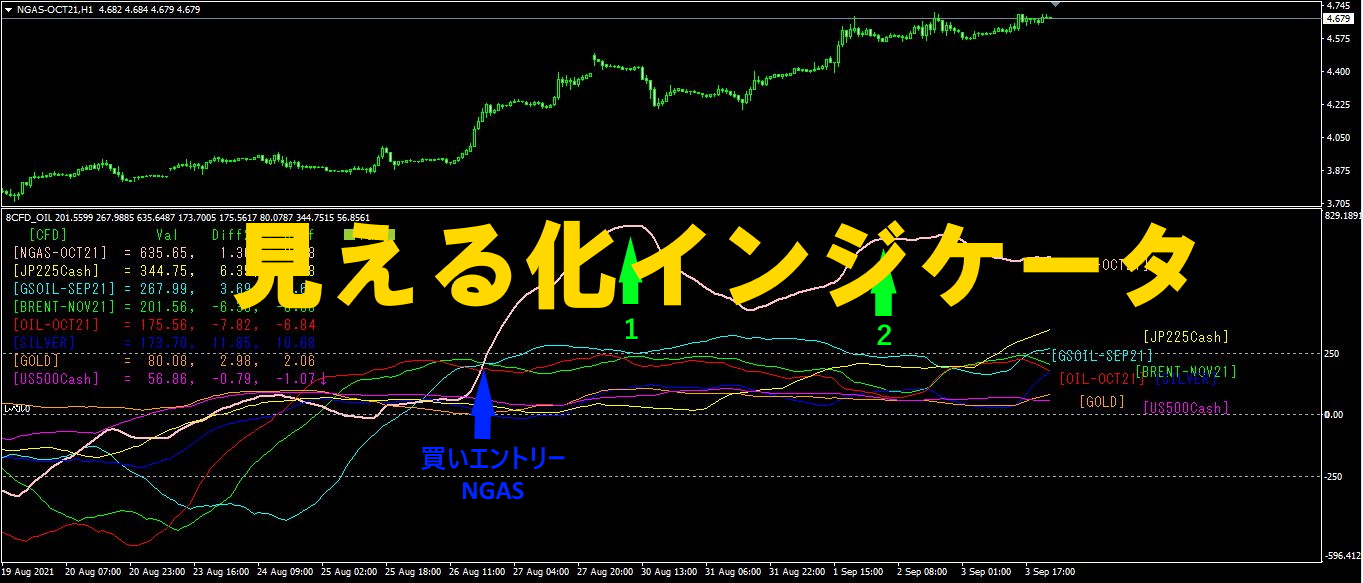
“8CP Visualization Indicator”to drawAUDUSD chart
The “8CP Visualization Indicator” includesOceaniaLondon version,NewYork version,AnyCP version. This time, we used theOceania version.
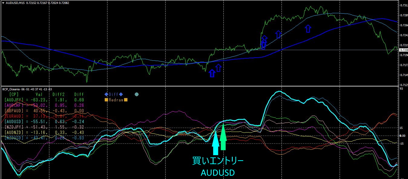
The top half is theAUDUSD 15-minute chart.
The upward blue arrows indicate the alert positions of the "28 Currency Pair List Indicator".
The bottom half is the, “8CP Visualization Indicator.” The light blue thick line graph corresponds toAUDUSD.
The alert from the “28 Currency Pair List Indicator” and the buy entry point from the “8CP Visualization Indicator” appear at nearly the same positions.1stDecember morning to1stJanuary night, if you held positions, you could have gained80~100PIPS of profit.
2. Best SelectTry the indicator
1January morning, displayed “28CP Best Select” indicator.
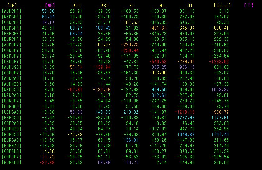
Because it was the weekend morning and price movement was low, for all 28 currency pairs the highest score did not exceed2000.
Overall, the display colors were inconsistent.
In such a case, the correct action is to not trade.
3. Best SelectIndicator (Advanced)
2. Then, when the “28CP Best Select” indicator’s display colors are not aligned, we decide not to trade. Now, how about the following scenario?
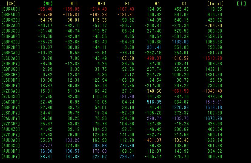
The above chart shows1January10 morning, 10:50, the instance that the “28CP Best Select” indicator was displayed.
’s5 minute chart,15 minute,30 minute,1 hour chart all in red. The hourly and daily charts are green. In long-term timeframes there is no trend, but in the short term a downtrend is occurring. Among 28 currency pairs, EURAUD shows the most pronounced decline in the short term, so entering a sell position here would be reasonable. If profitable, you should exit early as a trading tip.
The actual chart is as follows. The red arrows indicate the indicator display positions.
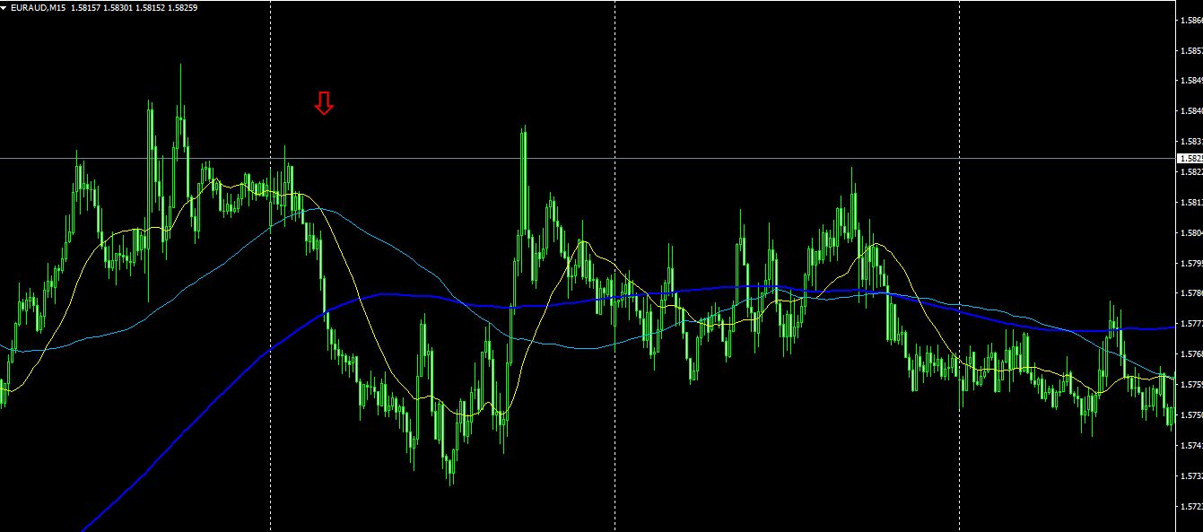
EURAUD has15 minute chart, the moving averages displaySMA20,75,200.SMA200 (blue thick line) is almost horizontal and lacks a clear direction. Not a clean chart, generally hard to trade. Even in such market conditions, the “28CP Best Select” indicator can isolate sharp declines and allow selling trades. Of course, if you gain40pips, you’ll exit with profit.
4. From May last year to now, what happened with EURJPY?
Since May 2021, we have been tracking EURJPY’s movement.
To view the overall trend, we draw roughly 3 weeks of the most recent 30-minute charts.
Previously, it was written as follows.
The move continues to rise.1January day200SMA breakout would have been a good buy. The strength of the rise seems to have weakened somewhat。
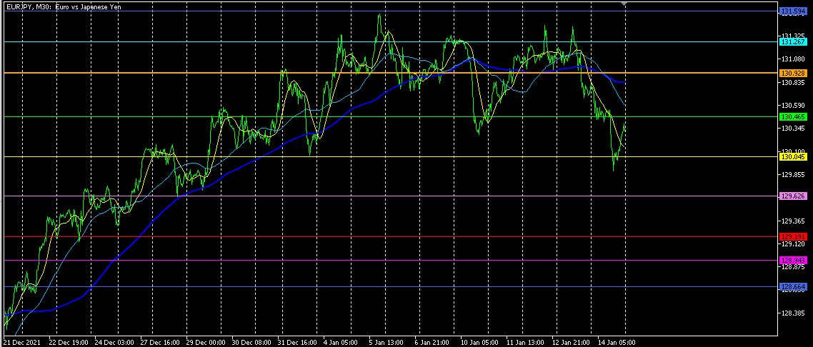
The uptrend is ending, and from here it will likely move downward. Wait for a pullback to sell and take selling trades.
【My Products for Sale】