
What is a Day/Night Chart ... [Basics of Day/Night Chart (1) - 8 Parts]
Chart Screen Structure

One of the components for the bottom-to-top chart is RCI(in the middle of the screen layout)
RCI (Rank Correlation Index) is called the “rank correlation coefficient.”
It assigns a rising rank to closing prices over a certain period and expresses its correlation with the number of days in that period as an index
and explains the timing and moment when the upward or downward trend begins
Please look at the next chart.

This is the 1-hour USD/JPY chart for August 2016.
When displayed with the general RCI settings (parameter = 9), it looks like the above,
and as such, it is only of reference and not very useful.
So, how about the next chart?

It's the same chart at the same time, but the convergence points of the RCI line nearly coincide with the high-low turning points of the candlestick,
so I think you can understand at a glance where the turning point is.
RCI itself is a traditional, commonplace indicator, and when shown as a single line, it visually captures only the flow to some extent, but
if you overlay around ten lines, it becomes significantly more intuitive and visually obvious without needing reasoning to identify turning points.
From the visually perceived features, compared to other classical indicators that also have frequent false signals such as MACD and RSI,
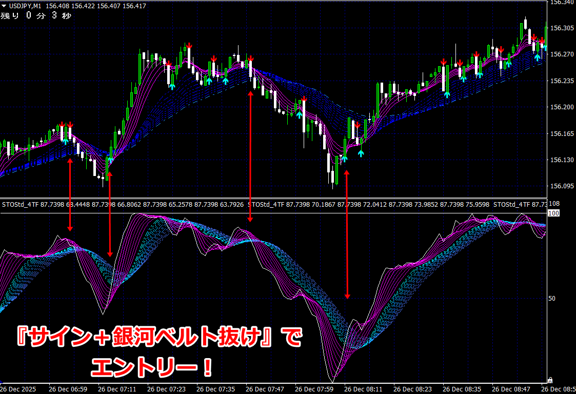
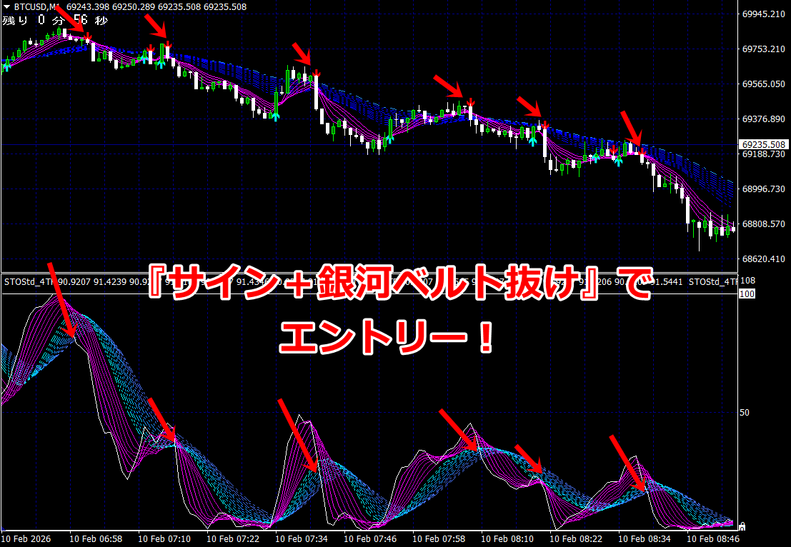
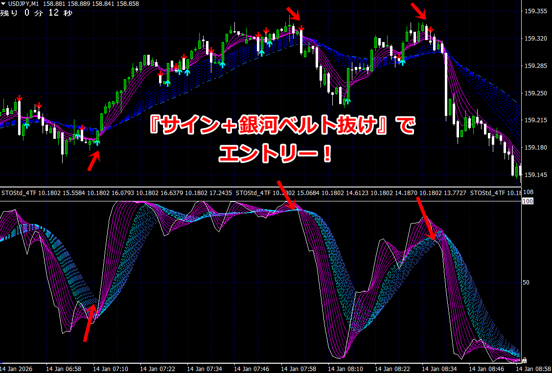
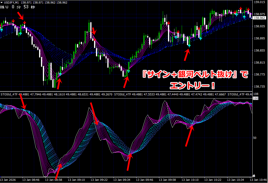
RCI has a characteristic that at market turning points, the slow RCI line and the fast RCI linealways intersect in a regular manner at the turning point,
that is, when rising from a bottom, the fast RCI line overtakes the slow RCI line.
As shown above, by changing the RCI parameters and taking about ten types for overlaying,
at clear rising or falling turning points, the convergence resembles the exact convergence of a Mobius strip
in whichmultiple bundles densely converge to the lower or upper bound to indicate a turning point.
In mild, small market turns, multiple lines are spread apart, and especially the slower RCI does not fully reach the upper or lower bound,
and drifts gently. In other words, by looking at the slow curve, you can roughly estimate which stage of the uptrend or downtrend the market is in.
which milestoneand you can roughly estimate which milestone of the uptrendand the downtrend you are in.
And when all RCI lines converge to the upper and lower limits at a single point, you can use it for high-accuracy timing analysis of turning points.
However, the only caution when using RCI is that during strong uptrends there is a tendency for prices to rise steadily, causing the RCI to stick to the upper limit smoothly (the opposite during strong downtrends).
This makes judgment difficult. This can be mitigated by changing to a higher time framewhere it stays flat at the upper limit (and vice versa in downtrends).
Another method to compensate for this without changing the time frame is to use a more emphasized
technical indicator,Stochastic.
Stochastic is also a fairly common indicator, but like RCI, when overlaid with around ten lines,overlays make it possible to see turning points in real time visually without needing reasoning.
Please look at the upper figure. As mentioned earlier, RCI tends to stick to the upper bound, but the stochastic does not stick as much; by comparing both indicators simultaneously, judgment of tops and bottoms becomes easier.

Furthermore,
by aligning with a higher time frame chart and displaying it simultaneously, you can supplement the judgment.
Of course, these two indicators cannot guarantee 100% accuracy. However, by mastering the density of multiple lines of RCI and stochastic overlays, you will surely gain a key to effective timing.
At the very least, stacking other classical indicators will not yield as much effect.
The same concept applies to moving average lines as well.
In the bottom-to-top chart, rather than the usual method of using moving averages (such as 5-day, 25-day, 75-day), we still use overlays of more than ten lines.
Overlaying multiple moving averages produces similar “convergence” and “divergence” patterns as RCI and stochastic, making turning points easier to visually identify.
Using these three chart components together can further improve the reliability of identifying turning points.
In short, the bottom-to-top chart can be summarized as
‘A bundle of multiple RCIs and stochastic lines converge at the lower bound,and after crossing,they begin to diverge upward,and when the candles appear above the moving average band,
it indicates a buying signal (uptrend).Sell/short when candles appear below the moving average band.
Conversely, when the bundles of RCI and stochastic converge at the upper bound and diverge downward after crossing,they indicate a selling signal,and when candles appear below the moving average band,
these indicate a bearish signal (downtrend).,
This is a chart that is easy to understand visually.
Even though it seems simple, applying the moving average filter makes it more accurate.
The key points of technical analysis are to have turning points that are clearly visible, with few false signals, and timing that is not delayed.
Among many classical technical indicators, the combination of multiple RCIs and overlays of stochastic is markedly more effective, and I can say this with confidence.
Next, to be continued in [Foundations of the Bottom-to-Top Chart II].
┏━┓
┃★┃ Watch the video of the ‘Bottom-to-Top Chart MT4’
┗━┻━━━━━━━━━━━━━━━
Where exactly do the signals appear?
→ I conducted a backtest.