Jojo Jyo's Rising Ideism ~ How to Read the Sparkling Chart Gradient: Practical Application ~
Hello.
I am Akiko Shiro, the Kirameki Chartist.
This article quotes material that was published on Ameblo on October 28.
The blog also posts daily trades, so please take a look.
The blog is here ↓
https://ameblo.jp/bikabubikabu/
Today’s Nikkei Stock Average also reached an all-time high for the year.
Since it has been hitting year-to-date highs daily, the setting for the High-Price Breakout Stocks Investment Method is very active even in Troste.
Now, the rising stock 7748, 7748 Holon
Daily chart
From August 14 to October 28, let’s view the period with the Kirameki Chart.
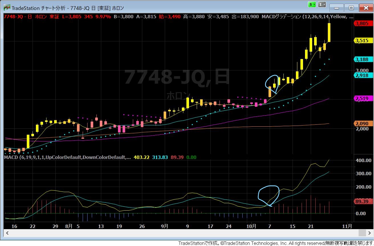
As I mentioned at a recent Monex Securities-hosted venue seminar,
when checked on the daily chart, you enter at the point marked in blue,
and furthermore, on the weekly chart
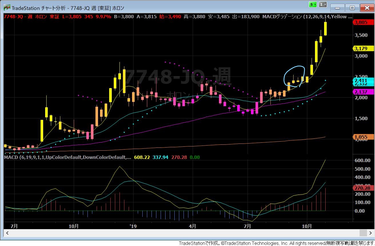
you can enter at the blue-marked point
In the Kirameki Chart, the entry point is clear.
And originally, looking back over the past, from where did the entry into Holon begin?
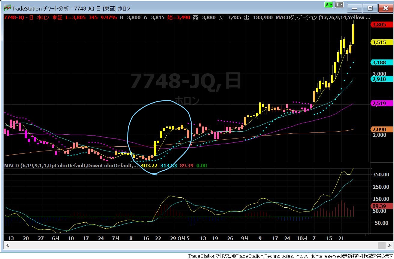
On the daily chart, entry begins from the blue-marked area.
If you’ve been following the blog, you’ve probably been watching since this time.
※ Here, an advanced edition of viewing the Kirameki Chart will be introduced!!
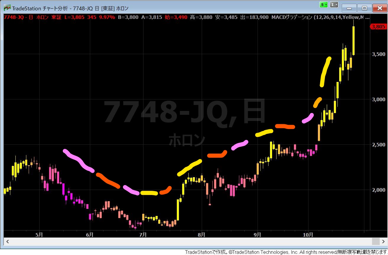
Pay attention to the MACD gradient
Generally speaking, roughly, the order is pink → orange → yellow → orange → pink,
if you trace Holon’s color, it goes pink → orange → pink,
in this case, even if yellow appears next, you should note that for the long term yellow does not appear and it either pulls back or moves sideways for a bit
As in the current rise, when yellow continues for a long time, it indicates a beautiful gradient is in place.
I hope you will take this one point as a reference for the future.
Well, I’ve recorded another video, so I’ll update that as well.