
This is a question. What is the difference in this chart?
Talk in consulting.
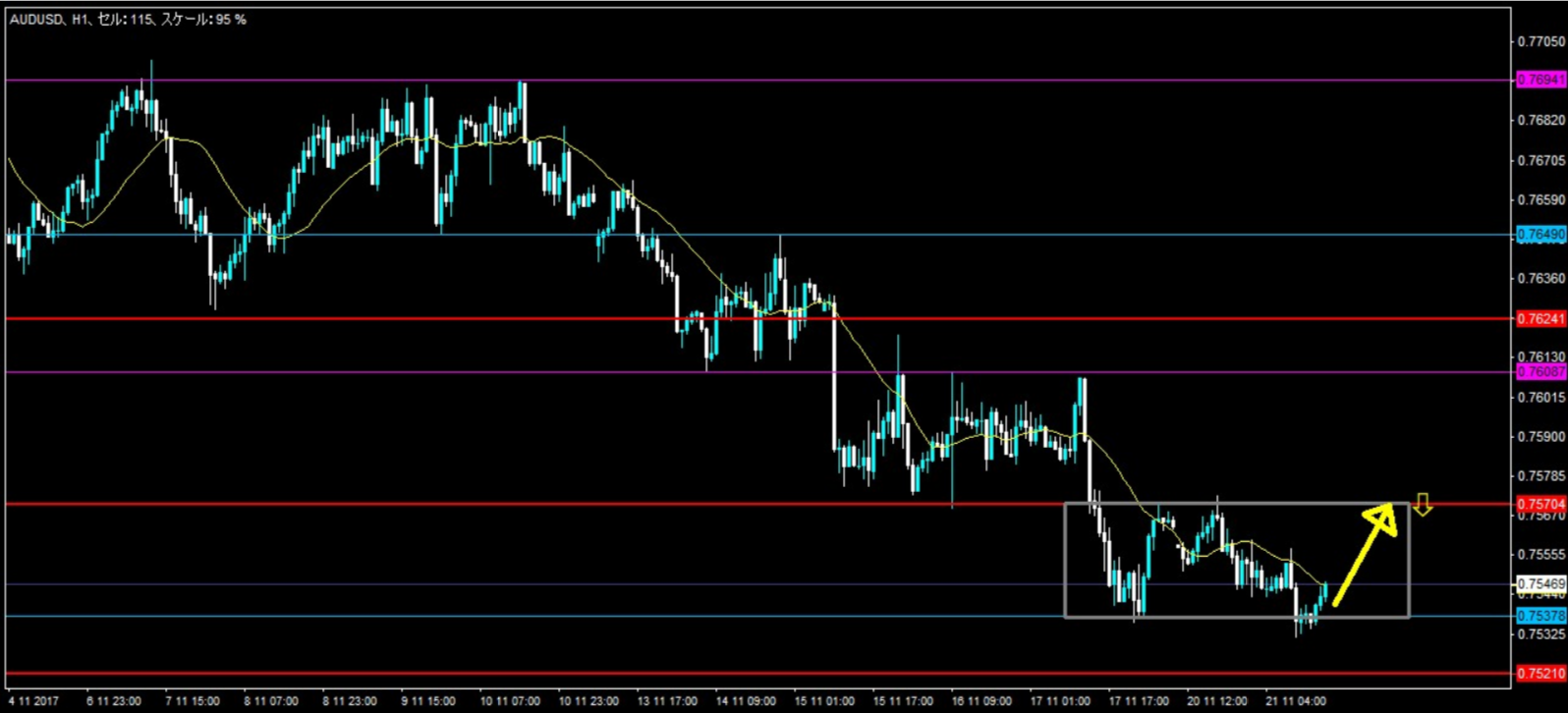
Buying from the bottom (yellow arrow). Image ①
In the trade journal correction, I said this was NG.
However, the person who made this trade says that before, in the same pattern, entry was OK.
Image ②
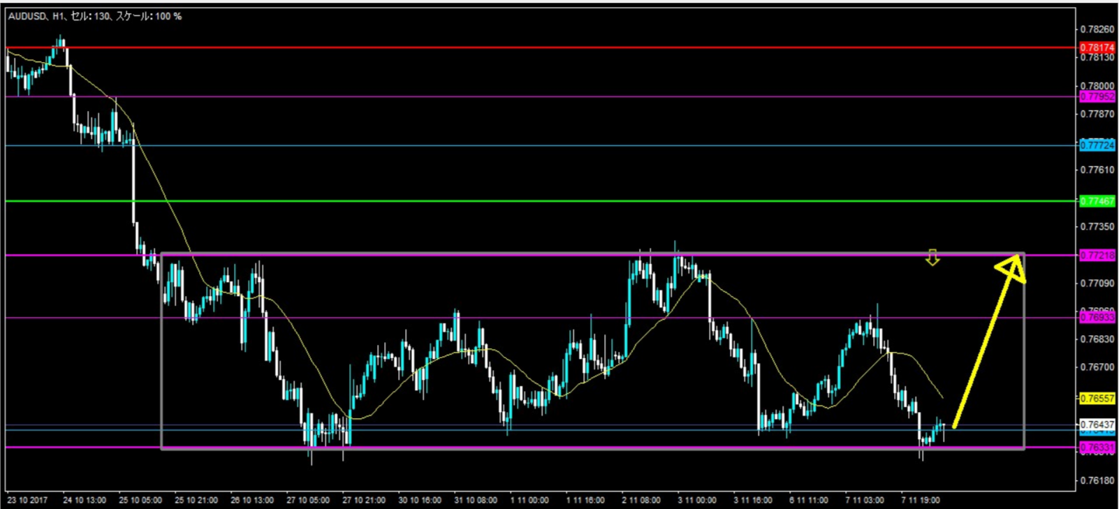
To me, the charts in images ① and ② look completely different.
To be able to recognize it differently means I am receiving more information.
Although we should be looking at the same chart, one person says it is the same, another says it is different.
It seems like everyone is trading while looking at the same chart,
but in reality, each is trading on a completely different chart.
What are the differences between the two charts above?
× ![]()