Utilization of the "Visualization Indicator" (No. 270)
“Visualization Indicator” utilization(Part270)
1. Further evolving the “28Currency Pair List Indicator” into the indicator
“8CPVisualization Indicator”toAUDUSDdraw
The “8CPVisualization Indicator”hasOceaniaedition, Londonedition, NewYorkedition, and AnyCPeditions available.This time, we used the Oceaniaedition.
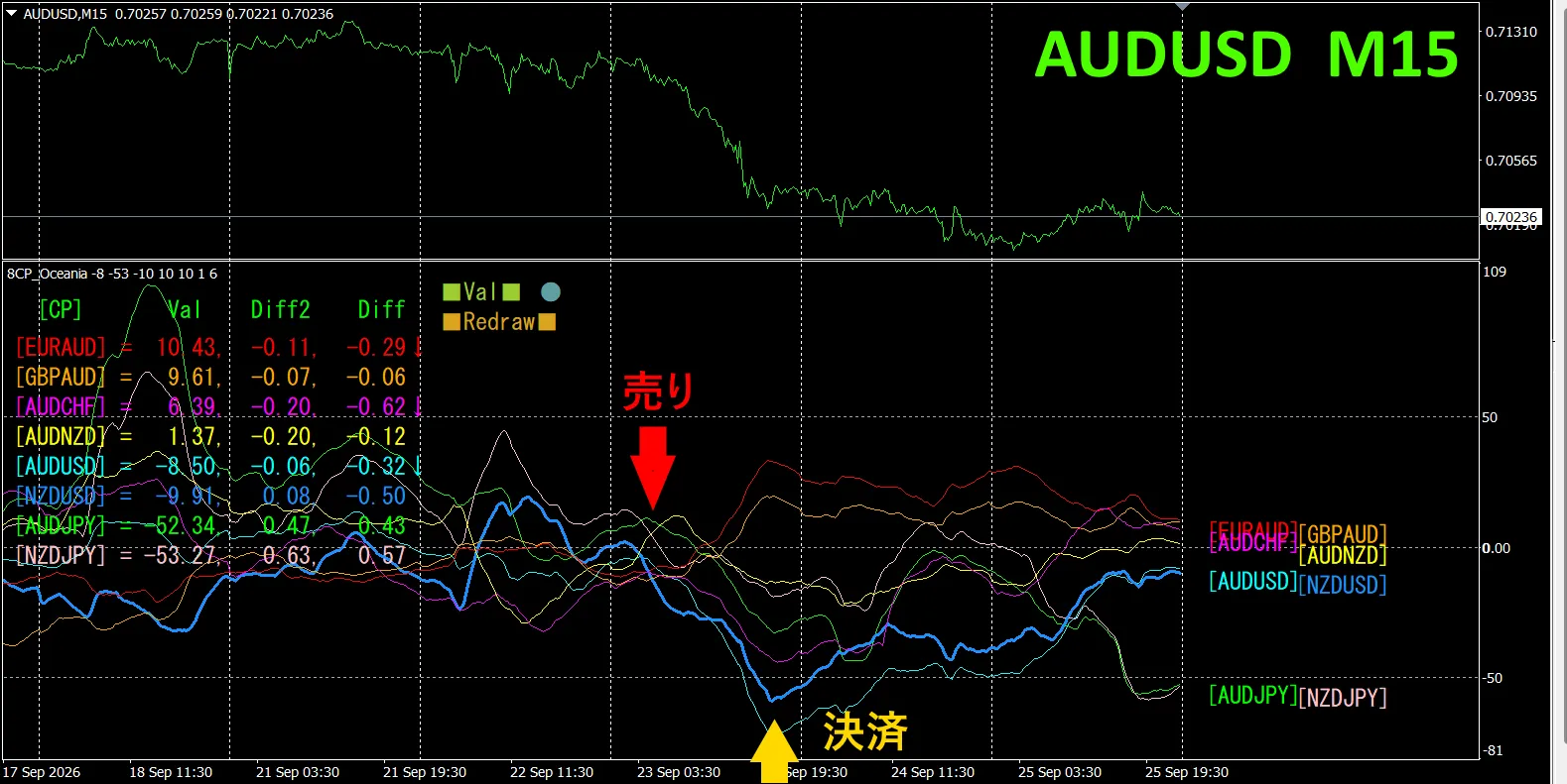
The top half isAUDUSD15-minutechart.The bottom half is by the “8CPVisualization Indicator”.Thethick blue linegraphcorresponds toAUDUSD
On Wednesday, the AUDUSDgraph broke downward out of the cluster of other graphs,so we opened a sell position.We closed at the day’s bottomabout75pipsprofit was obtained.
Currency strength/weakness graph
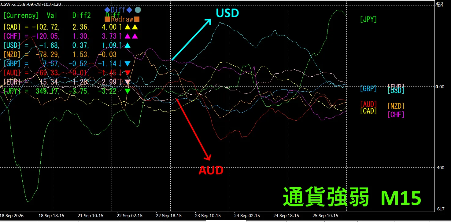
Looking at the15-minuteUSDandAUDare,in an inverse correlation relationship.USDandAUDare diverging and spreading apart—we only trade in those sections. AUD < USDso,during divergencesell AUDUSDtotrade and that’s fine.Because of the inversecorrelationrelationship,we aim only for those points and trade.
In FX,if you choose and trade the pairthat is currently stretching the most,and is inversely correlated,the results will naturally follow.
“Aim for inverse correlation in currency strength/weakness!”isan iron ruleof FX.
If you use “TrendLine-EX”,you can automate entries and exits on diagonal trendline breaks.You can leave it running as is,makingtradingeasy. “TrendLine-EX”isasemi-automated EA,that can auto-sell on trendline breaks downEAand auto-exit on breaks up.
2. Try using the Best SelectIndicator
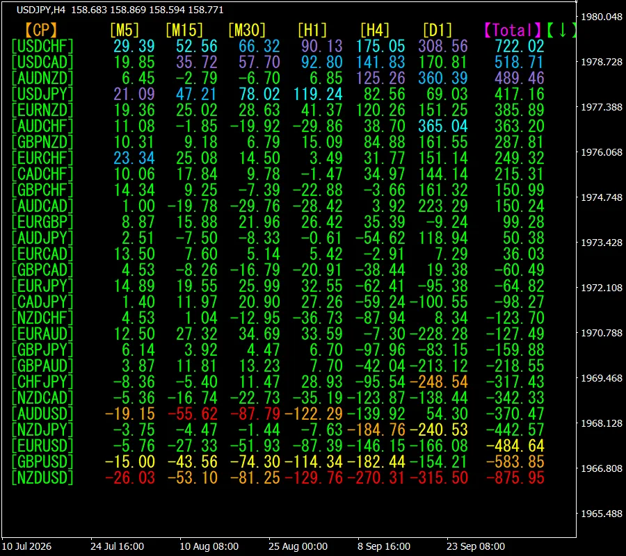
Thefigure below is a screenshot taken on2026September24,23:31.(JST) .
[Total]is sortedin descendingorder by value.At the top,USDCHFis,in all timeframesshown in blue tonesin display color. Totalvalueis722.02andit’sa positivenumber.USDCHFissuggestedto havean uptrend occurring.
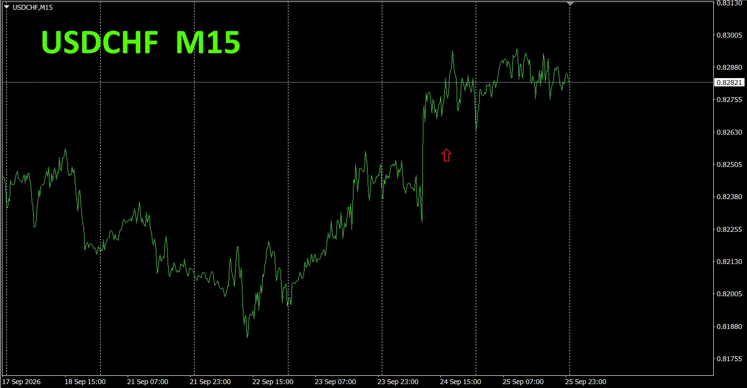
Now,let’s look attheUSDCHF chart.
The red arrow marks where the screenshot was taken.In the middle of the uptrend,itcaptures a point extending upward. “28Currency PairBest SelectIndicator”can,among the 28 currency pairs, identifywhich currencyis experiencing the strongest trend with ease.
The “28Currency PairBest SelectIndicator”can,among the 28 currency pairs,easily identify which is trending the most.Also,“28Currency PairDeviation ComparisonIndicator”will,among the 28 currency pairs,tell youwhich pair has the greatest deviation.From all pairs,you can instantly judge which pair to trade—an excellent indicator.
“28Currency PairBest SelectIndicator”

https://www.gogojungle.co.jp/tools/indicators/35128
3. Since2021Maywe’vebeen followingEURJPY—what happened to its movement?
Since2021May,we’ve been followingthe movement of EURJPY.
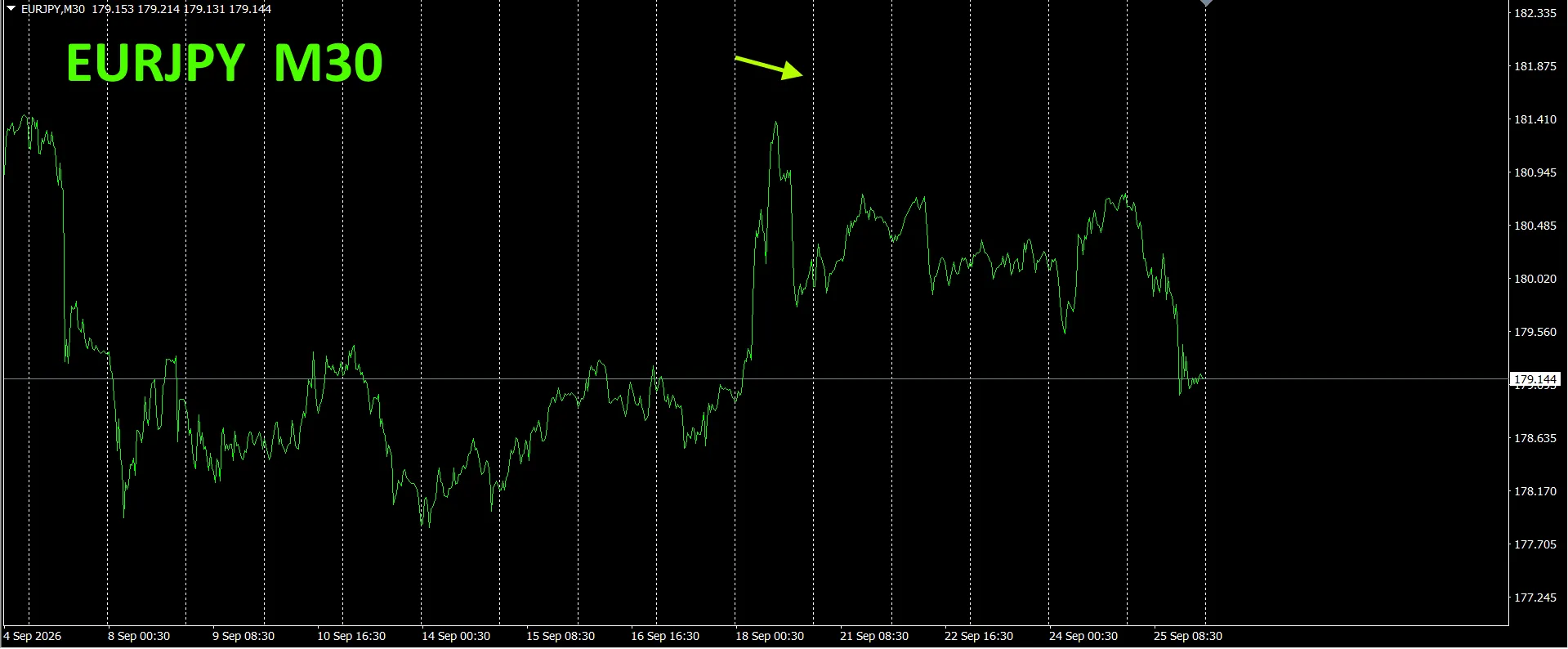
To see the overall flow,we plotted about the most recent3weeks on a 30-minute chart.
Last time,we wrote the following.
Pinkis EUR,greenis JPY.EUR’svector is pointing slightly downward from horizontal, JPYis pointing up on a rebound from the bottom.From the currency strength chart, EURJPYis expected to decline going forward.
EURJPY thenmoved with a downward bias as if capped.
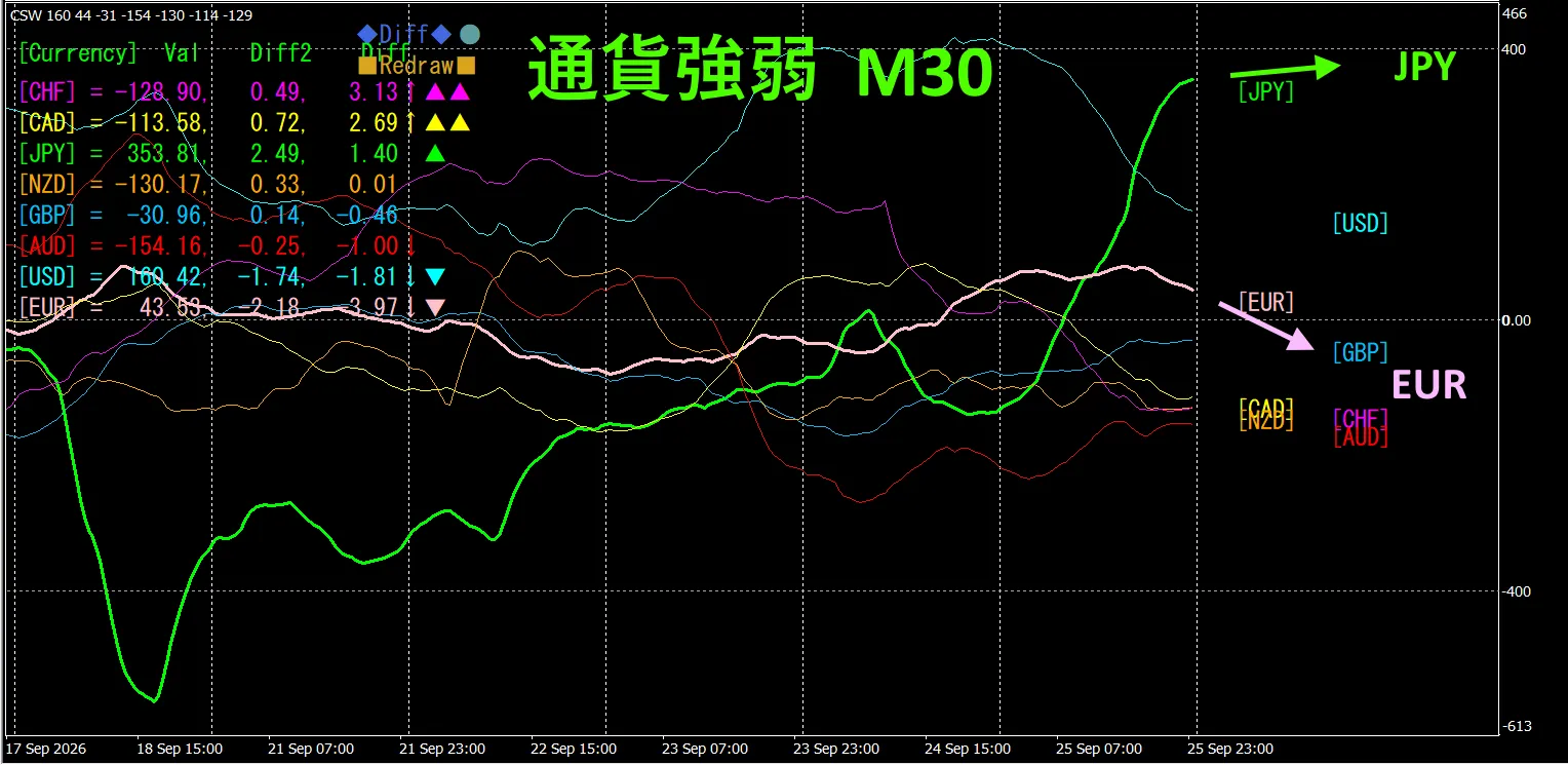
This is the30-minute currency strength chart.
Pinkis EUR,greenis JPY.EUR’svector is pointing downward, JPYis pointing slightly upward from horizontal.From the currency strength chart, EURJPYis expected to head further downward.
4. Tried using the new indicator Dual_MACD_Trend_Indicator
See the new indicator “Dual_MACD_Trend_Indicator” below.
MT4edition:https://www.gogojungle.co.jp/tools/indicators/62199
MT5edition:https://www.gogojungle.co.jp/tools/indicators/62202
This indicator clearly shows trend direction with colors.If the color bar isLimeit’s buy, Redit’s sell,making it easy to understand and use even for beginners.Green bars indicate an uptrend,red indicates a downtrend,and no color means no trend.With color display,you can grasp the trend state at a glance.
We applied this indicatorto AUDJPYon the1-hour timeframe.
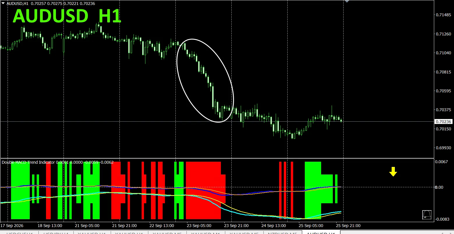
The sell-zone red,and the buy-zone green,are neatly separated,making trading easy at a glance.In the figure above,you just sell in the white-elliptical areas within the red regions.The long-termMACDslope is also useful.If the long-termMACDis sloping down to the right, sell,if it’s sloping up to the right, buy.
With “Dual_MACD_Trend_Indicator”,just follow the simple rule:buy in green zones,sell in red zones,and don’t trade otherwise.
By using “Dual_MACD_Trend_Indicator”,you’llno longer hesitate on trade direction.
Note,“Dual_MACD_Trend_Indicator”has been updated,with bar displayintwostages,and now shows the trend directions of the toptwohigher timeframes with arrows.
5. “Trend_Color_MA_MTF”hasbeen newlyreleased
From the sales page
“Trend_Color_MA_Dual_MTF”wasdevelopedto transform your trading.This tool is more than a simple moving average.It visualizes trend direction“with color”andalerts you the moment opportunity arrives“with sound”and“notifications”—your dedicated assistant,indeed.
As one example,on the AUDUSD1-hour chart, we simultaneously displayed the4-hour moving average.
The jagged, stair-like lineis the4-hour moving average. 1-hour MAand the4-hour MAbothdisplay in blue tones when rising,and in red tones when falling,so you can identify at a glancethe current chart’s trend directionandthe higher timeframe’s trend directionby color
When the higher timeframe and the current timeframe colors align,trade sell if red-toned,buy if blue-toned.
For sells,1HMAredand falling, 4HMAisorangeand falling—sell there.
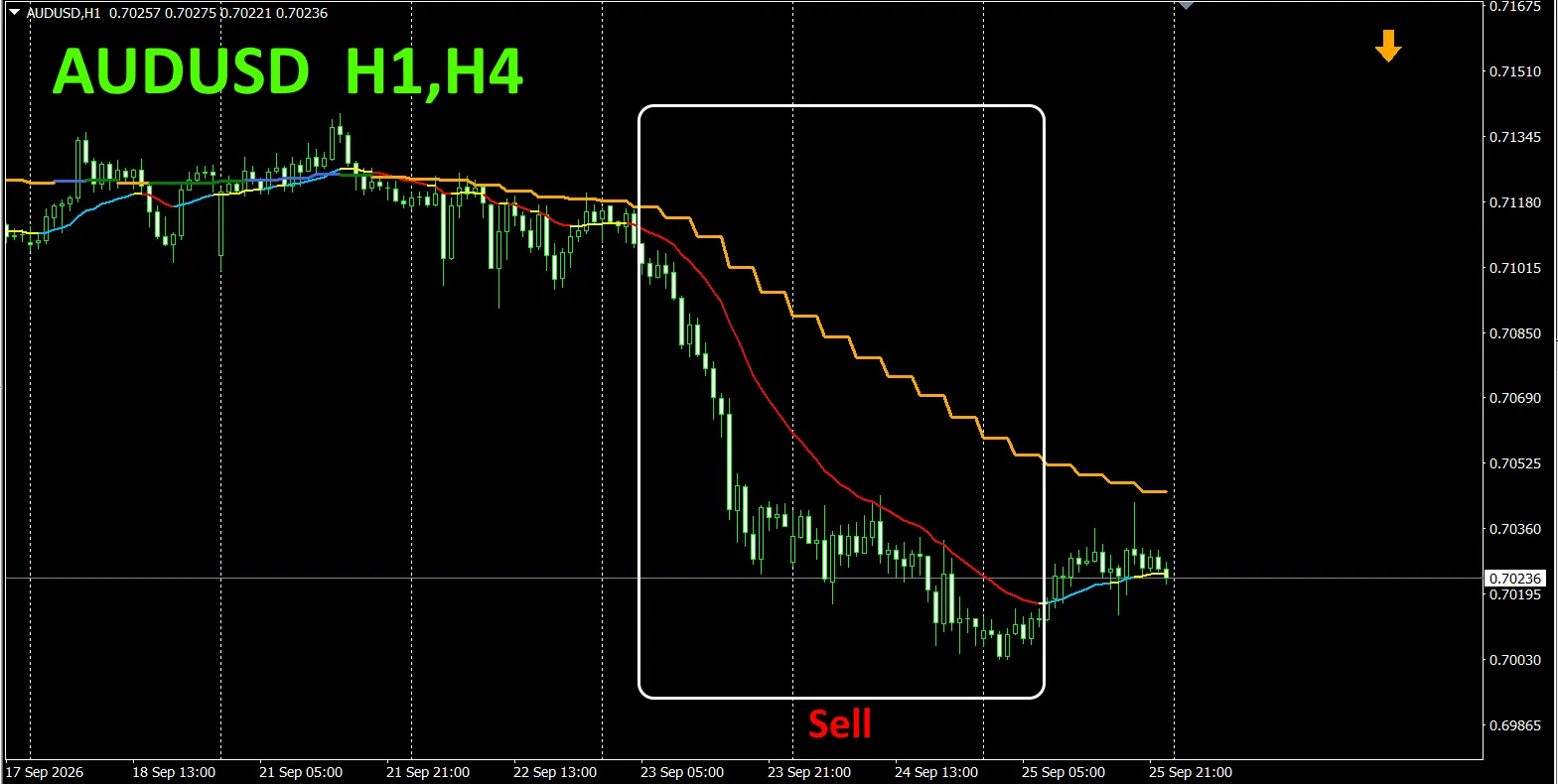
In the figure above,focus on the white boxed areas and trade sells.
For details,please see the following link.
https://www.gogojungle.co.jp/tools/indicators/75985
“8CFDVisualization IndicatorAnyedition”
https://www.gogojungle.co.jp/tools/indicators/32288
“Toretore Indicator”
https://www.gogojungle.co.jp/tools/indicators/50115
“TrendLine-EX”
https://www.gogojungle.co.jp/tools/indicators/42257
“8CCurrency Strength Visualization Indicator” pleaserefer to the following page.

MT4edition https://www.gogojungle.co.jp/tools/indicators/39150
MT5edition https://www.gogojungle.co.jp/tools/indicators/39159
[My listed products]