

[Practice] The "Histogram Shape" I Observe in Binary
Hello, I’m your wife.
In previous articles, I wrote about the tool my husband is building and how I actually use it in binary options.
This time, I’d like to be a bit more specific,
“Exactly which parts of the chart do I look at?”
I’m going to write about that.
I’m not performing difficult analyses as a trader.
Rather, what I’m conscious of is the “shape” of the two histograms displayed underneath the chart.
I display these in the sub-window, and the knowledge comes from when my husband read Bill Williams’ books.
AO/AC alone is an oscillator you can trust enough to say the future can be seen.
What I was curious about was the “color” and the “shape.”
At first, I watched the color changes to green or red.
But after looking at charts many times,
“Even within green, the shapes seem different.”
“After this shape, the movement tends to continue?”
I started to think so.
For example, something like this.
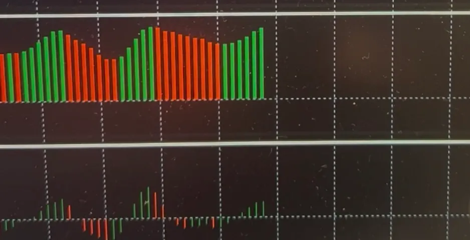
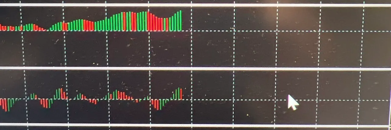
The top row is AO, the bottom row is AC.
In simple terms, AO has a greater influence than AC in the bottom row, and it’s reflected in the future candlestick movements.
As in the second photo, the AC in the bottom row changes from green to red.
I understand this as indicating a change in an uptrend.
However, even if this AC turns red, if the AO above is still moving up and green, the candlestick movements will still rise strongly.
A clear movement of AO and AC is shown in the first photo.
AO and AC are both rising and green.
If you come home and open your computer and see this situation,
you’re incredibly lucky.
It indicates that candlesticks tend to extend upward in the up direction.
After this, I lightly perform higher-timeframe environment checks, and if I’m convinced that it’s safe to enter, I’ll enter.
I’ll explain this higher-timeframe judgment method in another article.
For now, we’ll continue looking at this histogram.
The status of the next histogram.
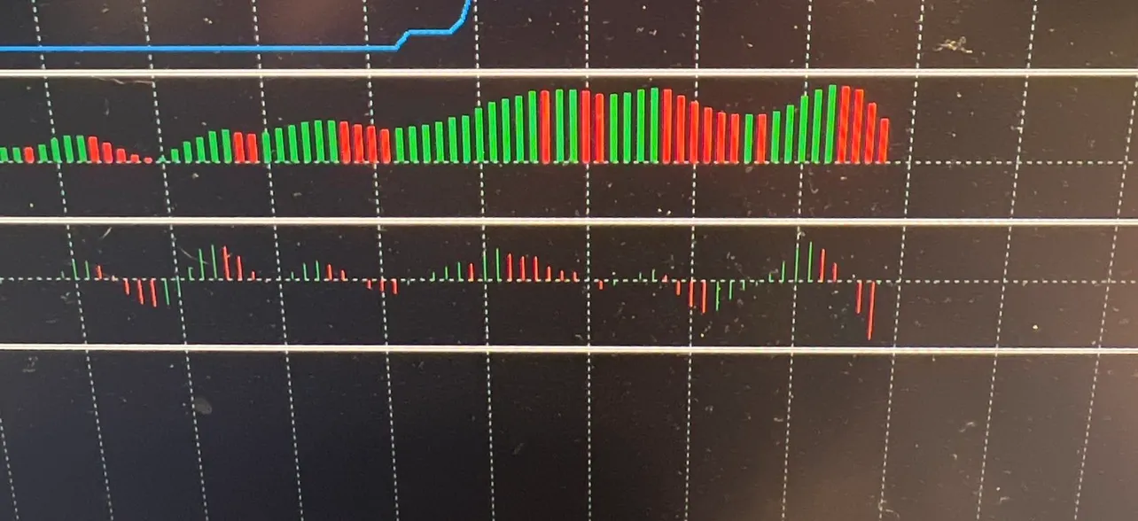
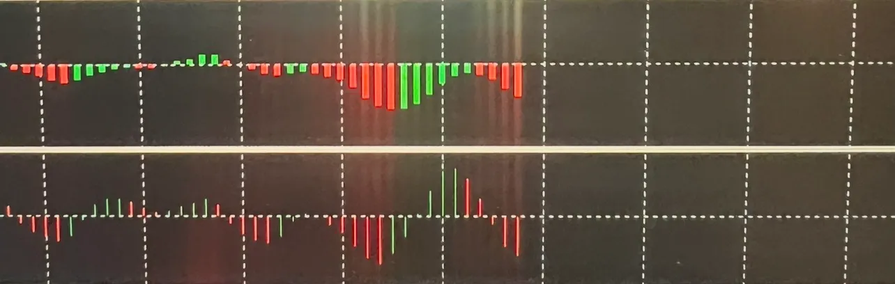
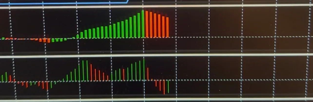
Sorry for the image being attached, but
★ Look at AO and AC in the topmost image.
Both AO and AC are red.
But AO is higher than the center.
This means the upward momentum is still strong, but in the short term there is a chance of a pullback.
Keep that in mind.
The AC bar is lengthening downward, so in a 1-minute chart there’s a high likelihood of two candlesticks extending downward.
★ The second image shows both AO and AC extending from around the same position toward below the center. This shape is ideal for a downward binary decision and would be a good shape to enter on a 5-minute chart.
However, even in such a perfect shape, checking higher-timeframes remains key to my logic.
What’s important to remember is that if this shape appears on a 1-minute chart, there can be many false signals, so higher-timeframe checks are essential, but it’s binary-friendly.
If this pattern in the second image appears on a 15-minute or 30-minute chart instead of 1-minute, it can be considered FX-friendly.
★ The third image is similar to the first image.
AO is red. AC was red, but one bar turned green and is rising. Since AO is above the center overall it’s upward, but recently there is also a downside. AC, conversely, shows a green line appearing and may go up in the short term.
Later movements where the green line of AC shortens and rises above the center, and AO’s current red line changes to green,
I would decide to enter.
Looking at the two directions together
From the three images above, it’s important to view the top and bottom together.
Meanwhile, the histogram is very easy to read, and as you gain experience, it becomes even clearer.The colors red and green and the direction (upward) are made easily readable at a glance.Do not rely on the top histogram alone for decisions.The upper histogram shows weakening momentum.Meanwhile, the lower histogram shows movement in the opposite direction starting to appear.When you spot this kind of moment,you think, “Is the flow going to change soon?”and you try to view the chart as a whole.Of course, this alone does not guarantee a reversal.This is a very important point.It’s even more interesting when viewed with the actual chartLet’s look at the overall chart screen.Above is the overall chart image.In the past, there have been five light-blue dot signs. After that, light-blue arrows,then three upward pink arrows appeared, and after that, the pin dot signs.AO is green but the line is flat. In addition, the line length is short, indicating weak trend strength, but a tendency to go up, AC shows a small red dot toward the bottom.The alligator is also gently upward.From these indicator analyses, the upward momentum is weak, but it’s acceptable to touch the pink solid line on the chart. Then judge whether a single bearish candle might appear.Well, this is also a common pattern in range markets.This is a very clean example of chart conditions.The indicators are fairly aligned.AO and AC are clearly rising together.Looking at the chart, alligator lines green, red, blue rise in order in an uptrend.If you were at home in this situation, you’d be very happy.It can be said to be in sync with the market.During good times, charts with this kind of clean pattern appear several times.That’s when you can win cleanly and smoothly.Note: the light-blue dot appearing is a negative element to keep in mind.When the pink solid line is touched by the candlestick, there is a possibility that the candlesticks extend downward.Looking at it this way,you can check both the histogram changes and actual price movement togethermaking it much easier to understand.In particular, I focus on“Is the bar longer?”“Is the bar shorter?”“What color is it?”“Are AO and AC both upward or downward?”and I watch these aspects.Lately, I also look at moving averages and the position of candlesticks together.Moving averages refer to the alligator, a term borrowed from Bill Williams.I’m not entering just because a signal appearsThis is the part I want to emphasize most in this article.I do not think,“Arrow appears = enter.”Even if a signal appears,“What is the current histogram shape?”“Is the momentum increasing or weakening?”“Where is the candlestick?”If there is a sense of incongruity, I skip it.Conversely,I only consider entering when several conditions overlap.That is how I use it now.Using the tool my husband built from a different perspectiveThe husband is the one who builds the tool.I am the one who actually uses it.What’s interesting is that the way the creator envisioned and the points I notice while using it do not always coincide.“This shape feels good.”When I say that, the husband asks,“Then why does it happen this way?”and checks the details.That’s what we’ve been doing lately.We’re still validating.That’s why I want to record not only the good moments but also the times when things don’t go well.I want to include those too. In the next article,“So what shapes would I actually consider entering?”I’d like to write more concretely.Thank you very much for sticking with me until the end!If you have questions about this indicator, please feel free to ask.Product PageThe product page for PW Indicators is here.https://www.gogojungle.co.jp/tools/indicators/85572※This article is a usage example and personal validation record. It does not guarantee profits or win rates. Please make your own final trading decisions.
The colors red and green and the direction (upward) are made easily readable at a glance.
Do not rely on the top histogram alone for decisions.
The upper histogram shows weakening momentum.
Meanwhile, the lower histogram shows movement in the opposite direction starting to appear.
When you spot this kind of moment,
you think, “Is the flow going to change soon?”
and you try to view the chart as a whole.
Of course, this alone does not guarantee a reversal.
This is a very important point.
It’s even more interesting when viewed with the actual chart
Let’s look at the overall chart screen.
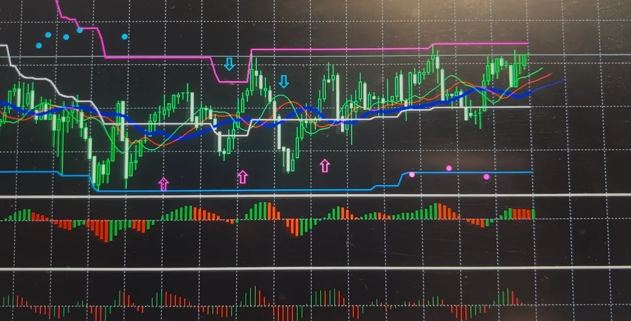
Above is the overall chart image.
In the past, there have been five light-blue dot signs. After that, light-blue arrows,
then three upward pink arrows appeared, and after that, the pin dot signs.
AO is green but the line is flat. In addition, the line length is short, indicating weak trend strength, but a tendency to go up, AC shows a small red dot toward the bottom.
The alligator is also gently upward.
From these indicator analyses, the upward momentum is weak, but it’s acceptable to touch the pink solid line on the chart. Then judge whether a single bearish candle might appear.
Well, this is also a common pattern in range markets.
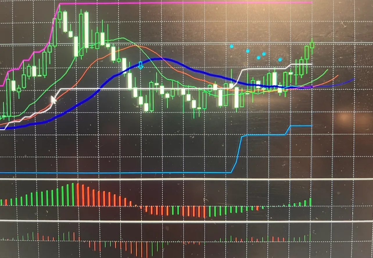
This is a very clean example of chart conditions.
The indicators are fairly aligned.
AO and AC are clearly rising together.
Looking at the chart, alligator lines green, red, blue rise in order in an uptrend.
If you were at home in this situation, you’d be very happy.
It can be said to be in sync with the market.
During good times, charts with this kind of clean pattern appear several times.
That’s when you can win cleanly and smoothly.
Note: the light-blue dot appearing is a negative element to keep in mind.
When the pink solid line is touched by the candlestick, there is a possibility that the candlesticks extend downward.
Looking at it this way,
you can check both the histogram changes and actual price movement togethermaking it much easier to understand.
In particular, I focus on
“Is the bar longer?”
“Is the bar shorter?”
“What color is it?”
“Are AO and AC both upward or downward?”
and I watch these aspects.
Lately, I also look at moving averages and the position of candlesticks together.
Moving averages refer to the alligator, a term borrowed from Bill Williams.
I’m not entering just because a signal appears
This is the part I want to emphasize most in this article.
I do not think,
“Arrow appears = enter.”
Even if a signal appears,
“What is the current histogram shape?”
“Is the momentum increasing or weakening?”
“Where is the candlestick?”
If there is a sense of incongruity, I skip it.
Conversely,
I only consider entering when several conditions overlap.
That is how I use it now.
Using the tool my husband built from a different perspective
The husband is the one who builds the tool.
I am the one who actually uses it.
What’s interesting is that the way the creator envisioned and the points I notice while using it do not always coincide.
“This shape feels good.”
When I say that, the husband asks,
“Then why does it happen this way?”
and checks the details.
That’s what we’ve been doing lately.
We’re still validating.
That’s why I want to record not only the good moments but also the times when things don’t go well.I want to include those too.
In the next article,
“So what shapes would I actually consider entering?”
I’d like to write more concretely.
Thank you very much for sticking with me until the end!
If you have questions about this indicator, please feel free to ask.
Product Page
The product page for PW Indicators is here.
https://www.gogojungle.co.jp/tools/indicators/85572
※This article is a usage example and personal validation record. It does not guarantee profits or win rates. Please make your own final trading decisions.