The use of “Visualization Indicator” (Part 266)
“Visualization Indicator” Utilization(Part266)
1. Further evolving the “28-Currency Pair List Indicator” into an advanced indicator
“8CPVisualization Indicator”todraw GBPAUD.
The “8CPVisualization Indicator”hasOceania version, London version, NewYork version, and AnyCP versions available.This time, the Oceania version was used.
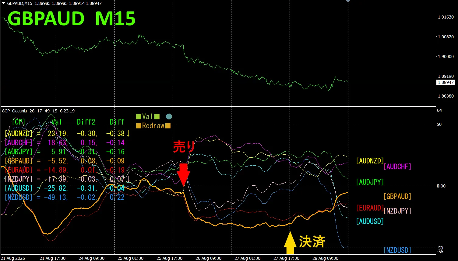
The upper half,GBPAUDis a15-minute chart.The lower halfis by the “8CPVisualization Indicator”,andthe thick orange linegraphcorresponds to GBPAUD.
On Wednesday, the GBPAUDgraphbroke below the other group of graphs,and started falling sharply,so we opened a sell position.On Thursday, it rebounded from the bottom, so we closed the trade.About160pipsof profit was obtained.
Currency strength chart
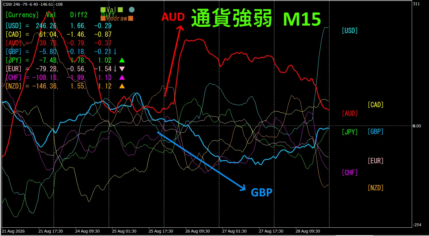
Looking at the15-minute currency strength chartAUDandGBPare,in an inverse correlation relationship.AUDandGBPWe only tradein the parts where they diffuse and spread apart. AUD > GBPso,when they divergesell GBPAUDtotrade and it will be fine.Because of the inversecorrelationrelationship,we target only those points for trading.
In FX,if you select the currency pair that is currently expanding the most,and is inversely correlated,the results will naturally follow.
“Aim for inverse currency strength correlation!”isan iron ruleof FX.
If you use “TrendLine-EX”,you can automate entries and exits with diagonal trendline breaks.You can leave it as is,makingtradingeasy. “TrendLine-EX”isasemi-automatic EA that can auto-sell on a trendline break below,and auto-close on a trendline break aboveEA.
2. Trying the Best SelectIndicator
Thefigure belowis a screenshot from 2026,Aug26,22:43(JST) .
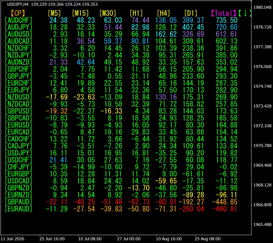
[Total]is sortedin ascending orderof values.The topAUDCHFhas,bluetones shownacross all timeframes. Totalvalueis735.50and,it is a positivenumber.AUDCHFis,suggested to be in anuptrend.
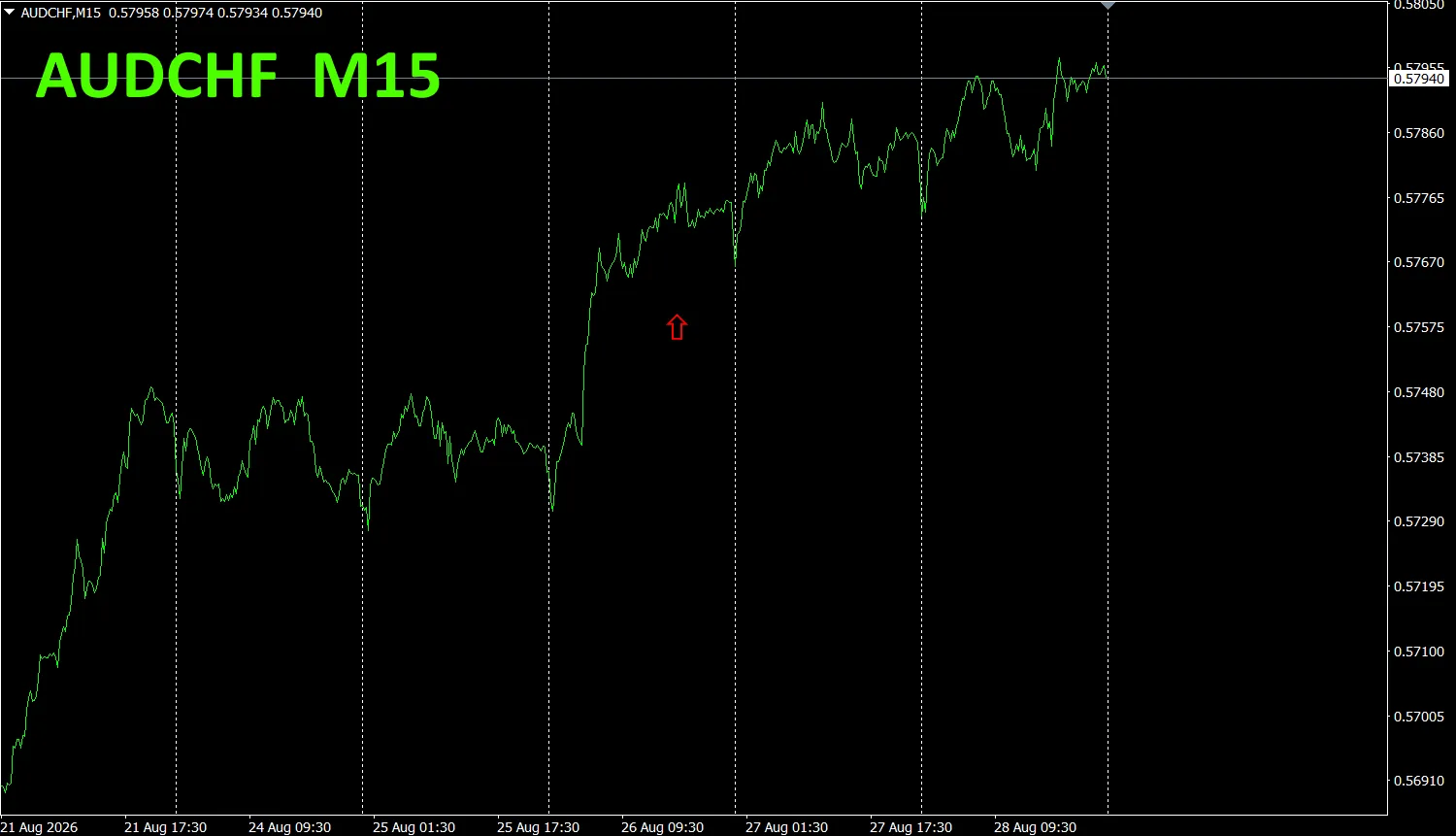
Now,let’s look attheAUDCHF chart.
The red arrow marks where the screenshot was taken.It clearlycaptures a part of the uptrend.
“28 Currency Pairs Best Select Indicator”can,among 28currency pairs,easily identify which currency has the strongest trend.Also,“28 Currency Pairs Divergence Comparison Indicator”will,among 28currency pairs,tell you thepair with the greatest divergence.From all currency pairs,it is an excellent indicator that lets youinstantly determine which pair to trade.
“28 Currency Pairs Best Select Indicator”

https://www.gogojungle.co.jp/tools/indicators/35128
3. How has the2021-May onward trackedEURJPYmovement turned out?
Since 2021,Maywe have beentracking EURJPYmovements.
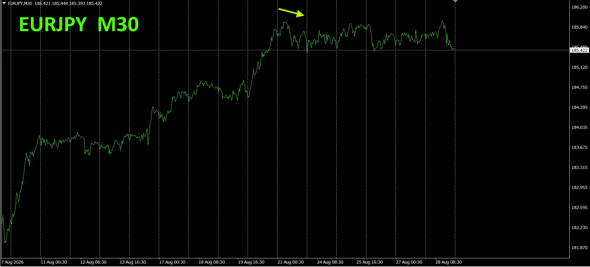
To see the overall flow,we plotted about the last3weeks on a 30-minute chart.
Last time,we wrote as follows.
Pink isEUR,green isJPY.The vector of EURis,slightly downward, JPYis slightly upward.From the currency strength chart, EURJPYis,expected to move with a slight downward bias.
The steady rise with an upward slope has stopped,and as predicted,the upside has been capped,and it seems to be trending slightly downward.
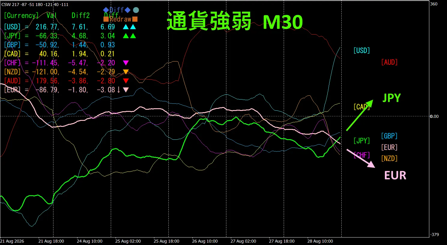
30-minute currency strength chart.
Pink isEUR,green isJPY.The vector of EURis,downward, JPYis upward.From the currency strength chart, EURJPYis,expected to move with a downward bias.
4. Tried using the new indicator Dual_MACD_Trend_Indicator
Please see below for the new indicator “Dual_MACD_Trend_Indicator.”
MT4version:https://www.gogojungle.co.jp/tools/indicators/62199
MT5version:https://www.gogojungle.co.jp/tools/indicators/62202
This indicator clearly shows the trend direction in colors.If the color bar isLimeit’s buy, Redis sell,making it easy to understand and use for beginners.If the bar is green, it’s an uptrend,if red, it’s a downtrend,and if there’s no color, there is no trend.With color display,you can grasp the trend status at a glance.
The red sell zone and,the green buy zone are,clearly separated,making trading easy at a glance.In the figure above,focus on areas where the rate moves up and down with a certain slope,sell in the white ovals within the red areas,and buy in the white ovals within the green areas.
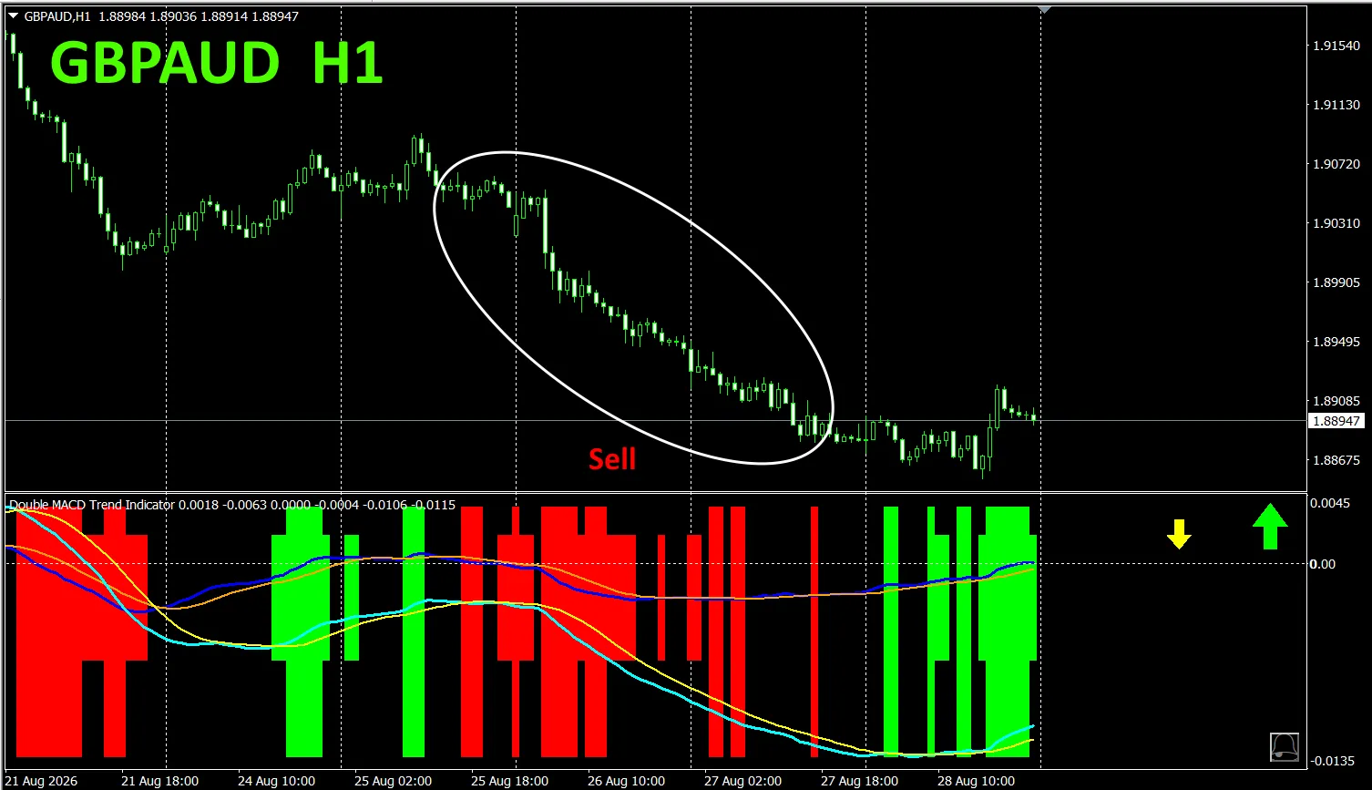
With “Dual_MACD_Trend_Indicator”,buy in green zones,sell in red zones,and do not trade otherwise—just follow this simple rule.
“Dual_MACD_Trend_Indicator”makes it so,you will no longer be confused about trade direction.
Additionally,“Dual_MACD_Trend_Indicator”has been upgraded,with bar displayintwolevels,and now shows the trend directions of the toptwohigher timeframes with arrows.
5. “Trend_Color_MA_MTF”hasbeen newlyreleased
From the product page
“Trend_Color_MA_Dual_MTF”wasdevelopedto transform your trading.This tool is more than just a moving average.It visualizes trend direction with“color”andnotifies you the moment“sound”and“alerts”signal an opportunity,acting as your dedicated assistant.
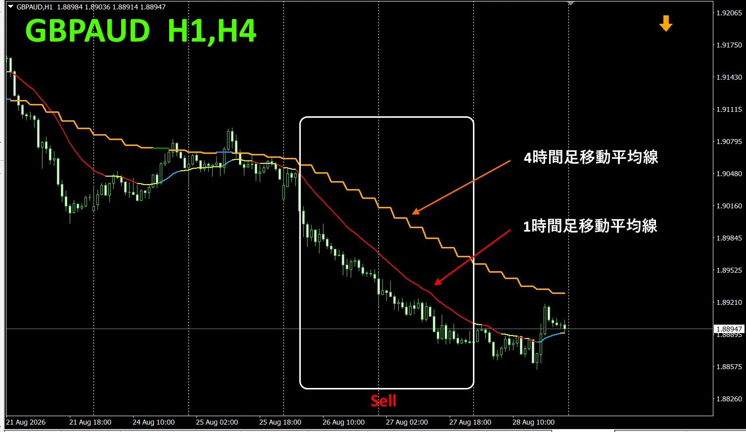
As an example,on GBPAUDthe1-hour chart, the 4-hour moving average was displayed simultaneously.
The jagged, staircase-like lineis the 4-hour moving average. The 1-hour moving averageand the 4-hour moving average,are shown in blue tones during rises,and in red tones during declines,sothe current chart’s trend direction andthe higher timeframe’s trend direction,can be identified at a glance by color.
When the higher timeframe and current timeframe colors align in the same tone,sell if red tones,buy if blue tones.
For sells, the 1-hourMAisredand falling, the 4-hourMAisorangeand falling—sell at that point.
In the figure above,focus on the white boxed areas and take sell trades.
For details,please see the following link.
https://www.gogojungle.co.jp/tools/indicators/75985
“8CFDVisualization IndicatorAny version”
https://www.gogojungle.co.jp/tools/indicators/32288
“Toretore Indicator”
https://www.gogojungle.co.jp/tools/indicators/50115
“TrendLine-EX”
https://www.gogojungle.co.jp/tools/indicators/42257
“8CCurrency Strength Visualization Indicator”is,please refer to the following pages.

MT4version https://www.gogojungle.co.jp/tools/indicators/39150
MT5version https://www.gogojungle.co.jp/tools/indicators/39159
[My listed products]