
Explain yesterday's USD/JPY in chronological order
2026 Latest Edition!!
You can watch the dialogue VTR with Gojozan President Hayakawa and me here
There is also a free gift.
This is information about new products!!

Please try reading the product information.
.
Good morning everyone.
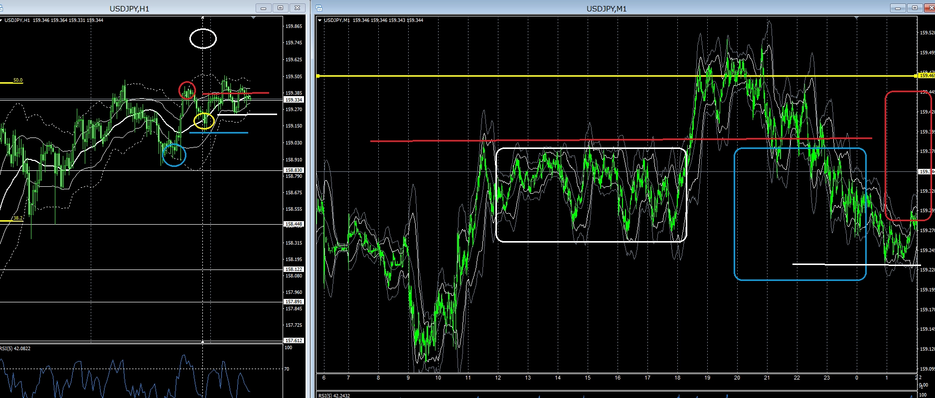
Yesterday's USD/JPY range was about 60 pips.
Generally, this is the typical range when there is nothing going on.
I think it might be okay to start on the day with that assumption.
USD/JPY 1-hour & 1-minute chart yesterday
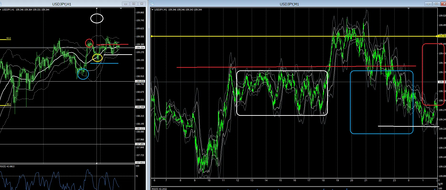
The left is the 1-hour chart, and I will explain it in chronological order.
The explanation also reflects how I always view the chart.
White circle indicates the time I wrote yesterday's article.
Yellow circle indicates the drop right after the Tokyo stock market opened.
Blue horizontal line is near 15900, so there might be a rebound rally.
However, looking at the red and blue circles, if it rises at yellow circle, it will exceed red circle; if it falls, it may break blue circle, forming a trend.
Definition of trend: higher highs and higher lows for an uptrend; lower lows and lower highs for a downtrend.
When you see yellow circle, there is probably no breakdown of blue circle, and I judged that as not; so I personally focused on an upward trend beyond red circle.
Blue-red horizontal line is the Tokyo time high-low range
From 3 PM onward, the Tokyo high reaching the red horizontal line suggests a selling image.
However, since there might be a break toward the red line aiming for red circle, if you hold an L position, cut losses and see how far it goes.
Alternatively, consider an L position breakout on a red horizontal line break.
Decide whether to sell at reaching red horizontal line or take the loss on an L breakout.
Result: breakout above
My stance is to watch how far it goes, but since it has crossed red circle, I’m anticipating a temporary pullback.
1-minute chart Blue □ zone: consider selling for huge profits.
Consider how far this drop will continue, whether it will break yellow circle.
As a result, it rebounded at the white horizontal line, but if you look at the last hour chart, you can interpret it as a rough support line.
However, it might drop further, so if the huge profit 1-minute chart turns to buy, seize the initial move by cutting losses below the most recent low and taking a long position.
As a result, it rose about 20 pips and then closed in New York to the present.
This is roughly the kind of analysis, and I always view the chart in this way.
The key is from what time I participate, so I check the past chart up to the most recent highs and Tokyo highs and lows.
The main thing I focus on is whether the trend will continue.
I imagine how the highs and lows will be updated and set up a position scenario.
Today, after returning home, how about viewing it in this way?
For huge-profit or unusual hedgers, I think it will clear your mind quite a bit.
Thank you for your continued support today as well.
Anyway, for traders who want to succeed in trading, to make a living, this is my recommended product, a self-taught trading technique that can be learned here ↓