Use of "Visualization Indicators" (No. 265)
“Visualize Indicator” utilization(its265)
1. “Currency Pair List Indicator” to further evolve into an indicator
“8CP Visualize Indicator” for USDCHF chart
“8CP Visualize Indicator” includes Oceania version, London version, NewYork version, AnyCP version. This time, we used the NewYork version.
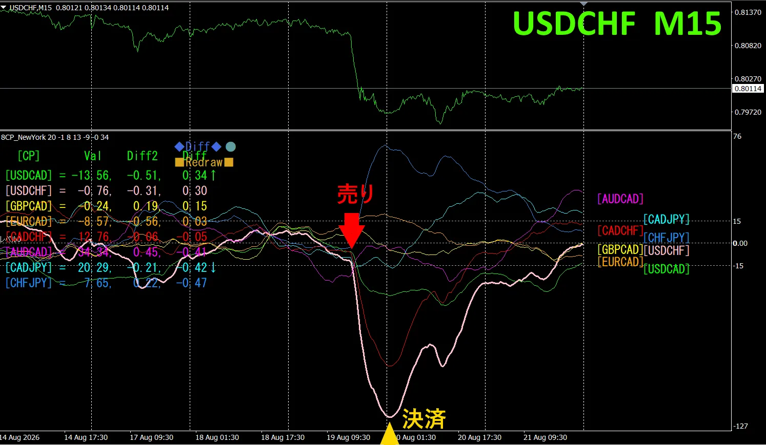
The upper half shows USDCHF 15-minute chart. The lower half is from the “8CP Visualize Indicator.” The pink bold line corresponds to USDCHF.
On Wednesday, USDCHF’s chart fell sharply, so we sold. We settled at the day’s low, earning about 100 pips of profit.
Currency Strength/Weakness Graph
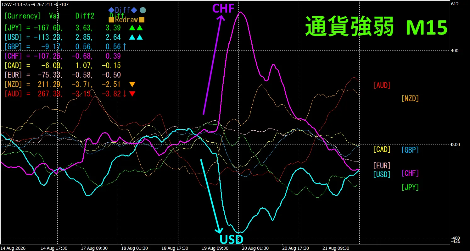
Looking at the 15-minute currency strength chart, CHF and USD are in an inverse correlation. We trade only in the spreading sections where CHF > USD, so when the spread widens we can sell USDCHF, given the inverse correlation. We trade only at that point.
In FX, you pick the currency pair that is currently expanding the most and has inverse correlation, and the results come naturally.
“Aim for currency strength inverse correlation”
If you use “TrendLine-EX,”
2. Try Best Select
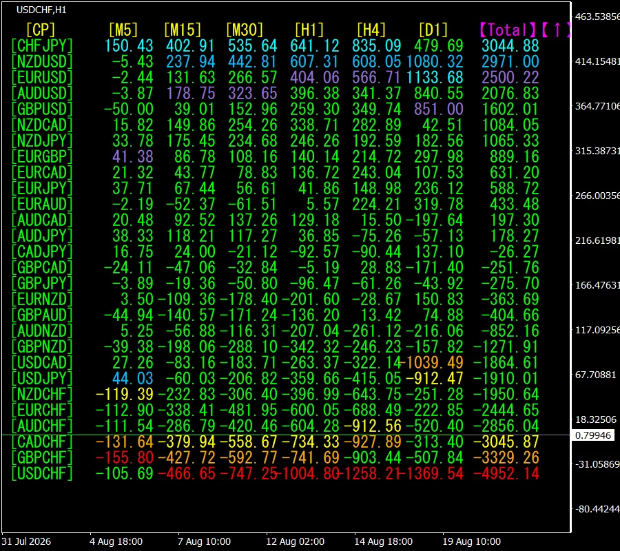
The lower figure is a screenshot as of 2026 year 8 month 20 day 00:43 ( JST ) screenshot.
[Total] is sorted in ascending numerical order. The top CHFJPN is [ Daily chart ]. All other timeframes display in blue tones. The Total value is 3055.88, a large positive figure. It indicates a rising trend for CHFJPY.
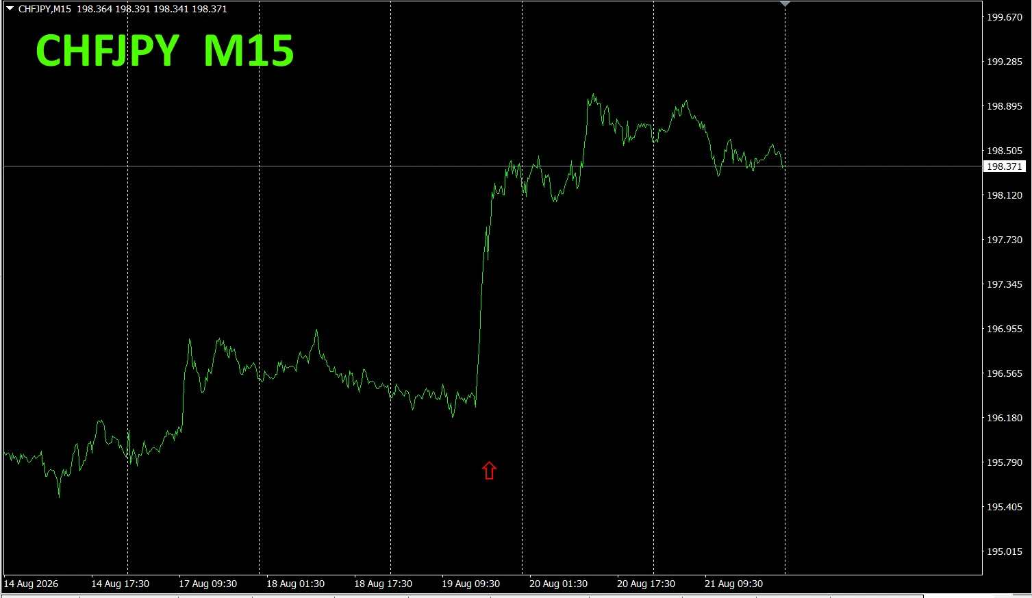
Now, let’s look at the CHFJPY chart.
The red arrows mark the capture point of the screenshot. It captures the rising segment.
“28 Currency Pairs Best Select Indicator” allows you to easily identify which of the 28 pairs has the strongest trend. Also, “28 Currency Pairs Deviation Comparison Indicator” tells you, among the 28 pairs, which pair has the largest deviation. It’s a superior indicator that lets you quickly decide which pair to trade across all pairs.
“28 Currency Pairs Best Select Indicator”
https://www.gogojungle.co.jp/tools/indicators/35128
3. From May 2021 onward, how has EURJPY moved?
We have tracked EURJPY since May 2021.
To view the overall trend, we chart roughly the last three weeks on a 30-minute chart.
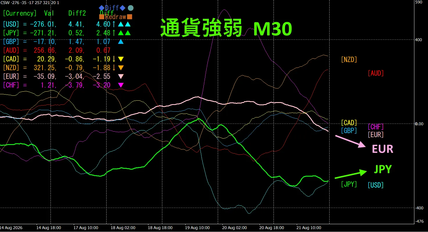
Last time, we wrote the following: Pink is EUR, green is JPY.
EUR’s vector is slightly upward from the horizontal, while JPY’s is slightly downward. Based on the currency strength chart, EURJPY is expected to rise in the future.
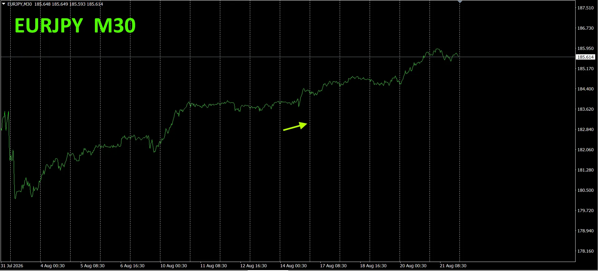
As predicted, it slowly rose.
30-minute currency strength chart
Pink is EUR, green is JPY. EUR’s vector is slightly downward, while JPY’s is slightly upward. Based on the currency strength chart, EURJPY is expected to trend downward in the future.
4. Tried the new indicator Dual_MACD_Trend_Indicator
For the new indicator “Dual_MACD_Trend_Indicator,” please see below.
MT4 version:https://www.gogojungle.co.jp/tools/indicators/62199
MT5 version:https://www.gogojungle.co.jp/tools/indicators/62202
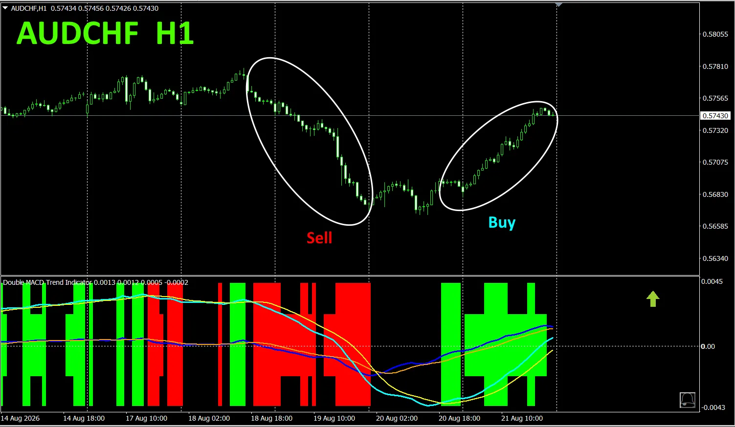
The indicator clearly shows the direction of trends with color. If the color bar is Lime, it’s a buy; if Red, it’s a sell; and if no color, there is no trend. The color display makes it easy to grasp the trend at a glance.
I installed this indicator on AUDCHF on a 1-hour chart.
The red sell zone and the green buy zone are clearly separated, making trading straightforward at a glance.In the top chart, the red zones indicate sells and the green zones indicate buys. It’s recommended to target the regions where the price has some angle and circled in white ellipses for sells (red) and buys (green).
With “Dual_MACD_Trend_Indicator,” buy in green zones, sell in red zones, and refrain from trading elsewhere.
Using “Dual_MACD_Trend_Indicator” eliminates ambiguity about trade direction.
Note that,“ has been updated to show bars in two levels and to display trend direction of the top two timeframes with arrows.
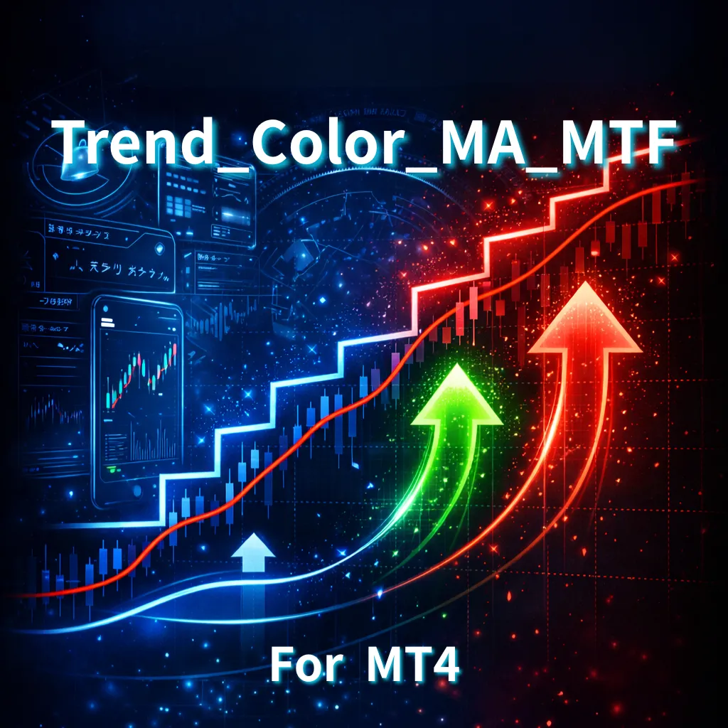
5. “Trend_Color_MA_MTF” has been released. From the sales page,
“Trend_Color_MA_Dual_MTF” This tool is more than a moving average line. It visualizes trend direction with color and notifies you with sound and alerts as soon as a trading opportunity arrives, acting as your personal assistant.
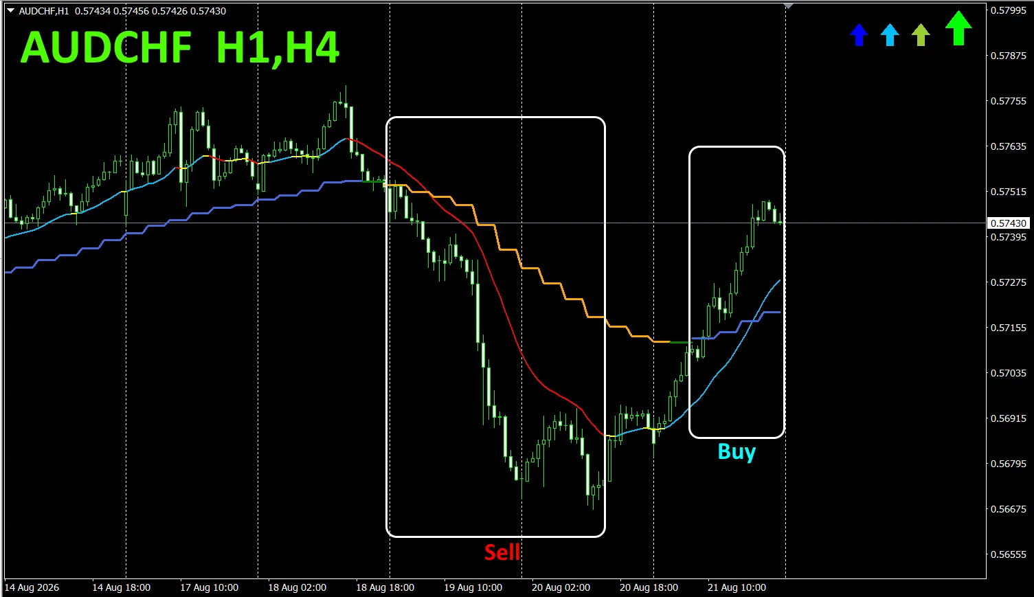
As an example, on AUDCHF’s 1-hour chart, four-hour moving averages are displayed simultaneously.
The jagged staircase is the four-hour moving average. The 1-hour moving average is also shown in blue during uptrends and red in downtrends, allowing you to determine the current chart’s trend and the higher timeframe trend at a glance via colors.
When the higher timeframe and current timeframe colors align, if red, trade sells; if blue, trade buys.
For selling, the 1-hour MA is red indicating a downtrend, and the 4-hour MA turns orange during the downtrend, at which point you sell.
In the top chart, focus on the area enclosed by the white box to trade sells/buys.
For details, please refer to the following link.
https://www.gogojungle.co.jp/tools/indicators/75985
“8CFD Visualize Indicator Any Version”
https://www.gogojungle.co.jp/tools/indicators/32288
“Toretore Indicator”
https://www.gogojungle.co.jp/tools/indicators/50115
“TrendLine-EX”
https://www.gogojungle.co.jp/tools/indicators/42257
“8 C Currency Strength Visualization Indicator” is described on the following pages。

MT4 version https://www.gogojungle.co.jp/tools/indicators/39150
MT5 version https://www.gogojungle.co.jp/tools/indicators/39159
【Products I have for sale】