Usage of the "Visualization Indicator" (Part 264)
「Visible Indicators」 Utilization(that264)
1. “USD Pair List Indicator” was evolved into an indicator
“8CP Visible Indicators” to plot NZDUSD.
“8CP Visible Indicators” includes Oceania version、 London version、 NewYork version version、 AnyCPがあります。今回は、Oceania版を使いました。
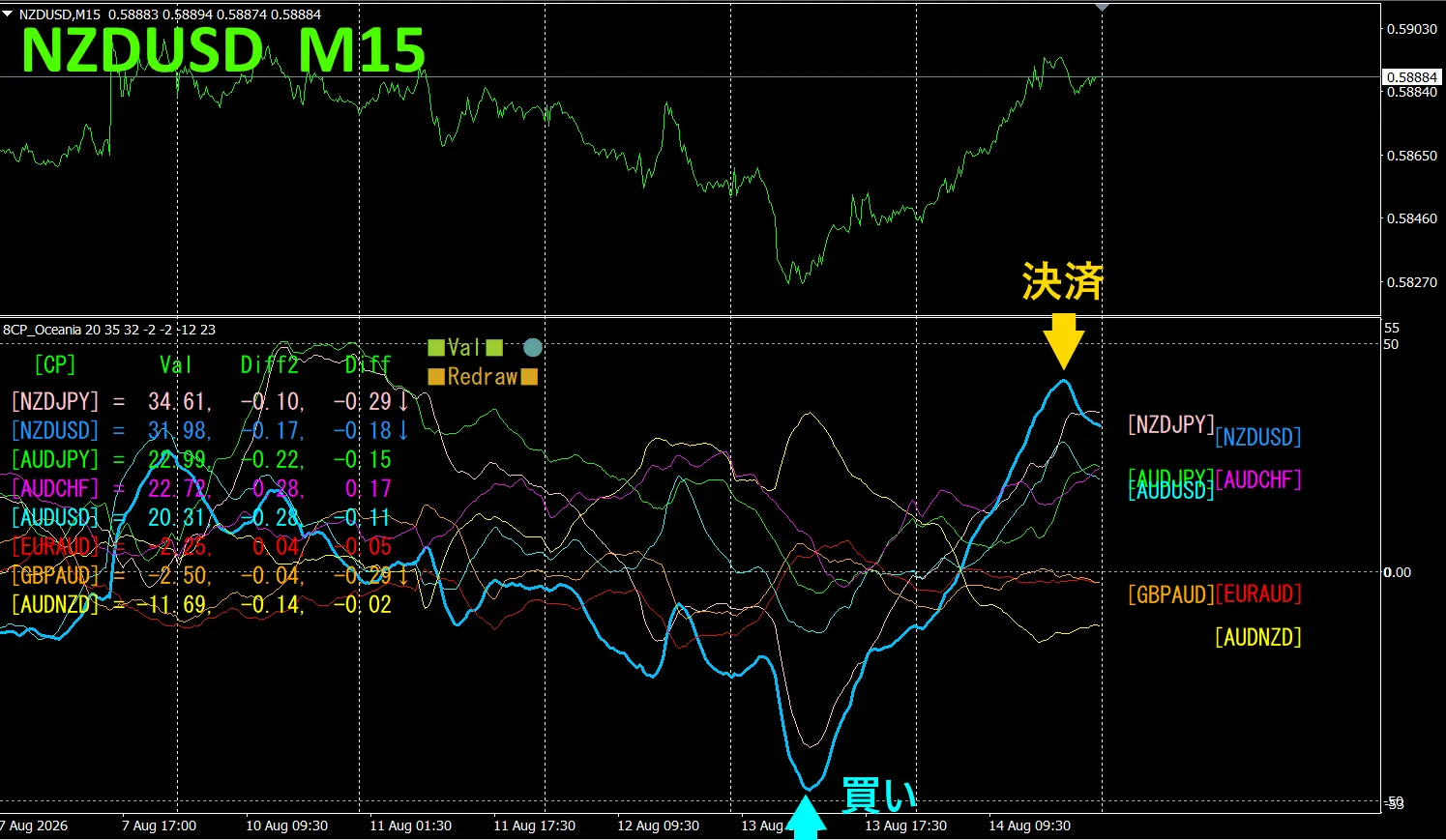
Top half shows, NZDUSDY 15-minute chart. Bottom half shows the “8CP Visible Indicators” data the light blue thick line corresponds to NZDUSD.
On Thursday, NZDUSD’s graph bottomed out and turned up, so we bought. We exited at Friday’s peak, about 67 pips of profit.
Currency Strength/Weakness Graph
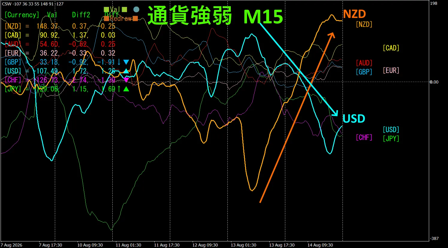
Looking at the 15-minute currency strength graph, NZD and USD are inversely correlated.Trade only in areas where JNZ and USD are diverging and spreading. Since NZD > USD, buy NZDUSD during the spread.
In FX, choose the currency pair with the strongest move and inverse correlation to trade, and the results will follow accordingly.
“Aim for currency strength inverse correlation!” is a rule of FX.
Using “TrendLine-EX”, you can automate entries and exits with diagonal trendline breakouts. Since you can leave it as is, easy trading becomes possible. “TrendLine-EX” can automatically short on a trendline break below, auto-close on a trendline break above, a semi-automatic EA.
2. Try Best Select Indicator
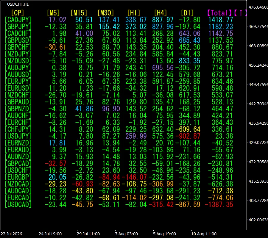
Below is a screenshot as of Aug 11, 2026 01:35(JST) .
[Total] sorts by numerical value in ascending order. The top CADJPN is, [Daily] is excluded, all timeframes display blue color. Total value is 1418.77, indicating a positive number. CADJPY shows an upward trend prospects.
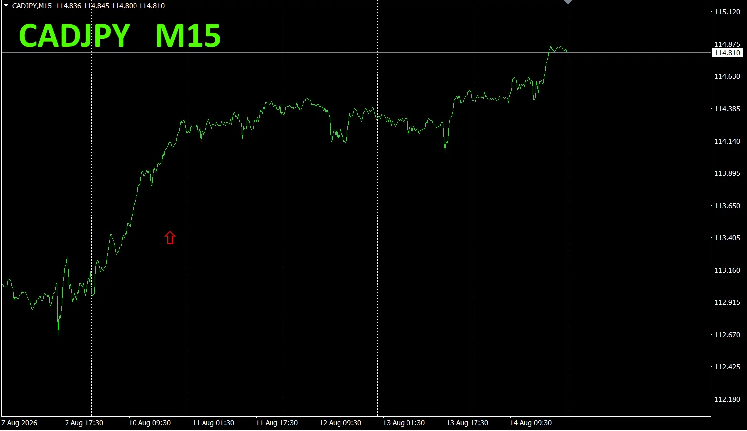
Now, let’s look at the CADJPY chart.
The red arrows indicate where the screenshot was taken..
“28 Currency Pairs Best Select Indicator” can easily identify which of the 28 currency pairs has the strongest trend. Also,, “28 Currency Pairs Divergence Comparison Indicator” shows the currency pair with the largest divergence among all pairs.
“28 Currency Pairs Best Select Indicator””

https://www.gogojungle.co.jp/tools/indicators/35128
3. 2021年5月から追っている EURJPYの動きはどうなった?
From May 2021, EURJPY has been tracked.
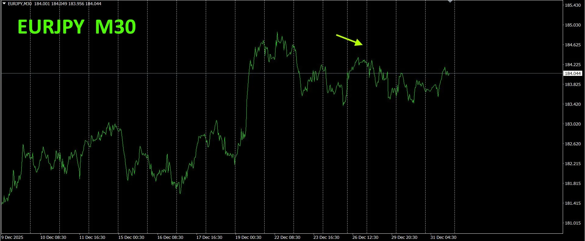
To view the overall trend, a 30-minute chart showing roughly the last 3 weeks is drawn.
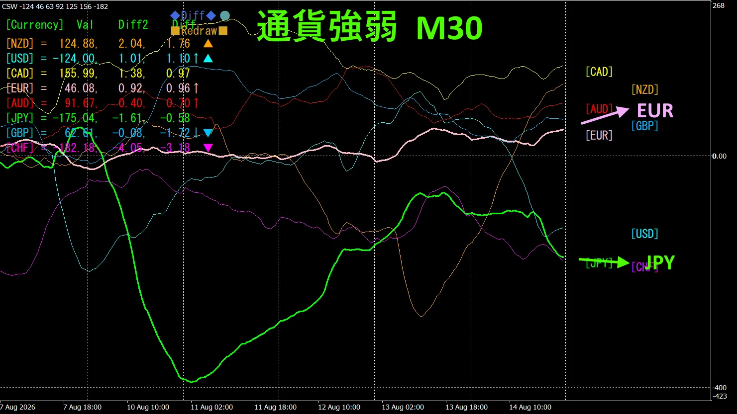
Previously I wrote: The pink indicates EUR
, the green indicates JPY. EUR vector is slightly downward from the horizontal, JPY is downward.
Due to intervention, a large drop occurred and is slowly recovering, rising gradually.
30-minute Currency Strength Chart
Pink EUR, green JPY. EUR vector is slightly upward from the horizontal, JPY slightly downward.
4. New indicator Dual_MACD_Trend_Indicator used
Please see the new indicator “Dual_MACD_Trend_Indicator” below.
MT4 version:https://www.gogojungle.co.jp/tools/indicators/62199
MT5 version:https://www.gogojungle.co.jp/tools/indicators/62202
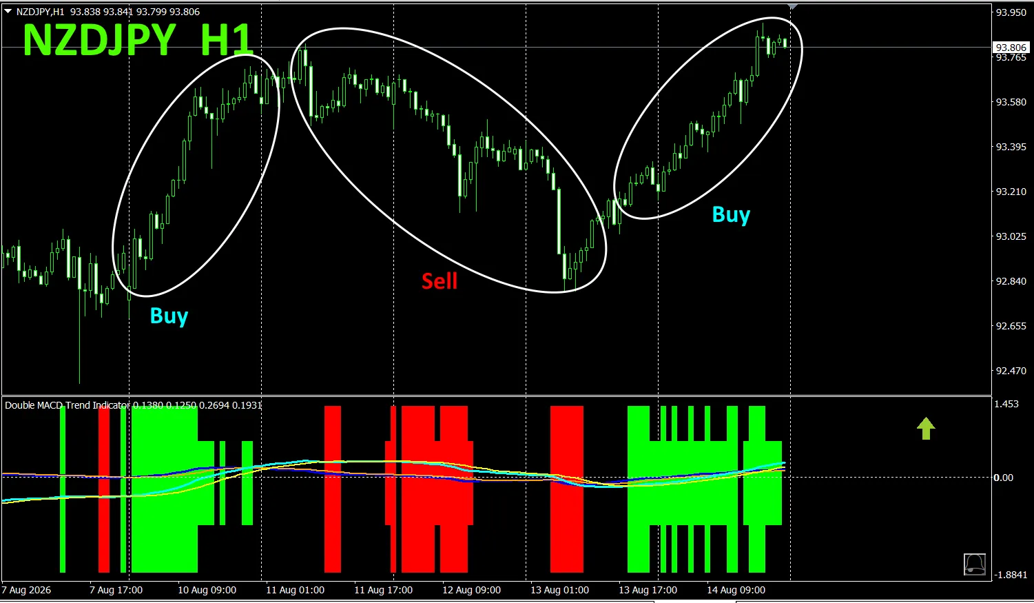
A indicator that clearly shows the direction of trend with color. Color bars: Lime = buy, Red = sell. Easy for beginners to use. If bar color is green, uptrend; if red, downtrend; if no color, no trend. With color display, you can grasp trend state at a glance.
The red in the sell zone and green in the buy zone are clearly separated, making trading easy at a glance. In the above figure, you can sell in the white oval around areas that are red, and buy in those that are green.
In Dual_MACD_Trend_Indicator, buy in green zones, sell in red zones, and do not trade otherwise—simple rules. Using it, you will no longer hesitate about trade direction.
Note, the “Dual_MACD_Trend_Indicator” has been updated to show bars in two levels and arrows indicating trend direction for the top two timeframes.
5. New Release: “Trend_Color_MA_MTF” is available. From the sales page,
“Trend_Color_MA_Dual_MTF” was developed to transform your trading. This tool is not merely a moving average. It visualizes the trend direction with color and notifies you at the moment opportunities arise via sound and alerts, acting as your personal assistant.
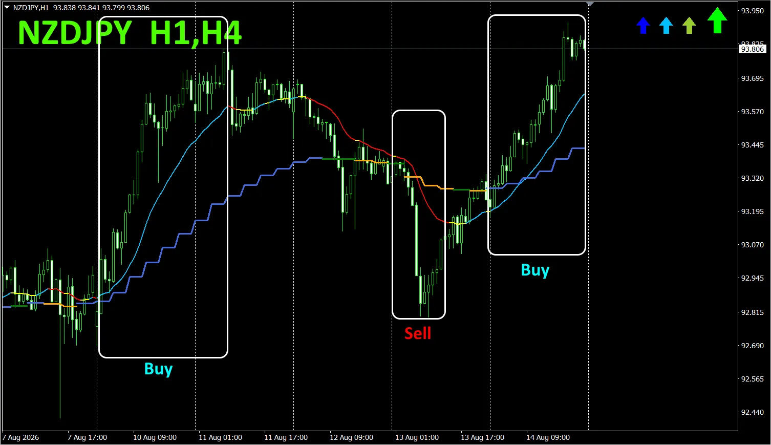
As an example, I displayed four-hour moving averages on the one-hour chart of NZDJPY.
The jagged staircase is the four-hour moving average. The one-hour and four-hour moving averages are shown in blue when rising and in red when falling, so the trend direction of the current chart and the higher timeframe can be identified at a glance.
If the colors of the upper and current timeframe match, trade as follows: red for sell, blue for buy.
For selling, the 1-hour MA is red and declining, and the 4-hour MA turns orange and declining, then sell.
In the above image, focus on the area enclosed by the white box to trade buy/sell.
For details, please refer to the following link.
https://www.gogojungle.co.jp/tools/indicators/75985
「8CFD Visible Indicators Any version”
https://www.gogojungle.co.jp/tools/indicators/32288
“toretore Indicator
https://www.gogojungle.co.jp/tools/indicators/50115
“TrendLine-EX”
https://www.gogojungle.co.jp/tools/indicators/42257
“8C Currency Strength Visible Indicator” is available on the following pages.

MT4 version https://www.gogojungle.co.jp/tools/indicators/39150
MT5 version https://www.gogojungle.co.jp/tools/indicators/39159
【My items for sale】