

Is the Fibonacci ratio special — a record of testing everything from 20% to 90%
I am Tonochi, developing EA. I have been analyzing various methods that I had found curious but overlooked, with the help of AI, incorporating good ones into EAs, and presenting those that I judged did not show an advantage in my analysis in this format. This is one such case.
The subject isFibonacci. The 38.2%, 50%, and 61.8% levels are among the most famous figures in chart analysis. What would happen if we had a machine verify them?I tested the depth of retracement from 20% to 90% in 2.5% steps and investigated whether Fibonacci numbers stand out as especially good.
I’ll write the conclusion first.With my method of measurement, Fibonacci numbers did not stand out as superior.
However this does not mean “Fibonacci doesn’t work.”What I tested is only one of countless possible applications. The starting point, entry timing, and the way exits are made were all fixed to a single approach I chose. Please read this article as a record of “what happened when I used one particular measurement method.”
Moreover, it was more interesting what I learned in the middle, so I’ll focus on that.
1. Fibonacci lines change entirely depending on where you start from
Fibonacci is a tool for selecting high and low prices and dividing the range between them. 38.2% retracement, half retracement, 61.8% retracement—these are used as levels where price tends to rebound.To choose the high and low, and draw the lines between them, that is the basic use. You mark where the chart shows a peak and a trough, and use those to draw lines.
When you draw by hand while looking at a chart, it’s not difficult. You can quickly decide “this is the peak, this is the trough.”
But from the perspective of verification, there is one troublesome property.The position where the lines are drawn entirely depends on which peak you take as the starting point. The same chart can yield different 38.2% levels depending on the starting point.
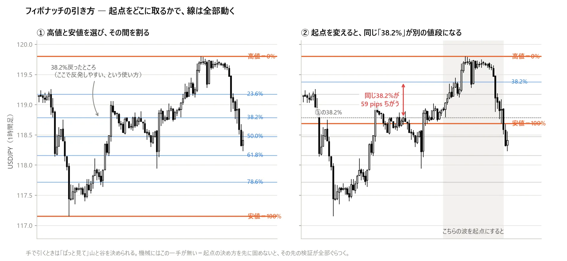
▲Figure 1: Fibonacci divides the range between a high and a low at each ratio. ① shows the method. ② shows a different wave starting point on the same chart, where the same “38.2%” would land at a price different by 59 pips. USDJPY, 1-hour chart.
That’s ②. The same “38.2%” ends up at a different price by as much as59 pipsdepending on the starting point.
Therefore, even if you measure “does 38.2% work,” what appears is not Fibonacci’s performance, butthe performance of how I chose the starting point. You must fix this first, otherwise all subsequent numbers become unreliable.
2. How I fixed the starting point this time
So this time I fixed the starting point to a simple form: “the high and low within the most recently fixed number of bars.” There are three options: 20, 50, and 100 bars.
These three tended to yield very similar results (rank correlation 0.80–0.91).Changing the number of bars did not change the ranking, so within this framework the results are stable.
Using this method to draw the lines, the chart would look like this: among the most recent 100 bars, mark the highest point as 0% and the lowest as 100%, and divide the interval by the ratios. Once the starting point is fixed, the rest is automatic.
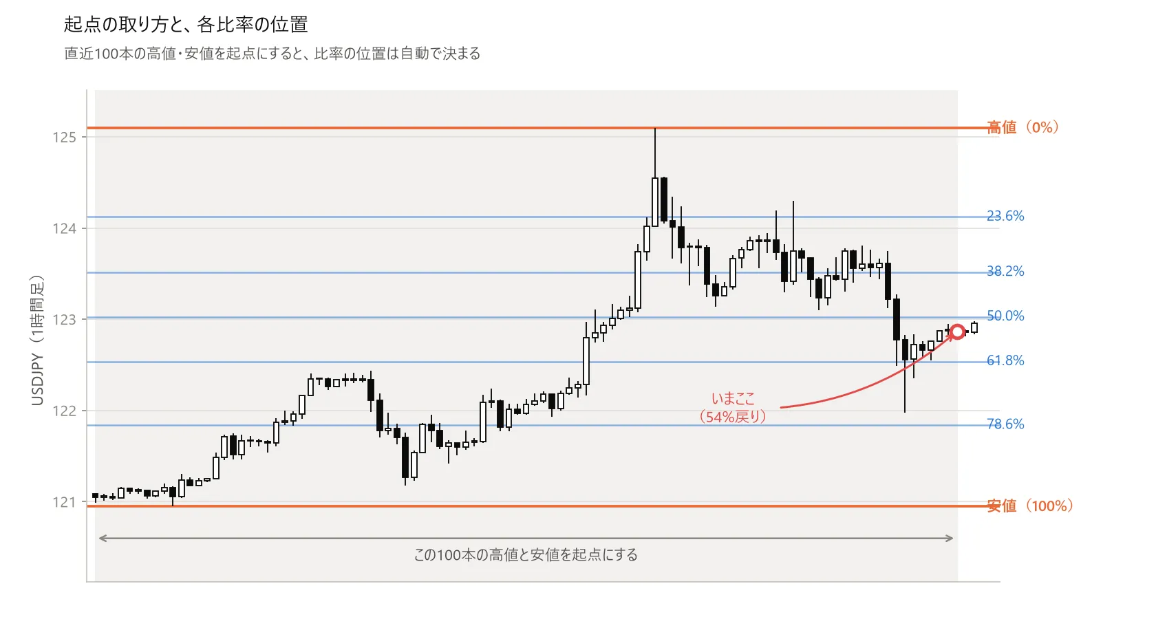
▲Figure 2: USD/JPY 1-hour chart. Highest price in the last 100 bars is 125.10 as 0%, lowest 120.95 as 100%, with horizontal lines drawn at 23.6%, 38.2%, 50%, 61.8%, and 78.6%. After rising from the low to the high, there is a pullback, and the current price is at the 54% retracement level.
Honestly speaking,this is not the same as manually drawn Fibonacci. When a human draws, a meaningful peak is chosen, but the machine only looks at the most recent price range. Therefore all future results are conditioned on “the starting point was chosen in this way.”
3. Change of mindset — comparing with counterfeit
Here I changed the verification approach.
Even if you test “enter at 38.2%,” you won’t get a clear answer.Even if you win, you can’t tell whether it’s because of Fibonacci numbers or simply because you entered at a deep pullback. A deeper pullback can be advantageous for reasons unrelated to Fibonacci.
So I borrowed a method used to test drug efficacy.When evaluating a new drug, you compare with a placebo that looks exactly the same but has no active ingredients. If the apparent effect is also produced by the placebo, then the effect is not due to the drug’s components.
Do the same thing here.Retrace depths from 20% to 90% in steps of 2.5%, and only Fibonacci numbers as special, compare them to the neighboring levels.
What is looked at is not the absolute performance of the level itself, buthow far the value deviates from the average of its neighbors. This way, even if the underlying is “deeper is better,” that effect is not driven by depth alone. If the curve is smooth, what works is the depth, not the Fibonacci number. If only the Fibonacci levels form peaks, then those numbers have meaning.
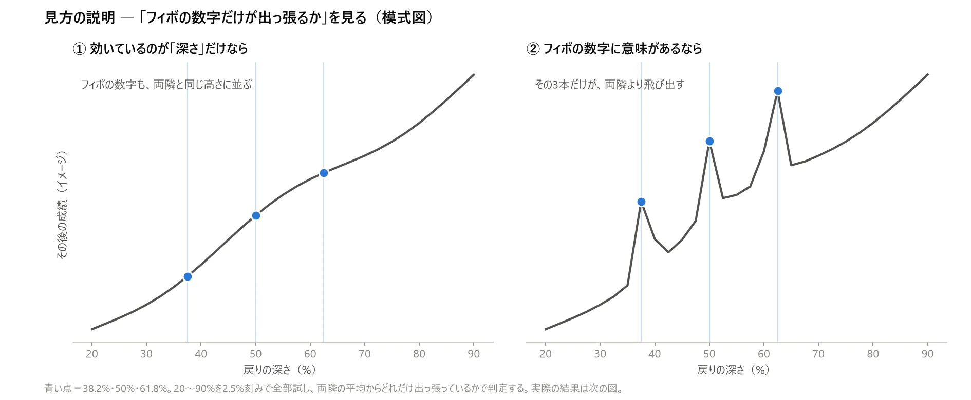
▲Figure 3: Conceptual diagram. ① If the effect is only in depth, Fibonacci numbers align with neighbors. ② If the numbers themselves have meaning, only 38.2%, 50%, and 61.8% rise above neighbors. Actual results appear in the next figure.
4. Results — It was a coin toss
I tested 27 combinations in total: three timeframes, three methods for measuring peaks and valleys, and three durations for how long to hold. Seven currencies, from 2000 to the present.
Fibonacci numbers were better than other numbers in 12 of the 27 conditions. Not a majority.
Averaged among representative conditions (1-hour chart) for the “peaks,” the results are as follows:
| Average deviation | |
|---|---|
| Fibonacci levels (23.6/38.2/50/61.8/78.6%) | −0.134 pips |
| Other levels | +0.023 pips |
The sign is reversed. Looking across seven currencies, in five currencies Fibonacci-sided measurements were negative.The famous “half-retrace” (50%) appeared worse than the surroundingsas a result.
Looking at the entire curve, Fibonacci numbers (the circles) do not appear at particularly special positions.
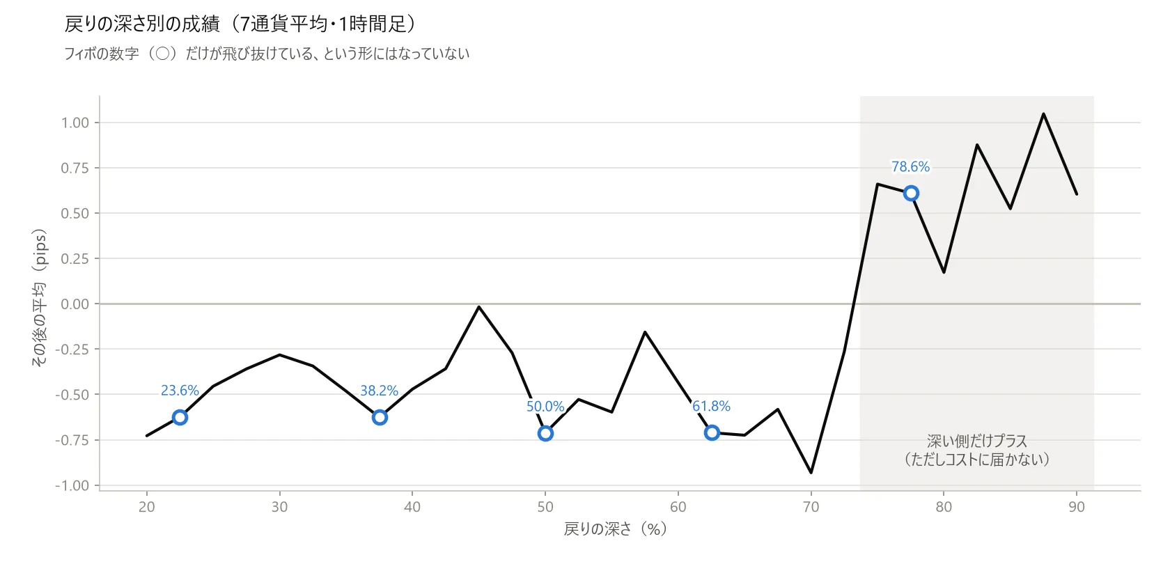
▲Figure 4: A line chart with retracement depth 20–90% on the x-axis and average pips on the y-axis. The five Fibonacci levels are marked with circles, but none stand out. From around 70% the overall trend is negative, and it turns positive deeper than 75%.
5. The decisive factor was the number of observations
Under some conditions, Fibonacci numbers create clear peaks. On a 4-hour chart, they can even show a positive gain of+1.211 pips, which would suggest they work.
But when you line them up by sample size, the story reverses.
| Condition | Fibo peak | Number of cases per level |
|---|---|---|
| 15 minutes | −0.002 | 115,522 cases |
| 1 hour | 27,385 cases | |
| 4 hours | +1.211 | 6,782 cases |
Conditions with fewer cases show larger peaks.
If this were a genuine effect, more data should reinforce it. But with the most frequently observed 15-minute data, the peak is almost zero (−0.002), and the more data you have, the more the numbers swing.
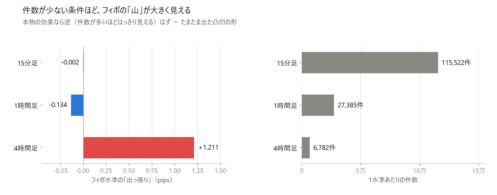
Figure 5: Two horizontal bar charts. Left shows Fibonacci “peaks” at 15 minutes −0.002, 1 hour −0.134, 4 hours +1.211. Right shows the number of cases per level: 15 minutes 115,522 cases, 1 hour 27,385 cases, 4 hours 6,782 cases. The fewer cases, the larger the peak.
This is simply a random fluctuation. If you roll a die six times you’ll get a skew, but roll it sixty thousand times and it averages out. The same thing is happening here.
6. By-product — the depth itself shows a slight bias
Fibonacci numbers themselves did not show a difference, butthe depth of retracement itselfshowed a gentle tendency (1-hour chart, across 7 currencies, measured in pips).
| Depth of retracement | Average |
|---|---|
| 20% | −0.73 |
| 50% | −0.71 |
| 70% | −0.93 |
| 75% | +0.66 |
| 85% | +0.52 |
| 90% | +0.60 |
Only when retracement is deeper than 75% does the result become slightly positive. It’s not about specific ratios, but the entire deep-side band tends to be so.
However thiscannot be used as is. Even a positive result is only around 0.5–1.0 pips, andit does not reach the trading costs (actual spread is a bit over 1 pip). After deducting fees, it disappears.
7. Placing stop loss and take profit, re-measuring as a trading strategy
Up to here I measured in a simple fixed-time exit. That is enough to fairly compare ratios, butit does not answer whether the method wins as a trading system. So I re-measured using textbook-style exits.
- Enter: place a limit order at the retracement level (Fibonacci is meant to be used this way, which is more favorable than a market order)
- Stop loss: at 100% level (if starting point is broken, the reading is invalid)
- Take profit: 1.0×, 1.272×, or 1.618× the distance from the starting point (the so-called extension)
With four timeframes × three peak-measuring methods × ten levels × three take-profit types =360 combinations tested across seven currencies from 2000 to 2026. If both stop loss and take profit are hit on the same bar, the loss is treated as the stop loss (the harsher outcome).
Proportion that ended in profit
| Timeframe | Profit-able combinations |
|---|---|
| 15 minutes | 0%(0 of 90) |
| 1 hour | |
| 4 hours | |
| Daily |
When focusing only on famous levels (38.2%, 50%, 61.8%), 15 minutes and 4 hours show clear negatives, 1 hour is nearly break-even (profit-to-loss ratio around 1.00–1.01), and the daily chart is slightly positive (0.99–1.05).The best among the 360 combinations was the 45% retrace on the daily chart, which is not a Fibonacci number.
The reason the daily results improve is that there are fewer trades and the cost impact is smaller. It doesn’t indicate the method is superior.
And, more importantly — even if you set trading costs to zero, you still don’t win.
When I re-measured on the 1-hour chart with zero costs, the profit-to-loss ratio was 1.03–1.04. In other wordsyou’re not winning because of the costs; the read itself is not correct. If costs were the issue, removing them would turn it into a winner.
For safety, I also tried changing the direction of the peaks/valleys (judging by moving average arrangement vs which price high/low is newer). The conclusion did not change.
8. Trying a different use — as a filter, in conjunction with other tools
“Weak as an entry” and “useless as a tool” are different things. In fact, my EA uses moving-average crossovers that are weak as entry signals but effective for environment recognition. Fibonacci might behave similarly. I tried three approaches.
(1) Enter with Fibonacci, filter with other tools
Here I found a striking result: on a daily chart, narrowing to “61.8% retrace + long-term moving average cross” yields +39.2 pips per trade. Profit-to-loss ratio 1.38. Not bad.
But the number of cases is 191.So I tried adjusting one number and observed a flip.
| What I changed | Result |
|---|---|
| As is | +39.2 pips |
| Level 61.8% → 60% | −7.8 pips (sign flipped) |
| Peaks measured from 100 bars → 50 bars | −31.5 pips |
| Change moving-average combination | −59.9 pips |
Just moving one parameter flips the outcome.This is a random artifact. I’ve fallen for the same trap in another test (Elliott wave), so I always include this verification.
(2) Use Fibonacci to decide whether to enter (the main approach)
Fix entry and exit, andonly allow trades where retracement is within Fibonacci bands (38.2–61.8%). This is how I intended to use Fibonacci.
Here I found an important detail.With some entry types, you may never even reach the Fibonacci band.
| Entry | Median retracement depth | Proportion entering Fibonacci band |
|---|---|---|
| Gentle pullback entry | 11% | 1.2% |
| Entry aiming for even deeper rebound |
With the shallow pullback entry, you reach the Fibonacci band only about once in 100 trades.This combination cannot be viable, regardless of good or bad.
Andthe deeper rebound entry — which I honestly wrote I had not tested in the previous article — also failed to win using Fibonacci bands (bands performed worse than no filter, and when randomly thinning the same number of trades, there is no distinct difference) (statistical probability p=0.845; cannot claim “not due to chance” unless p<0.05).
When listing retracement depths in 10% increments, the best order went 40–50%, then 60–70%, then 80–90%, and the best was 90–100%,which simply improves gradually. The effect is in thedepth, not in Fibonacci numbers. Same conclusion as before.
(3) Take-profit decided by Fibonacci (extension)
| Take-profit method | Per trade | Profit-to-loss |
|---|---|---|
| Fixed 100 pips | +7.04 | 1.23 |
| Fixed 150 pips | +7.58 | |
| Range × 1.272 (Fibo) | +6.34 | |
| Range × 1.618 (Fibo) | +6.75 | |
| Range × 2.0 (non-Fibo) | +7.14 |
All forms that scale with the range underperform fixed targets.Moreover, even among the “scale with range” group, the non-Fibonacci 2.0× sometimes outperforms 1.618×. There was no particular significance to the ratio itself.
9. Finally, I tried it in my own EA
“Generally weak” as a concept and “what happens when added to my tool” are two different things. It is actually true that adding uncorrelated items can improve a system. I measured that here.
I replaced my EA’s take-profit method with Fibonacci’s approach (range × multiplier) and ran from 2000 to present. The comparison method was to align the worst drawdown (maximum drawdown including floating loss) across configurations and then observe net growth. If risk is not matched, you may only appear to win by taking larger bets.
The result was that, with the same risk level, profits dropped by about 20% (annualized around 1 percentage point lower).
If you increase the multiplier, you end up holding the position longer, so floating loss grows and the maximum drawdown jumps from 20.7% to 30.9%. This is a known phenomenon from a different test as well.
I also tried the approach “trade only when the price hits the Fibonacci band.” This improved both win rate and profit-to-loss ratio (roughly +6 percentage points win rate, +0.09 improvement in ratio). Yet the number of trades dropped by about 20%, so when you compare risking the same amount, the annual return dropped by about 1.3 percentage points.
This is a common pattern in my testing, so I consistently compare with matched risk levels to avoid being misled.
10. Limitations of this study (this is important)
As stated at the start,this is not an evaluation of Fibonacci as a tool. It is the result of my measurement method.
In the first version (when I initially wrote this article) I listed two limitations: “no exit strategy” and “no test that confirms reversal before entering.”I have filled those two gaps in this article (Chapters 7 and 8). Even after filling them, the conclusion did not change.
- Starting point method: Only the high and low within a fixed number of bars. The meaningful peaks chosen by hand are not used here.This same selection method could not be reproduced by machine, which reflects the limitations of my tools rather than an evaluation of manual use
- Context: Only directions aligned with market context (whether the market is currently in an up or down trend). No counter-trend or range-bound use was examined
- Band selection: Treated 38.2–61.8% as Fibonacci bands. Different practitioners use different levels
- Other tools combined with it: Only tested moving averages, RSI, and price position. Not tested with candlestick patterns or other chart patterns
- Instrument: Seven major currency pairs involving USD, using 15-minute bars aggregated to hourly, 4-hour, and daily; not tested on stock indices or gold
- Time-based Fibonacci: I did not experiment with when the price would reverse after a given number of bars
In short, what I can say is“Using this measurement method, I did not find any special advantage in Fibonacci numbers.”This does not invalidate users of Fibonacci.
11. Still, there was some payoff
I did not write a single EA until I knew there was merit in the ratio itself. I only wrote it to assess what would happen if I added it to my own tool.
Before building, compare with a fake.
When considering methods that use ratios and levels (not just Fibonacci, but any percent pullback or expansion), I think this sequence works best. For me, this was the biggest takeaway from this study.
I also publish similar negative results. Only listing successful cases obscures what you’re basing decisions on.
Verification conditions: EURUSD, USDJPY, GBPUSD, USDCHF, AUDUSD, NZDUSD, USDCAD / 15-minute price data aggregated to hourly, 4-hour, and daily / 2000–2026 / starting point = high and low of a fixed recent number of bars / decision uses only confirmed bars (no foresight).
・Chapters 3–6 (ratio comparison) = enter at level reached, exit after a fixed time (no stop loss or take profit) with spreads not considered =relative comparison of ratios only and cannot be used for absolute value discussion.
・Chapters 7–8 (re-measured as trading) = places limit orders at the level, stop loss = 100% level, take profit = 1.0, 1.272, 1.618 times the distance. Each trade costs 1.2 pips. If both stop loss and take profit are hit on the same bar, the stop loss is taken (the tougher outcome).
・Chapter 9 (my EA) = not a tick-by-tick test, but a 1-minute bar test over 2000–present, with compounding and matched maximum drawdown for comparison.
Disclaimer: This article documents a development record based on backtesting with historical data and does not guarantee future performance. It is not investment advice. Please make trading decisions at your own risk.
About this verification: The creation of the verification code, exhaustive condition testing (27 ratio conditions × 360 trading configurations), and checking the relationship with the number of observations were all done in pair with AI (Claude Code). Humans designed and judged, AI produced and tested—that is the division of labor. This time it was an example where I could stop before building.