"Visualization Indicator" Utilization (Part 260)
「Visualizing Indicator」 utilization(that260)
1. Evolution of the “28 Currency Pair List Indicator” into a more advanced indicator
「8CP Visualization Indicator」 for drawing NZDUSD
「8CP Visualization Indicator」 includes Oceania版, London版, NewYork版, AnyCP版版があります。 This time, we used the Oceania版.
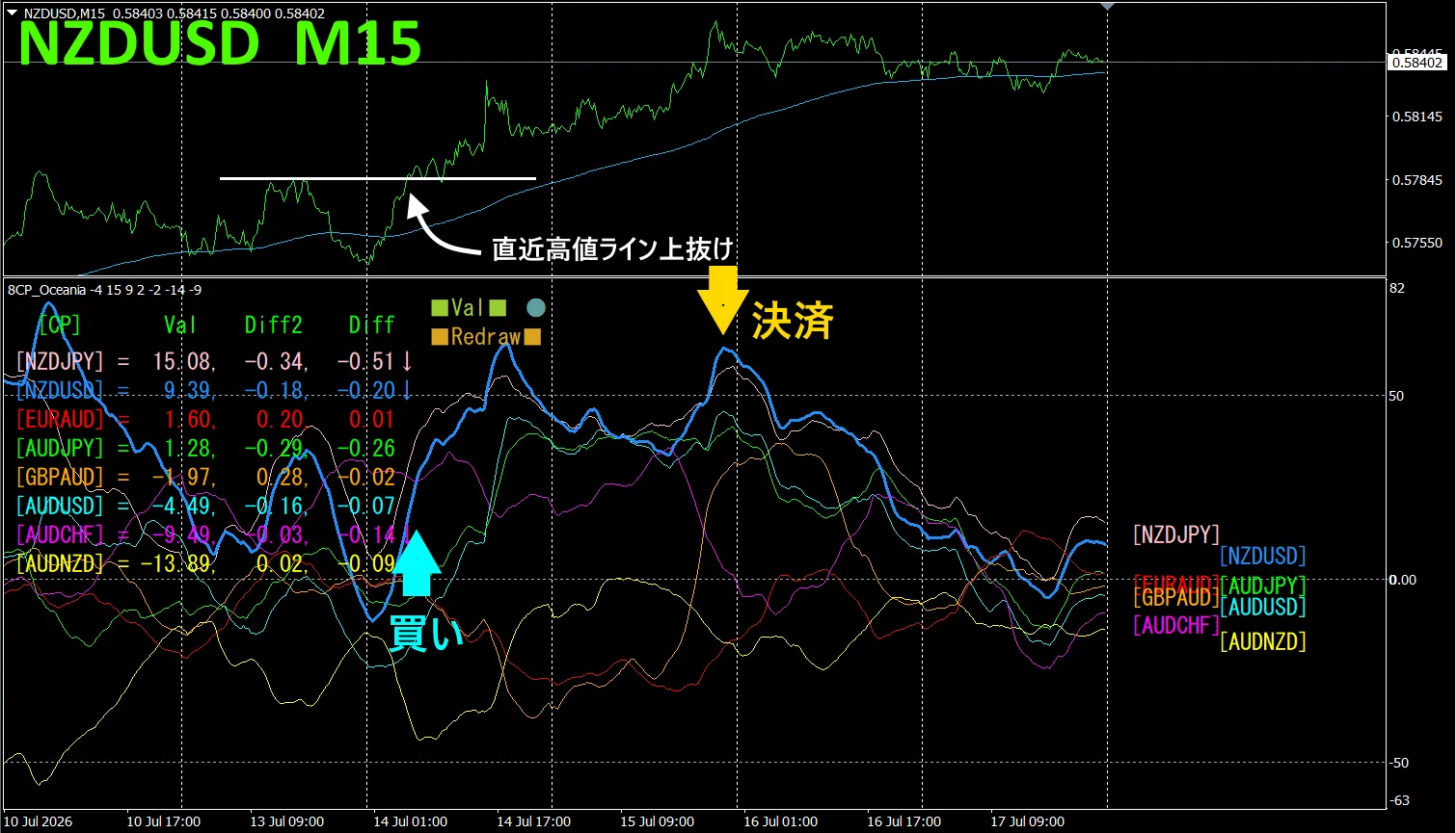
The upper half is a 15-minute chart of NZDUSD. The lower half is from the “8CP Visualization Indicator”, with a blue thick line representing NZDUSD.
On Tuesday, NZDUSD’s chart broke above the others, so we will buy. Sell on Wednesday’s peak to lock in approximately 77 profits.
Currency Strength/Weakness Graph
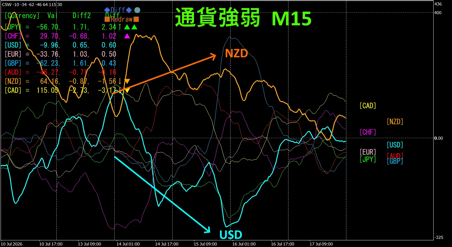
Looking at the 15-minute currency strength graph, USD and NZD are inversely correlated. Trade only in the areas where USD and NZD widen apart. When NZDUSD spreads, buy NZDUSD. Since the relationship is inversely correlated, focus trading only on those points.
In FX, pick the currency pair that is currently growing the most and is inversely correlated; results will follow.
“Target currency strength inverse correlation” is FX’s Golden Rule.
Using “TrendLine-EX” allows you to automate entries and exits at diagonal trendline breaks. You can leave it running for easy trading. “TrendLine-EX” can automatically sell on a lower breakout and automatically close on an upper breakout; this is a semi-automatic EA.
2. Best SelectTry the indicator
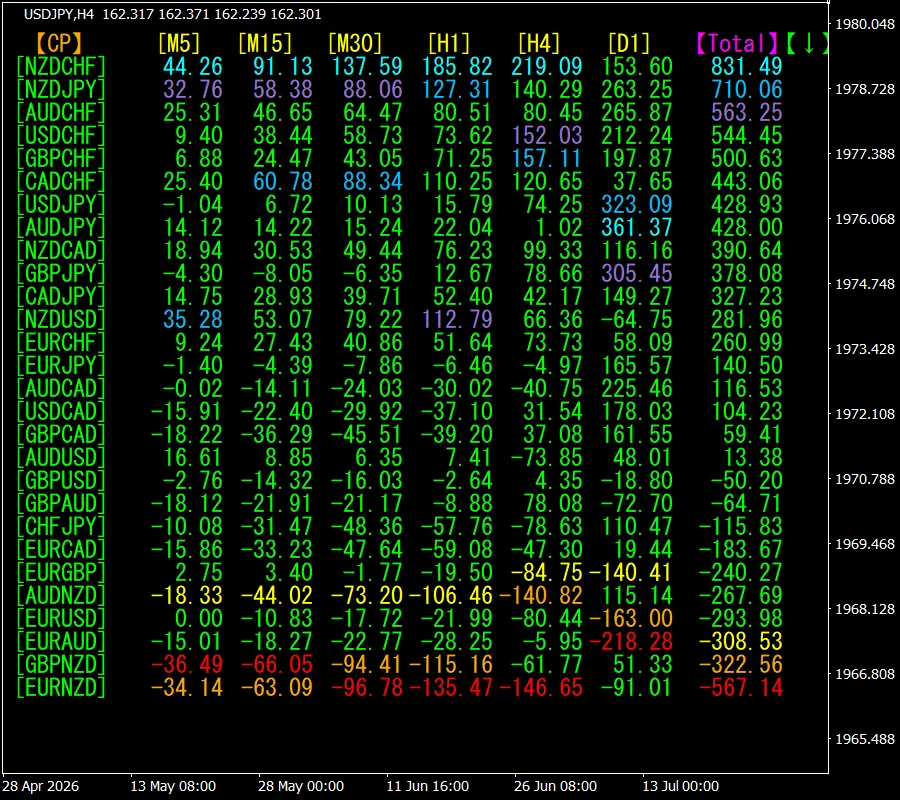
The following image is a screenshot from 2026 July 14 16:26 (JST).
[Total] sorted in ascending order. From the top, the first is NZDCHF, which, excluding D1, shows blue color on all time frames. The Total value is 831.49, positive. This indicates an uptrend for NZDCHF.
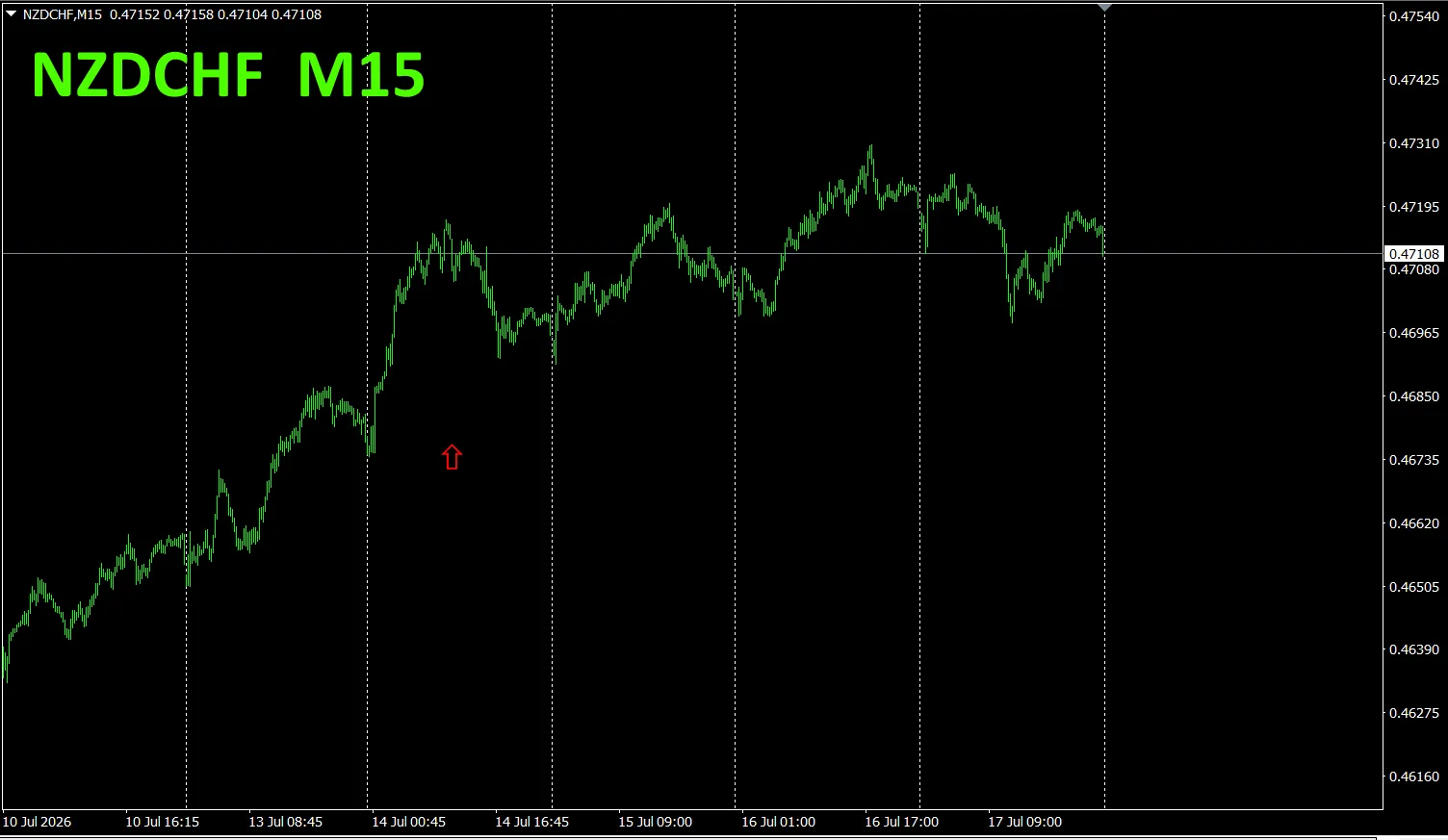
Now, look at NZDCHF’s chart.
Red arrows indicate the points where the screenshot was taken.
“28 Currency Pairs Best Select Indicator” can identify, among 28 currency pairs, which one has the strongest trend. It also includes the “28 Currency Pairs Divergence Comparison Indicator,” which tells you which pair among 28 has the largest divergence. A single indicator to determine which currency pair to trade.
“28 Currency Pairs Best Select Indicator”

3. Since May 2021 we have been tracking EURJPY movement. What happened?
In 2021 May, EURJPY movement was tracked
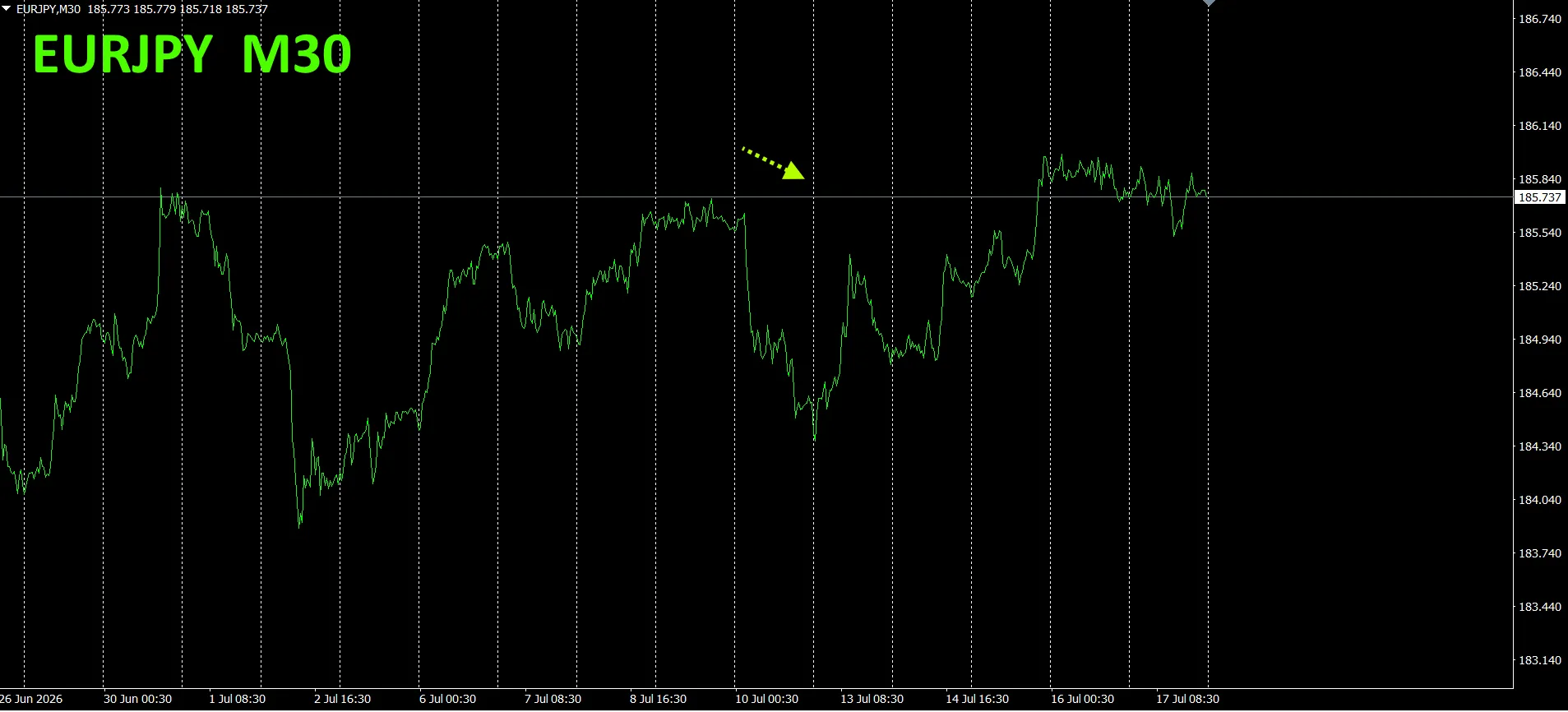
To see the overall trend, a 30-minute chart covering around the last 3 weeks is drawn.
Previously we wrote:
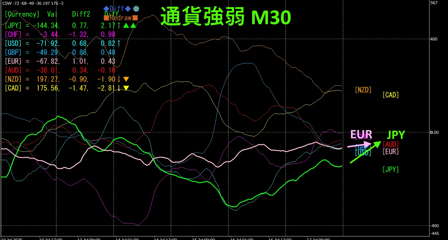
Pink is EUR, green is JPY. EUR vector is downward, JPY is horizontal to slightly upward. Therefore, EURJPY will likely move slightly downward.
Looking at a week, it appears to be moving up slightly, but the upside seems capped.
Pink is EUR, green is JPY. EUR vector is slightly downward, JPY slightly upward. Therefore EURJPY is likely to trend downward.
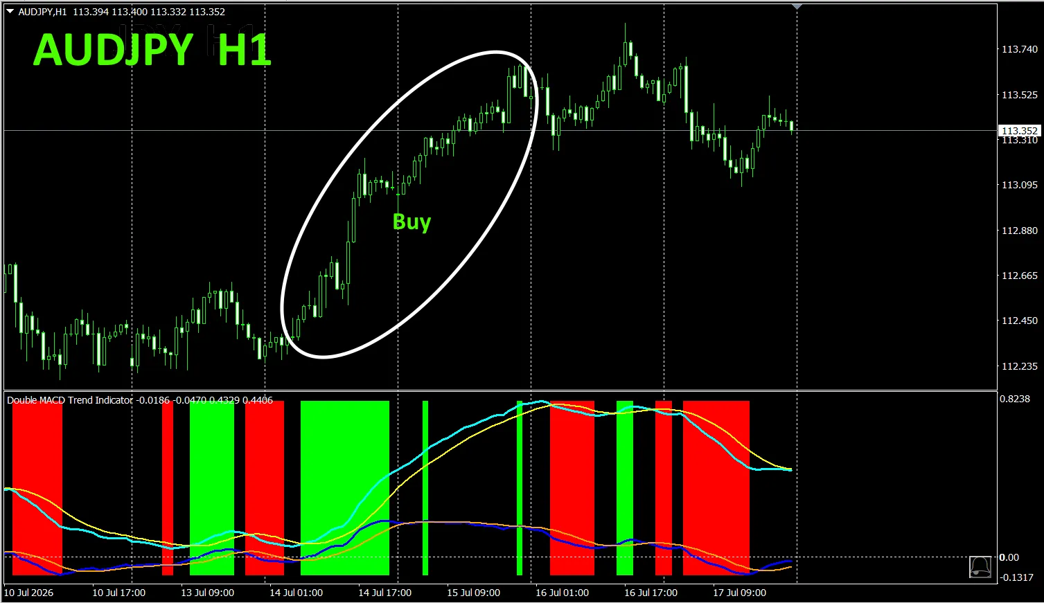
This indicator clearly shows trend direction with color. If color is Lime, it’s a buy; if Red, it’s a sell. If no color, there is no trend. The color display makes it easy to grasp the trend at a glance.. When applied to AUDJPY on a 1-hour chart, the colored zones show clear buy/sell zones, making trading easier.
In the figure above, the buy area is indicated by the white rectangle.
For details, please refer to the following link:
https://www.gogojungle.co.jp/tools/indicators/75985
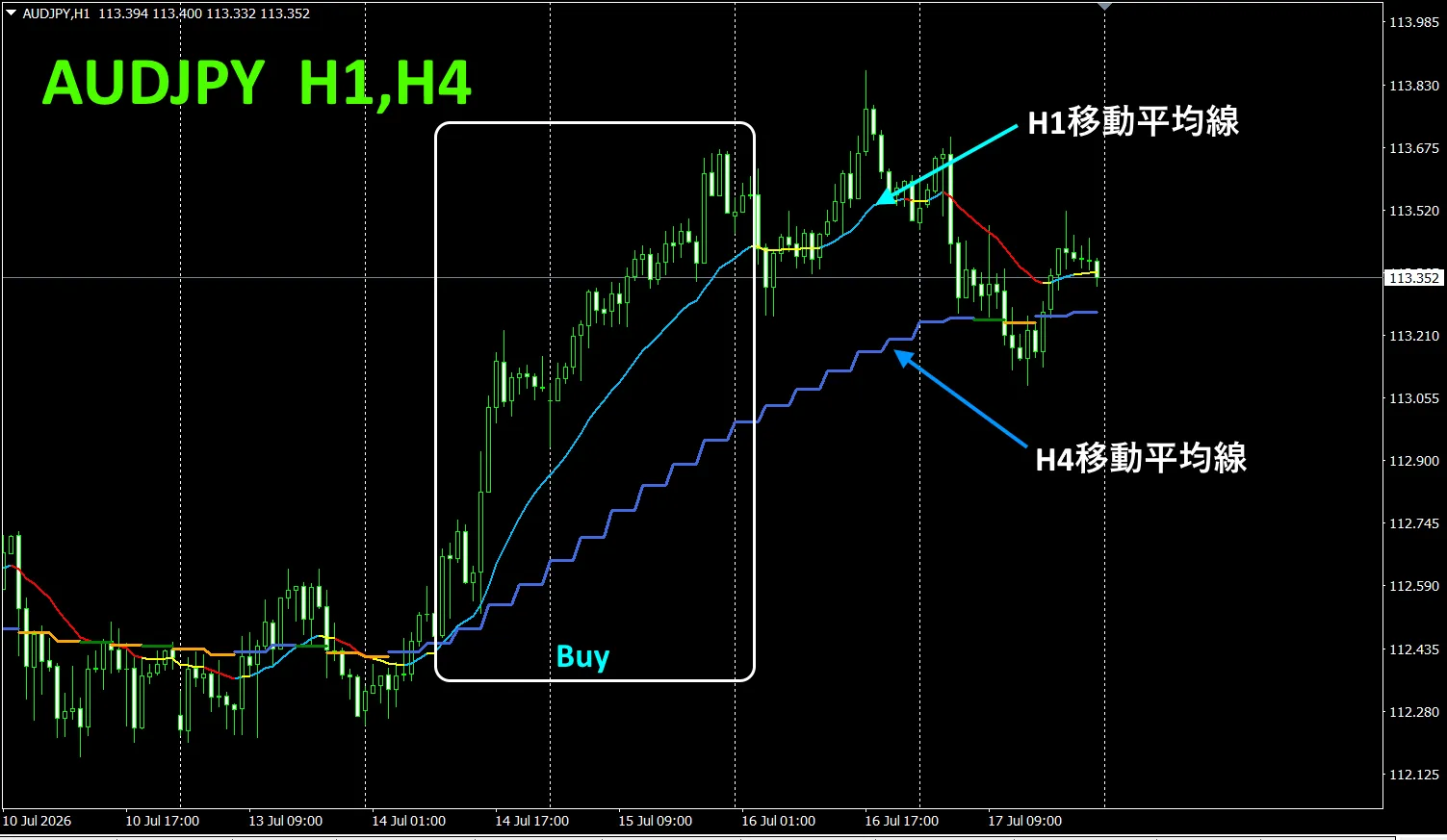
」
“Toretore Indicator”https://www.gogojungle.co.jp/tools/indicators/50115
“TrendLine-EX”
“8 Currency Strength Visualization Indicator” is described on the following pages.

MT4 version https://www.gogojungle.co.jp/tools/indicators/39150
MT5 version https://www.gogojungle.co.jp/tools/indicators/39159
【Items I have for sale】