Utilization of the “Visualization Indicator” (Part 259)
「Visualization Indicator」 utilization(that259)
1. 「28Currency Pair List Indicator」をさらに進化発展させインジケータ
「8CPVisualization Indicator」でAUDNZDを描く
「8CPVisualization Indicator」にはOceania版本、London版、NewYork版、AnyCP版があります。今回は、Oceania版を使いました。
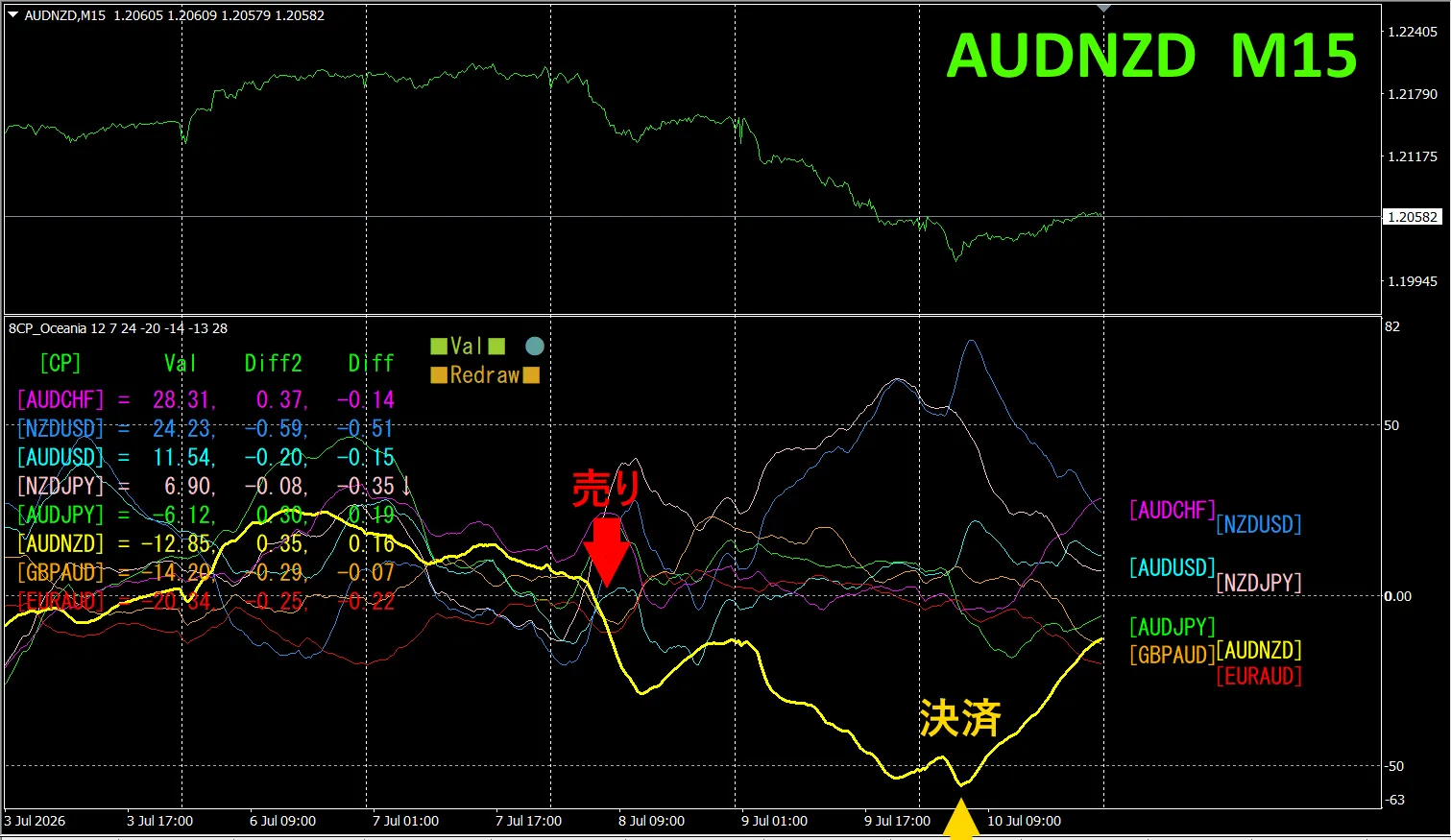
Upper half is、AUDNZDの15分足 chartです。Lower half is、by“8CPVisualization Indicator”,the graph corresponding to
On Wednesday, is highlighted with a yellow thick line the AUDNZD graph dropped below the others, so. we sell. On Friday at the bottom we closed the position and earned about 140 pips.
Currency Strength/Dweakness Graph
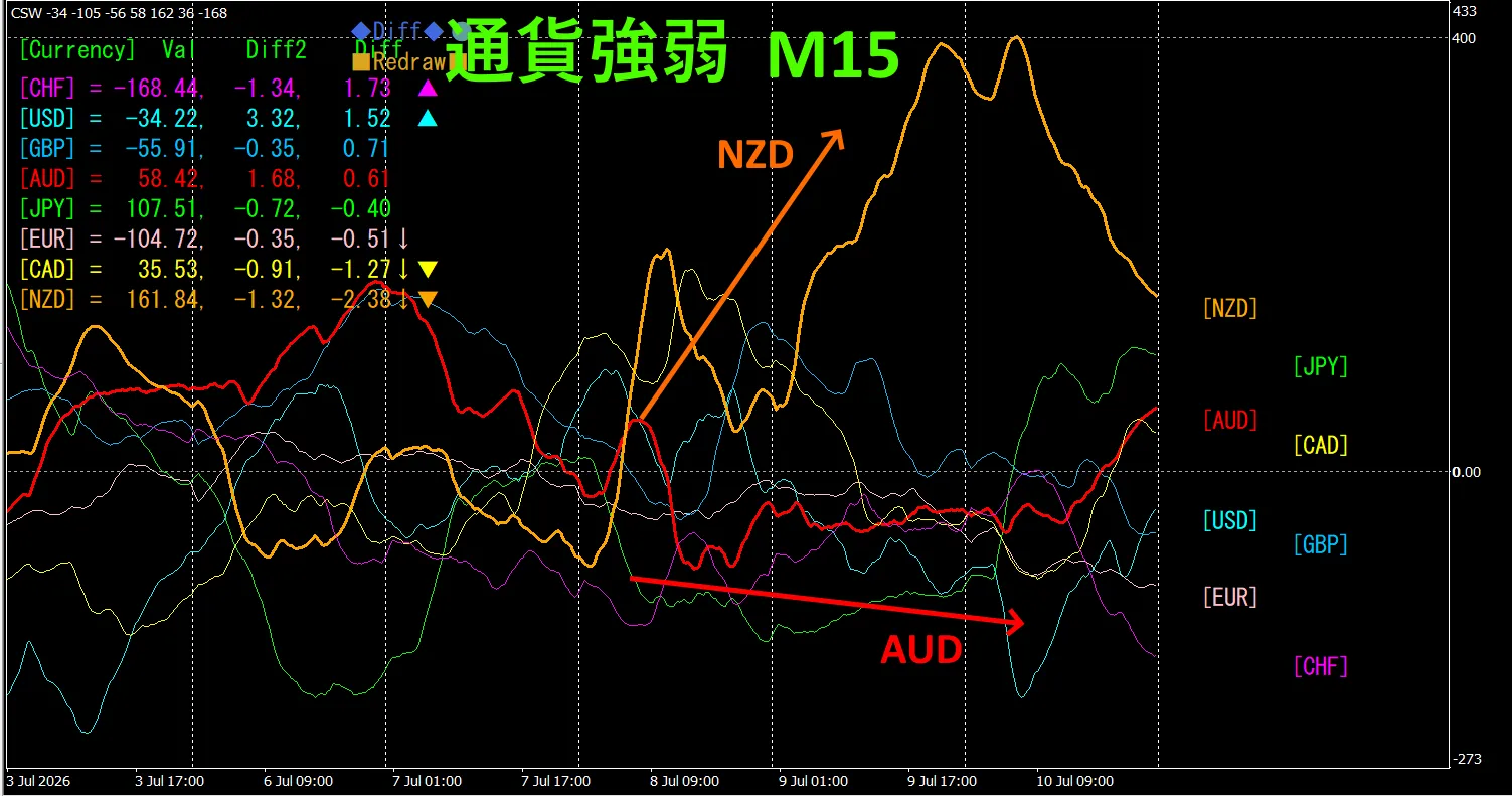
Looking at the 15-minute currency strength graph, AUD and NZD are negatively correlated with each other. When AUD and NZD spread out, we trade. Since they are anti-correlated, we trade only at that point.
In FX, you should pick the currency pair that is currently growing the most and is in anti-correlation to trade, and you will naturally see results.
“Aim for currency strength anti-correlation!” is FX's iron rule.
“TrendLine-EX”, automatic entries and exits via oblique trendline breaks can be performed. Since you can just leave it as is, easy trades become possible. “TrendLine-EX” can automatically short when breaking below a trendline and automatically exit when breaking above, making it a semi-automatic EA.
2. Best SelectTry using the indicator
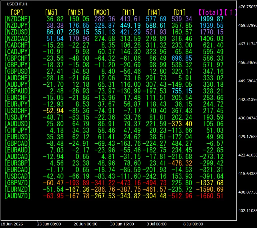
The lower image is a screenshot as of2026 July 8 14:46 (JST) .
[Total]Top two are NZDJPY, and “D1” excluding all timeframes show a blue color. The Total value is 1939.55, positive. It indicates an uptrend for NZDJPY.
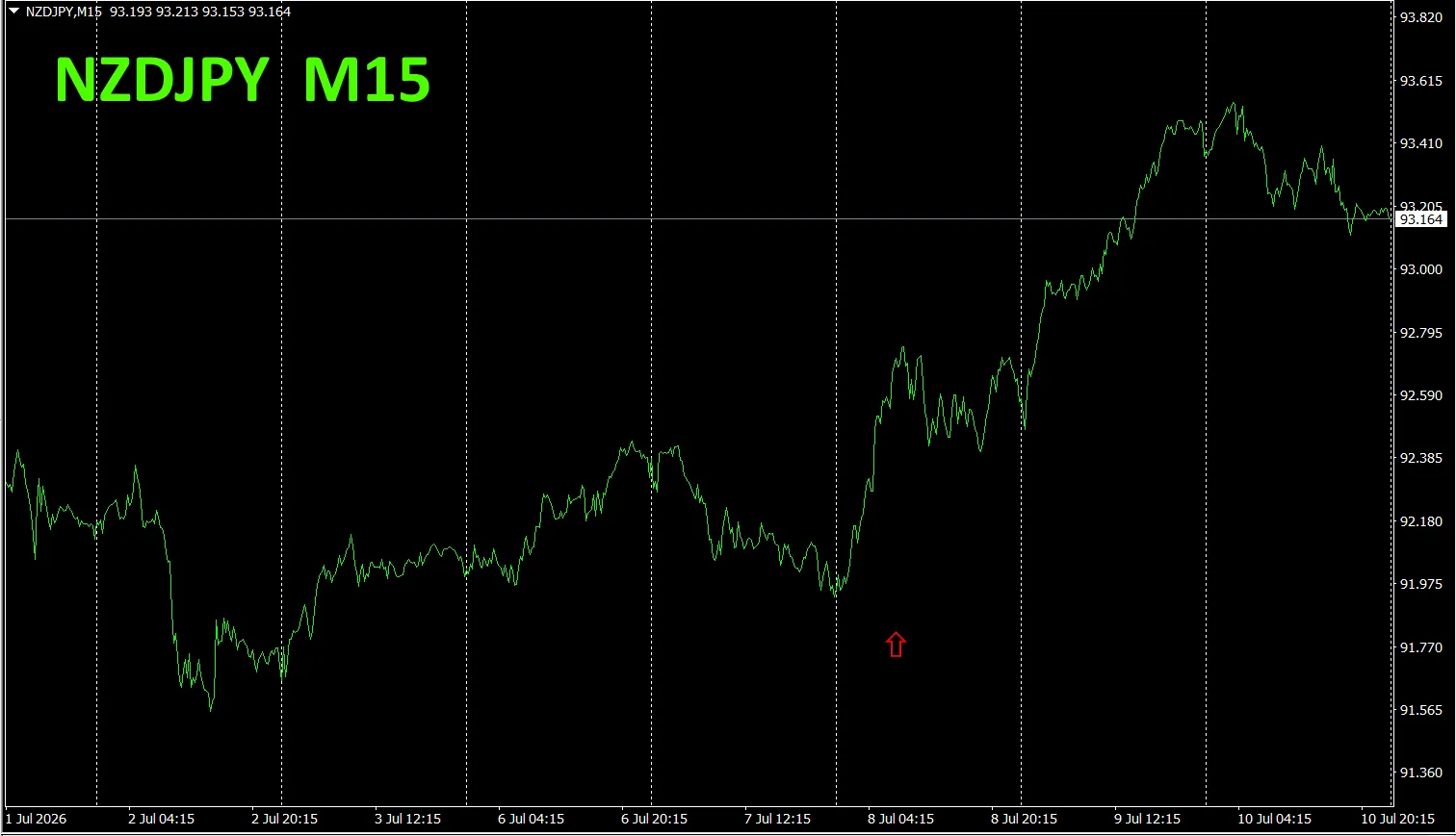
Now, let's look at NZDJPY chart
The red arrows indicate the points where the screenshot was taken. They capture the declining portion.
“28 Currency Pair Best Select Indicator” is, among 28 currency pairs, easily identify which one has the strongest trend. Also, “28 Currency Pair Disparity Comparison Indicator” shows the currency pair with the largest disparity among all 28 pairs. This is a superb indicator that lets you decide at a glance which pair to trade.
“28 Currency Pair Best Select Indicator””

https://www.gogojungle.co.jp/tools/indicators/35128
3. 2021年5月から追っているEURJPYの動きはどうなった?
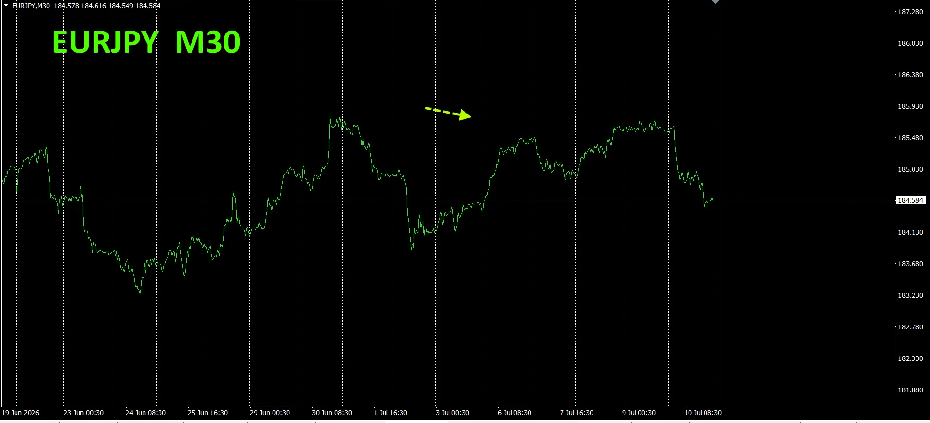
Since May 2021, we have been tracking EURJPY movements.
To view the overall trend we draw about 3 weeks of 30-minute chart data.
Previously I wrote the following.
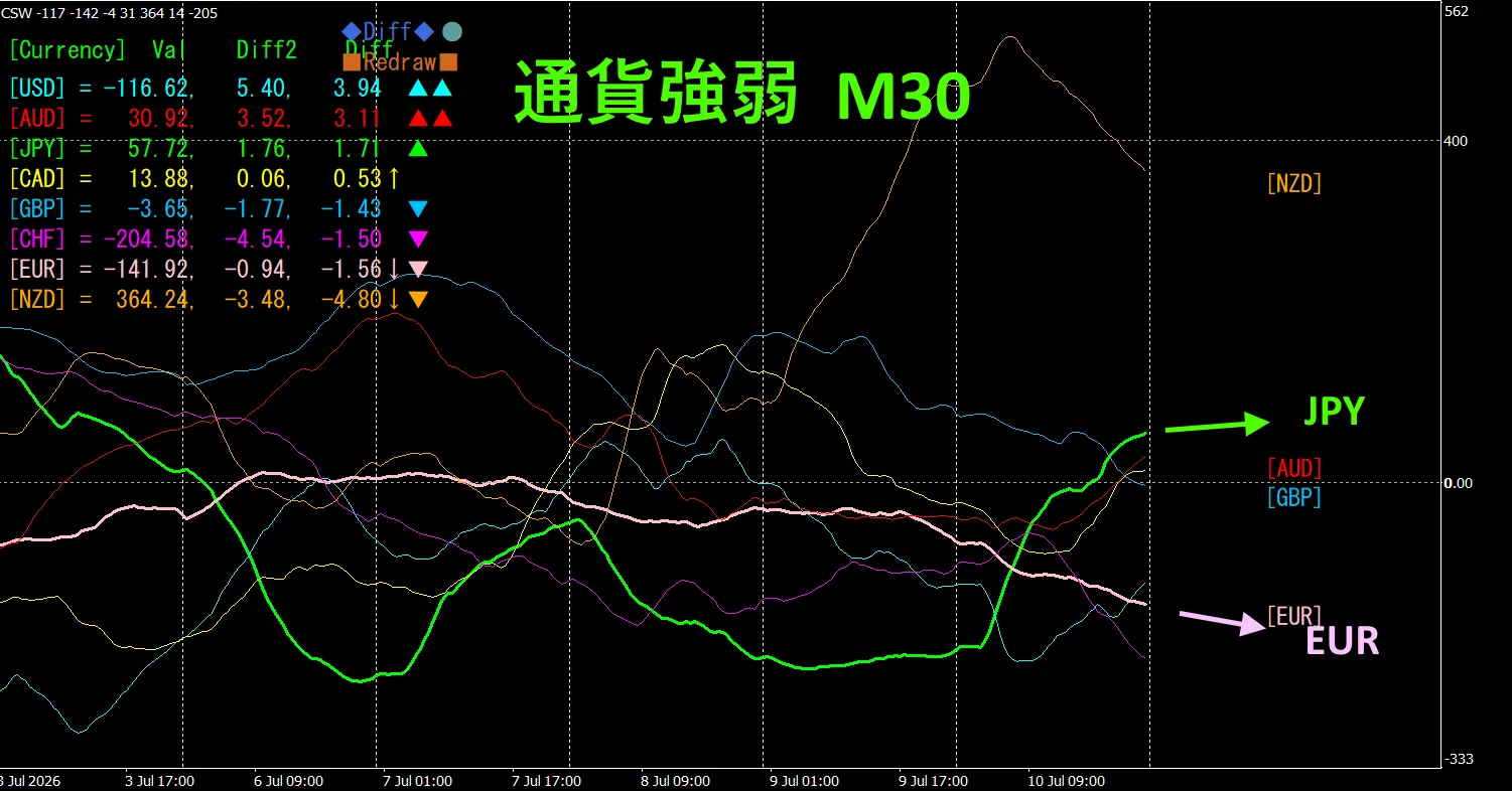
Pink is EUR, Green is JPY.EUR vector is downward, and JPY is slightly downward from horizontal, so we expect EURJPY to decline.
There hasn't been a pronounced drop, but it appears to be capped at higher levels..
30-minute currency strength chart.
Pink is EUR, Green is JPY.EUR vector is downward, and JPY is slightly upward from horizontal. Therefore, EURJPY may move slightly downward.
4. Trying the new indicator Dual_MACD_Trend_Indicator
For details on the new indicator “Dual_MACD_Trend_Indicator” see below.
MT4版:https://www.gogojungle.co.jp/tools/indicators/62199
MT5版:https://www.gogojungle.co.jp/tools/indicators/62202
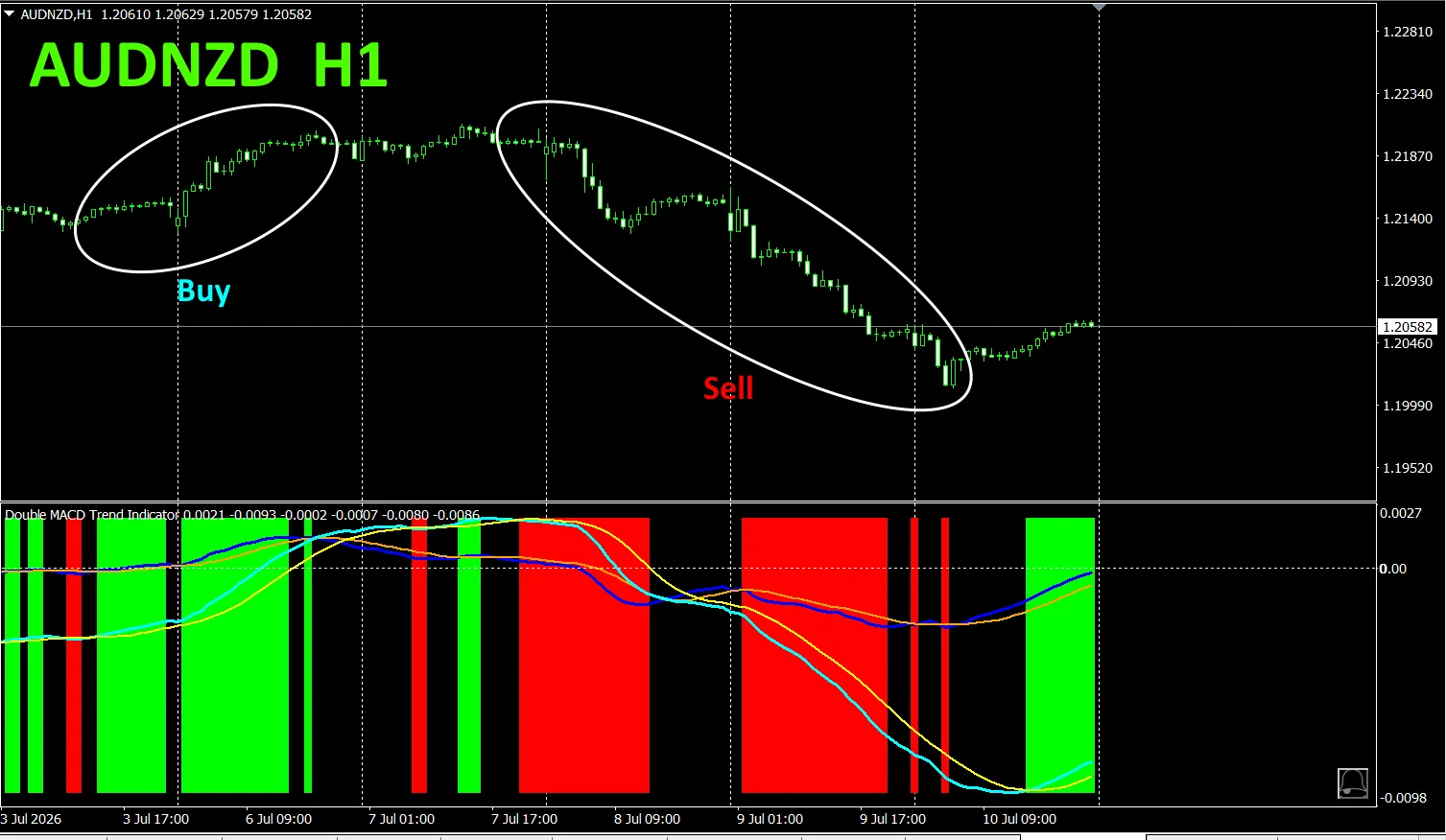
This indicator clearly shows the direction of the trend with color. If the color bar is Lime, it’s a buy; if Red, it’s a sell; if no color, there is no trend. The color display lets you understand the trend at a glance.
The red zone for sell and green zone for buy are clearly separated, making trading easier at a glance.In the above figure, buy in the green shaded area enclosed by a white circle, and sell in the red shaded area enclosed by a white circle
This indicator was introduced to AUDNZD on the 1-hour chart.
“Dual_MACD_Trend_Indicator” allows, buy in green zones, sell in red zones, and otherwise do not trade.
From the sales page
“Trend_Color_MA_Dual_MTF” designed to transform your trading. This tool is not just a moving average. It visualizes the trend direction in color, and notifies you with a sound and alert when a trading opportunity arises, acting as your personal assistant.
As an example, AUDNZD 1-hour chart shows simultaneously the 4-hour moving average.
The 4-hour moving average forms a stair-step pattern. Both 1-hour and 4-hour moving averages rise in blue tones and fall in red tones, so current chart direction and higher-timeframe direction can be judged at a glance.
When higher-timeframe and current timeframe colors match, sell in red, buy in blue.
For selling, 1-hour MA is red and descending, 4-hour MA is orange and descending, sell when these conditions align
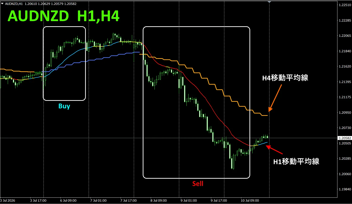
In the above figure, focus on the area enclosed by the white rectangle to trade buy/sell.
For details, please refer to the following link
https://www.gogojungle.co.jp/tools/indicators/75985
“8CFD Visualization Indicator Any version”
https://www.gogojungle.co.jp/tools/indicators/32288
“Totoro Indicator”
https://www.gogojungle.co.jp/tools/indicators/50115
“TrendLine-EX”
https://www.gogojungle.co.jp/tools/indicators/42257
“8C Currency Strength Visualization Indicator” is, please refer to the following page。

MT4 version https://www.gogojungle.co.jp/tools/indicators/39150
MT5 version https://www.gogojungle.co.jp/tools/indicators/39159
【Products I have listed】