
Use of the "Visualization Indicator" (Part 258)
“Visualization Indicator” Utilization(that258)
1. “28Currency Pair List Indicator” to be further evolved into an indicator
“8CPVisualization Indicator” for USD/CHF to be drawn
“8CPVisualization Indicator” has Oceania version、 London version、 New York version version、 AnyCP exists。 This time, we used version the New York.
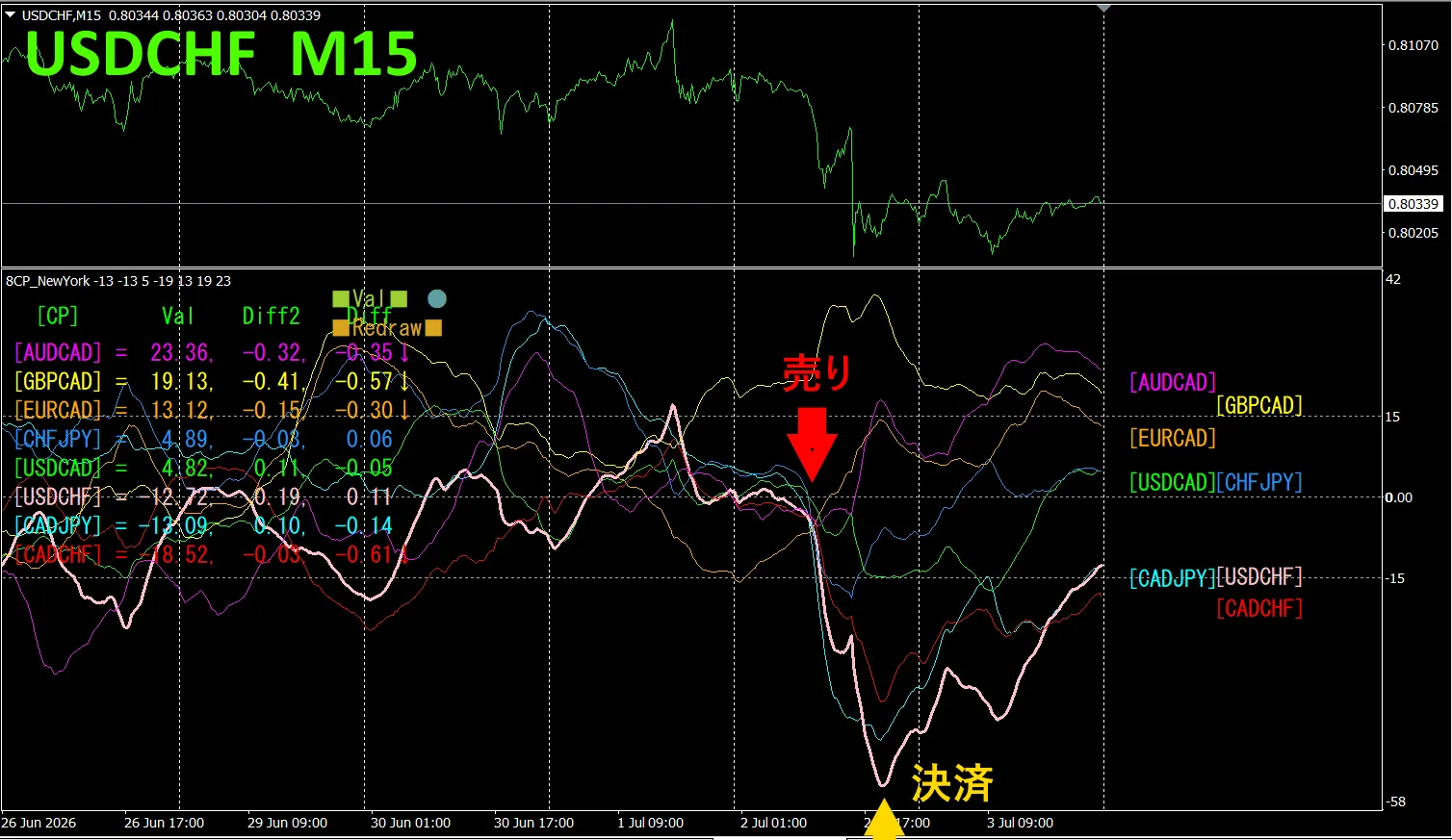
The top half is a 15-minute chart of USD/CHF. The bottom half is from the “8CP Visualization Indicator; the pink thick line on the graph corresponds to USD/CHF.
On Thursday, the USD/CHF graph fell below the other graphs, so we sold. We closed at the bottom of the day, obtaining about 60 pips in profit.
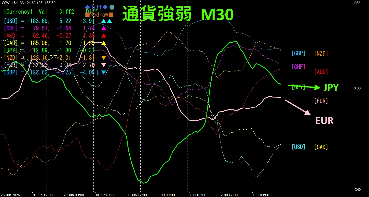
Currency Strength/Weakness Graph
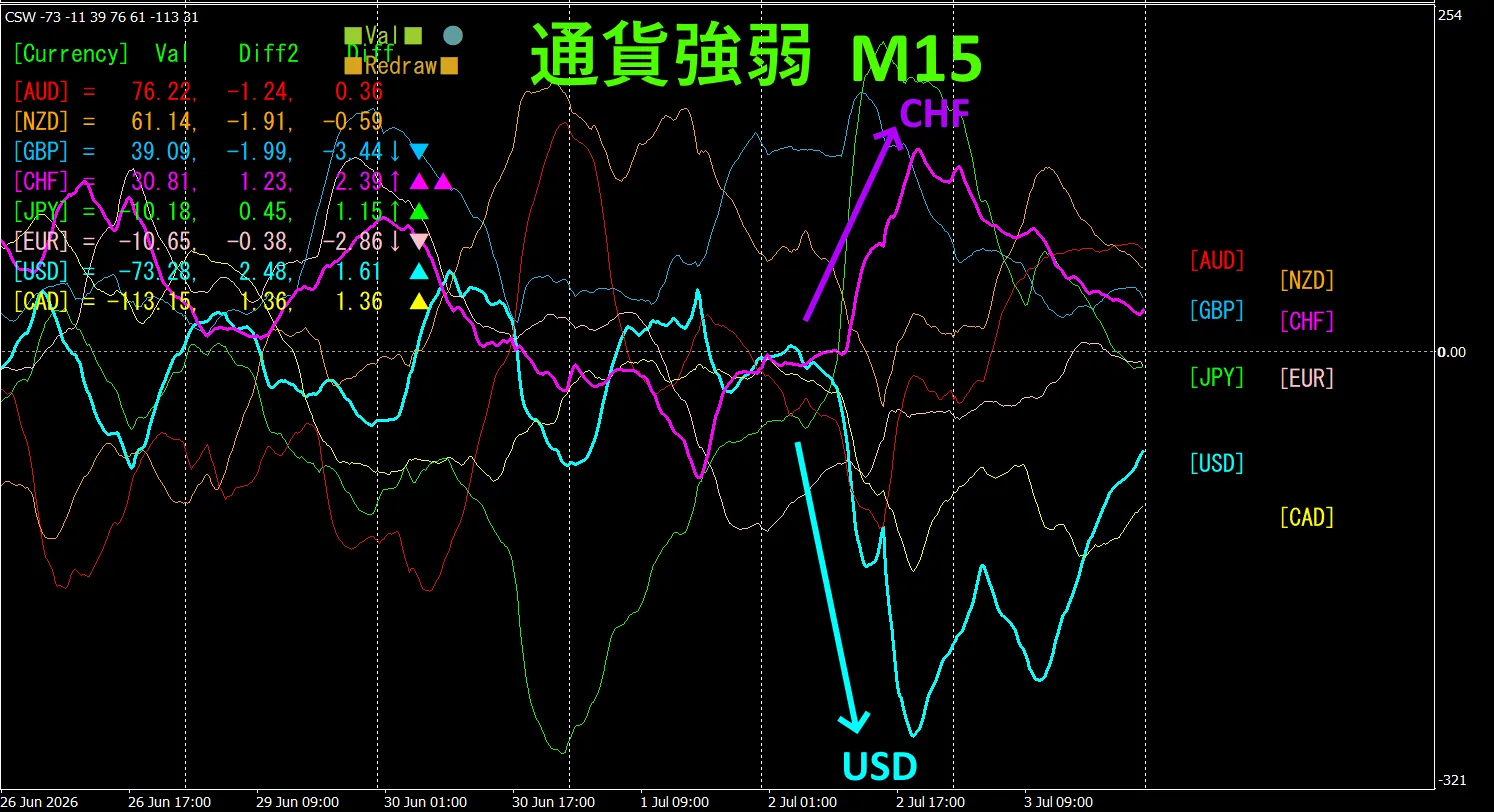
Looking at the 15-minute currency strength graph, C HF and USD show a negative correlation. Only the CHF and USD expansion/dispersion is traded during dispersion. When dispersion occurs, sell USD/CHF is appropriate. Since they are in a negative correlation, trade only at that point.
In FX, pick the currency pair that is growing the most and has negative correlation, and you will naturally see results
“Aim for currency strength/weakness anti-correlation!” is FX's rule.
Using “TrendLine-EX”, you can automate entries and settlements with diagonal trendline breaks. Since you can leave it as is, easy trading becomes possible. “TrendLine-EX” is a semi-automatic EA that executes short when the trendline breaks below, and closes when it breaks above.
2. Best SelectTry the Indicator
The below figure is a screen capture from 2026 June 29 20:46(JST) .
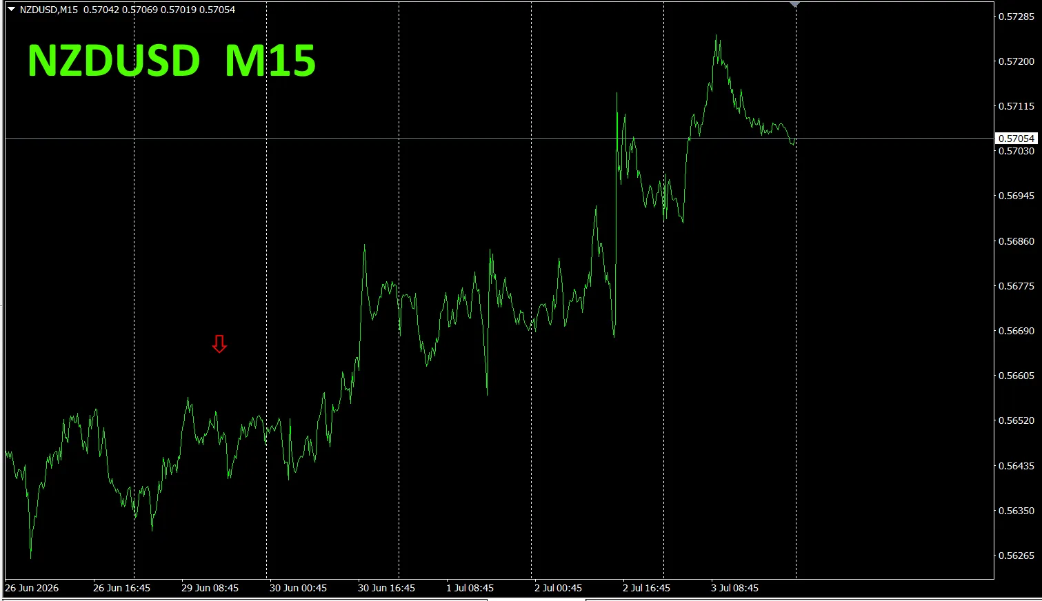
[Total] sorts numbers in descending order. The bottom-most is NZD USD, which, in every timeframe except D1, is shown in red. The Total value is -431.10, a negative number. This indicates a weakly descending trend for NZD. USD
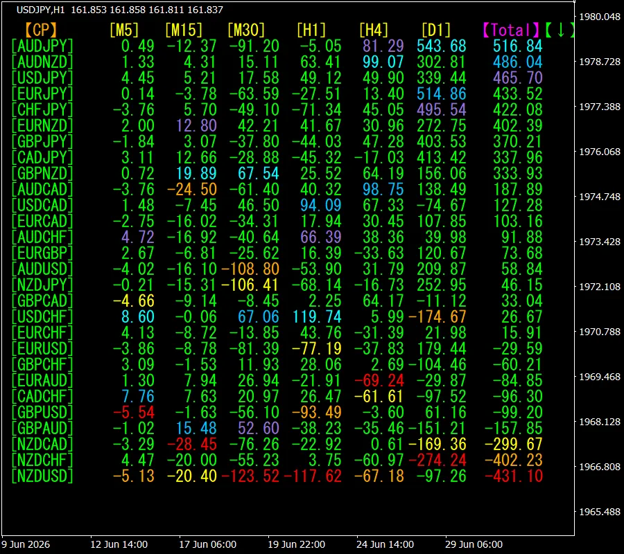
,let's look at the NZD USD chart.
The red arrows indicate where the screenshot was taken. It captures the legs where price was falling.
“28 Currency Pairs Best Select Indicator” allows easily identifying which currency is most trending among 28 pairs. Also, the “28 Currency Pairs Deviation Comparison Indicator” tells you which pair has the largest deviation among the 28 pairs. It’s an excellent indicator to determine at a glance which pair to trade among all pairs.
“28 Currency Pairs Best Select Indicator”
https://www.gogojungle.co.jp/tools/indicators/35128
3. Since May 2021, we have been tracking EURJPY movements?
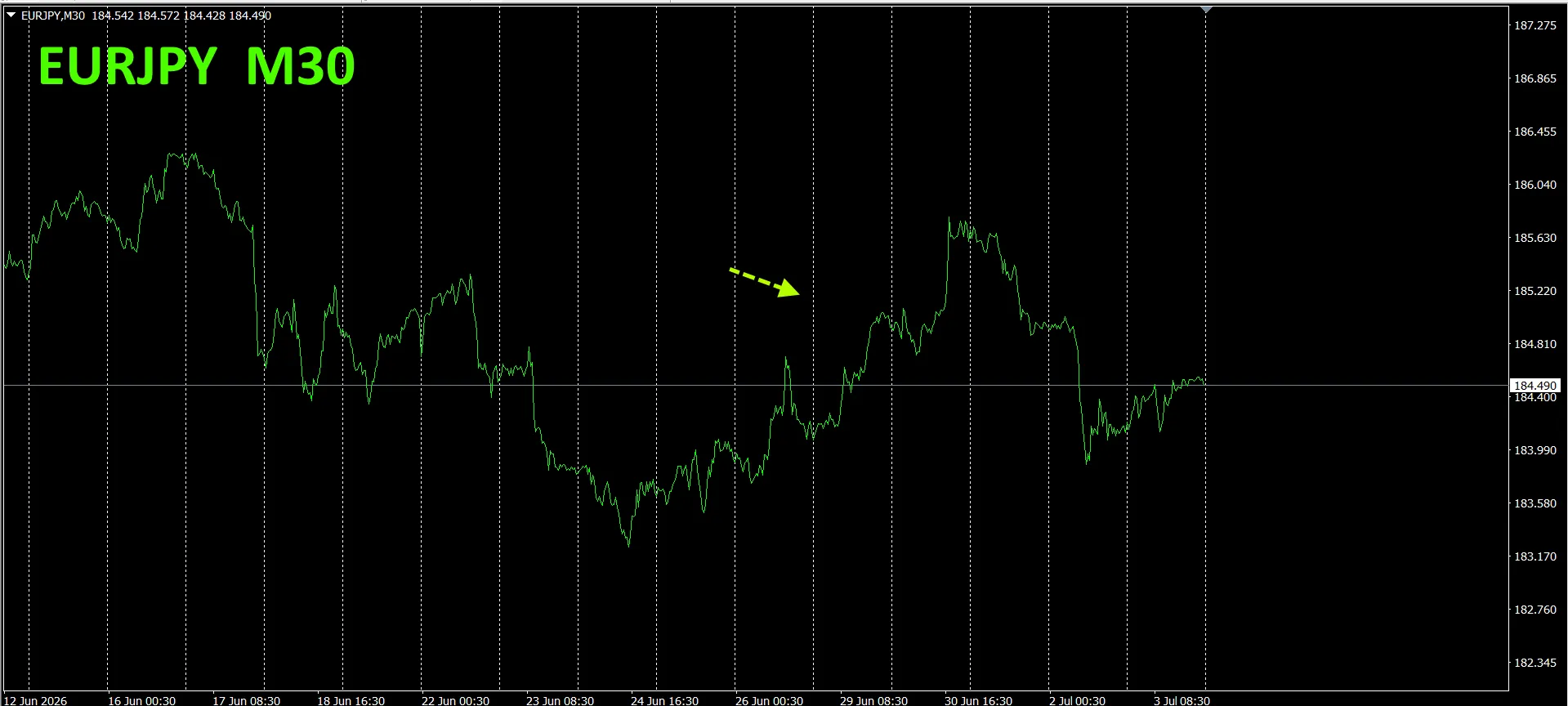
From May 2021, we have been tracking EURJPY movements.
To view the overall trend, we plot roughly the past 3 weeks on a 30-minute chart.
Last time, we wrote the following.
Pink is EUR, green is JPY. The EUR vector is downward, while the JPY vector is slightly upward, thus EURJPY is expected to head downward.
Mon day~ Tue showed a small rise, but subsequently declined.
30-minute currency strength chart.
Pink is EUR, green is JPY. EUR vector is downward, JPY is roughly horizontal to slightly downward, so EURJPY is expected to move down.
4. Try the new indicator Dual_MACD_Trend_Indicator
New Indicator “Dual_MACD_Trend_Indicator” please see below.
MT4 version:https://www.gogojungle.co.jp/tools/indicators/62199
MT5 version:https://www.gogojungle.co.jp/tools/indicators/62202
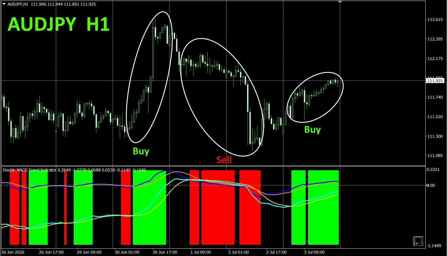
This indicator clearly and colorfully shows trend direction. If the color bar is Lime, it’s a buy; if Red, it’s a sell; and if there is no color, there is no trend. Because it’s color-based, you can grasp the trend state at a glance.
We have applied this indicator to AUD JPY on the 1-hour chart.
In the red sell zone and the green buy zone, clearly separated, it makes trading easy at a glance. In the above chart, the buy area is enclosed by a white circle in green, and the sell area by a white circle in red
“Dual_MACD_Trend_Indicator” uses a simple rule: buy in the green zone, sell in the red zone, and do not trade otherwise.
Using “Dual_MACD_Trend_Indicator” eliminates any hesitation about trade direction.
From the sales page
“Trend_Color_MA_Dual_MTF” is designed to transform your trading. This tool is not just a moving average. It visualizes the trend direction with “color” and notifies you the moment a signal arrives with “sound” and “notification” as your personal assistant.
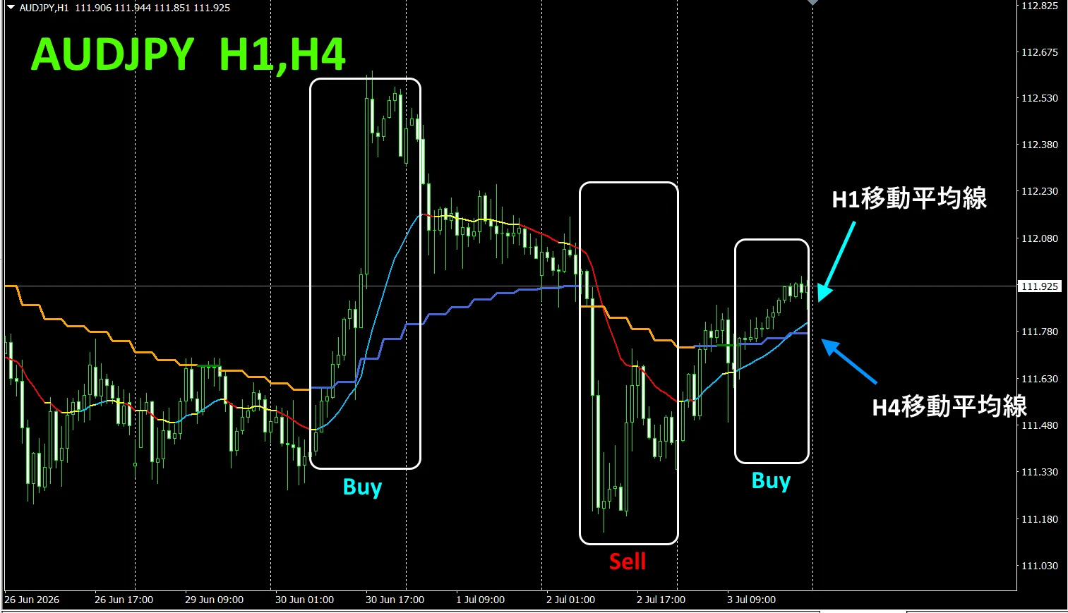
As an example, AUD JPY on the 1-hour chart shows four-hour moving averages concurrently.
The jagged staircase is the four-hour moving average. The 1-hour MA and the four-hour MA are colored blue when rising and red when falling, so you can instantly judge the current chart trend direction versus the higher timeframe trend direction by color.
When the higher timeframe and current timeframe colors align in the same hue, sell when red, buy when blue.
For selling, the 1-hour MA turns red while the 4-hour MA turns orange during the downtrend, and you sell at that point.
In the above image, pay attention to the white box around the area for selling buying/
For more details, please refer to the following link.
https://www.gogojungle.co.jp/tools/indicators/75985
※
“8CFD Visualization Indicator Any version”
https://www.gogojungle.co.jp/tools/indicators/32288
“Toretore Indicator
https://www.gogojungle.co.jp/tools/indicators/50115
“TrendLine-EX”
https://www.gogojungle.co.jp/tools/indicators/42257
“8C Currency Strength Visualization Indicator” is available on the following pages.
MT4 version https://www.gogojungle.co.jp/tools/indicators/39150
MT5 version https://www.gogojungle.co.jp/tools/indicators/39159
【Items I have for sale】