
Utilization of the "Visualization Indicator" (Part 257)
“Visualization Indicator” utilization(its257)
1. Evolution of the “28 Currency Pairs List Indicator” into an advanced indicator
“8CP Visualization Indicator” for AUDCAD draw
“8CP Visualization Indicator” has Oceania edition, London edition, New York edition, AnyCP edition. This time, we used the New York edition.
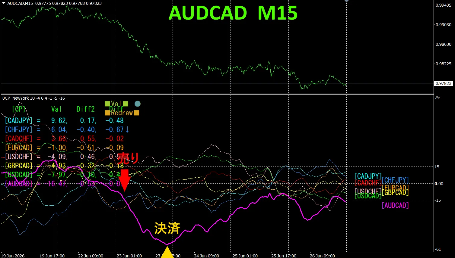
The upper half is the 15-minute chart of AUDCAD. The lower half is from the “8CP Visualization Indicator”, showing that the red-violet solid line corresponds to AUDCAD.
Tuesday, the AUDCAD graph fell below the others groups, so we sold. We settled at the day’s bottom, earning about 70 pips of profit.
Currency Strength Diagram
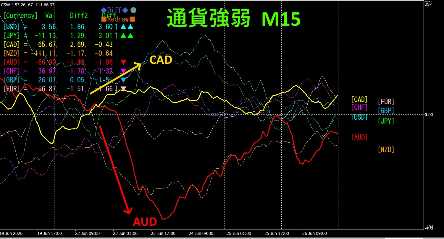
Looking at the 15-minute currency strength graph, AUD and CAD are in a negative correlation. AUD and CAD spread out and we trade only at the expansion areas. During expansion, you can sell AUDCAD as an inverse correlation trade. Because they are negatively correlated, you should trade only at those points.
In FX, it's best to pick the currency pair that is currently expanding the most and showing a negative correlation so that results come naturally.
“Aim for currency strength inverse correlation!” is FX iron rule.
By using “TrendLine-EX”, you can automate entry and settlement with diagonal trendline breaks. Since you can just leave it as is, it enables easy trading. “TrendLine-EX” is a semi-automatic EA that can automatically sell on trendline lower breaks and automatically settle on trendline upper breaks.
2. Try Best Select Indicator
Below is the 2026 June 23 day 21:26 ( JST ) screenshot.
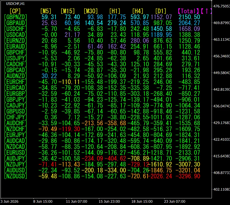
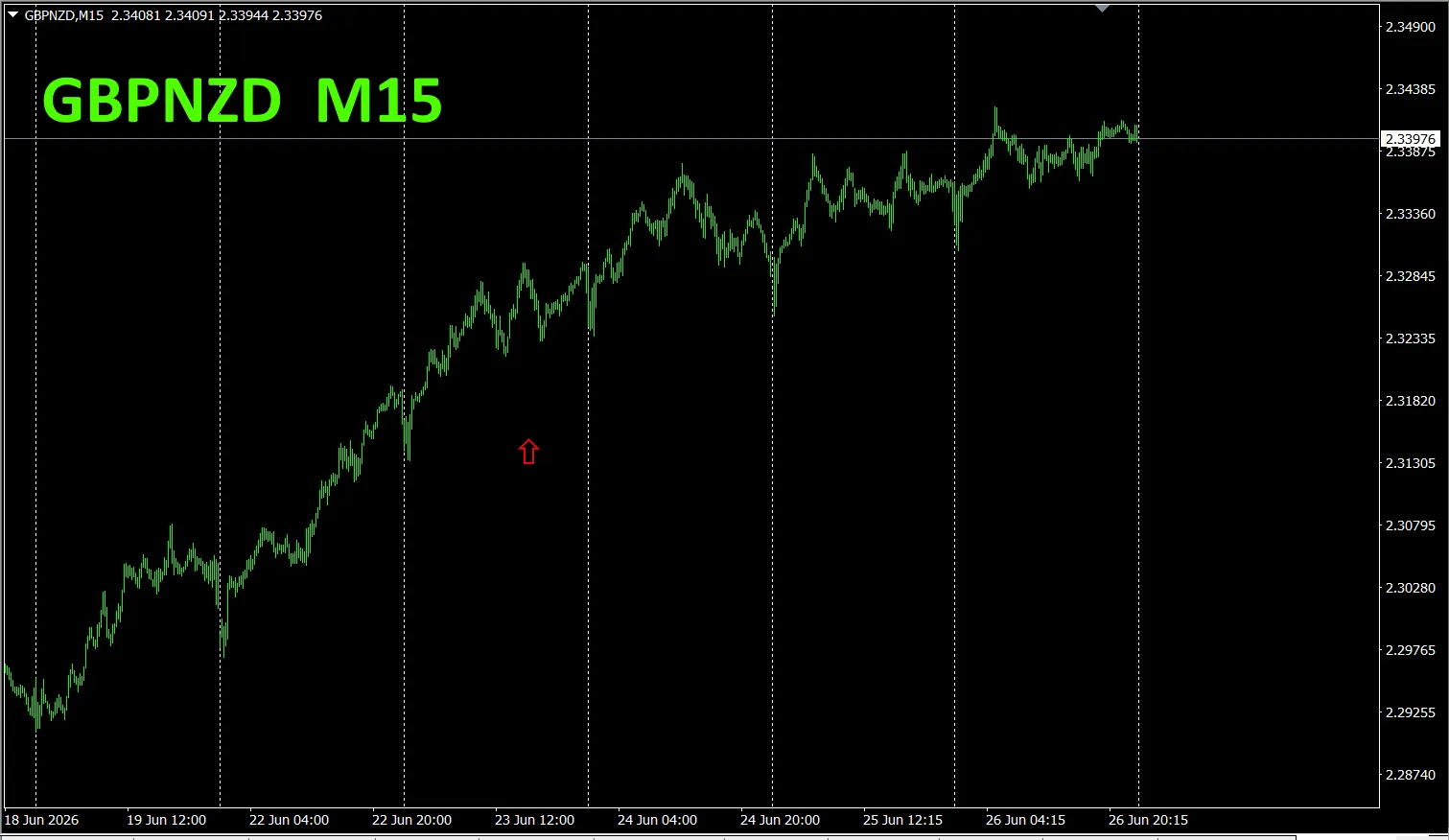
[Total] The top one, GBPNZD, shows blue display color across all timeframes. Moreover the Total value is 2150.50, indicating a large positive number. This suggests a rising trend in GBPNZD.
, let’s look at the GBP/ chart.
The red arrows indicate where the screenshot was taken. It captures rising sections.
“28 Currency Pairs Best Select Indicator” can easily identify which currency is showing the strongest trend among the 28 pairs. Also, “28 Currency Pairs Deviation Comparison Indicator”. It’s a powerful indicator to decide which pair to trade at a glance.
“28 Currency Pairs Best Select Indicator””

https://www.gogojungle.co.jp/tools/indicators/35128
3. Since May 2021, what happened with EURJPY
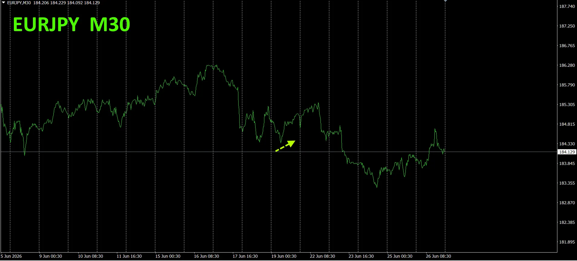
We have been tracking EURJPY since May 2021.
To view the overall trend, we have drawn roughly three weeks of the most recent 30-minute charts.
Previously, we wrote the following.
Pink is EUR, green is JPY.EUR vector is horizontal,JPY is slightly downward, but not clearly directional yet, and may move slightly upward EURJPY in the future.
Monday saw a small rise, but later it declined.
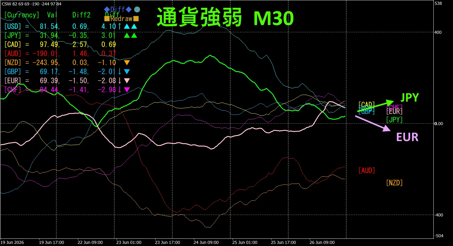
30-minute currency strength chart.
Pink is EUR, green is JPY.EUR vector is downward,JPY slightly upward, therefore EURJPY is expected to move downward.
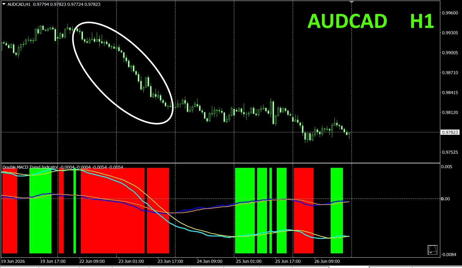
4. Try the new indicator Dual_MACD_Trend_Indicator.
New Indicator “Dual_MACD_Trend_Indicator” is shown below。
MT4 version:https://www.gogojungle.co.jp/tools/indicators/62199
MT5 version:https://www.gogojungle.co.jp/tools/indicators/62202
The indicator clearly shows the trend direction with color; color bars: Lime = buy, Red = sell, easy for beginners to use. If the bar color is green, it indicates an uptrend; if red, a downtrend; if no color, no trend. With color display, you can understand the trend at a glance.
This indicator was applied to AUDCAD on the 1-hour chart.
The red sell zone and green buy zone are clearly separated, making trades easy at a glance.In the upper chart, the area shaded red should be sold.
“Dual_MACD_Trend_Indicator” indicates, in green zones buy, in red zones sell, and otherwise no trades.
Using “Dual_MACD_Trend_Indicator” eliminates any trading direction hesitation.
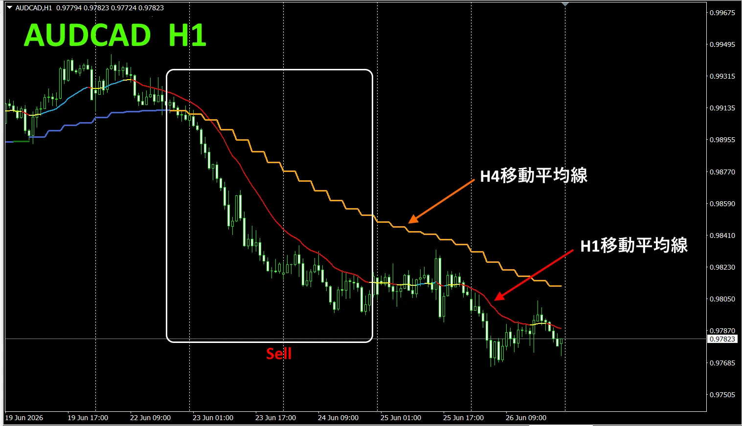
5. “Trend_Color_MA_MTF” has been released
From the sales page
“Trend_Color_MA_Dual_MTF” was developed to transform your trading. This tool is not just a moving average. It visualizes trend direction with “color” and notifies you the moment a signal arrives with “sound” and “notification”, acting as your personal assistant.
As an example, on the AUDCAD 1-hour chart, showing the 4-hour moving averages simultaneously.
The 1-hour MA and the 4-hour MA both show, during uptrends, blueish hues and during downtrends, reddish hues, so you can easily compare current chart trend direction with higher-timeframe trend direction at a glance.
When the colors of the higher and current timeframes align, if red, trade a sell; if blue, trade a buy.
In a sell scenario, the 1-hour MA is red and in the downtrend, the 4-hour MA is orange and in decline, and you sell when those conditions occur.
In the upper chart, focus on the white boxed area to trade a sell.
For more details, see the following link.
https://www.gogojungle.co.jp/tools/indicators/75985
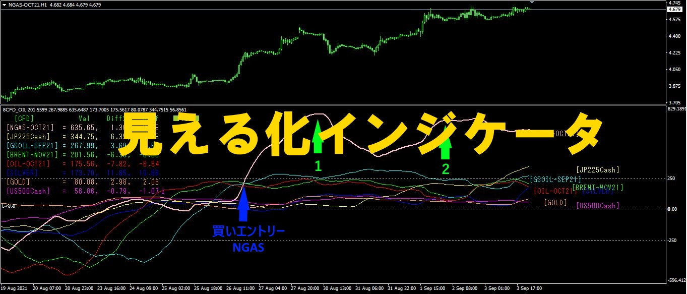
“8CFD Visualization Indicator Any edition”
https://www.gogojungle.co.jp/tools/indicators/32288
“toreto Indicator”
https://www.gogojungle.co.jp/tools/indicators/50115
“TrendLine-EX”

https://www.gogojungle.co.jp/tools/indicators/42257
“8C Currency Strength Visualization Indicator” is available on the following pages.

MT4 version https://www.gogojungle.co.jp/tools/indicators/39150
MT5 version https://www.gogojungle.co.jp/tools/indicators/39159
【My listed items】