
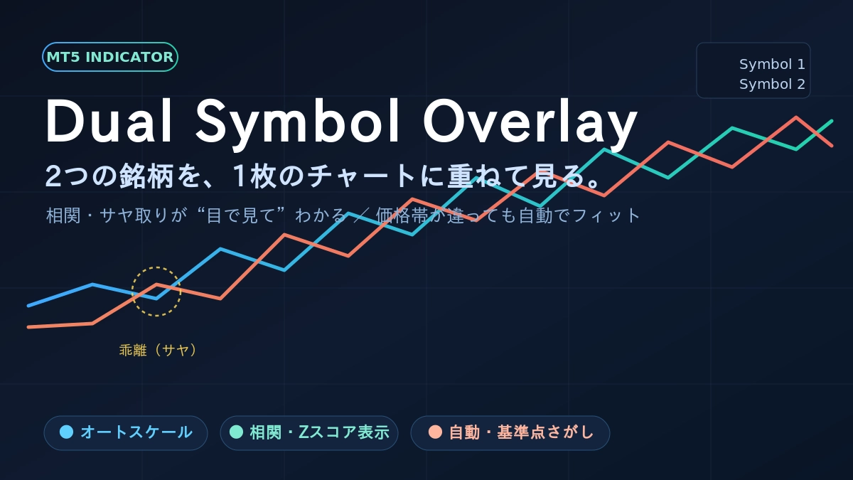
Two currency pairs are overlaid on a single chart, Dual Symbol Overlay.
That “vaguely similar movement”—are you really seeing it clearly?
―― By simply overlaying two symbols on a single chart, you’ll uncover the market’s “other face”――
────────────────────────────
■ Have you ever had this experience?
While watching the euro/dollar, you think to yourself.
“The pound/dollar should be moving similarly… but which is stronger right now?”
Gazing at the gold chart, you might also think this.
“Is silver really keeping up properly? Is one side lagging behind?”
With that thought, you switch to another chart.
After watching for a while, you return to the original chart.
In your mind you roughly overlay two price movements and make a rough judgment.
It is the Dual Symbol Overlay that turns this “vague sense” into a clear, visible form.
────────────────────────────
■ The moment two lines overlap, the world changes
What this indicator does is very simple.
On the currently open chart,
overlay and draw the price movement of the other symbol as is.
That’s all there is to it.
But the moment the two lines actually appear side by side on one screen,
things that were previously invisible suddenly become visible.
A sense of reassurance that they move together all the time.
A sense of discomfort when something is strangely detached here.
A time lag where one moves first and the other lags behind.
When you were comparing by memory by switching charts,
these were only vaguely felt, but now
they appear clearly as two lines in front of you.
────────────────────────────
■ “I can’t overlay them because the prices are so different”—you don’t need to worry about that anymore
Have you ever tried overlaying two symbols and thought,
“Dollar/Yen is in the 150s, euro/dollar is around 1.0. The digits are so different that overlaying seems meaningless.”
Indeed, if you overlay as-is, one ends up nearly straight on the top of the screen,
and the other on the bottom, making comparison impossible.
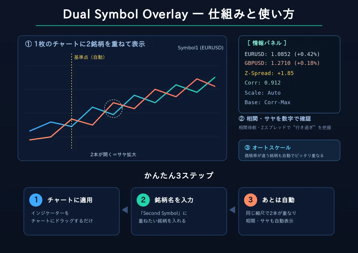
This indicator automatically solves that problem.
Just by installing with default settings, regardless of price range,
the two price movements will perfectly align, with automatic scaling.
All you need to do is “enter the name of the symbol you want to overlay.”
No need to wrestle with settings or calculations.
────────────────────────────
■ When you can spot the “too far apart” moment, your trading changes
Two symbols that should move together.
Sometimes, they drift apart unusually far.
Like rubber being stretched, what has separated will eventually return to form.
Using this “over-extension → reversion” movement is a concept used by professionals as pair trading (spread trading).
With Dual Symbol Overlay,
that moment when they diverge is instantly visible as two lines widening apart.
Moreover, it’s not just a visual judgment.
An information panel displayed in the corner of the chart
tells you in numbers
“How similarly they move (correlation)”
“How far apart they are now (Z-spread)”
and guides your assessment numerically.
Not just guessing by feel—
you can see, with rationale, that “correlation is about 0.9 and usually aligns, but the spread is currently wide.”
This is the main fun of using this tool.
────────────────────────────
■ It can also serve as a look for arbitrage (arbitrage)
Finding the distortions between correlated symbols to seek profit—that is the world of arbitrage.
Two symbols that should move in tandem
Sometimes there is a temporary misalignment (price gap, spread),
and that is where the arbitrage opportunities lie.
Dual Symbol Overlay is precisely a tool to visualize this “distortion.”
• Overlay highly linked symbols and capture moments when the spread opens from usual
• Use correlation coefficient and Z-spread numbers to determine whether the divergence is statistically excessive
• Automatically find a baseline point and measure deviation around the most minimal spread
These uses are directly applicable to spotting distortions in correlated symbol pairs
as part of Statistically Arbitrage or spread trading
and serve as their “eyes.”
Not by guess or luck, but by the two lines and their numbers as evidence of distortions.
This indicator brings that first step much closer to you.
────────────────────────────
■ Furthermore, you can also entrust the question of “where to base from”
When comparing two differences, the starting point (base) matters,
and the viewpoint can change dramatically.
However, finding the optimal base point by yourself is somewhat laborious.
This indicator includes a feature that automatically finds that base point.
It discovers “the moment when the two moved most coherently” or “the moment when the difference was smallest,”
and marks it with a yellow line on the chart.
You can delegate the difficult analysis to a single button.
That kind of “smarts” is another hidden appeal of this tool.
────────────────────────────
■ Beginners gain the most
When you hear about “correlation” and “pair trading,”
it can feel like an advanced, difficult world.
But it is actually the opposite.
This indicator translates that seemingly tough world into a form anyone can intuitively grasp—
the movement of two lines.
When the lines move together.
One day, one line drifts apart.
After a while, they come back close again.
Just by watching this story,
the “relationships” that exist in the market naturally seep into your understanding.
Even the time you spent lining up two charts side by side to compare
or the time you hesitated about which one was stronger
can be settled with this single tool.
────────────────────────────
■ How to use in just 3 steps
1. Apply to a chart
Just drag the indicator onto the chart as usual.
2. Enter the symbol you want to overlay
In Settings, enter the name of the second symbol in “Second Symbol.”
(At first, you can leave it as the default. When you get used to it, try GOLD or USDJPY, etc.)
3. Then, just look
The two price movements automatically overlay, and correlation and spread are displayed as numbers.
All you have to do is read the story told by the two lines.
────────────────────────────
■ You’ll surely find you can’t live without it in moments like
・When two currencies that should be correlated drift far apart and you feel, “this will revert”
・When you notice silver lagging Gold and can anticipate the move
・When the two lines move together perfectly and you can see the market structure
・When many charts were open and now they’re consolidated onto one
────────────────────────────
■ In conclusion
Improving at trading may be about
“Being able to see things others can’t see.”
If you look at only one chart, you’ll never notice these misalignments and connections.
Dual Symbol Overlay displays them before your eyes as two lines.
Settings are simple. Yet the world you see expands dramatically.
Overlay another line on your usual chart.
You'll see the market differently than ever before.