
Utilization of "Visualization Indicator" (Part 254)
「Visualization Indicator」 Utilization(That254)
1. “28 Currency Pair List Indicator” to further evolve into an Indicator.
“8CP Visualization Indicator” to draw NZDUSD.NZDUSD chart
“8CP Visualization Indicator” has Oceania version, London version, NewYork version, AnyCP version. This time, Oceania version was used.
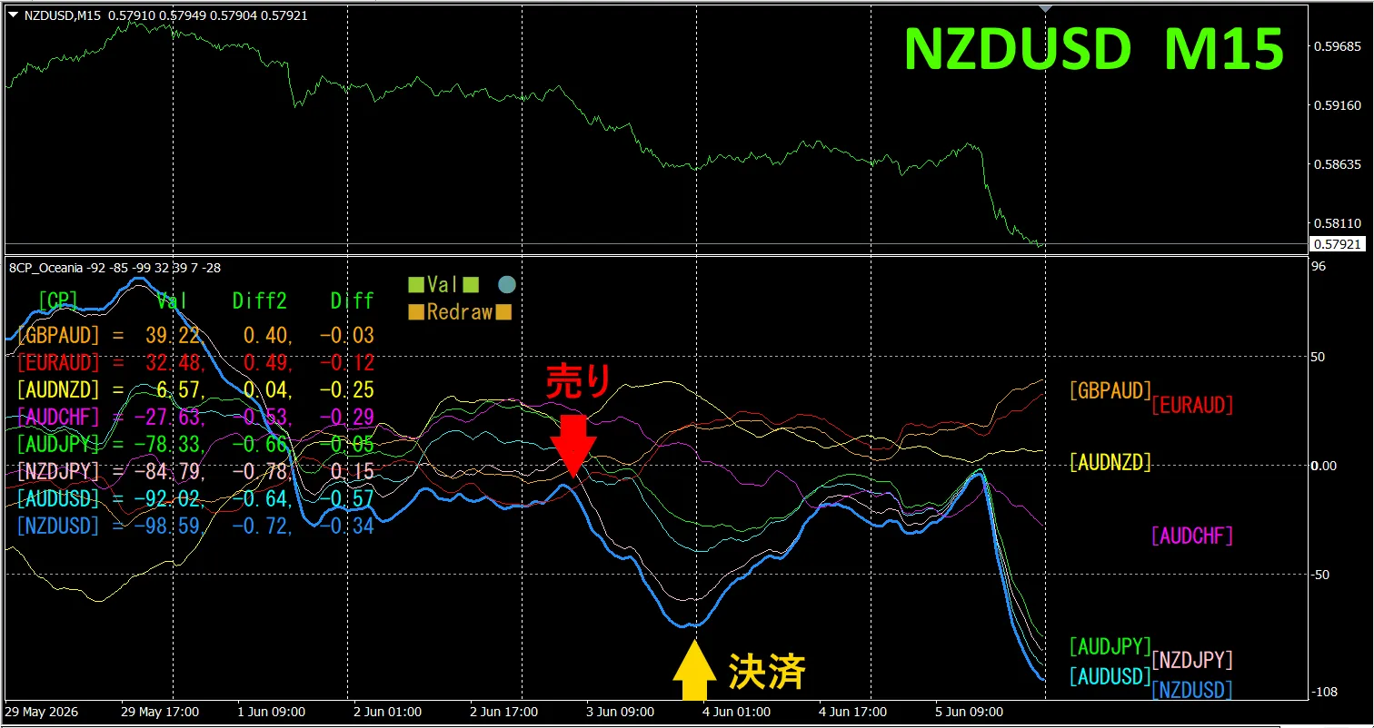
The upper half shows,NZDUSD 15-minute chart.The lower half is from the “8CP Visualization Indicator”., the light blue thick line graph corresponds to NZDUSD.
On Wednesday, NZDUSD’s graph fell below the others, so we sold. We closed at the day’s low, obtaining approximately 65 pips of profit.
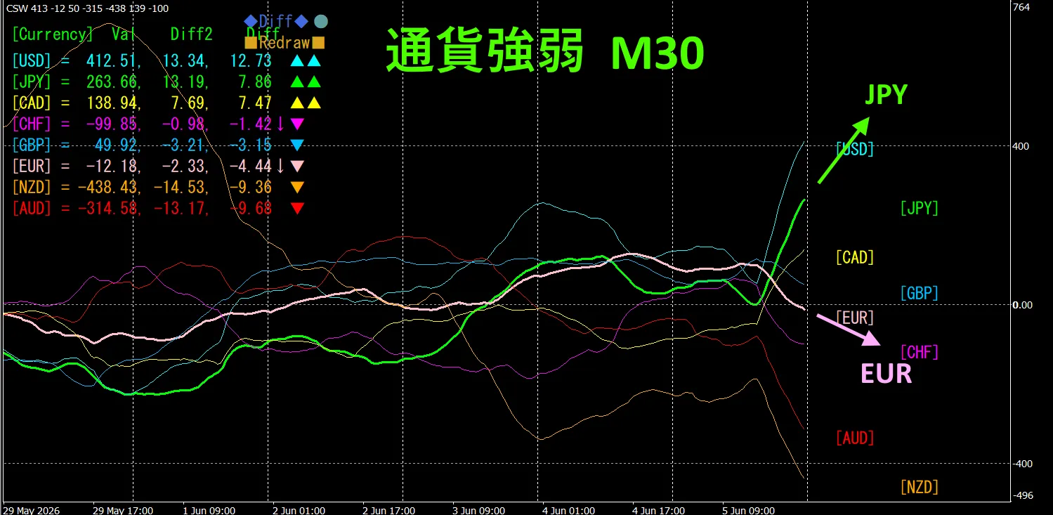
Currency Strength/Weakness Graph
shows in 15-minute timeframe that, NZD and USD are in an inverted correlation.Trade only when NZDUSD is expanding (diverging).Since they are in inverse correlation, target only that point for trading.In FX, choose the currency pair that is currently expanding the most and has an inverse correlation, and profits will follow.
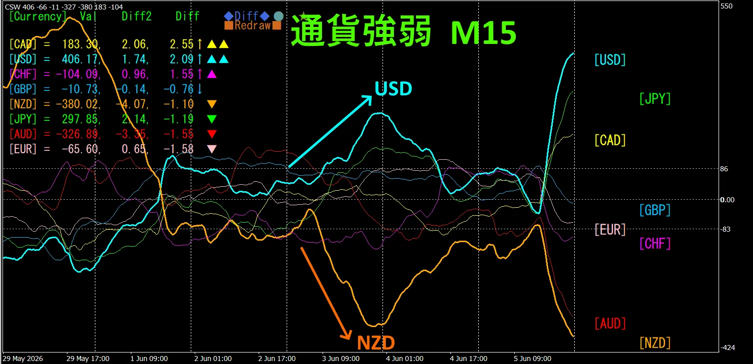
“Trade currency strength inverse correlation”
isFX’s rule of thumb.
If you use “TrendLine-EX”, you can automate entry and exit with diagonal trendline breaks. Since you can leave it as is, you can achieve a comfortable trade.“TrendLine-EX” can do semi-automatic selling on trendline break and semi-automatic closing on trendline break above.
2. Best Select Try the Indicator
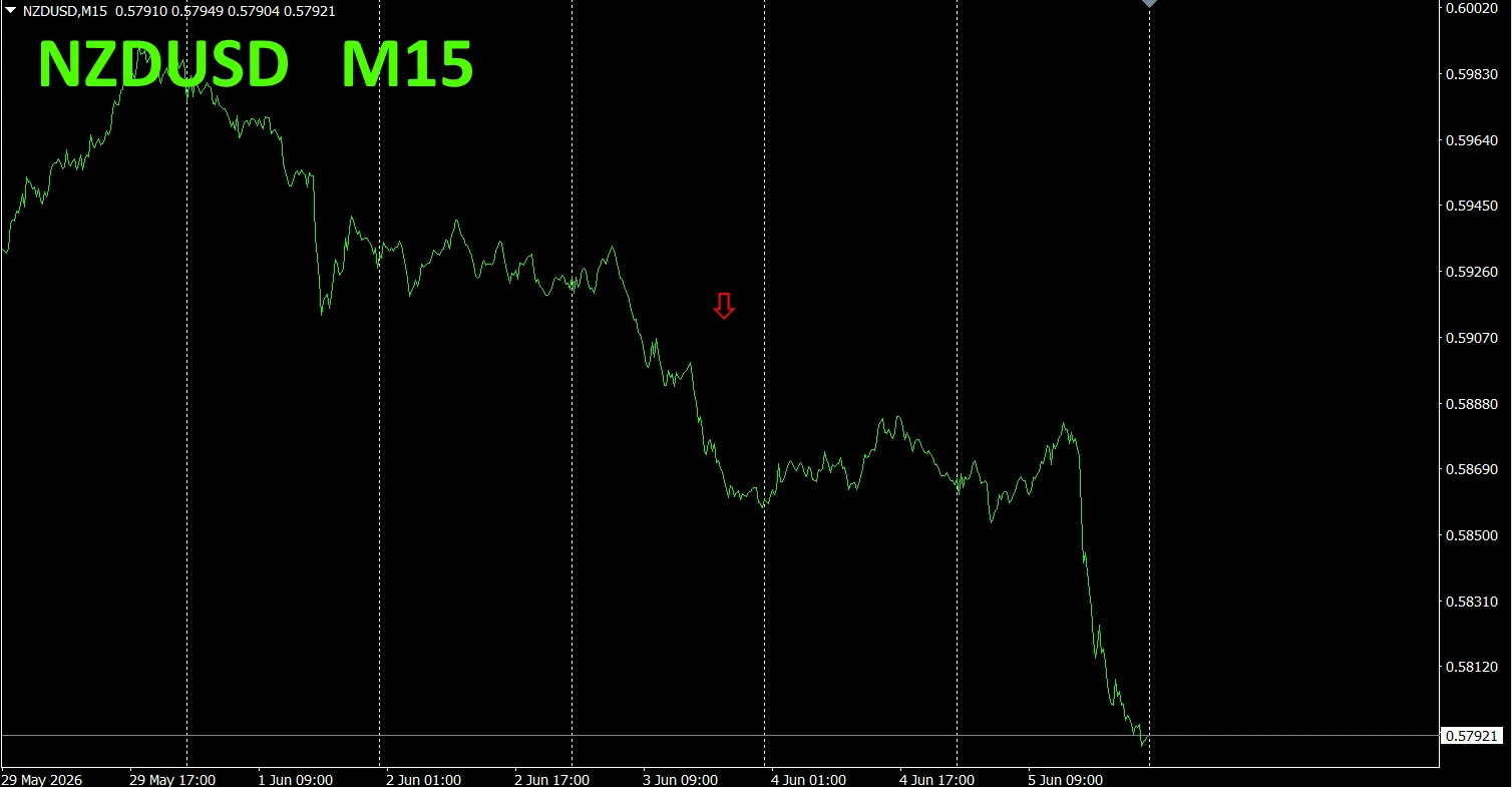
The following image is a screenshot from 2026/06/04 01:02 (JST).
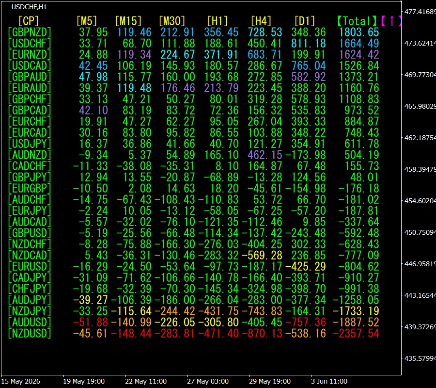
[Total] shows values in descending order. NZUSD at the bottom is red across all timeframes. This indicates a downtrend for NZDUSD.
Now, let’s look at NZDUSD’s chart
The red arrows indicate the screenshot position. It captures the downtrend portion.
“28 Currency Pairs Best Select Indicator” lets you easily identify which of the 28 currency pairs has the strongest trend. Also, the “28 Currency Pair Disparity Comparison Indicator” shows which pair has the largest disparity among the 28 pairs, enabling quick judgment on which pair to trade. It is an excellent indicator for selecting trading opportunities from all pairs
“28 Currency Pairs Best Select Indicator” is

https://www.gogojungle.co.jp/tools/indicators/35128
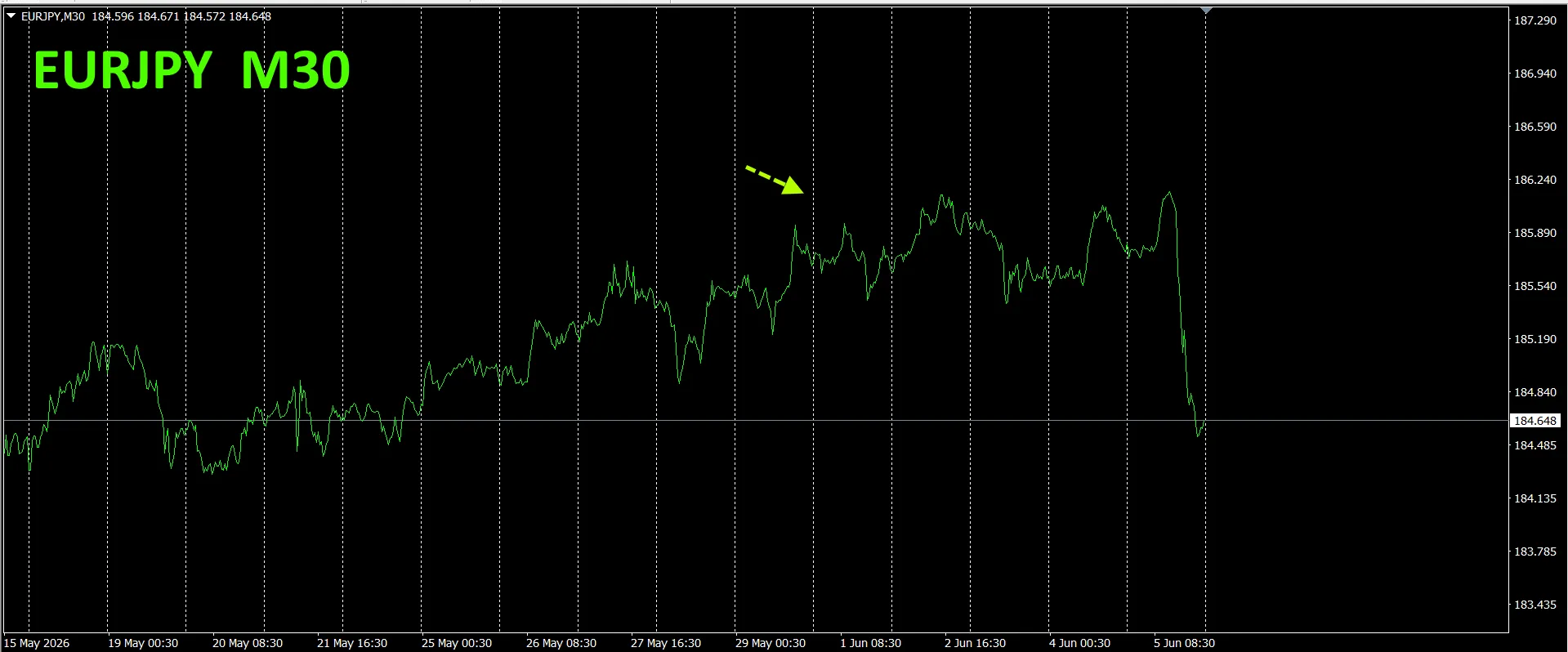
3. Since May 2021, the behavior of EURJPY has been tracked
We have been tracking EURJPY since May 2021.
To view the overall trend, we draw about the last 3 weeks on a 30-minute chart.
Last time I wrote as follows.
Pink is EUR, Green is JPY. EUR vector leans slightly downward, JPY is nearly horizontal, so EURJPY is expected to trend slightly downward.
It seems to be losing momentum slightly..
30-minute currency strength chart.
Pink is EUR, Green is JPY. EUR vector is downward, JPY is upward, so EURJPY is expected to rise.
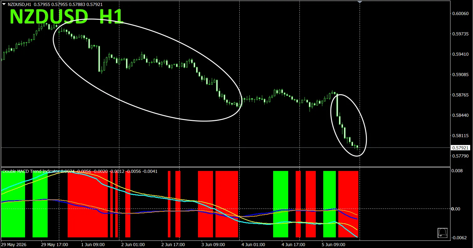
4. Try the new indicator Dual_MACD_Trend_Indicator.
New indicator “Dual_MACD_Trend_Indicator” details are below.
MT4 version:https://www.gogojungle.co.jp/tools/indicators/62199
MT5 version:https://www.gogojungle.co.jp/tools/indicators/62202
This indicator clearly shows trend direction with color. Color bars: Lime for buy, Red for sell. It is beginner-friendly and easy to use. If the bar color is green, it indicates an uptrend; if red, a downtrend; if no color, no trend. With color visualization, you can grasp the trend status at a glance.
This indicator was applied to NZDUSD on the 1-hour chart.
The red sell zone and the green buy zone are clearly separated, making trading straightforward at a glance. In the upper chart, focus on the white-circled area to sell.
The “Dual_MACD_Trend_Indicator” allows you to trade according to simple rules: buy in green zones, sell in red zones, and do not trade otherwise.
Using Dual_MACD_Trend_Indicator eliminates uncertainty about trade direction.
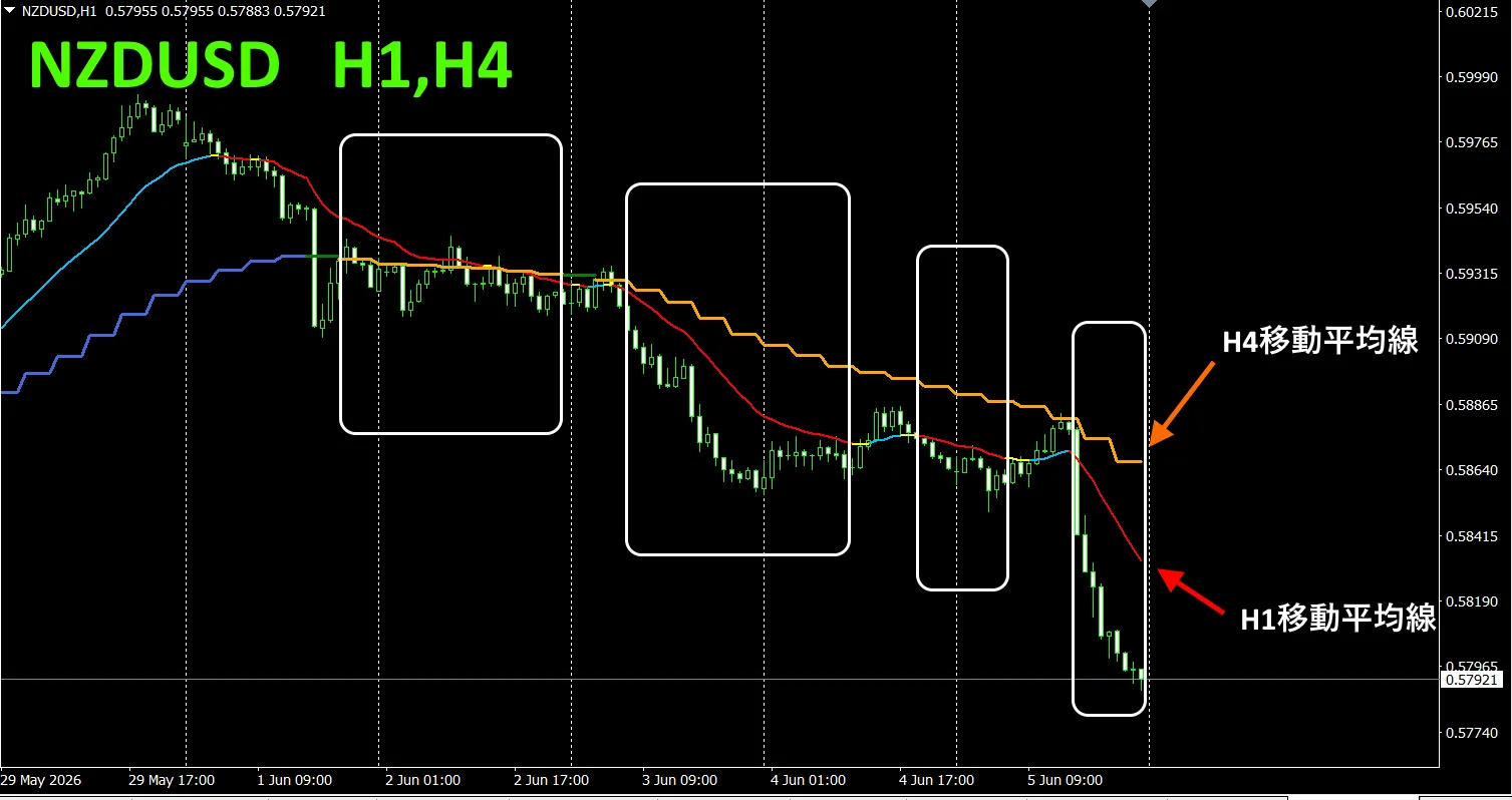
5. “Trend_Color_MA_MTF” has been newly released. The sales page states
“Trend_Color_MA_Dual_MTF” is designed to transform your trading. This tool is not just a moving average. It visualizes trend direction with color, and notifies you with sound and notification the moment a new opportunity arrives, acting as your personal assistant.
As an example, on NZDUSD 1-hour chart we displayed 4-hour moving averages simultaneously. The 4-hour MA shows stair-step, while 1-hour MA also displays, and rising is shown in bluish colors, falling in reddish colors, so you can easily compare current chart trend direction with higher time-frame trends by color.
When the colors of the higher and current timeframes align in the same color family, sell if red, buy if blue.
In selling, 1-hour MA is red indicating a downtrend, 4-hour MA is orange showing a downtrend, and you sell when the candles break below the two moving averages.
In buying, 1-hour MA is blue showing an uptrend, 4-hour MA is blue as well showing an uptrend, and you buy when candles break above the two moving averages.
This trading strategy enables you to trade effectively.
In the upper chart, focus on the area enclosed by the white box to trade for selling.
For more details, see the following link.
https://www.gogojungle.co.jp/tools/indicators/75985
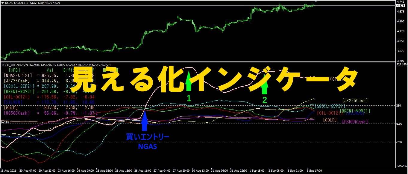
“8CFD Visualization Indicator Any Version””
https://www.gogojungle.co.jp/tools/indicators/32288
“Toretore Indicator”
https://www.gogojungle.co.jp/tools/indicators/50115
“TrendLine-EX”

https://www.gogojungle.co.jp/tools/indicators/42257
“8- Currency Strength Visualization Indicator” is available on the following pages.

MT4 version https://www.gogojungle.co.jp/tools/indicators/39150
MT5 version https://www.gogojungle.co.jp/tools/indicators/39159
【Products I am selling】