
【FX】Who is moving the market? An explanation with a pyramid image of participants and trading volume by time frame!
Shirō here!

Do traders' trading volumes differ depending on the time frame?

And why do we usually follow a long bias on higher timeframes in the first place?
For those who are curious, and almost for my own sake, in this article we will
explain clearly which kinds of traders exist on each timeframe through images.
in an easy-to-understand image explanation.
【FX】Image Explanation of Trading Volume by Timeframe with a Pyramid
First, an image explanation.
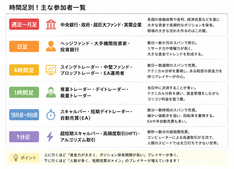
Key Points
The higher the timeframe, the larger the lot size
Markets tend to move toward larger lot sizesso, this is the reason you need to enter in a long bias along with the higher timeframes.
Next is the pyramid image explanation.
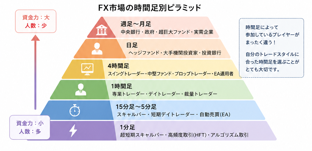
From this view, there are many companies from monthly to daily charts.
Conversely, the 4-hour chart and below are imagined to have more traders.
As that happens, I feel that the safest trades are when you follow from weekly to daily timeframes.
Actual Imagery
For example,
Pattern ①
- 1000 individuals
- 0.01 lot each
→ Total 10 lots
Pattern ②
- One institution
- 500 lots
→ Total 500 lots
Pattern ② is overwhelmingly stronger, and the flow tends toward ②.
“Prices move toward the direction where large lots pass more easily.”
Therefore, the FX rule is to enter in the direction aligned with the higher timeframes (larger lots).