Utilization of the “Visualization Indicator” (Part 252)
「Visualization Indicator」 Utilization(that2522)
1. Evolve the “28 Currency Pairs List Indicator” into an advanced indicator
“8CP Visualization Indicator” to draw AUD CAD on
“8CP Visualization Indicator” includes Oceania version, London version, NewYork version, AnyCP version. This time we used NewYork version.
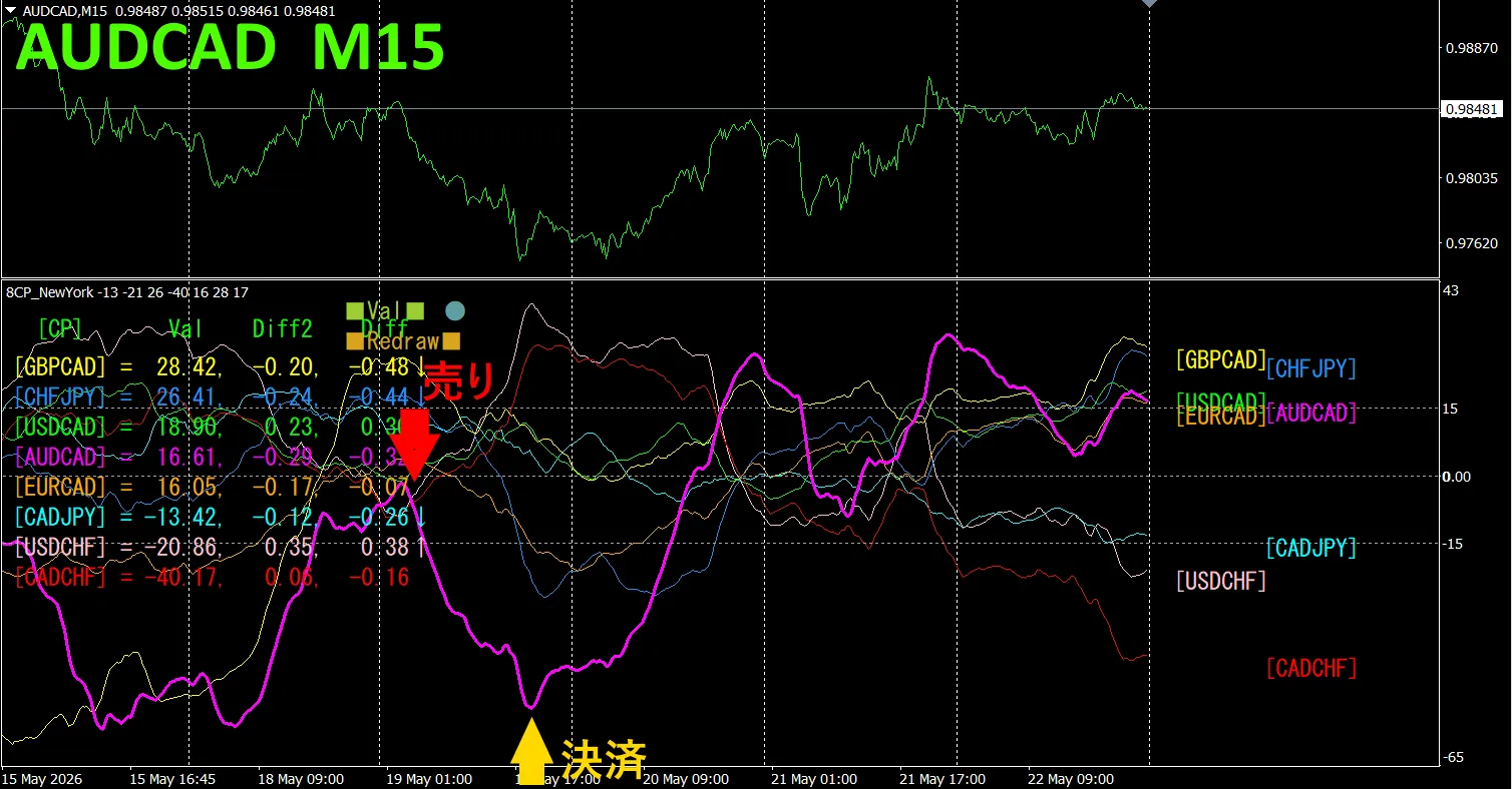
The top half is the AUD CAD 15-minute chart. The bottom half is from the “8CP Visualization Indicator”. The red-purple thick line chart corresponds to AUD CAD.
On Tuesday, the AUD CAD chart fell below the other charts, so we sold. We closed at the bottom of the day and earned about 80 pips in profit.
Currency Strength/Weakness Chart
Looking at the 15-minute currency strength chart, CAD and AUD show an inverse correlation. Trade only when the spreadout sections of CAD and AUD widen. Since they are inversely correlated, you can target only those points for trading.
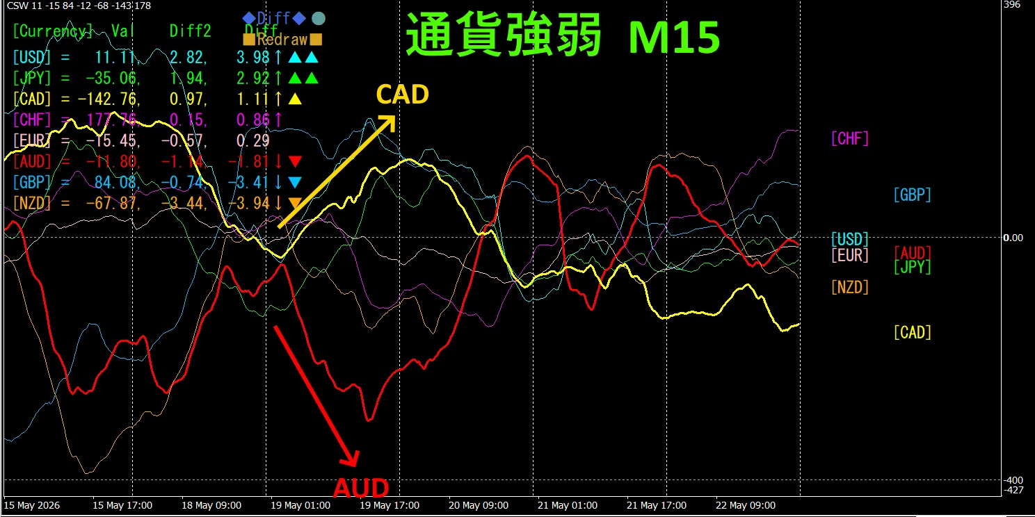
In FX, choose the currency pair that is currently expanding the most and showing inverse correlation to trade, and the results will follow.
“Currency Strength/Inverse Correlation Target” is FX’s rule of thumb.
Using “TrendLine-EX”, you can automate entries and exits by diagonal trendline breaks. Leaving it as is enables easy trading. “TrendLine-EX” is a semi-automatic EA that sells on trendline breakdowns and closes on trendline breakouts.
2. Try Best Select Indicator
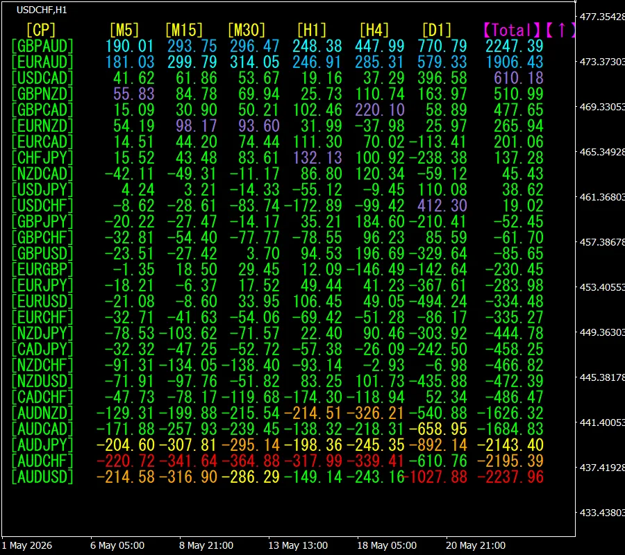
The bottom diagram shows, as of May 2, 2026 1: 21 (JST) screenshot.
Total values are sorted in descending order. At the top is GBP AUD, which is in blue across all timeframes. Also, the Total value is 2247.39, indicating a strong positive trend for GBP/AUD.
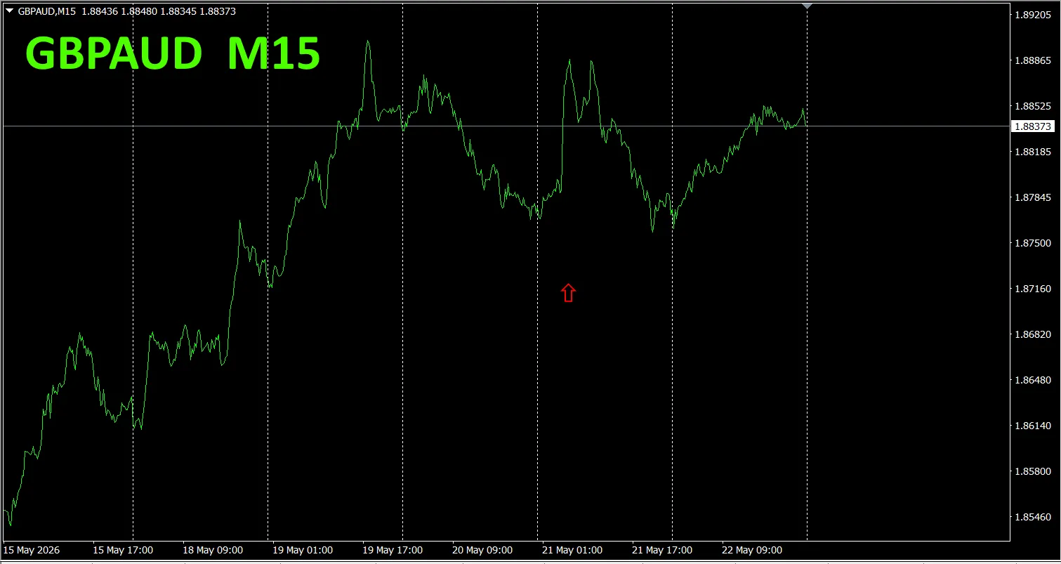
Now, let's look at GBP/AUD chart.
The red arrows mark the screenshot points. They capture the rapid rise.
“28 Currency Pair Best Select Indicator” makes it easy to identify which of the 28 pairs has the strongest trend. Also, the “28 Currency Pair Deviation Comparison Indicator” shows the pair with the largest deviation among the 28, allowing you to judge at a glance where to trade.
“28 Currency Pair Best Select Indicator”
https://www.gogojungle.co.jp/tools/indicators/35128
3. Since May 2021, EURJPY movements have been tracked.
From May 2021, we have tracked EURJPY movements.
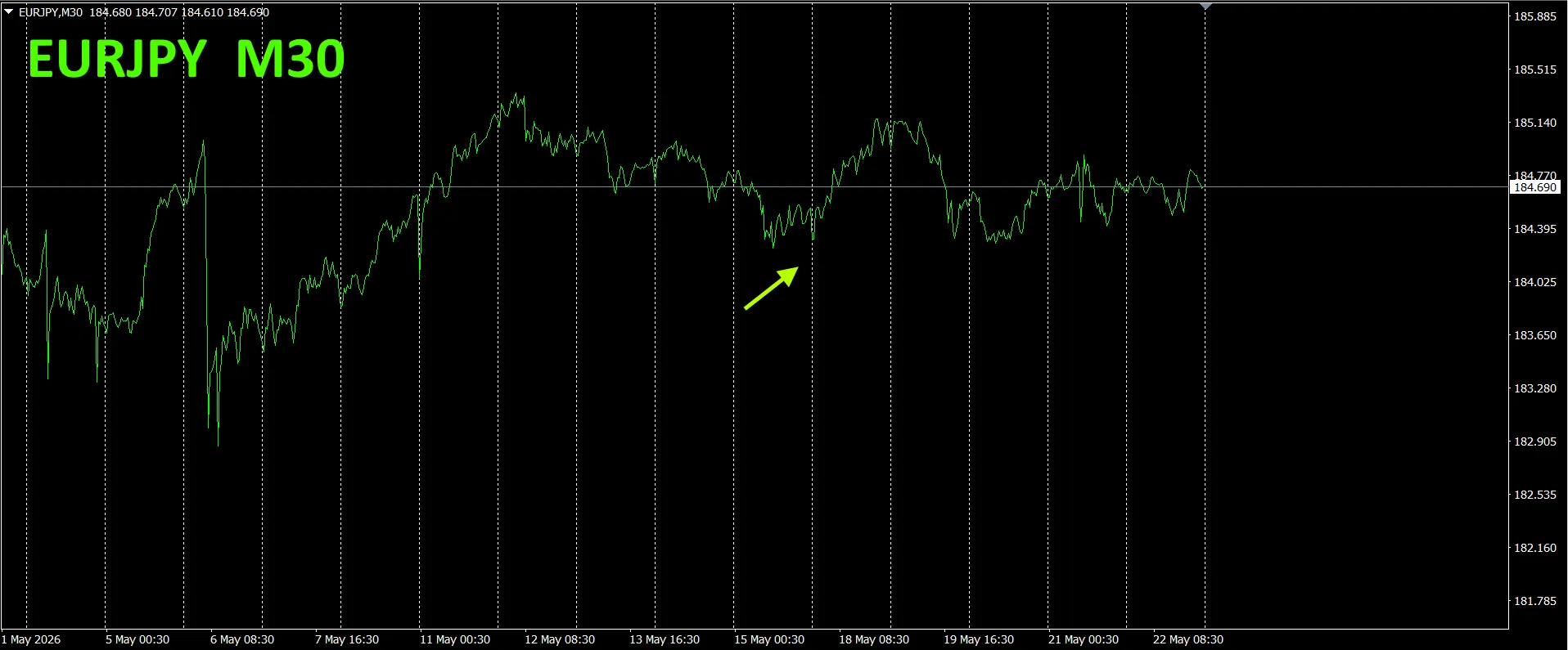
To view the overall trend, a 30-minute chart covering roughly the last three weeks is drawn.
Previously, we wrote as follows.
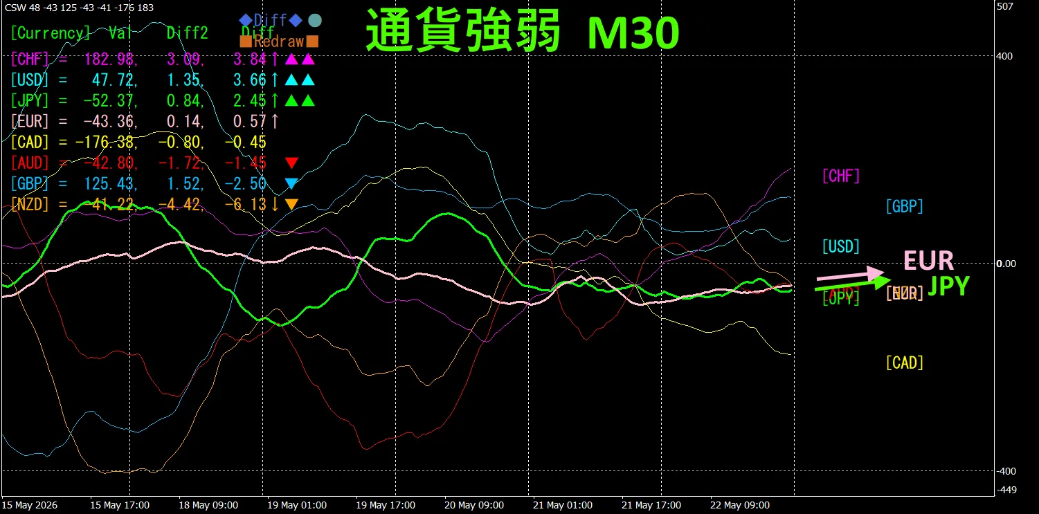
Pink is EUR, green is JPY. EUR vector is upward, JPY slightly downward, so EURJPY is likely to rise slightly.
Monday rose a bit, but then retraced.
30-minute currency strength chart..
Pink is EUR, green is JPY. EUR vector upward, JPY slightly downward, so EURJPY is likely to rise slightly.
4. Try new indicator Dual_MACD_Trend_Indicator.
New indicator “Dual_MACD_Trend_Indicator” is described below.
MT4 version:https://www.gogojungle.co.jp/tools/indicators/62199
MT5 version:https://www.gogojungle.co.jp/tools/indicators/62202
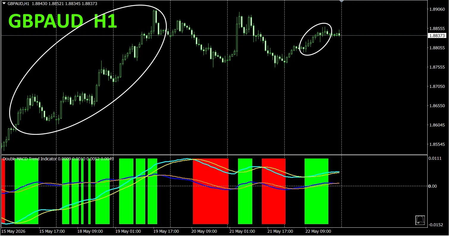
This is an indicator that clearly shows the direction of the trend with colors. If the color bars are Lime, it’s a buy; if Red, it’s a sell; and if there is no color, there is no trend. The color display lets you grasp the trend state at a glance..
This indicator was applied to the GBP/AUD 1-hour chart to show four-hour moving averages alongside it.
The red zone for selling and green zone for buying are clearly separated, making trading easy at a glance. In the top figure, since there are many green areas, focus only on the white ellipse circled area to trade for buying.
With the Dual_MACD_Trend_Indicator, buy in green zones and sell in red zones; do not trade otherwise.
Using the Dual_MACD_Trend_Indicator eliminates any confusion about trade direction.
5. Trend_Color_MA_MTF has just been released. From the sales page,
Trend_Color_MA_Dual_MTF was created to transform your trading. This tool is not just a moving average. It visualizes trend direction in color, and notifies you with sound and alerts the moment a signal arrives, acting as your personal assistant.
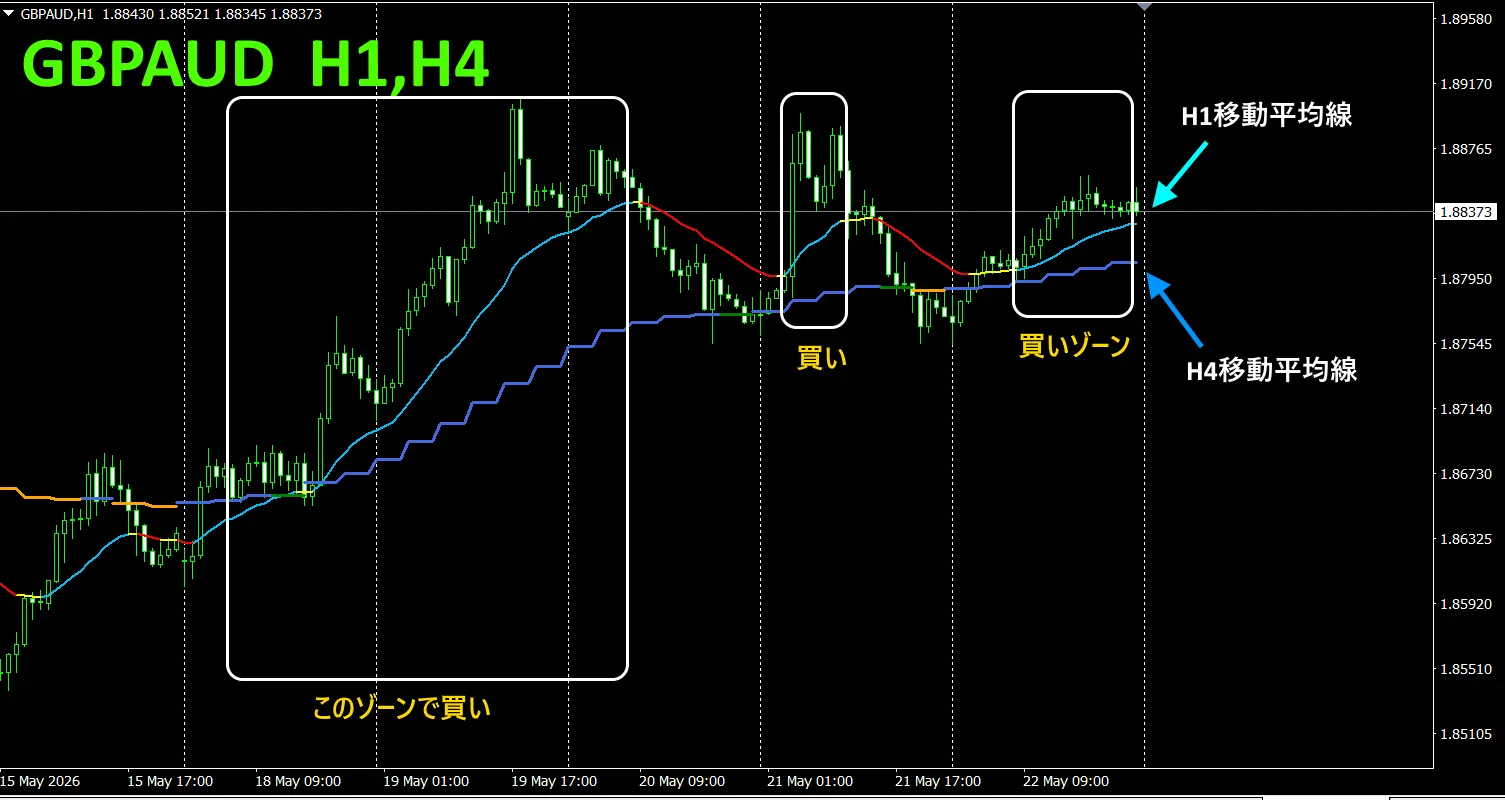
As an example, on GBP/AUD I displayed the 4-hour moving averages on the 1-hour chart.
The four-hour moving average is jagged and stair-stepped. The 1-hour and 4-hour moving averages both display upward in blue tones when rising and downward in red tones when falling, so you can tell the current chart trend direction and the higher-timeframe trend direction at a glance.
When the higher-timeframe color and the current timeframe color match, trade in the color direction: red for sell, blue for buy.
In selling, the 1-hour MA is red and trending downward, the 4-hour MA is orange and trending downward, and when the candles break below the two moving averages, sell.
In buying, the 1-hour MA is light blue and rising, the 4-hour MA is blue and rising, and when candles break above the two moving averages, buy.
This is a trading strategy you can use.
For details, see the following link.
https://www.gogojungle.co.jp/tools/indicators/75985
※
“8CFD Visualization Indicator Any Version”
https://www.gogojungle.co.jp/tools/indicators/32288
“Totoro Indicator”https://www.gogojungle.co.jp/tools/indicators/50115“TrendLine-EX”
https://www.gogojungle.co.jp/tools/indicators/50115
“TrendLine-EX”
https://www.gogojungle.co.jp/tools/indicators/42257
“8 Currency Strength Visualization Indicator” is described on the following pages.
MT4 version https://www.gogojungle.co.jp/tools/indicators/39150
MT5 version https://www.gogojungle.co.jp/tools/indicators/39159
【】