

【FX】Are the histogram of heaven and earth and Dow Theory the same? Verified with charts
Shirō here!
Lately, I’ve been studying Dow Theory as well, and when I look at it together with the天と地のヒストグラム (Heaven and Earth Histogram), I realize
that it closely resembles Dow Theory’s zones.
I found this out.
In an uptrend, it tends to be blue, and in a downtrend, it tends to be red
so I’d like to share how I discovered this and how to use it.
About 天と地のヒストグラム
天と地のヒストグラム is an indicator that incorporates the ideas ofcycle theory.
About cycle theory
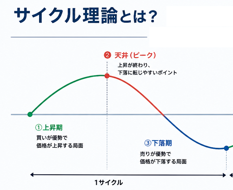
By connecting the lows with each other and the highs with each other, we judge the market by looking at selling pressure and buying pressure.
In the image,
- Upward movement is gradual
- Downward movement is somewhat stronger
so we judge that the market has strong selling pressure.
People may have different viewpoints or multiple ways of viewing, but I’ll leave the explanation of cycle theory here.
天と地のヒストグラム uses the calculation for Heaven and Earth points and describes itself as an indicator that uses this cycle theory.
I found that this histogram is very similar to Dow Theory’s uptrends and downtrends.
Are 天と地のヒストグラム and Dow Theory the same? I tested it
Dow Theory is a market that updates its lows and highs during a trend.It’s a market where lows and highs are updated in a trend..
Sorry for the handwritten explanation.
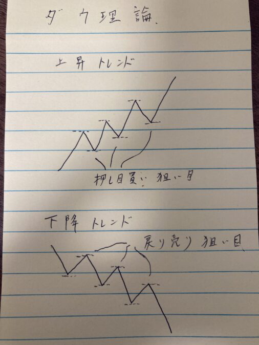
In such shapes, we grasp whether it’s an uptrend or a downtrend.
It’s often used in environmental recognition as well.
However, it has a similarity in nature.
In the shown chart there are
- Zigzag (an indicator easy to read with Dow Theory)
- Heaven and Earth points
- Heaven and Earth lines
- Heaven and Earth histogram
- Dow Theory histogram
there.
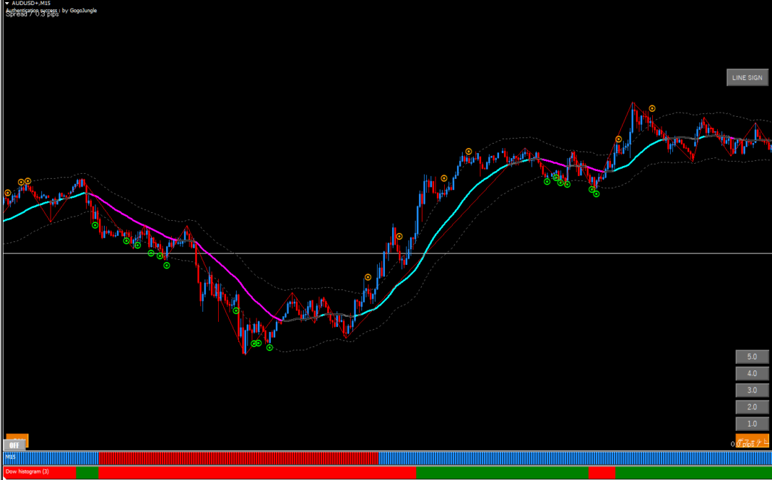
This is the 15-minute AUDUSD chart.
Histogram and below ita Dow Theory histogramis placed.
The bottom indicator is sourced from overseas, so the logic isn’t clear, but it certainly forms
green when rising and red when falling
in Dow Theory’s zones.
In the same way, 天と地のヒストグラム also turns around in similar places.
Since it isn’t an indicator of Dow Theory, it isn’t Dow Theory per se, but if you use 天と地のヒストグラム
it can be effective for grasping the overall or broad uptrend and downtrend
I think.
I will also explain it clearly on actual charts.
Daily chart environmental recognition
In an uptrend, lows fail to be broken → signal of trend end
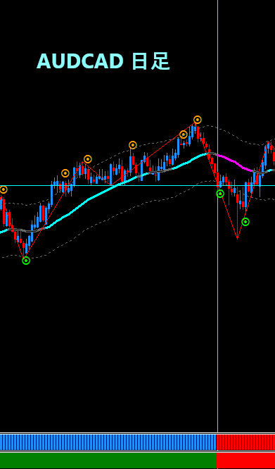
In the AUDCAD daily chart, highs and lows continued cleanly higher toward the latter half of the image.
That’s an uptrend.
However, at the light blue cross, the lower highs failed to be broken = Dow Theory is negated.
Dow Theory negatedmeaning thatthe trend may end and move into a range or reverse.
At that time, 天と地のヒストグラム also tends to turn red.
Dow Theory’s indicator also changes, doesn’t it.
It doesn’t always turn the histogram as neatly as this, but I felt it functions very well as a rough environmental recognition.
In conclusion

Actually, cycle theory is not yet completely absorbed into me personally. (Surprisingly complex.)
天と地のヒストグラム’s logic is unknown (even if you know it, you cannot clearly reveal it), but since it resembles Dow Theory, I thought it could be used for environmental recognition, so I wrote this blog.
That’s all for this article.