Utilization of the "Visualization Indicator" (Part 247)
「Visualization Indicator」 utilization(that247)
1.「 Twenty-Eight currency pairs list indicator」 to further evolve into an indicator
「Eight CP visualization indicator」 for EURAUD to draw
「Eight CP visualization indicator」 includes Oceania edition, London edition, New York edition, AnyCP edition. This time, we used Oceania edition.
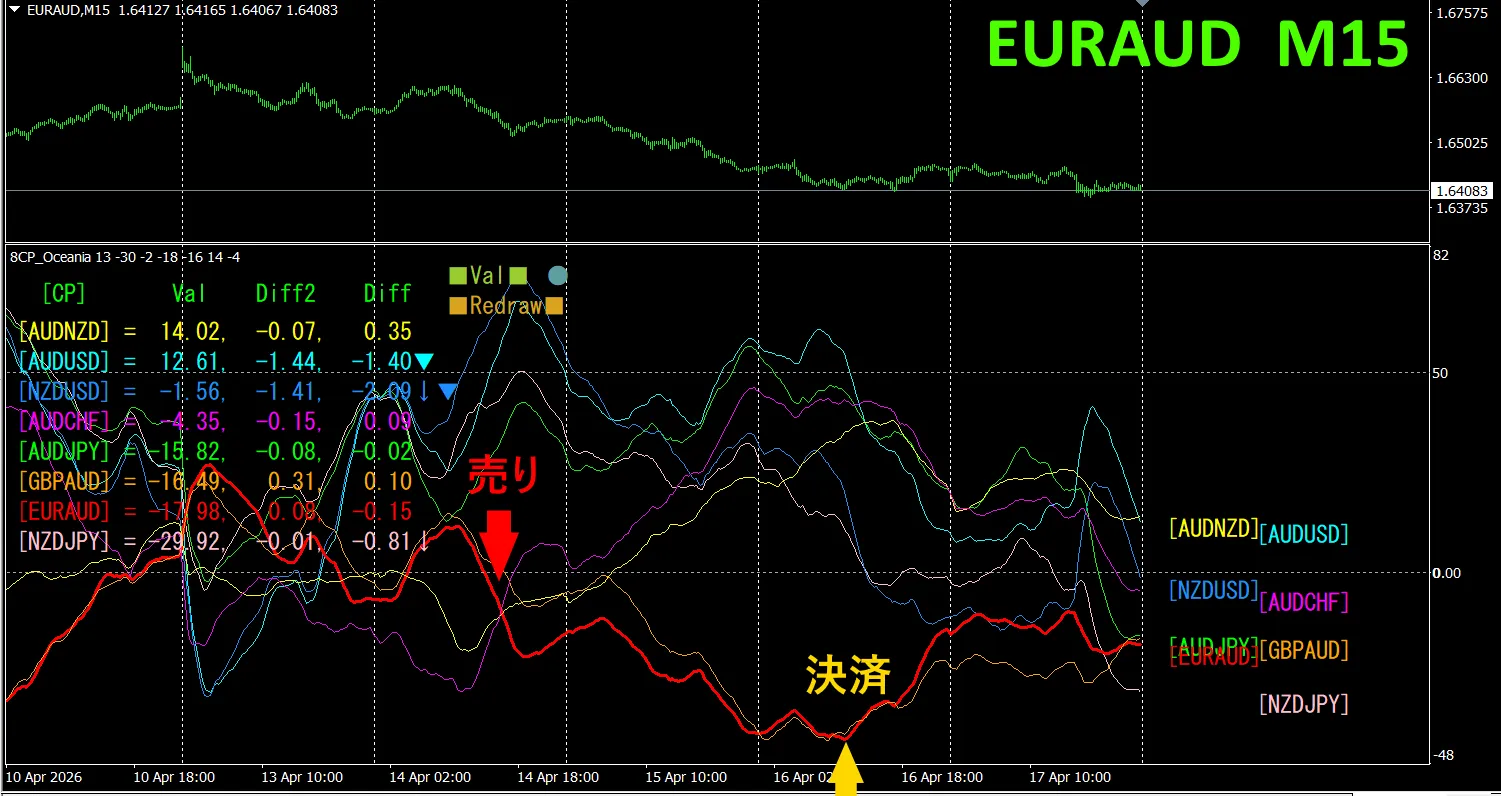
The upper half is,EUR/AUD 15-minute chart. The lower half is from the「Eight CP visualization indicator」, EUR/AUD.
On Tuesday, EUR/AUD’s graph dropped below other graphs, so we sold. We closed at the bottom on Thursday and made a profit of about 140 pips. Take what you can, and do not trade otherwise—that is the proper method.
Currency Strength/Weakness Graph
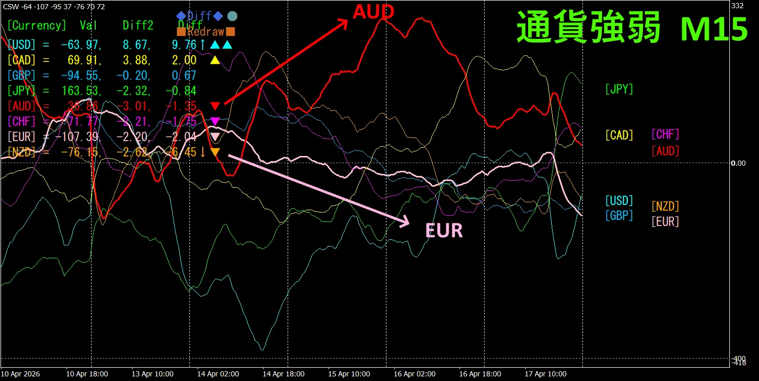
Looking at the 15-minute currency strength graph, AUD EUR are in an inverse relationship. Trade only when the two diverge and spread apart accordingly; when they diverge, selling EUR/AUD is appropriate. Because they are in an inverse relationship, target only that point for trading.
In FX, pick the currency pair that is currently expanding the most and in inverse correlation, and your results will follow.
“Aim for currency strength inverse correlation!” is a rule of FX.
With TrendLine-EX, you can automate entry and exit with diagonal trendline breaks. It can be left as is for easy trading. “TrendLine-EX” can automatically sell on a trendline break, and automatically close on a trendline break above, a semi-automatic EA.
2. Best SelectTry the indicator
The lower diagram is 2026 year 4 month 14 02:02 (JST) screenshot.
[Total] sorted by descending. The top one NZD USD shows, in all timeframes it displays in blue color. Moreover, the Total value is 2434.13, a large positive figure. This implies an upward trend in NZD/USD.
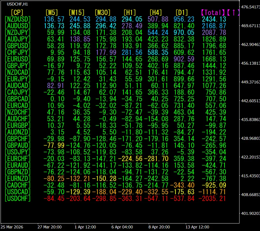
Now, let’s look at the NZDUSD chart
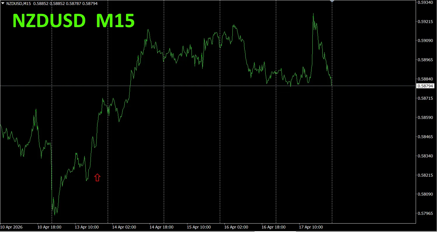
The red arrows indicate the points at which the screenshot was taken. They capture sharply rising points.
“28 Currency Pair Best Select Indicator” allows you to easily identify which of the 28 currency pairs is exhibiting the strongest trend. Also, the “28 Currency Pair Divergence Comparison Indicator” tells you which currency pair among the 28 has the largest divergence. It’s a superb indicator that lets you determine at a glance which pair to trade.
“28 Currency Pair Best Select Indicator”

https://www.gogojungle.co.jp/tools/indicators/35128
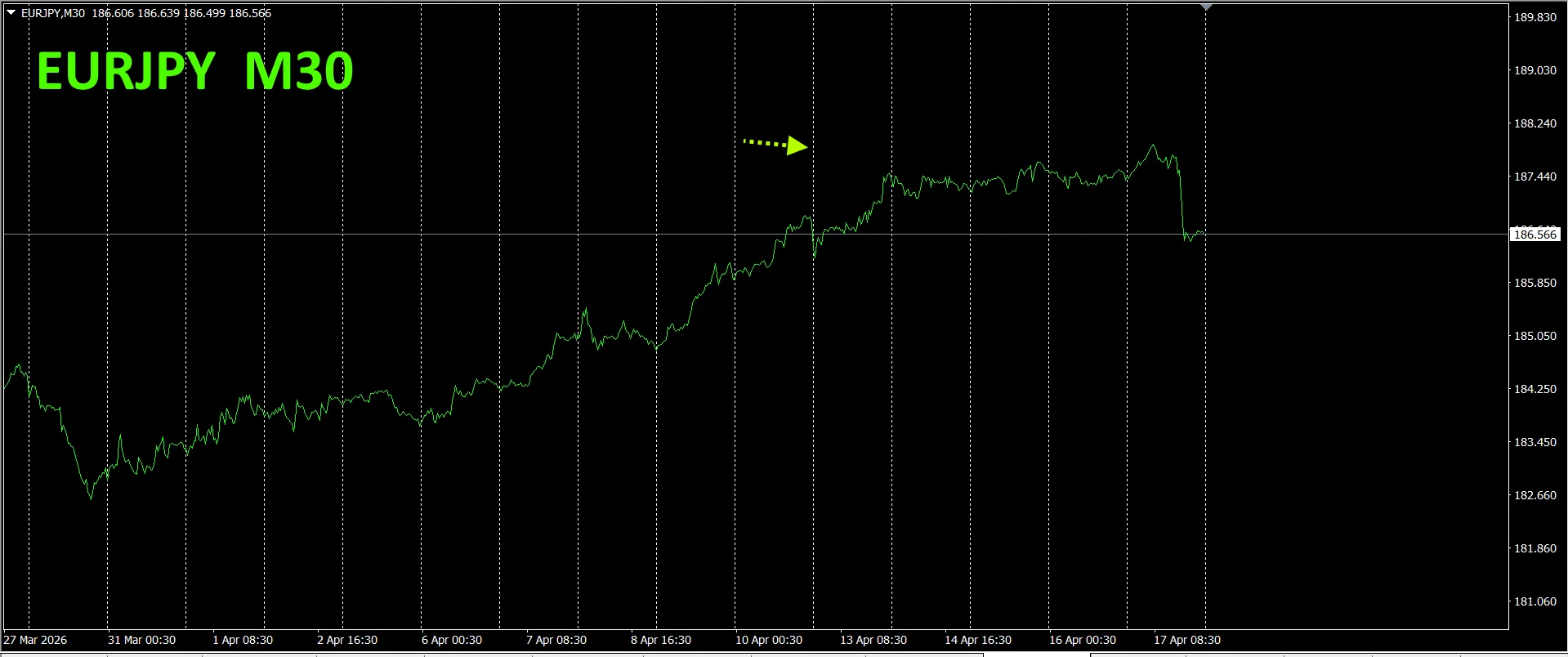
3. Since May 2021, what happened with EURJPY? ?
From May 2021, EURJPY movements have been tracked.
To view the overall trend, we draw roughly three weeks of 30-minute charts.
Last time, we wrote as follows.
If you compare the vectors of EUR and JPY, since the direction of JPY is slightly upward, EURJPY is expected to trend downward a bit in the future., EURJPY is expected to trend downward a bit in the future.
It did not decline, but,.
30-minute currency strength chart.
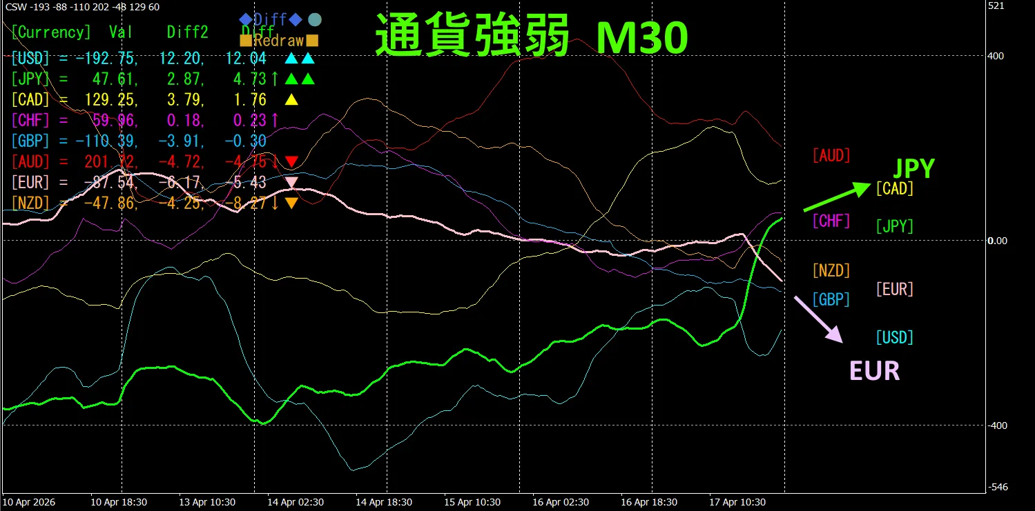
When comparing the vectors of EUR and JPY, JPY is moving upward and EUR is moving downward, so EURJPY is expected to be bearish。
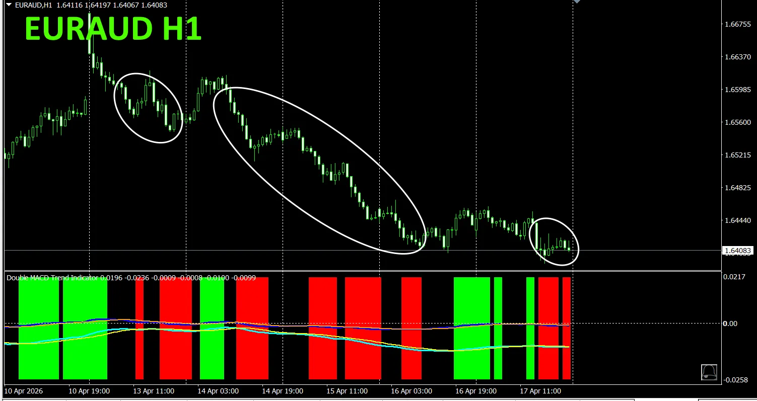
4. New Indicator Dual_MACD_Trend_Indicator is now availablePlease see the new indicator「Dual_MACD_Trend_Indicator」below.
MT4 version:https://www.gogojungle.co.jp/tools/indicators/62199
MT5 version:https://www.gogojungle.co.jp/tools/indicators/62202
This indicator clearly shows the direction of the trend with color. If the color bars are Lime, it is a buy; if Red, it is a sell; it is beginner-friendly to use. If the bars are green, it indicates an uptrend; if red, a downtrend; if no color, there is no trend. With color visualization, you can grasp the trend at a glance.
Red in the sell zone and green in the buy zone are clearly separated, making trading easy at a glance. In the top diagram, focus only on the white ellipsed area; since the indicator color is red, you simply trade in sells.
In the「Dual_MACD_Trend_Indicator」, in the green zone buy, in the red zone sell; else do not trade—simple rule.
Using「Dual_MACD_Trend_Indicator」 eliminates any doubt about trading direction.
From the sales page,
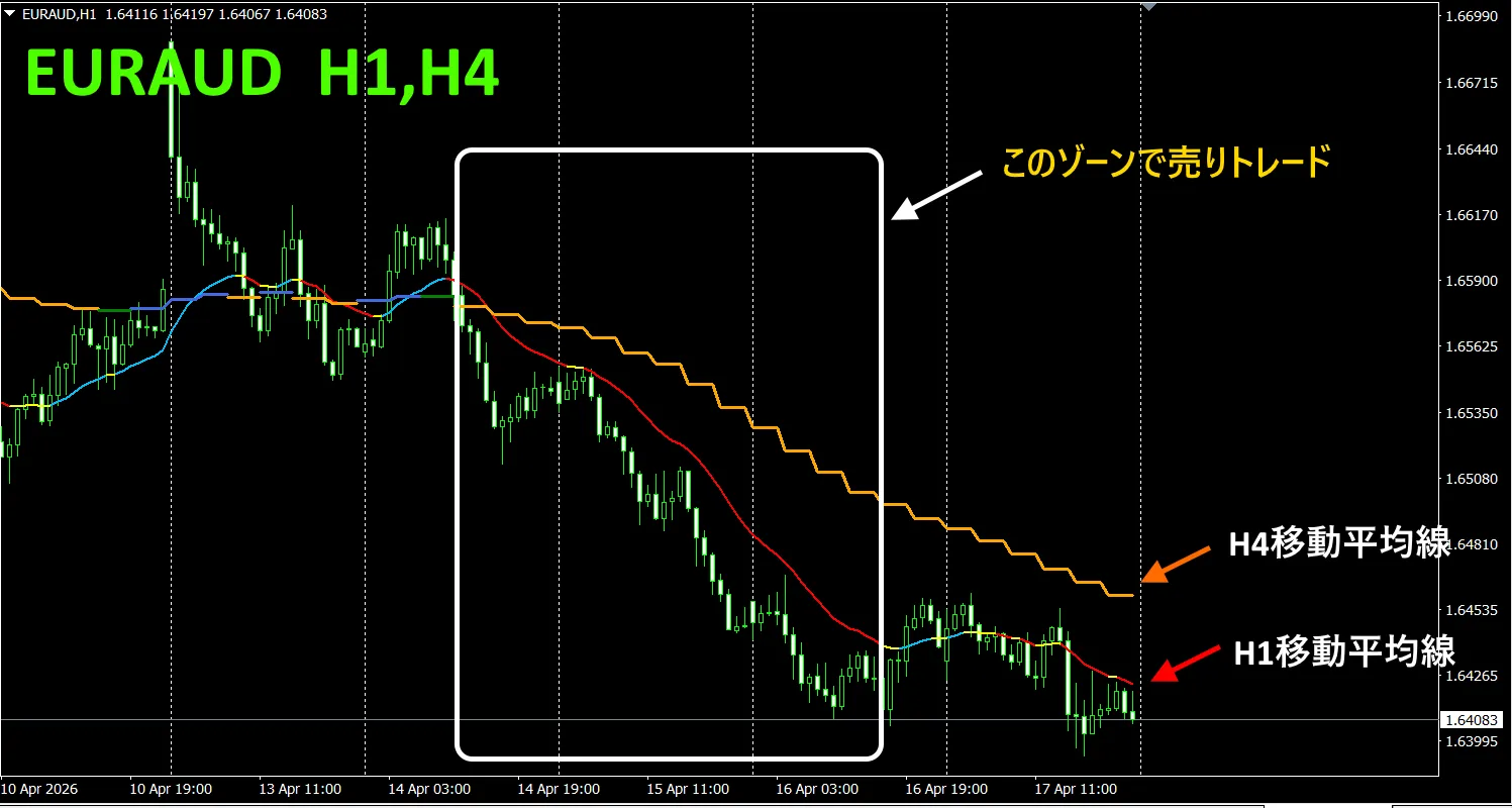
「Trend_Color_MA_Dual_MTF」 This tool is not just moving averages. It visualizes trend direction with “color” and notifies you with a sound and a alert as soon as a trend appears, acting as your personal assistant.
As an example, on the EURAUD 1-hour chart we displayed the moving average on the 4-hour chart simultaneously。
The staircase-like pattern is the 4-hour moving average. Both the 1-hour and 4-hour moving averages display upward in blue tones and downward in red tones, so you can see the current chart trend direction and the higher-timeframe trend direction at a glance through color.
When the two higher-timeframe and current-timeframe colors align and are the same hue, trade sell if red and buy if blue.
For selling, the 1-hour MA is red indicating a downtrend, the 4-hour MA is orange indicating downtrend, and you sell after the candles break below the two moving averages.
For buying, the 1-hour MA is cyan rising, the 4-hour MA is blue rising, and you buy after candles break above the two moving averages.
This is a tradable strategy.
For details, please see the following link.
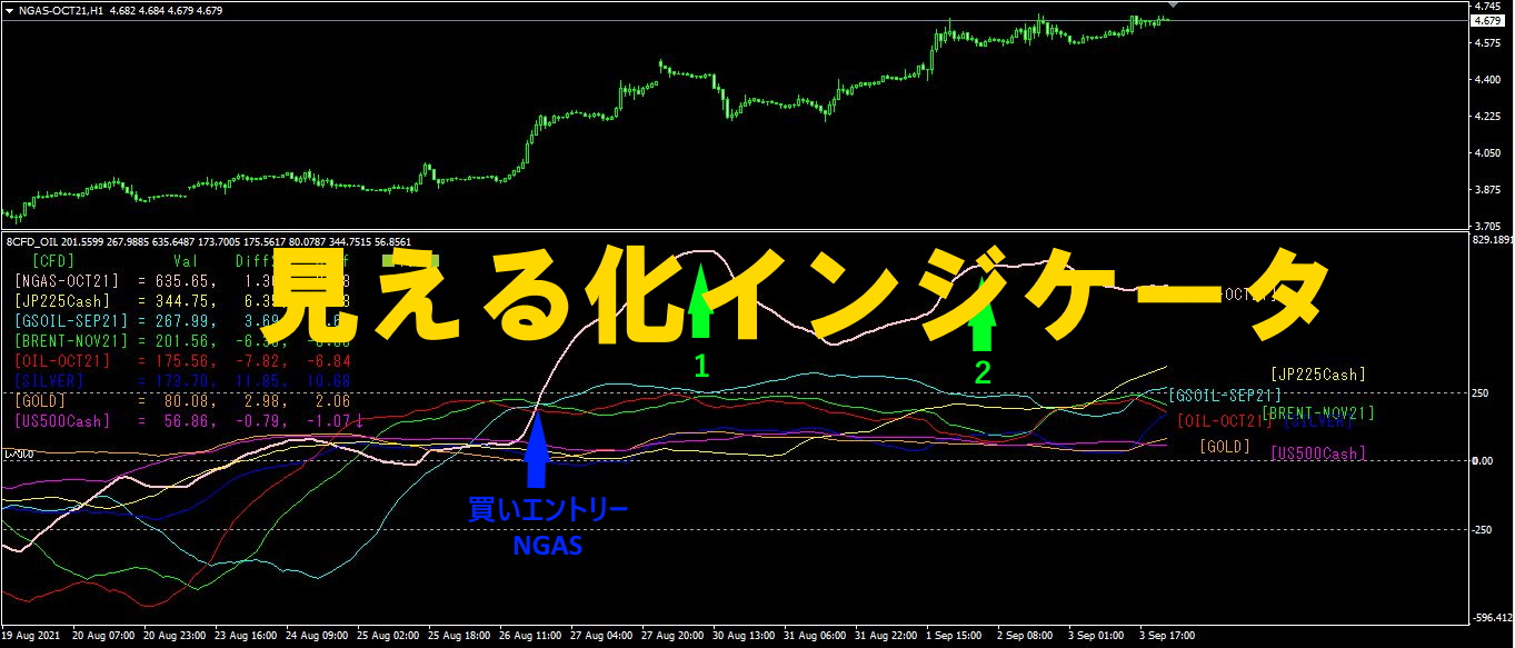
「8CFD Visualization Indicator Any Edition」
https://www.gogojungle.co.jp/tools/indicators/32288
「
https://www.gogojungle.co.jp/tools/indicators/50115
「TrendLine-EX」

https://www.gogojungle.co.jp/tools/indicators/42257
「8C Currency Strength Visualization Indicator」 is available on the following pages.

MT4 version https://www.gogojungle.co.jp/tools/indicators/39150
MT5 version https://www.gogojungle.co.jp/tools/indicators/39159
【 Products I have listed】