Utilization of the "Visualization Indicator" (Part 242)
Further evolving the “28 Currency Pairs List Indicator” into an indicator
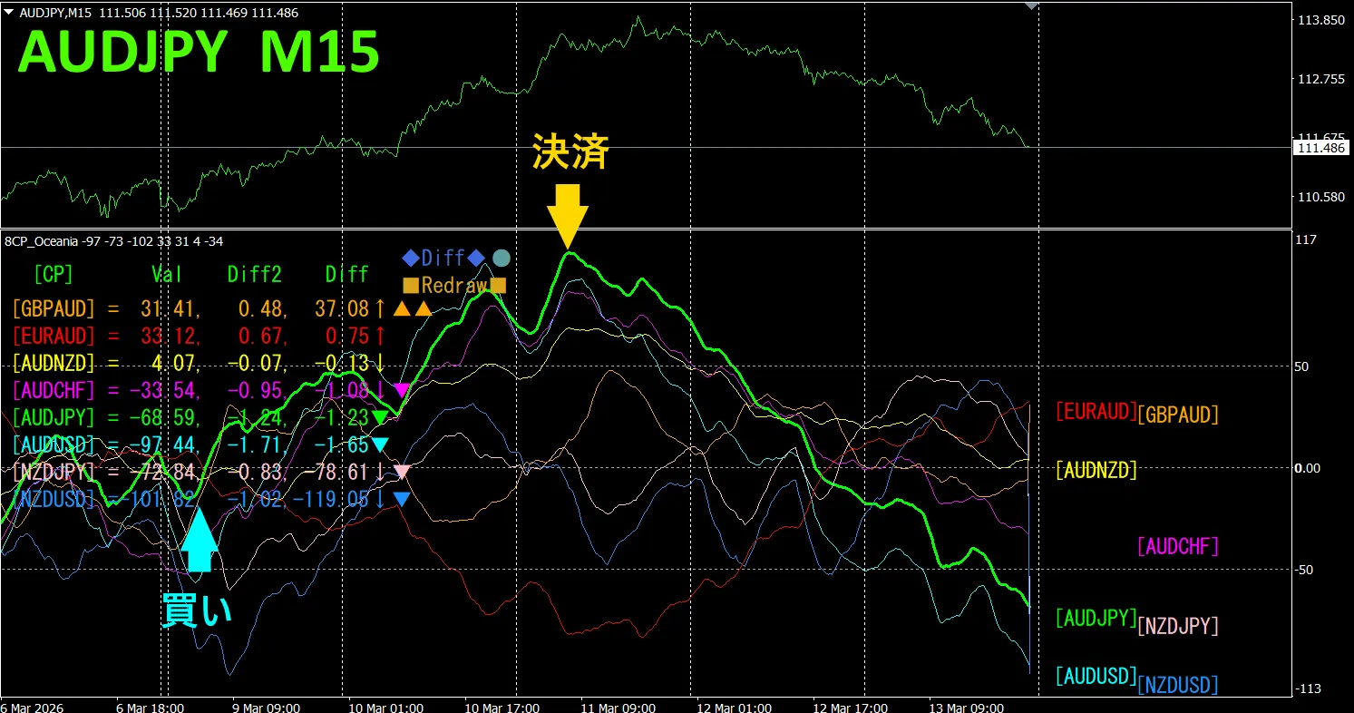
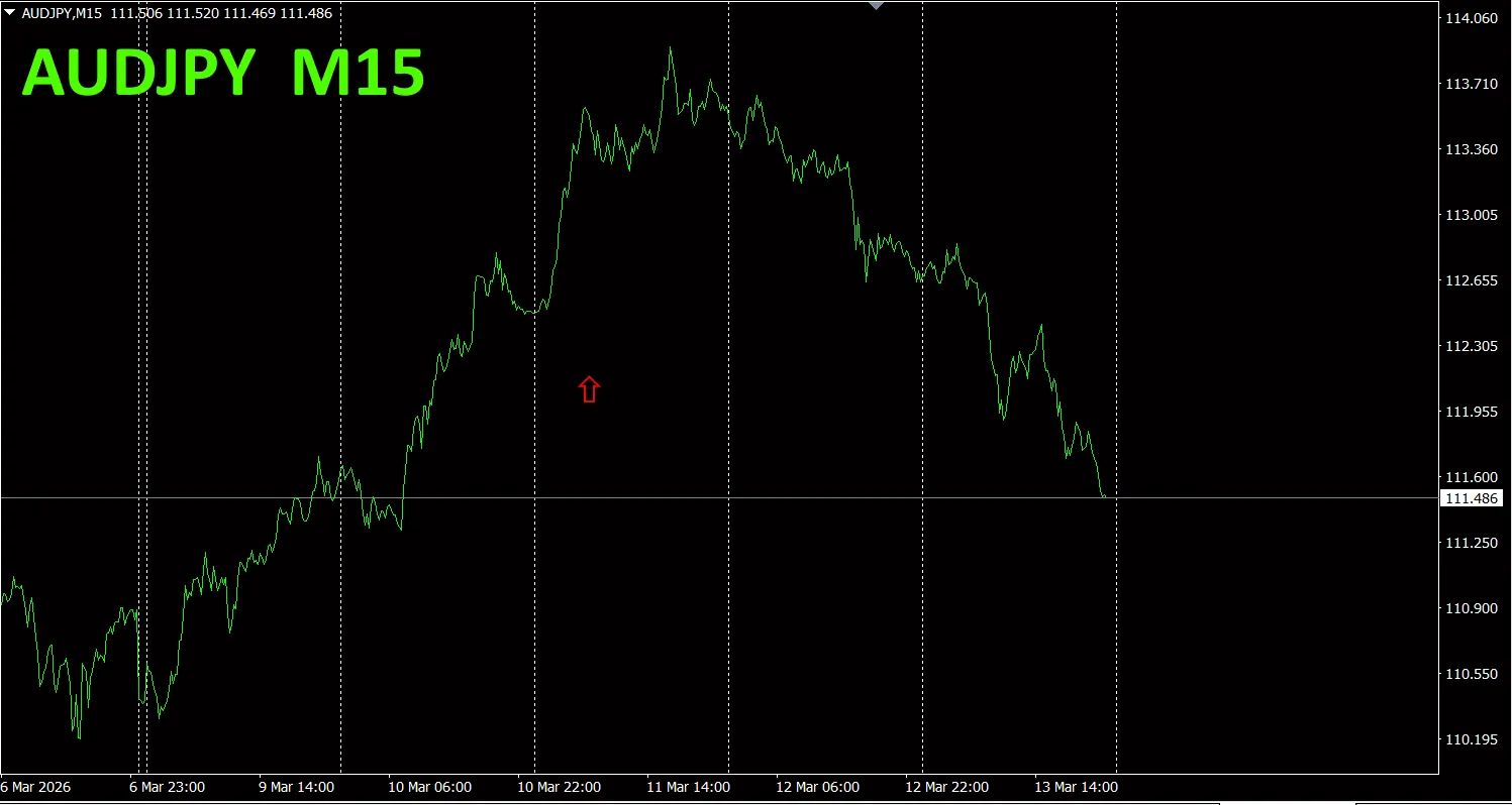
“8CP Visualization Indicator” to draw AUDJPY
The “8CP Visualization Indicator” comes in Oceania, London, New York, and AnyCP versions. This time I used the Oceania version.
The upper half is the AUDJPY 15-minute chart. The lower half is the result from the “8CP Visualization Indicator”; the green line corresponds to AUDJPY.
On Monday, the AUDJPY graph broke above the other graphs, so I bought. I exited at the peak and earned about 240 pips in profit. The correct method is to take profits where possible and not trade further.
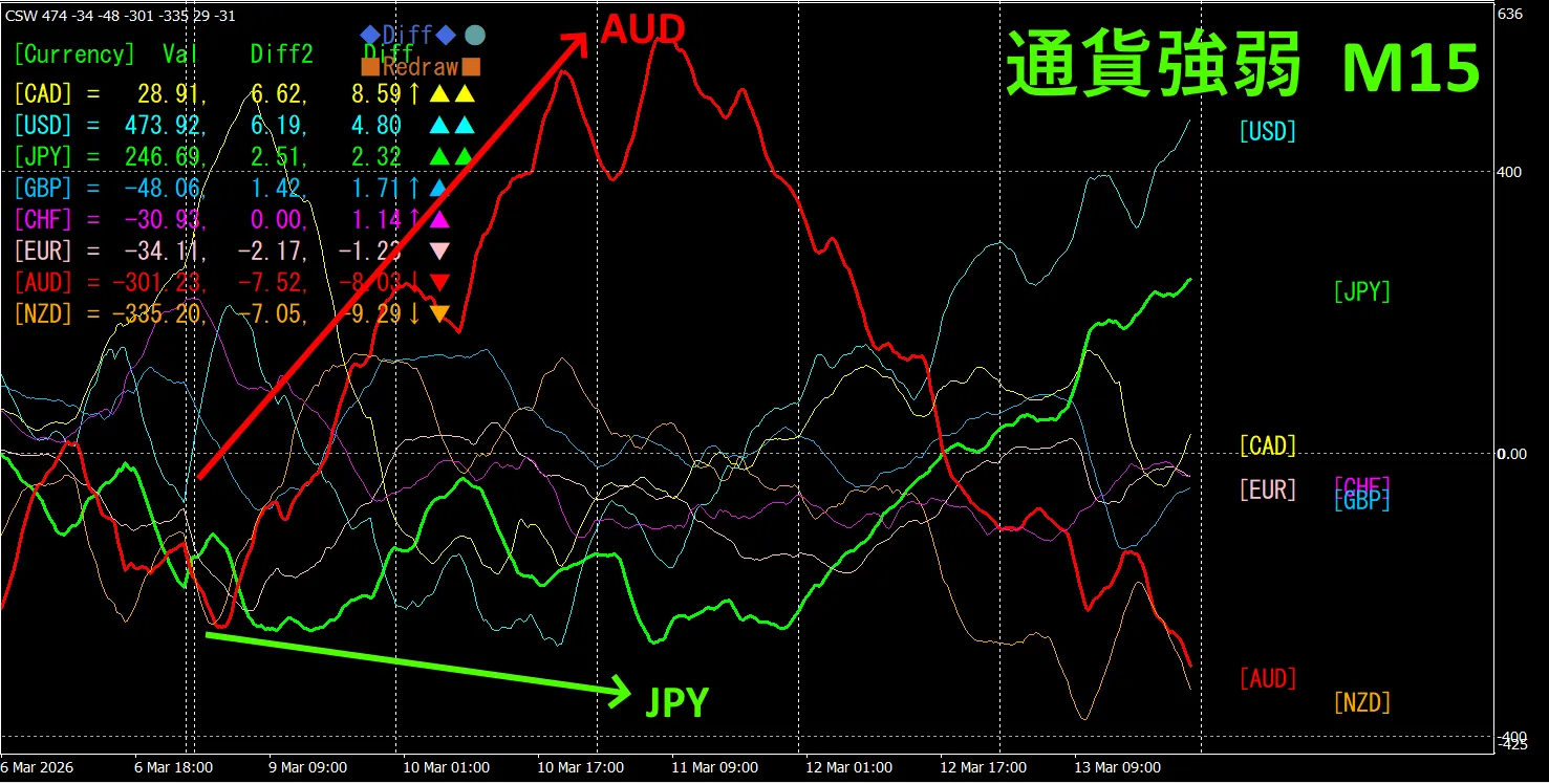
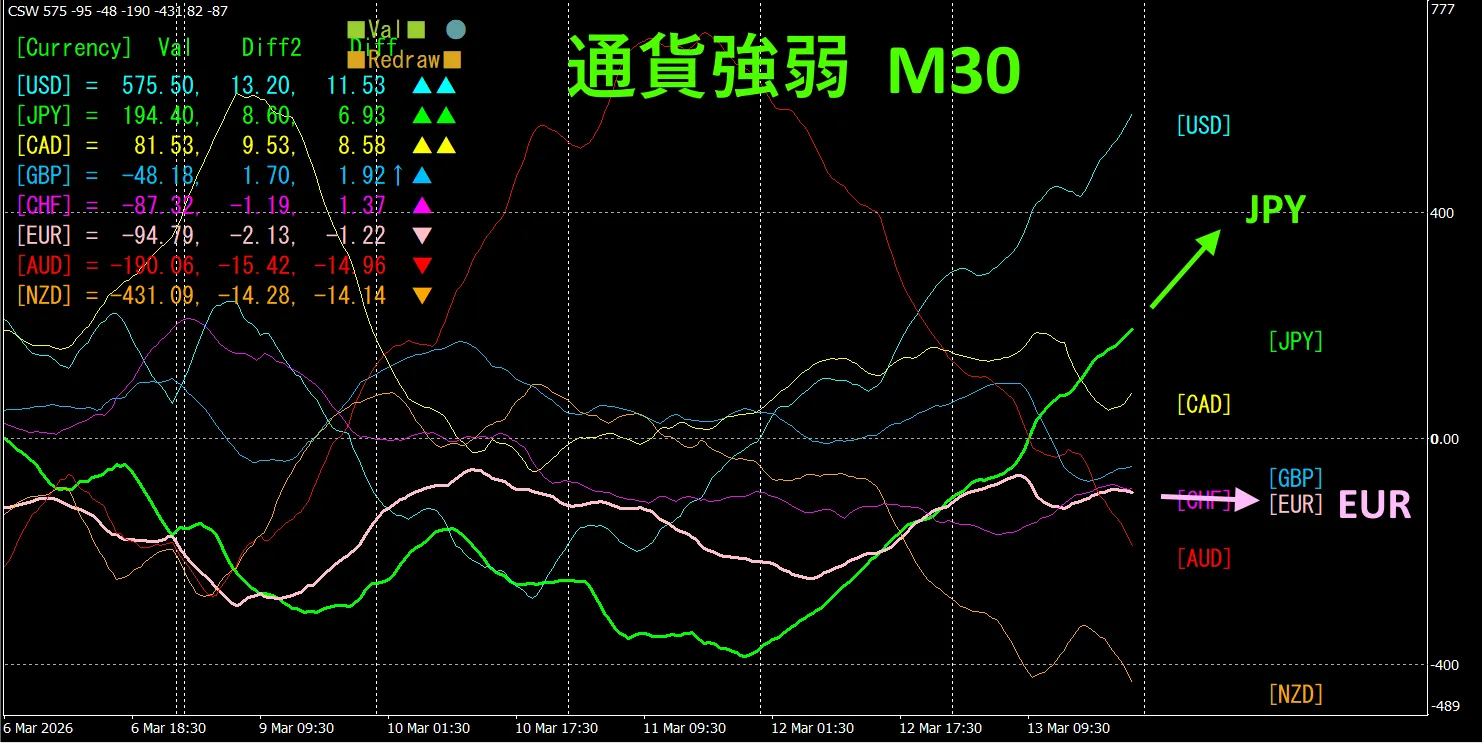
Currency Strength-Drequency (Momentum) Graph
Looking at the 15-minute currency strength graph, AUD is strong and JPYF is weak, showing an inverse correlation between AUD and JPY on the currency strength graph.
The relationship between AUD and JPY is where AUD > JPY, focusing only on the parts where AUD and JPY diverge and spread, you should buy AUDJPY. Since it forms a clean inverse-correlated chart, while the vectors are spreading, simply hold the position. In FX, you should pick currency pairs that are currently expanding the most and have an inverse relationship, then trade.
If you aim for the inverse-correlation of currencies, this is FX’s iron rule.
If you use “TrendLine-EX,” entering or exiting on diagonal trendline crossings can be automated. It can be left as is, enabling easy trading.
“TrendLine-EX” is a semi-automatic EA that automatically sells on a break below a trendline and automatically closes on a break above a trendline.
Try the Best Select Indicator
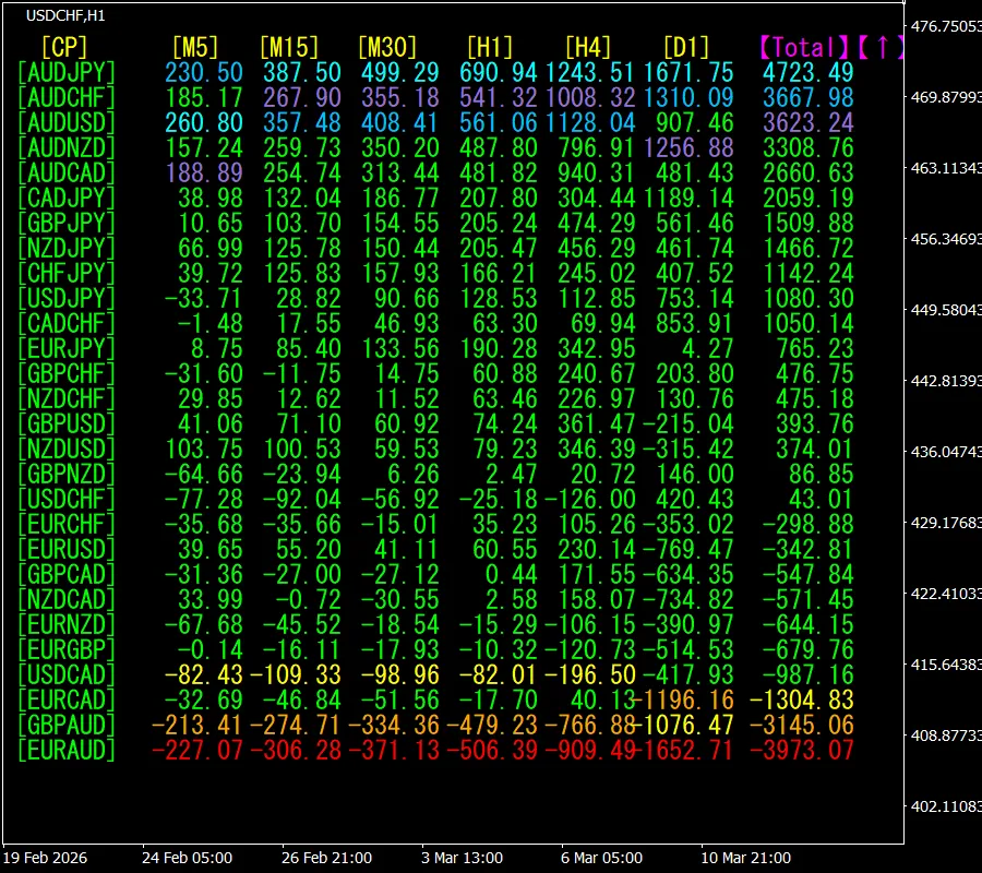
The screenshot below is from March 11, 2026, at 11:54 (JST).
[Total] values are ordered in descending order. At the top, AUDJPY shows blue hues across all timeframes. The Total value is 4723.49, a positive figure, suggesting an upward trend for AUDJPY.
Now, let's look at AUDJPY’s chart.
The red arrow marks the captured screenshot area, catching the rapid rise.
The “28 Currency Pair Best Select Indicator” makes it easy to identify which currency among 28 pairs is currently showing the strongest trend. It also tells you, by numbers and colors, whether you should trade now. It is a superior indicator that allows you to judge the overall movement of all currency pairs at a glance.
“28 Currency Pair Best Select Indicator”https://www.gogojungle.co.jp/tools/indicators/35128
What happened to EURJPY since May 2021?
Since May 2021, I have been tracking EURJPY’s movement.
To view the overall trend, I drew roughly the past three weeks of 30-minute bars.
Previously, I wrote the following.
Pink is EUR, green is JPY. EUR appears slightly upward, JPY slightly downward, so EURJPY is expected to trend upward slightly.
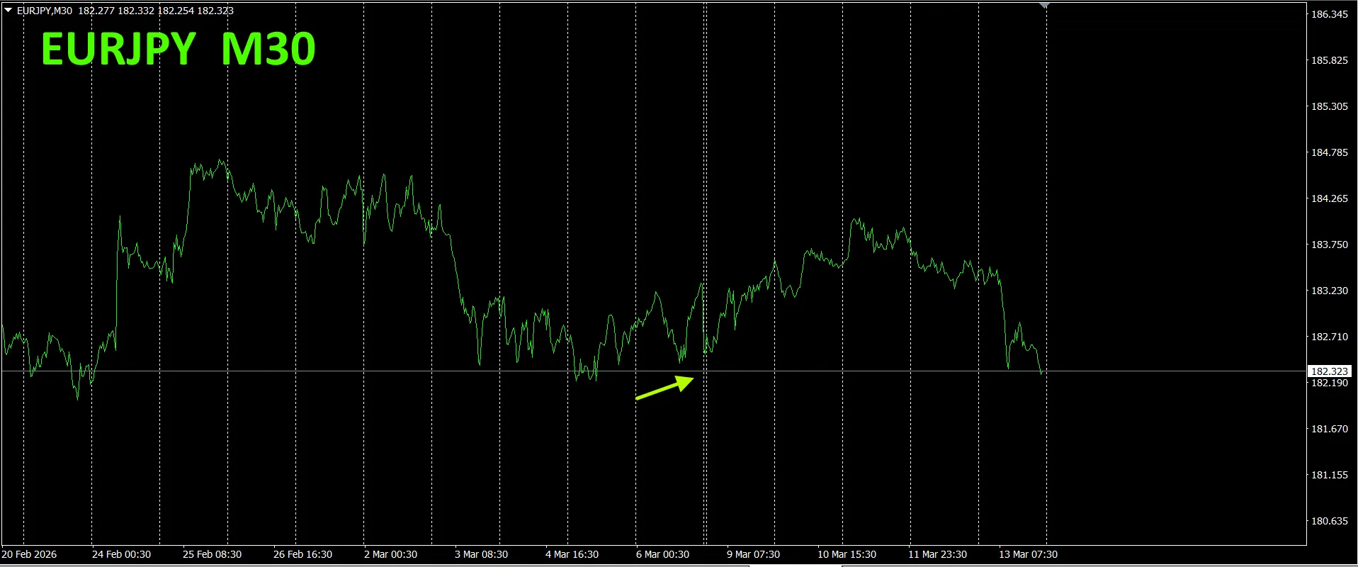
As expected, it rose. It has stretched about 150 pips higher.
This is a 30-minute currency strength chart.
Pink is EUR, green is JPY. EUR is slightly downward, JPY upward, so EURJPY is expected to move downward.
4.Trying the new indicator Dual_MACD_Trend_Indicator
New indicator “Dual_MACD_Trend_Indicator” is as follows. MT4 version:https://www.gogojungle.co.jp/tools/indicators/62199
MT5 version:https://www.gogojungle.co.jp/tools/indicators/62202
A indicator that clearly shows the direction of trend with colors. If the color bar is Lime, it’s a buy; if Red, it’s a sell. It’s easy for beginners to use. If the bar color is green, it’s an uptrend; if red, a downtrend; if there is no color, there is no trend. The color display allows you to grasp trend status at a glance.
I introduced this indicator on AUDJPY’s 1-hour chart.
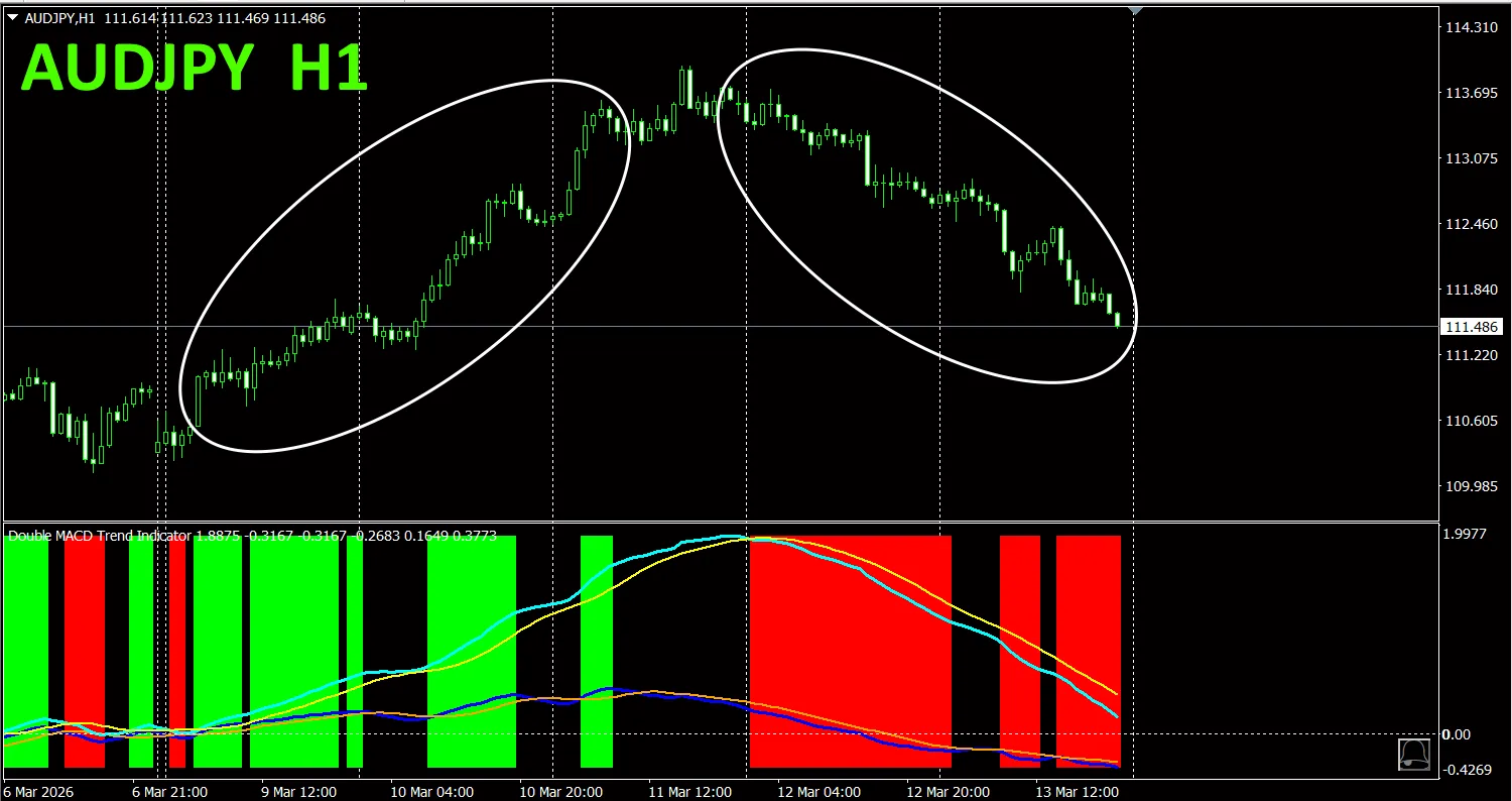
The red buy zone and green buy zone are clearly separated, making trading easy at a glance. In the above figure, focus only on the area circled by the white oval; trade buy when the indicator color is green, sell when red.
With the “Dual_MACD_Trend_Indicator,” follow the simple rule: buy in green zones, sell in red zones, and do not trade otherwise.
“Dual_MACD_Trend_Indicator” eliminates any trading-direction hesitation.
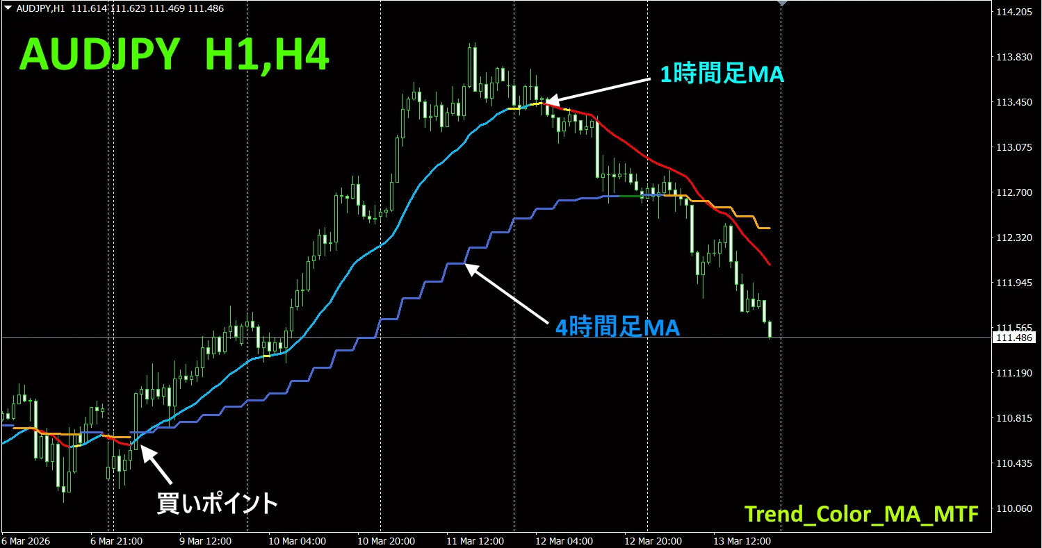
5. “Trend_Color_MA_MTF” has been newly released
From the sales page
“Trend_Color_MA_Dual_MTF” was developed to transform your trading. This tool is not merely a moving average. It visualizes trend direction with colors and notifies you with sound and alerts the moment a trading opportunity arrives, acting as your personal assistant.
As an example, I displayed the 4-hour moving average on a 1-hour chart of AUDJPY at the same time. The 4-hour moving average line appears stair-stepped. Both the 1-hour and 4-hour moving averages display blue tones when rising and red tones when falling, so you can instantly discern the current chart trend direction and the higher-timeframe trend direction by color.
To use it, wait for the color of the higher-timeframe moving average to turn blue, then the color of the chart’s moving average turns blue, which becomes a perfect point to buy on dips.The exact point to buy on a pullback is when the higher-timeframe moving average color turns blue and the chart’s moving average color changes to blue. For selling, wait for the higher-timeframe moving average color to turn red and the chart’s moving average color to shift from green to red, which becomes an excellent point to sell on rallies.
For more details, see the following link.https://www.gogojungle.co.jp/tools/indicators/75985
※ Recommended indicators
“8CFD Visualization Indicator Any Version”https://www.gogojungle.co.jp/tools/indicators/32288
“Toretore Indicator”https://www.gogojungle.co.jp/tools/indicators/50115
“TrendLine-EX”https://www.gogojungle.co.jp/tools/indicators/42257
“8C Currency Strength Visualization Indicator”; please refer to the following pages.
MT4 versionhttps://www.gogojungle.co.jp/tools/indicators/39150
MT5 versionhttps://www.gogojungle.co.jp/tools/indicators/39159