
Crazy moving average
Hello, this is 2pay.
This time it's a time-killing indicator creation.
This is a free distribution issue.
Do you all know an indicator called GMMA?
It refers to an indicator that bundles multiple moving averages (6 by default).
Even if not GMMA, many people display 2–3 MAs to visualize short-, mid-, and long-term perspectives.
In other words, it means calculating averages over various periods and confirming the flow from multiple viewpoints is important.
According to that theory, the more MAs you have, the more viewpoints you can stand on, allowing you to see the whole picture without gaps.
Now, let's create it. A GMMA with 40 lines.
Because it is a GMMA bundling GMMA, I named it GMMMMMMMMMMA.

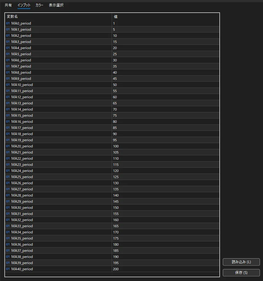
First, prepare 40 buffers.
I have no gapsI also prepared period 1 (= pure close) and secured a total of 41 buffers.
This is something developers know, but usually you only need 3 or 4 buffers.
As shown in the image below, it is rare to spend 200 lines just on the line properties (settings).
Including buffer allocation and handle acquisition/release, saying that “the code for this indicator is 90% properties” is not an overstatement.

The period ranges from 5 to 200, set in steps of 5. Beautiful....
Since it can be changed arbitrarily, please try various combinations.
A piece of foreknowledge that you will never use in your life, but there is a maximum number of parameters you can prepare.
In MT5, the limit is reportedly 1024, but depending on your PC specs and history, you may not be able to allocate buffers.
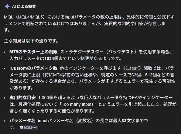
And this is what the finished product looks like.
The right side is so intertwined that it becomes incomprehensible.
I've never seen such a pattern outside of fishnet stockings or the Yamanote Line timetable.

However, as shown in the image below, there are often points where the MAs gather and respond strongly, becoming dense.
Thislike Lexus' front grilleindicator is indeed drawn at regular intervals such as a 5-step period.
Even so, some parts are very close and others are far apart, which may feel incongruous to human perception, right?
It is believed that the sections where these lines converge express a shared understanding.
Top-left is a reversal from an uptrend, appearing the brightest within this image (highest convergence). It can be said to be a clear reversal for everyone.
After that, there is a mid-sized stagnation at the bottom of the downtrend. The stronger the deviation from there, the more easily a corrective movement occurs.
Near the peaks of various lows, where MAs do not converge, I think it reflects the human psychology that “prices overshoot.”
When the trend accelerates, it tends to extend with follow-on from HFTs, so when one or two lines move abruptly, the tendency to revert becomes stronger.

// ---
This concludes today's content.
I usually post serious (?) content, but I prefer silly stuff, so if I feel like it, I’ll make something odd again.
The one I made this timelike Mr.’s clothesindicator (MT5) is placed below.
Thank you for reading until the end.