Utilization of the "Visualization Indicator" (Part 241)
「Visualization Indicator」 utilization(that241)
1. Evolution of the 28 Currency Pair List Indicator into a more advanced indicator
「8CP Visualization Indicator」を描くチャート
AUDCHF「8CP Visualization Indicator」にはOceania版、London版、NewYork版、AnyCP版があります。今回はOceania版を使いました。
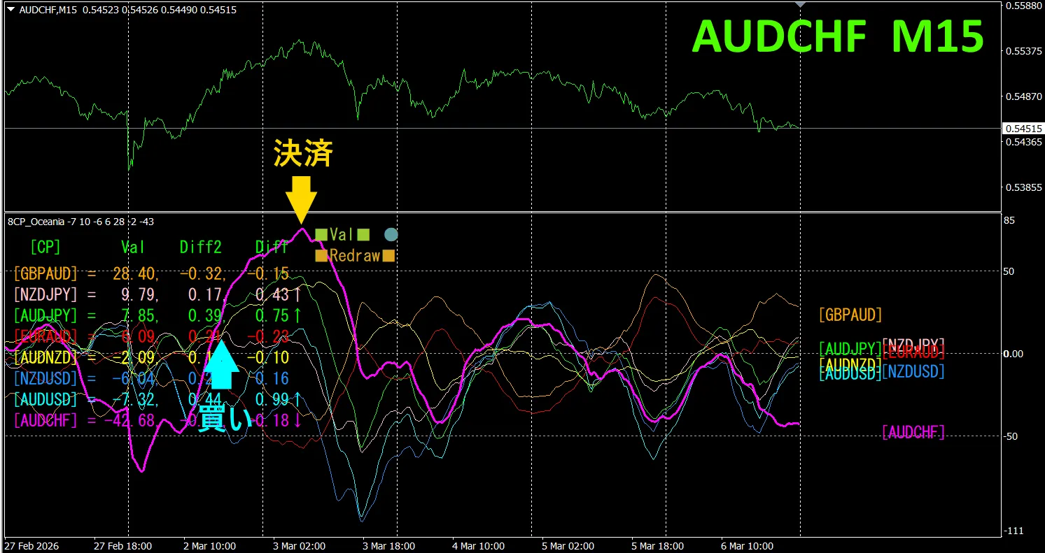
The upper half shows,AUDCHFの15分足チャートです。下半分は、「8CP Visualization Indicator」によるものです、赤紫色のグラフがAUDCHFに相当します
On Monday, the AUDCHF graph broke above the others, so we buy.、Sell at the peak。Profit was約50pipsの得られました。Take what you can、Then do not trade.
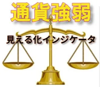
Currency Strength/Weakness Graph
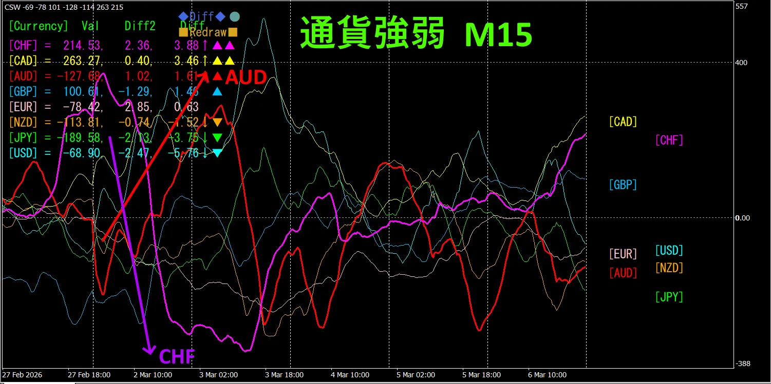
Looking at the 15-minute currency-strong/weak graph, AUD is strong, CHF is weak, and on the currency strength graph, AUD and CHF are inversely correlated.
The relationship between AUD and CHF is, AUD > CHF, focus only on the parts where AUDCHF spreads,buy AUDCHF.Because it forms a clean inverse-correlated chart,, as long as the vectors are expanding, just hold the position。
In FX,
“Aim for Currency Strength Reversal!” is FX's rule.
Using the “TrendLine-EX” allows diagonal trendline breaks to automate entries and exits. Since you can leave it running as is, easy trading is possible. “TrendLine-EX” can automatically sell on a downward break of the trendline, automatically close on an upward break, making it a semi-automatic EA.
2. Best SelectTry the indicator
The lower diagram shows, 2026年月日2日15:28(JST) のスクリーンショットです。
[Total] is sorted in descending order by value.The top one, USDJPY,, shows blue color across all timeframes.The Total value is 2166.38, a positive figure.USDJPY shows an upward trend indication
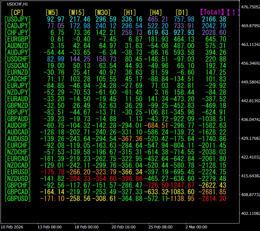
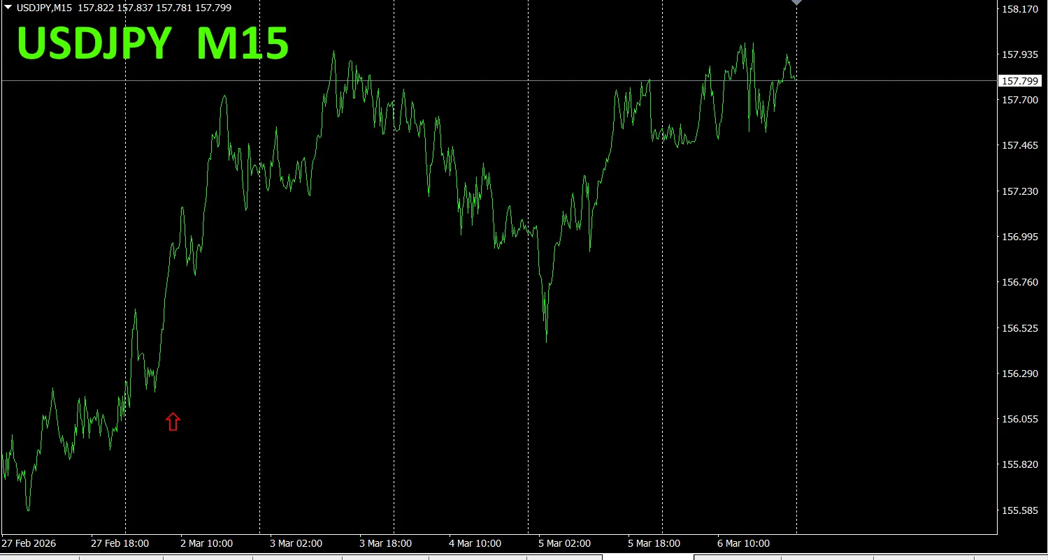
Now, let's look at USDJPY chart.
Red arrows indicate the screenshot point..It captures the rapid rise.
“28 Currency Pair Best Select Indicator” is, among 28 currency pairs, to easily identify which is showing the strongest trend. Also, whether to trade now or not is shown by values and colors.This is an excellent indicator for assessing all currency pairs at a glance.
“28 Currency Pair Best Select Indicator” ”

https://www.gogojungle.co.jp/tools/indicators/35128
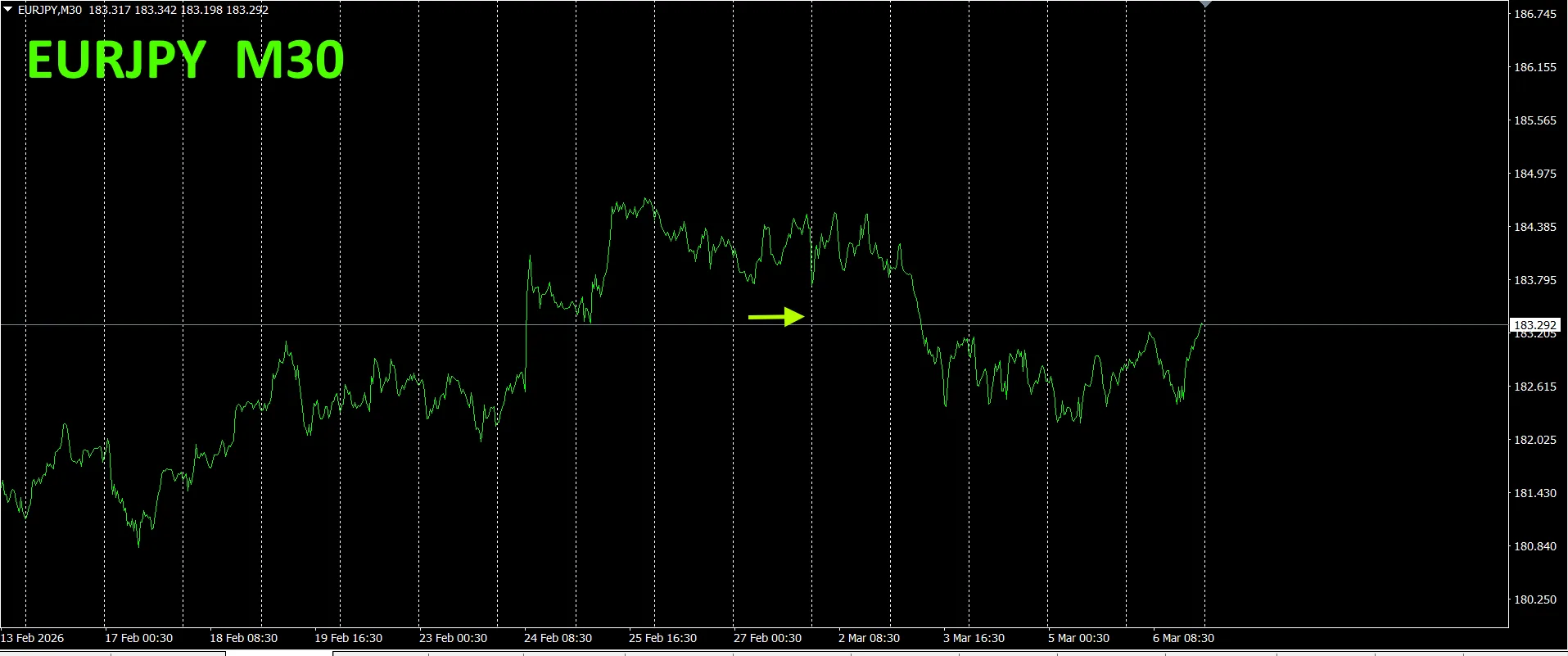
3. 2021年5月から追っているEURJPYの動きはどうなった?
Since May 2021, we have tracked EURJPY movements.
To view the overall trend, we plot about 3 weeks on a 30-minute chart.
Previously, we wrote the following.
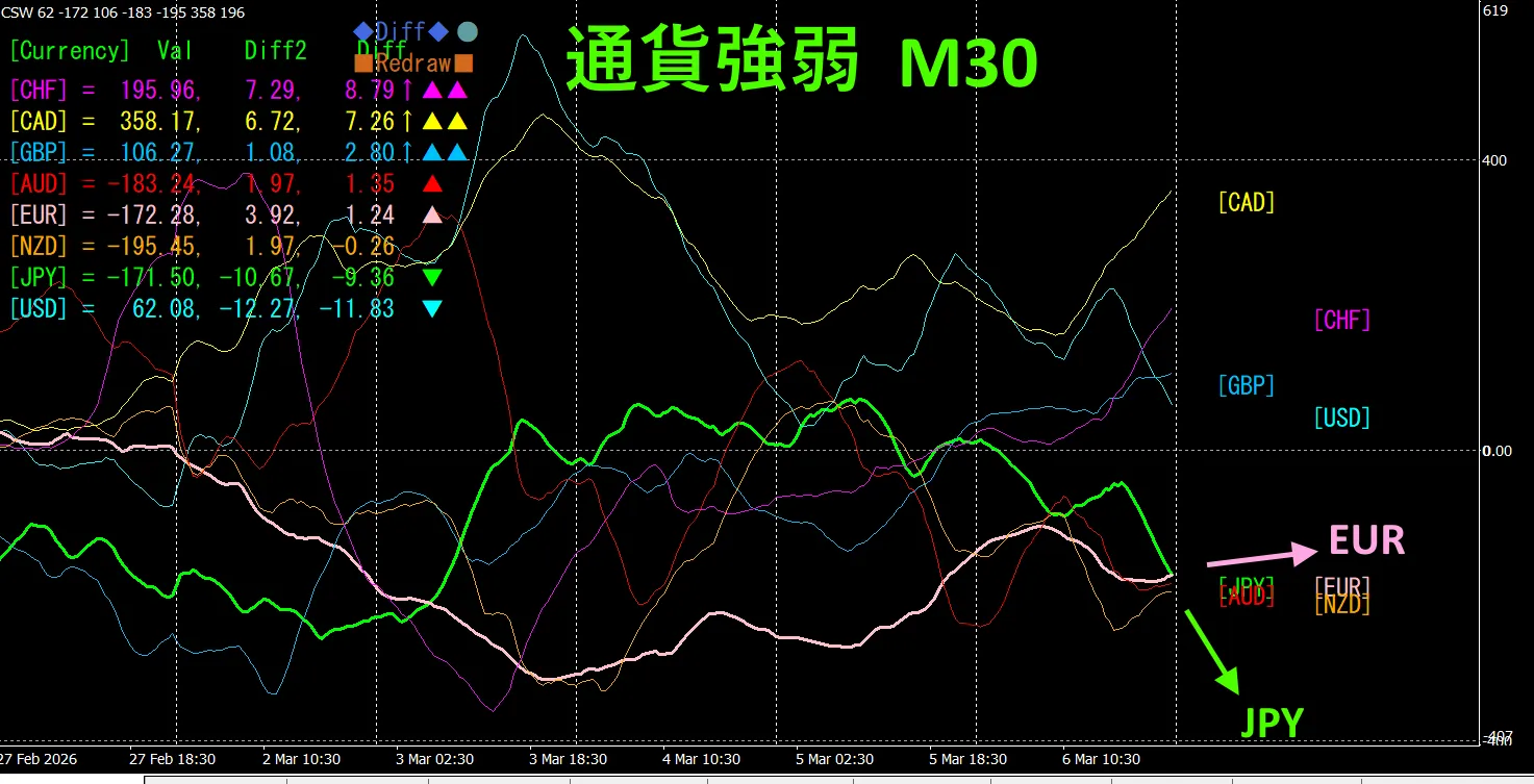
Pink represents EUR, green represents JPY.JPYもEURも、ほとんど水平方向に向いていて、clear direction is not evident.For a while, expect a range.
It appears to be in a range.
30
Pink EUR, green JPY.EUR is slightly up,JPY is down, so EURJPY is expected to move slightly higher.
See the new indicator “Dual_MACD_Trend_Indicator” below.
MT4 version:https://www.gogojungle.co.jp/tools/indicators/62199
MT5 version:https://www.gogojungle.co.jp/tools/indicators/62202
This indicator clearly shows trend direction with color. If the color bar is Lime, it’s a buy; if Red, it’s a sell; if there is no color, there is no trend. The color display makes trend status easy to grasp at a glance.
This indicator was applied to USDCHF on a 1-hour chart.
The red sell zone and green buy zone are clearly separated, making trading at a glance easier.The red zone for selling and the green zone for buying are clearly separated, making trading at a glance easier..In the upper diagramIn the upper diagram,, focus only on the white-ellipsed area focus only on the white-ellipsed area and trade long. and trade long.
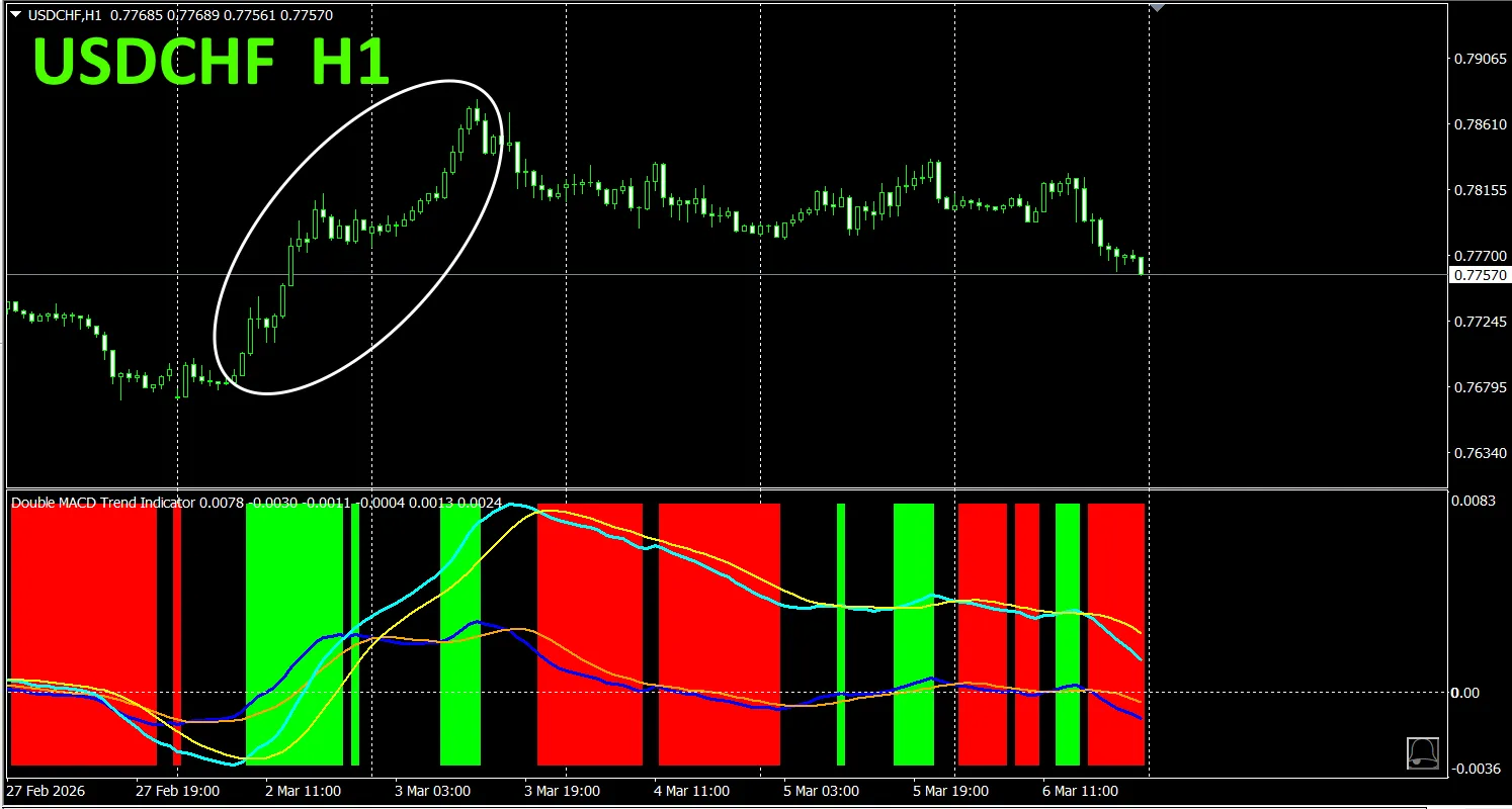
With the “Dual_MACD_Trend_Indicator,”“Dual_MACD_Trend_Indicator”では、 buy in green zones緑色のゾーンなら買い、,赤色のゾーンなら売り、 sell in red zones, and do not trade otherwiseそれ以外ではトレードしないという単純なルールに従うだけです。。
Using “Dual_MACD_Trend_Indicator” eliminates any hesitation about trading direction「Dual_MACD_Trend_Indicatorを使えば、もうトレードの方向に迷うことがありません.。
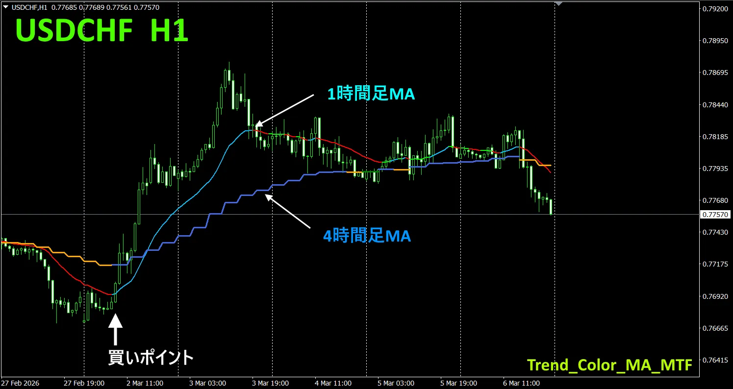
5. New release: Trend_Color_MA_MTF5. Trend_Color_MA_MTF is now available is newly released
From the sales page,From the sales page,
“Trend_Color_MA_Dual_MTF”“Trend_Color_MA_Dual_MTF” is is designed to transform your trading designed to transform your trading.. This tool is not merely a moving average This tool is not just a moving average.. It visualizes the trend direction with It visualizes the trend direction in color color,, and notifies you with a sound and alerts you with sound and notification when opportunities arise, becoming your personal assistant and a notification when opportunities arise, acting as your personal assistant..
As an exampleOne example, on the USDCHF to show the 4-hour moving averages alongside the 1-hour chart. 1-hour chart, display the 4-hour moving average as well. The stair-step appearance of the 4-hour moving average shows that the 4-hour moving average is blue during uptrends and red during downtrends, making it easy to compare the current chart's trend direction with the higher timeframe trend direction at a glance.
Usage: wait for the higher-timeframe moving average to turn blue, then when the chart's moving average turns blue, it is an excellent point to buy the dip. For selling, the opposite. Wait for the higher-timeframe moving average to turn red, then the point where the chart's moving average changes from green to red is an excellent point to sell a pullback
 .
.
For more details, please see the following link.
https://www.gogojungle.co.jp/tools/indicators/75985
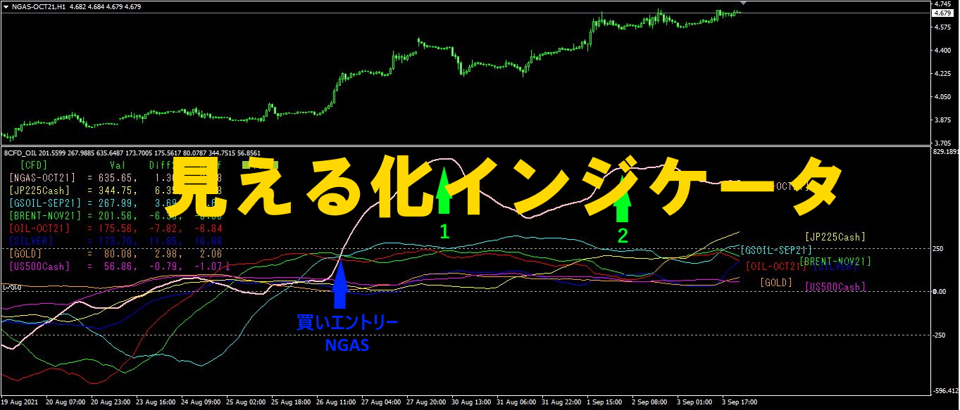
“8CFD Visualization Indicator Any Version”
https://www.gogojungle.co.jp/tools/indicators/32288
“TrendLine-EX”

https://www.gogojungle.co.jp/tools/indicators/42257
“8C Currency Strength Visualization Indicator” is available on the following pages.
MT4 version https://www.gogojungle.co.jp/tools/indicators/39150
MT5 version https://www.gogojungle.co.jp/tools/indicators/39159
【My products for sale】