
Idea brainstorming for indicators
Hello. This is 2pay.
Today I would like to introduce ideas for creating indicators and the way to realize them.
In the past I mainly did discretionary trading, but about two to three years ago I learned programming, and now my own trading is completely automated, with operation and performance checks left to the system.
As I push the system to its limits, I realize that human work can be taken over by machines (thrown away).
Lately I have leisure time, so alongside a half-life devoted to trading and research, I’m facing things I sacrificed, reviewing my investment history, and studying for new challenges.
While taking a study break, I began making an indicator and suddenly recalled a discretionary method that used to yield big profits.
It was a breakout method, a universal approach that everyone knows.
In one sentence: “follow the breakout direction of the range.”
Even though the rule is so simple, the range is an abstract concept that is difficult to quantify.
I had vaguely thought for a long time that it would be nice to visualize it, and now I think I might be able to realize it.
① How to formulate the range?
② What should be considered a breakout?
For now, regarding ②, I think it is enough to define a breakout as a real price move confirmed by breaking out of the range defined in ①.
However, while it is easy to visually capture the range and enclose it with a rectangular object, turning that into a program that identifies the range is hard to verbalize and formulate.
The difficulty in identifying the range comes from the fact that the concepts of range and trend are based on human subjectivity and judged by feel.
The theme this time is how to define such a range that is difficult to identify.
If we could programmatically identify the range and display it prominently, it would be very helpful as an assist for breakout trading.
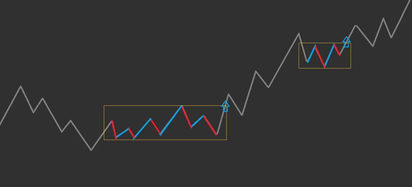
As in the figure below, I plan to create an indicator that detects the range and colors the corresponding candles.
The market is extremely subjective, a world of images. (Frie Lenn-like)
And what can be vividly imagined can be realized.
a. For example, if most of the rising wave and the following falling wave coincide in the same price range, those two waves are moving sideways.
b. If most of the rising wave and the following falling wave do not share the same price range, the larger wave is driving the movement.
If a is repeated, it means the price moves up and down in the same price range, which can be identified as a range.
If b is repeated, it means price moves in one direction, which can be identified as a trend.
Actual charts are not waves but candlesticks, so we measure whether each bar matches the same price range as the most recent bar, and evaluate by fit rate and the number of matches.
By the way, we will also monitor the contraction and expansion processes simultaneously, capturing the end of the range and the vicinity of the trend onset.
The same principle as the Bollinger Band squeeze → expansion process.
To reduce misidentification of trends and high-volatility ranges, we will prepare long-term and short-term volatility, so as not to pick up extremely large fluctuations and to respond to daily volatility changes.
To express this numerically (compression density), we formulate it as below.
Compression density = Density * Range ratio * Volatility ratio
Density = Number of fits / Evaluation period
Range ratio = High-low range / Short-term volatility
Volatility ratio = Short-term volatility / Long-term volatility
The calculated compression density is expressed on a scale from 0.0 to 1.0, so the density is colored in a four-tier gradient (with two more levels for both bullish and bearish candles, making 8 levels total).
This is the result.
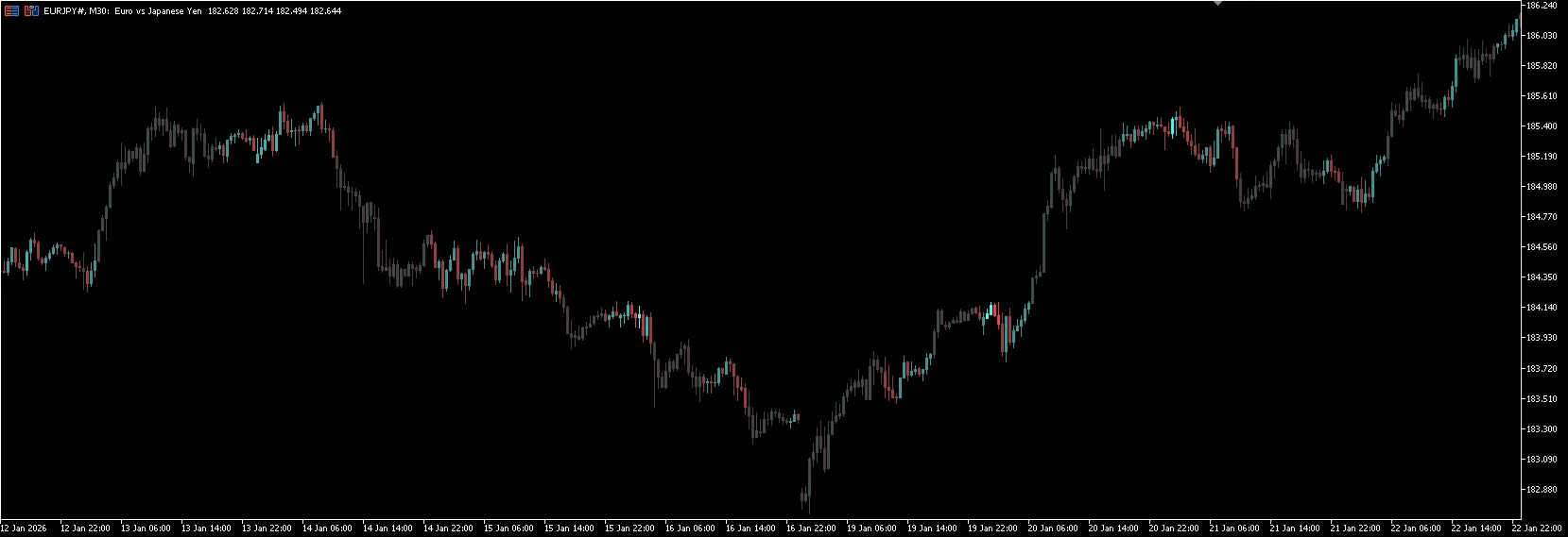
It roughly matches the idea, detecting a sideways range. When price starts to move, it turns gray.
The lighter the color, the higher the compression density; the darker areas indicate lower compression density (roughly representing the expansion process).
Light-colored areas indicate range-following (or not taking action), dark-colored areas indicate trend-following, allowing a visual mode switch.
// ---
The next image shows a lower-sensitivity display.
Colors are applied from the end of the range toward the trend initiation.
Since it marks the point where the trend resumes, it should be easy to judge buying on dips and selling into rallies.
Breakouts are not about predicting direction, but following the direction that is broken through, so it can also be used to identify trend reversals.
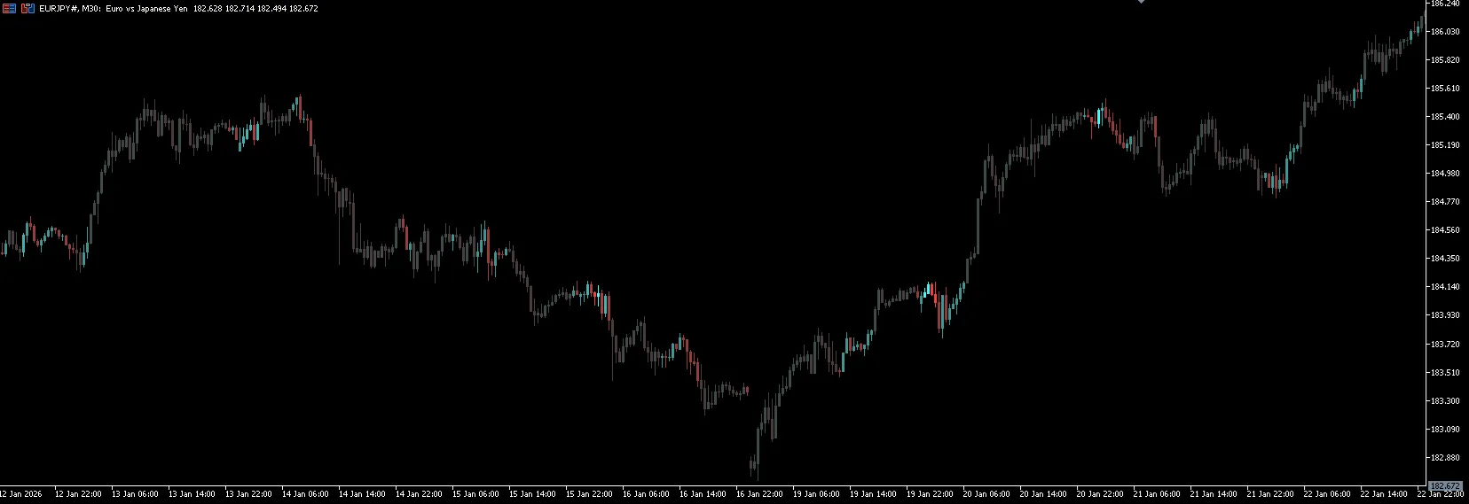
If the breakout aligns with the opening times of major stock markets, large money tends to enter, providing a solid trend ride.
The result is quite good, so I’m considering selling it.
If you draw a retracement and color up to near the 38–62% range, you can confirm that “it’s about to move,” and go in, right?
There should be far fewer situations where the entry is too early and causes hesitation.
Whether it sells or not, I would have liked to use this during my discretionary era ().
Many people probably share this concern.
// ---
In the past, discretion was thought to be a matter of fitting to the current market conditions and preparing a kind of bespoke scenario.
I still think that half of that idea is correct, but not everything needs to be discretionary; what can be quantified should be quantified for convenience.
By having quantitative parts, you reduce the items that must be considered as discretionary elements, allowing you to focus your cognitive resources more effectively.
The reason I learned programming was to create indicators that assist discretionary methods.
At that time, monitoring all scales with MTF, constantly checking resistance lines and market state (regimes) and phases was necessary.
It was difficult to construct a trading scenario accurately in the head.
Therefore, I created an indicator that includes the following lines and annotations on the current candle: {previous day open, today’s range, nearby round numbers, high/low for each market session, previous day and day before, limit movement per candle, recent high/low, Fibonacci levels} with the ability to show/hide each line via a button (the development would cost about 50,000–100,000 yen if done by someone else).
Being my first self-made indicator, it took about a month to develop.
Thanks to the effort, the actual trading environment felt good to use.
Because the burden of having to grasp everything in my head was greatly reduced.
Using indicators is a kind of improvement in work efficiency, and whether developed or purchased, I think it is worth investing in.
Indicators are not consumables (they endure), so if you win using them, recovering the initial investment is easy.
With that mindset, I buy many books, and I only buy books if I can expect a return on investment (even if the book costs 100 yen).
As a side note, lately I’ve graduated from Pan Rolling’s Wizard Book Series and started reading books from Kinzai and Nikkei Publishing.
It would be nice to be able to recommend books as well.
That will be all for now.
Thank you for reading.