Utilization of "Visualization Indicator" (Part 240)
「Visualization Indicator」 usage(that240)
1. 「28 Currency Pair List Indicator」 to be evolved into an indicator.
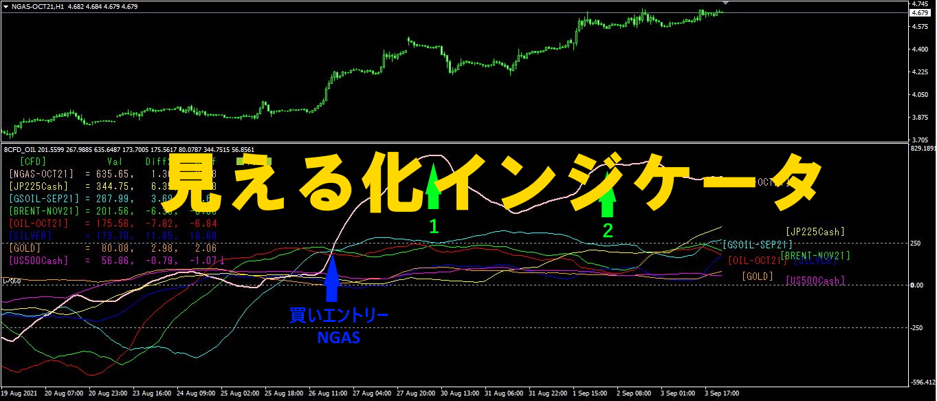
「8CP Visualization Indicator」 is used to draw USDJPY.
「8CP Visualization Indicator」 comes in Oceania version, London version, New York version, AnyCP version. This time we used Oceania version.
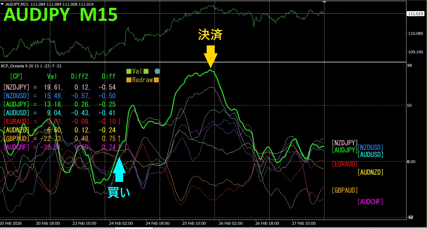
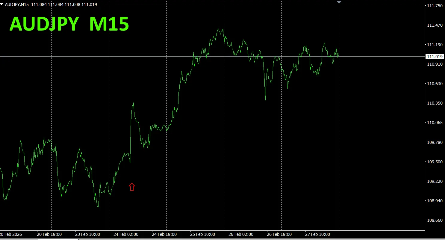
The upper half is the AUDJPY 15-minute chart. The lower half is from the Visualization Indicator” “8CP, the green colored graph corresponds to AUDJPY.
On Tuesday, the AUDJPY graph rose above the others, so we bought. We exited at the peak, profit was about 180 pips gained. Take what you can, and the rest not traded is the proper approach.
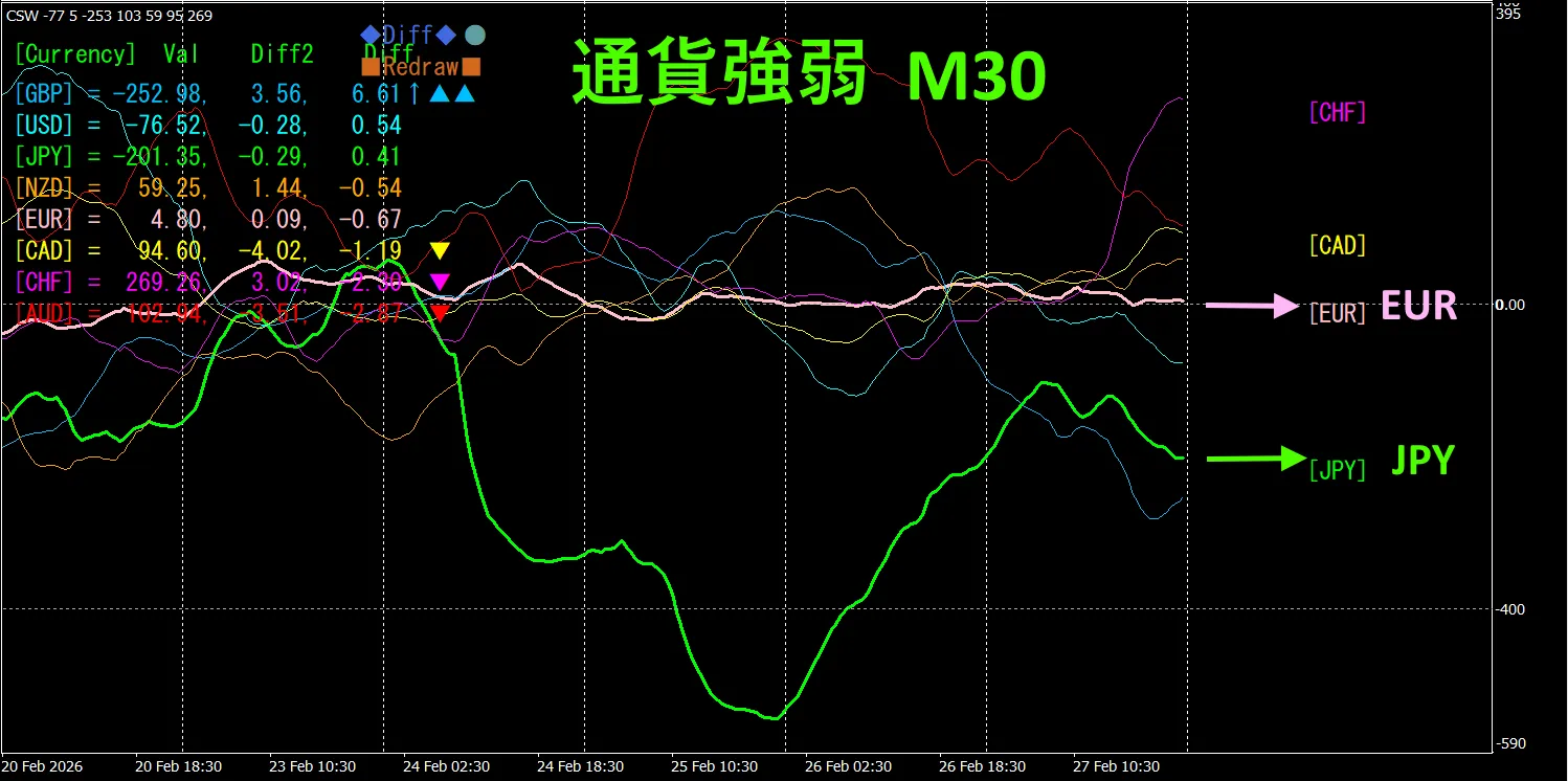
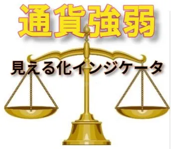
Currency Strength Weakness Chart
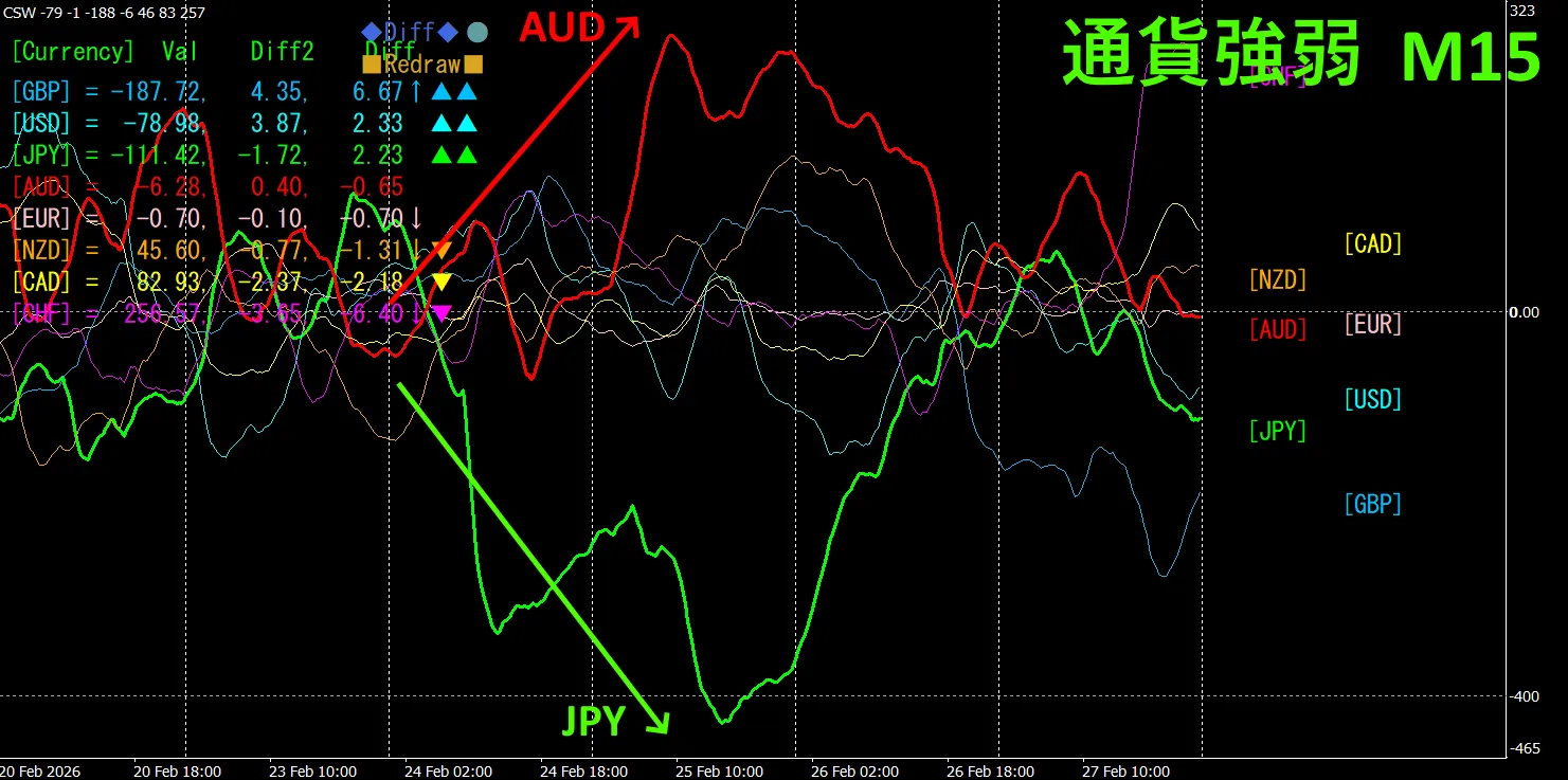
Looking at the 15-minute currency strength graph, AUD is strong, JPY is weak, so in the currency strength graph, AUD and JPY show a clear inverse relationship.
The relationship is, AUD and with AUD > JPY, focus only on the parts where AUD and JPY diverge and spread, buy AUDJPY, and hold your positions while the vectors spread.
In FX, pick the currency pair that is currently the strongest and in inverse correlation, and the results will follow naturally.
“Aim for Currency Strength Inverse Correlation!” is a rule of FX.
Using the “TrendLine-EX”, you can automate entries and exits by diagonal trendline breaks. Since you can leave it as is, easy trades become possible. “TrendLine-EX” is a semi-automatic EA that can automatic sell on trendline bottom breaks and auto close on top breaks.

2. Best SelectTry the indicator
Below is 2026 year 2 month 24 16:28(JST) is a screenshot
[Total] sorted in descending order by value. At the very top, AUDJPY is [H4] excluded, all timeframes show in blue color. The Total value is 2937.01, a positive number. This implies an upward trend for AUDJPY.
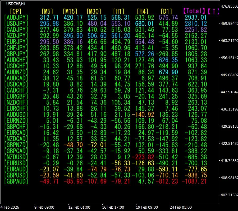
Now, let's look at the AUDJPY chart
The red arrows mark the point where the screenshot was taken. It captures a sharp rise.
“28 Currency Pair Best Select Indicator” shows which currency among the 28 pairs has the strongest emerging trend. It also shows whether you should trade now or not by numeric and color cues. It is an excellent indicator to judge all currency pairs at a glance.
“28 Currency Pair Best Select Indicator””

https://www.gogojungle.co.jp/tools/indicators/35128
3. Since May 2021 we have been tracking EURJPY movements
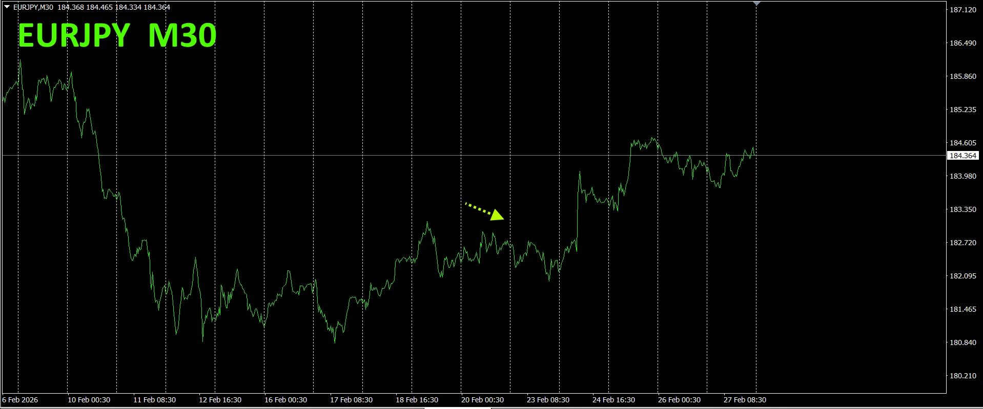
From May 2021, EURJPY movements have been tracked.
To view the overall trend, a 30-minute chart covering about the last 3 weeks is drawn.
Previously we wrote the following.
Purple is EUR, green is JPY. Both EUR and JPY mostly move horizontally and lack a clear direction.
On Monday it dipped slightly, but since then it has risen.
30
Purple is EUR, green is JPY. Both EUR and JPY again mostly move horizontally and lack a clear directional bias. For a while it is expected to stay in a range.
4. Try the new Dual_MACD_Trend_Indicator
New indicator “Dual_MACD_Trend_Indicator” details below.
MT4 version:https://www.gogojungle.co.jp/tools/indicators/62199
MT5 version:https://www.gogojungle.co.jp/tools/indicators/62202
A trend indicator that clearly shows direction with color. If the color bar is Lime, buy; if Red, sell. If there is no color, there is no trend. The colorization allows you to grasp the trend at a glance.
Red area for selling and green area for buying are neatly separated, making trading easier at a glance. In the top figure, only focus on the white circled area and trade on the buy side.
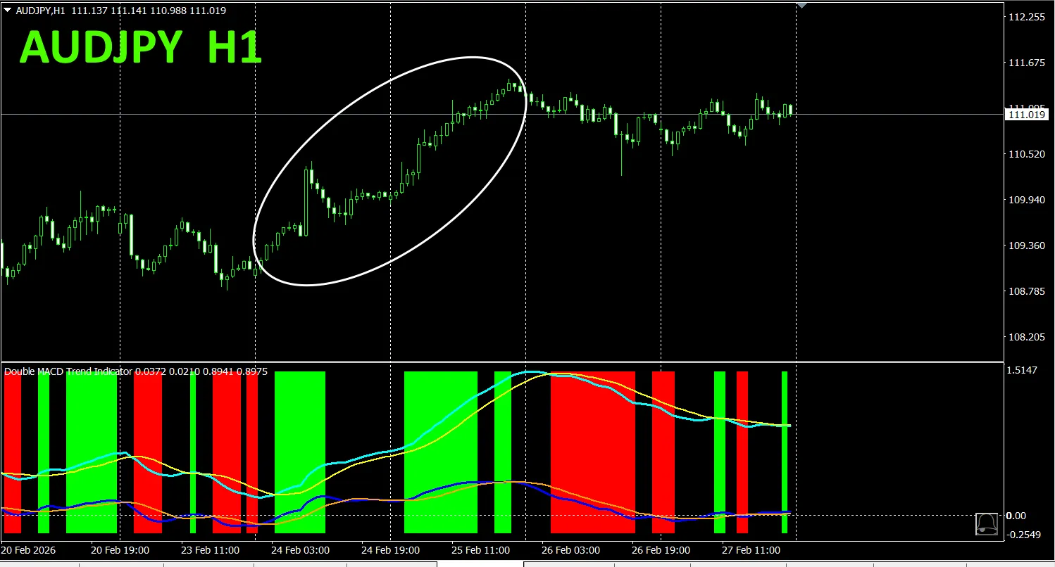
With “Dual_MACD_Trend_Indicator”, buy in green zones, sell in red zones, and do not trade otherwise.
By using “Dual_MACD_Trend_Indicator,” you will no longer hesitate about trade direction.
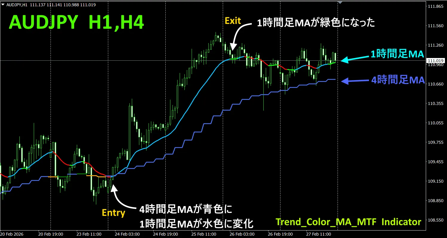
5. “Trend_Color_MA_MTF” has new releaseFrom the product page
“Trend_Color_MA_Dual_MTF” is designed to transform your trading. This tool is not merely a moving average. It visualizes the trend direction with color and notifies you at the moment a new opportunity arrives with sound and alerts, acting as your personal assistant.
is designed to transform your trading. This tool is not merely a moving average. It visualizes the trend direction with color and notifies you at the moment a new opportunity arrives with sound and alerts, acting as your personal assistant..
As an example, on the AUDJPY 1-hour chart, the 4-hour moving average is also displayed. The 4-hour moving average forms a staircase pattern. When the upper timeframe moving average is blue and the current chart MA turns blue, it is an ideal point for buying the dip, and the reverse for selling. The color of the upper timeframe MA turning red signals a good point for selling on the pullback.
Usage: wait for the color of the upper timeframe MA to turn blue, then when the chart MA changes from green to blue, that is a great dip-buying point. For selling, the reverse applies. Wait for the upper timeframe MA color to turn red, and when the chart MA changes from green to red, that is a great point to sell on the rally。
For more details, please refer to the following link..
https://www.gogojungle.co.jp/tools/indicators/75985
「8CFD Visualization Indicator Any Version」
https://www.gogojungle.co.jp/tools/indicators/32288
「
https://www.gogojungle.co.jp/tools/indicators/50115
「TrendLine-EX」

https://www.gogojungle.co.jp/tools/indicators/42257
「8C Currency Strength Visualization Indicator」 is described on the following pages.
MT4 version https://www.gogojungle.co.jp/tools/indicators/39150
MT5 version https://www.gogojungle.co.jp/tools/indicators/39159
【Products I have for sale】