Utilization of the "Visualization Indicator" (Part 239)
“Visualization Indicators” usage(its2399)
1. Evolution of the “28 Currency Pairs List Indicator” to a more advanced indicator
“8CP Visualization Indicator” for USDJPY to draw
“8CP Visualization Indicator” includes Oceania version, London version, NewYork version, AnyCP version. This time, we used London version。
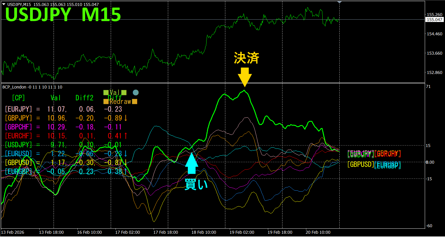
The upper half is the USDJPY 15-minute chart., The lower half is coming from Visualization Indicator”.” “8CP The green colored graph corresponds to USDJPY
On Wednesday, USDJPY’s graph rose above the others, so we will buy. Sell at the peak and profit. Profit was approximately 157 pips. Take what you can and do not trade for the rest.
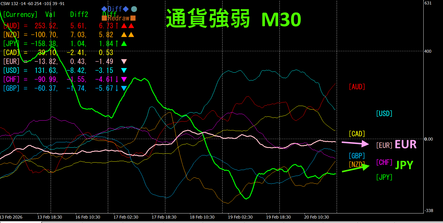
Currency strength/weakness graph
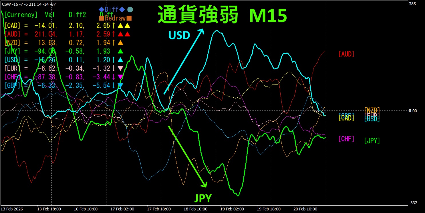
Looking at the 15-minute currency strength graph, USD is strong, JPY is weak, and in the currency strength graph, USDJPY exhibits a clear inverse correlation.
The relationship of JPY and USD is, JPY < USD, focusing only on the divergence portion, buy USDJPY. Hold the position while the vectors widen.
In FX, you should pick the currency pairs that are expanding the most and are in inverse correlation, and the results will follow.
“Trade currency strength inverse correlation!” is a rule in FX.
If you use TrendLine-EX, you can automate entries and settlements with diagonal trendline breaks. It can be left as is for an easier trading experience. “TrendLine-EX” can short automatically when the trendline breaks below, and automatically settle when it breaks above, making it a semi-automatic EA.
2. Try Best Select indicator
The image below is a screenshot taken on 2026 February 18 at 12:28 (JST) .
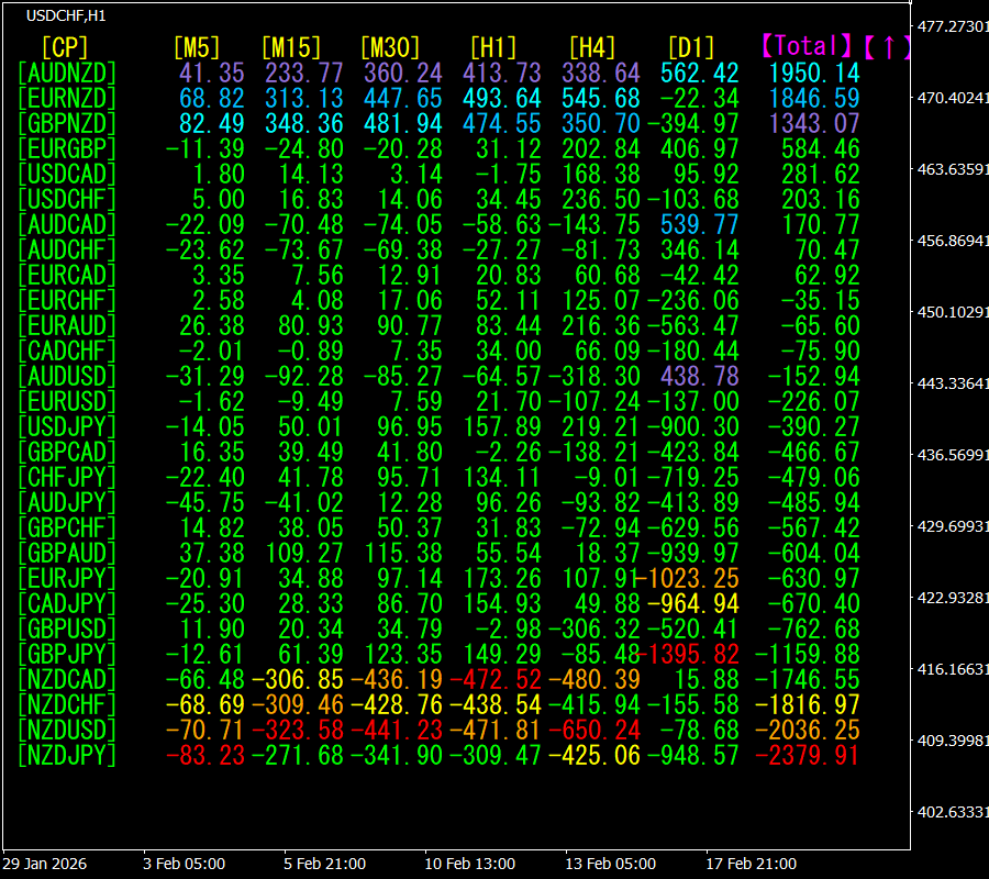
[Total] is arranged in descending numerical order. The top one, AUDNZD, shows blue color across all timeframes. The Total value is 1950.14, a positive figure. This suggests an upward trend for AUDNZD.
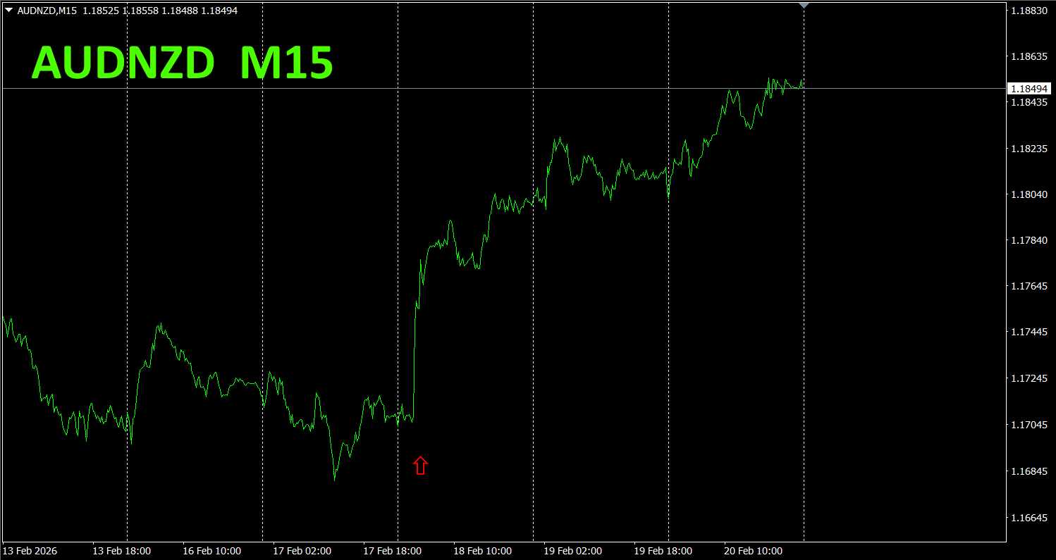
Now, let's look at AUDNZD chart.
The red arrows show the screenshot area capturing the surge.
“28 Currency Pairs Best Select Indicator” can easily identify which of the 28 pairs has the strongest trend. It also tells you now whether to trade with numbers and colors. A great indicator to assess all currency pairs at a glance.
“28 Currency Pair Best Select Indicator”

https://www.gogojungle.co.jp/tools/indicators/35128
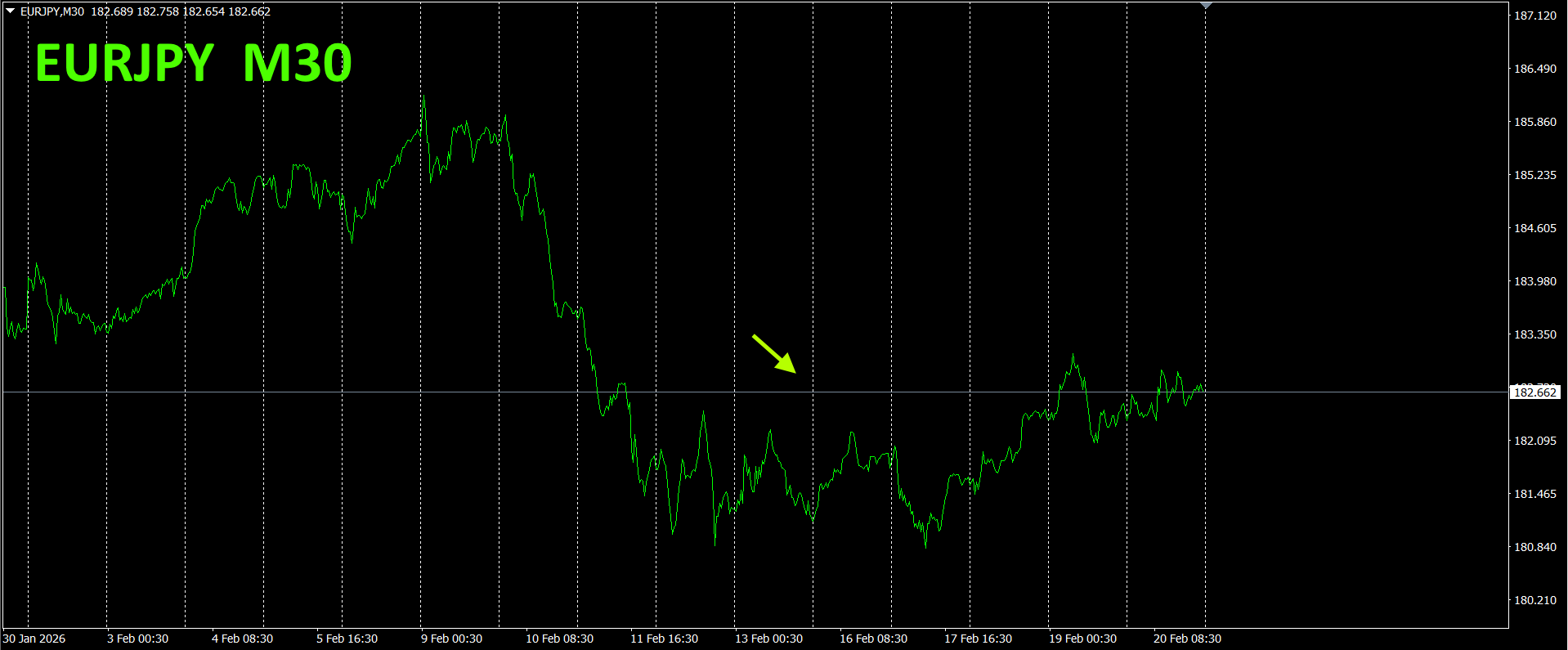
3. Since May 2021, the behavior of EURJPY has been tracked?
From May 2021, EURJPY has been tracked.
To view the overall trend, we depict approximately 3 weeks of the latest 30-minute charts.
Previously, I wrote as follows.
Pink is EUR, green is JPY. JPY is rising, EUR is flat to slightly downward. Therefore, EURJPY is expected to stay under pressure and fall further.
It dipped slightly but later rose a bit.
30-minute currency strength chart.
Pink is EUR, green is JPY. Both currencies are mostly moving horizontally, showing no clear directional bias. For a while
New indicator “Dual_MACD_Trend_Indicator” details below.
MT4 version:https://www.gogojungle.co.jp/tools/indicators/62199
MT5 version:https://www.gogojungle.co.jp/tools/indicators/62202
This indicator clearly shows the direction of the trend with colors. If the color bar is Lime, it means buy; if Red, sell. If there is no color, there is no trend. With color display, you can grasp the trend state at a glance。
I applied this indicator to USDJPY on the 1-hour chart.
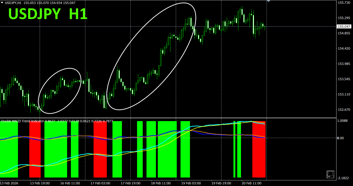
The red sell zone and green buy zone are clearly separated, making trading straightforward at a glance.In the above image, focus only on the white oval-marked region and buy.。
With “Dual_MACD_Trend_Indicator”, buy in green zones, sell in red zones and not trade otherwise,.
Using “Dual_MACD_Trend_Indicator” eliminates any hesitation about trade direction
5. Trend_Color_MA_MTF has been newly released
From the sales page
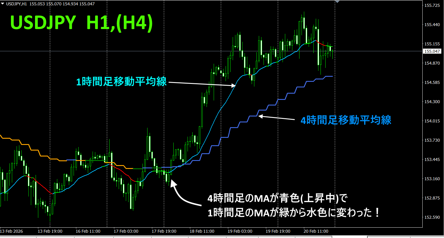
“Trend_Color_MA_Dual_MTF” is to transform your trading. This tool is not just a moving average. It visualizes trend direction with colors and notifies you with sound and alert as soon as a signal arrives, acting as your personal assistant
As an example, on the USDJPY 1-hour chart, we display the 4-hour moving average too. The four-hour moving average appears stair-stepped. The 1-hour and 4-hour moving averages show blue-based colors when rising and red-based colors when falling, allowing you to determine the current chart trend direction and the higher-timeframe trend direction at a glance.
How to use: Wait for the higher-timeframe moving average color to become blue, and note the point where the chart moving averages change from green to blue as an ideal buying point. For selling, the opposite applies. Wait for the higher-timeframe moving average color to become red, and note where the chart moving averages change from green to red as an ideal selling point
For details, please refer to the following link.
https://www.gogojungle.co.jp/tools/indicators/75985
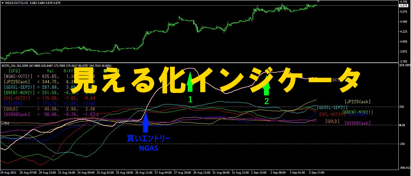
「8CFD Visualization Indicator Any Version
https://www.gogojungle.co.jp/tools/indicators/32288
「toretore Indicator
https://www.gogojungle.co.jp/tools/indicators/50115
「TrendLine-EX」

https://www.gogojungle.co.jp/tools/indicators/42257
“8C Currency Strength Visualization Indicator” is described on the following page。
MT4 version https://www.gogojungle.co.jp/tools/indicators/39150
MT5 version https://www.gogojungle.co.jp/tools/indicators/39159
【Items I have listed for sale】