

[Practical Commentary Part 5] Real-seller and real-buyer exhaustion reversal signal v1.0 — Core of trend reversal revealed by applying to the USD/JPY “weekly chart”
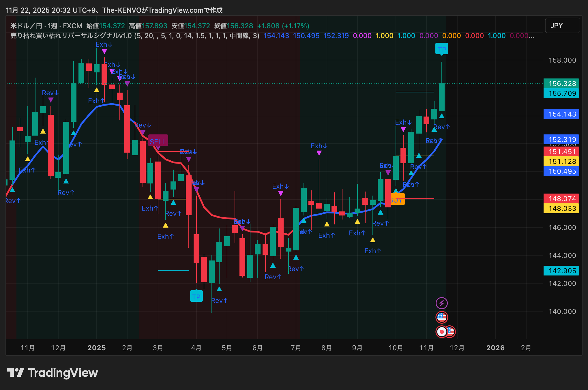
? Chart usage: USD/JPY weekly chart from January to November 2025
Signal: Sell Exhaustion Buy Exhaustion Reversal Signal v1.0
Timeframe: Weekly chart (1W)
Compared with 1-minute and 15-minute charts, there is less noise,and it is the most suitable timeframe to catch the “major trend reversal”.
? Chart usage: USD/JPY weekly chart from January to November 2025
Signal: Sell Exhaustion Buy Exhaustion Reversal Signal v1.0
Timeframe: Weekly chart (1W)
Compared with 1-minute and 15-minute charts, there is less noise,and it is the most suitable timeframe to catch the “major trend reversal”.
? 1. First, the conclusion
Sell exhaustion / buy exhaustion signals at the weekly level are
“sensors that read the big trend”and are extremely effective.
In the 2025 USD/JPY chart,
weekly signals are functioning very beautifully,
✔ End of a downtrend (Rev↑)
✔ Transition to an uptrend (Exh↑)
✔ Timing of a pullback (Rev↑)
✔ Slowdown in the ceiling area (Exh↓)
✔ Timing of final TP attainment
has been clearly confirmed.
By removing the tiny fluctuations of the short-term candles
and extracting only the structural change in USD/JPY,
weeklies applied here are shown to be very powerful.
? 2. Overall chart flow (January–November 2025)
Below, we read the chart in chronological order.
?【1】January–March: start of decline → repeated sell exhaustion signals
(left side of chart)
▼Rev↓ (sell exhaustion)” purple icon
▼Exh↓ (overly bearish) blue icon
This period shows a clear downtrend.
Around March,SELL exhaustion purple boxappeared,
strongly suggesting the subsequent down move.
?Weekly SELL is really strong.
It tells the direction of the major decline without being misled by short-term retracements.
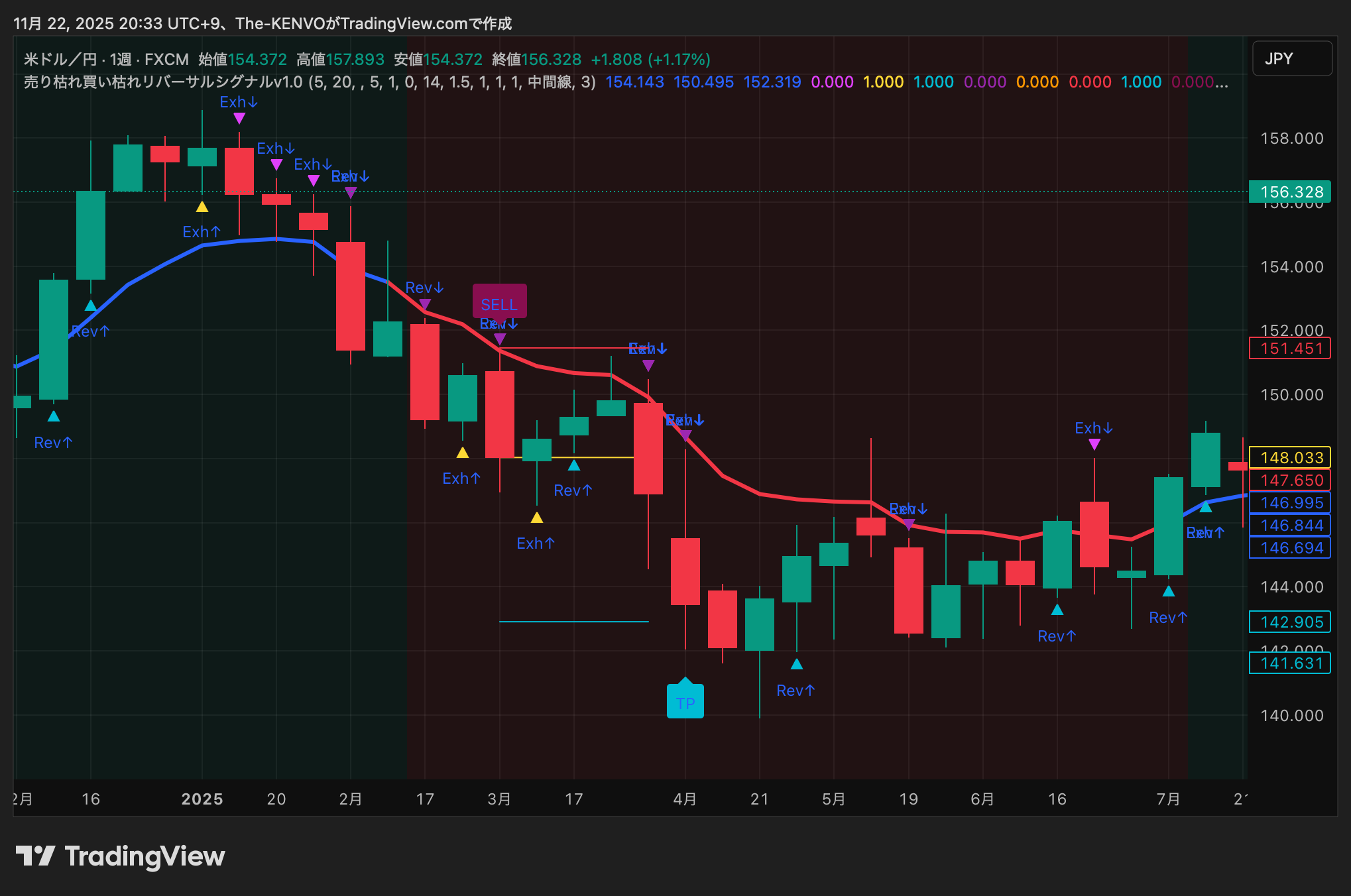
?【2】April–July: “quiet reversal preparation” in the bottom zone
This is the highlight of this chart.
▲Rev↑ (buy exhaustion)” yellow icon
▲Exh↑ (overbought in the upside) blue-green icon
From April to June,
the bottom region saw several small buy exhaustion signals light up.
This is a classic “downward fatigue.”
When this pattern appears on the weekly chart,
it indicates that a medium-term trend reversal is starting.
Especially June:
✔ Long lower wick
✔ Exh↑
✔ Rev↑
Strong rebound signal when all three align.
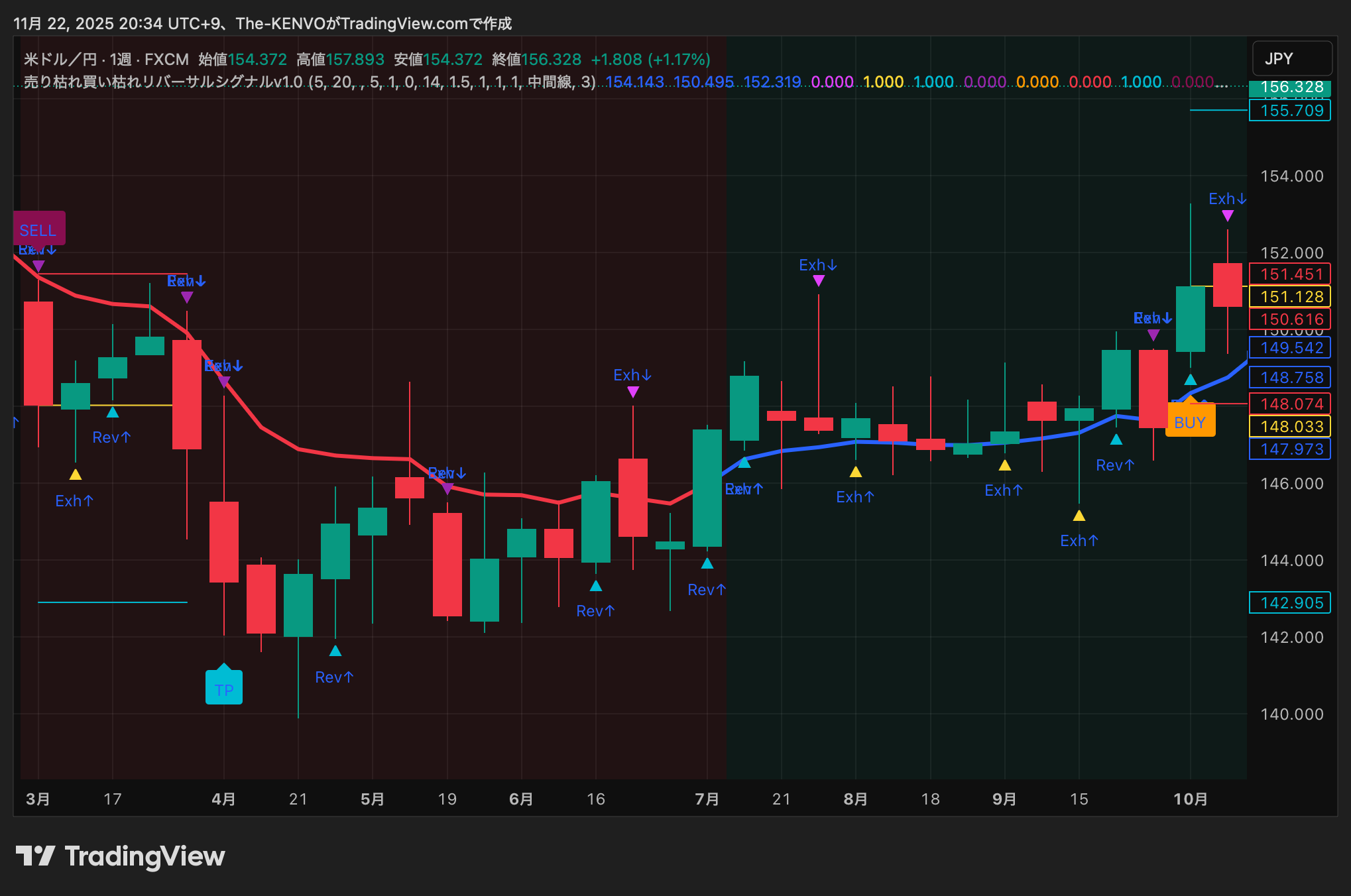
?【3】August–October: BUY signal → genuine uptrend
In August–September,BUY (yellow box)appeared.
From this point the weekly chart clearly turned up.
EMA (blue line) turned upward,
Candle closes above the EMA
Exh↑ lit up consecutively
→ complete trend reversal
Furthermore around October
Rev↑ indicates a pullback point.
? The weekly Rev↑ pullback is the most reliable entry point in the mid-term.
In reality the chart rose nicely afterward.
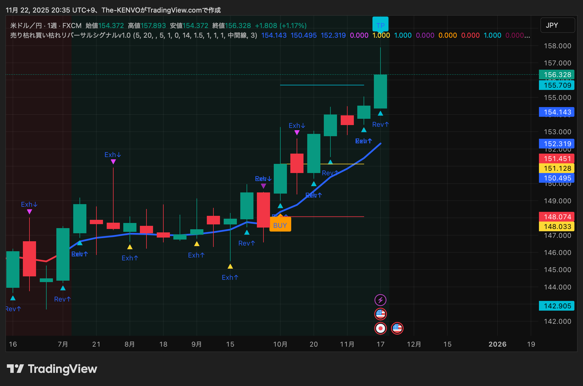
?【4】November: TP signal reached → strong uptrend completed
In NovemberTP (blue-green box)appeared.
A milestone of the upward move in recent months
A temporary end of the trend
An ideal point to realize profits
TP signal is not a ceiling forecast, but on a weekly basis it indicates a very favorable profit-taking situation
for-profit points.
In fact, the candles formed a large bullish candle,
suggesting a peak (at least a pause) in the mid-term uptrend.
? 3. How to use it on a weekly chart vs. short-term candles
? Short-term candles (M15–H1)
A lot of noise
frequent reversals
Many small signals
High frequency but consistent reliability
A lot of noise
frequent reversals
Many small signals
High frequency but consistent reliability
? Weekly chart (1W)
Capture only major regime changes
Fewer signals
Each signal carries more weight
Capture the structural change in price up or down
Capture only major regime changes
Fewer signals
Each signal carries more weight
Capture the structural change in price up or down
As in this example,
① Rev↑ at the bottom, ② BUY, ③ pullback Rev↑, ④ TP
When this flow occurs,
you can trade solely on the weekly chart and still be fully competitive.
? 4. How to trade in practice (mid-term swing scenario)
✅ Entry
Rev↑ (bottom zone)
→ enter with a small position
BUY signal (August)
→ main position
Rev↑ (bottom zone)
→ enter with a small position
BUY signal (August)
→ main position
✅ Add-on entry
Pullback Rev↑ (October)
Pullback Rev↑ (October)
✅ Take profit
TP (November)
→ close half to all
→ then monitor for a new trend
TP (November)
→ close half to all
→ then monitor for a new trend
? 5. What we can learn from this chart (important)
✔ Weekly sell exhaustion / buy exhaustion capture the structural change in the market
✔ In particular Rev↑ (buy exhaustion) has high bottom reliability
✔ BUY signal is central to mid-term trend reversal
✔ TP is not a top but a strong profit-taking point
✔ Combined with 1-minute to 4-hour charts, creates the strongest setup
? 6. Summary
In 2025 USD/JPY weekly chart, the
“Sell Exhaustion Buy Exhaustion Reversal Signal v1.0”
✔ End of down move
✔ Transition to up move
✔ Location of pullbacks
✔ Profit-taking points
remarkably accurate.
Viewed from the weekly chart’s big breathing pace,
the intrinsic strength of this indicator becomes clearer.
.
This article is not trading advice but a practical learning guide. Please make investment decisions at your own risk.
? Purchase details here
This indicator is listed on GogoJungle.
There are easy-to-try options:【Monthly version】 and【One-time purchase version】.
【Monthly version】3,000 yen/month
【One-time purchase version】30,000 yen