★★Useful Tool Introduction★★ Maximizing Fibonacci's analytical capabilities with a tool
In analysis of the market, I want to use Fibonacci, but
there are some annoyances, you know...
“When using multiple timeframes, I can’t tell which timeframe’s Fibonacci is being displayed…”
“When Fibonacci lines overlap, the level display becomes hard to see because they stack…”
“I don’t want to display unnecessary level lines in the first place, and deleting them is a hassle…”
and so on...
Even though it’s a very effective analytical method,
the more you develop your own method, the more you say, “If only this could be like this.”
Today, we created a tool to meet that need.
That is this
Just by inserting this tool into the chart,
Fibonacci becomes dramatically easier to use!!

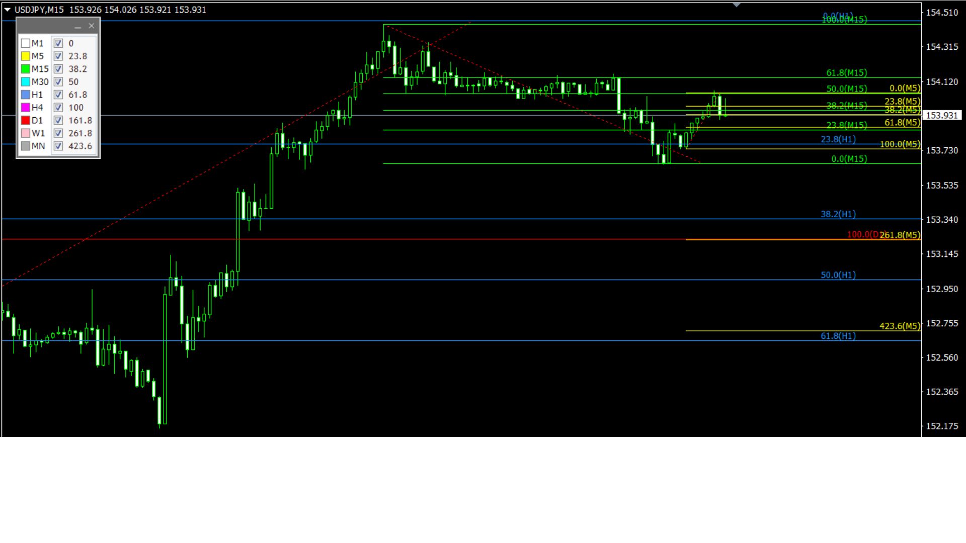
【Usage Example】
As shown in the image, timeframes are colored and the displayed timeframes are shown on each level line.
In the chart’s left panel, use the checkboxes to set whether to display each level line.
*For detailed usage, please see the sales page.